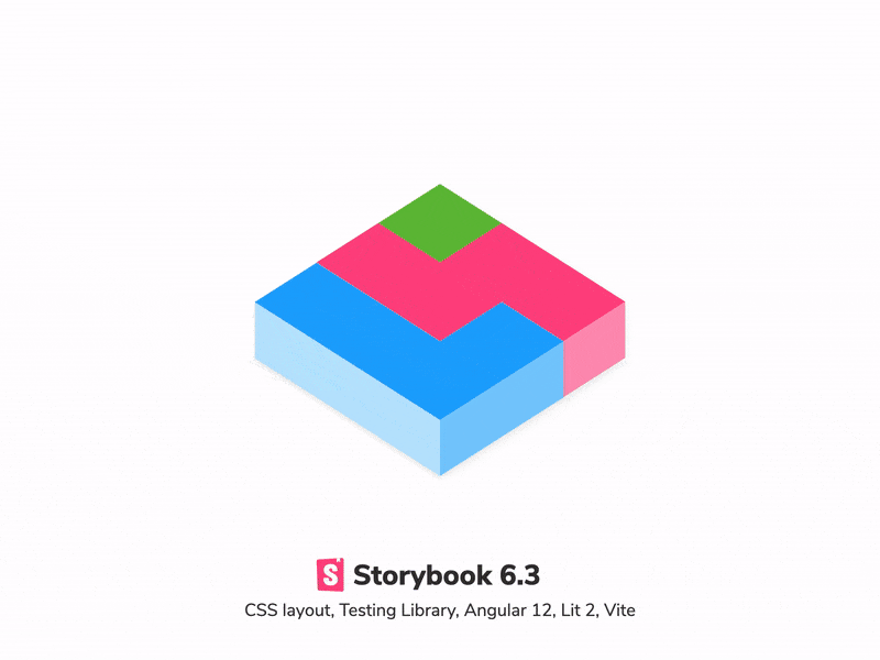
Storybook 6.3
Optimized for UI development

Storybook is the industry-standard UI development workshop for components and pages. It's used by Dropbox, Shopify, Stripe, and thousands more teams.
Developers choose Storybook because it helps them focus on one thing: the user interface. There's already a mountain of complexity in app development, Storybook makes your job simpler by isolating UI concerns from the noise of backend, APIs, and data.
In 6.3, we examined the tasks UI developers do everyday – styling and testing – to see how they can be streamlined. We're thrilled to share new visual inspection tools, utilities for reusing stories across your test suite, and revamped integrations.
- 📐 Style: measure and outline DOM elements
- 🔌 Test: Reuse stories in Jest, Testing Lib, Cypress
- 🚀 Frameworks: Angular 12 Ivy, Lit 2 Web Components
- 🛠 Builders: Webpack 5 stable, Vite
- 📦 Packaging: Modern ESM performance option
- 💯 Hundreds more improvements
Inspect CSS layout in one click
Storybook 6.3 ships with new tools to make CSS debugging a snap. Frontend developers spend a lot of time ensuring that UI implementation matches the design spec but it's trickier than ever to tell if the layout looks right.
Measure helps you check spacing. Enable the addon using the m key and hover over an element to get its dimensions, margin, and padding overlaid atop of the DOM node.
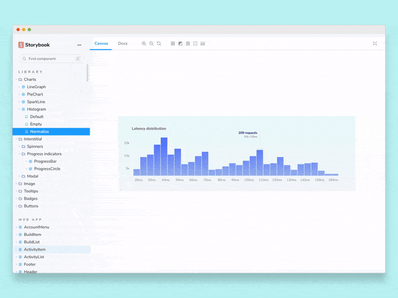
Outline helps you spot misaligned or broken layouts. Click once to toggle CSS outlines on all the UI elements on the page. The outlines act as a visual guide to make layout debugging easier.
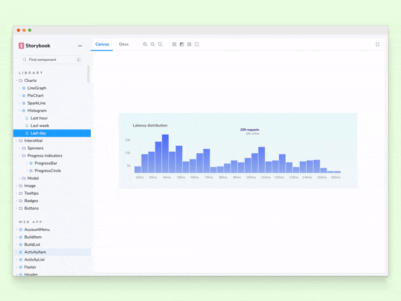
Viewport now allows you to cycle through various viewport sizes using keyboard shortcuts. That simplifies developing responsive UIs in Storybook.
Toolbars also supports keyboard shortcuts now. You can fully customize all shortcuts from the Keyboard shortcuts settings page.
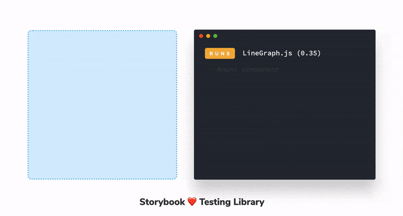
Reuse stories in your tests
Stories are tests, but for UI component states. Under the hood, stories compile to standard ES6-based modules. In 6.3, we streamlined how to reuse your stories across your React and Vue testing suite.
@storybook/testing-react and @storybook/testing-vue, for React and Vue respectively, allow you to import stories into tools like Jest, Testing Library, Cypress, and Puppeteer.
You can reuse the scenario setup code that you already configured in Storybook. That means you can focus on writing clean, simple tests. No more duplicated boilerplate. Read more at How to use Testing Library to test Storybook.
Frameworks: Angular 12, Lit 2
Storybook supports every major web framework. First-class support across the board isn't easy, but our recent work on Vue 3 and Svelte showed that continued investment leads to huge wins for users. In 6.3, we're excited to announce first-class upgrades to Angular and expanded Web Components support.
Angular 12. Angular is one of the most popular frameworks, and also one of the most distinctive. 6.3 brings a ton of improvements including Angular 12 support (with Webpack 5!), and experimental Ivy rendering support. It also includes highly-requested Storybook Docs features such as inline story rendering and dynamic snippet generation. Read more about Storybook for Angular.
Web Components Lit 2. The biggest news in Web Components (WC) is Lit 2, a smaller, faster, SSR-compatible overhaul of Google's popular WC library. In 6.3 we've added Lit 2 support to Storybook. We've also fixed HMR and improved its TypeScript types, and are continuing to invest in WC features and documentation.
Builders: Webpack 5 stable, Vite support
In 6.2 we announced experimental Webpack 5 support, and a pluggable builder API. Now in 6.3, Webpack 5 support is official, and we have our first community builder for Vite!
Webpack 5 is stable. In the last three months, Storybook's opt-in Webpack 5 builder skyrocketed from 0 to 150,000+ weekly npm downloads.
For 6.3, we upgraded and sped up the React TypeScript docgen processing that automatically generates UI controls for your component props.
Webpack 5 is also now used to build Storybook's manager UI. This fixes a variety of NPM/Yarn hoisting issues, and enables a smooth transition to Webpack 5 as the default builder in Storybook 7.0.

Vite community builder. Vite is the official bundler of both Svelte and Vue. It's increasingly popular in the React community as well because of 10-100x faster startup times and instant refresh.
In 6.3 you can swap out the Webpack 4/5 builder for Vite. That means if you're already using Vite in your app, you get a native experience in Storybook.
Big thanks to Eirik Sletteberg, Sasan Farrokh, and Ian VanSchooten who created the experimental Vite builder. Read more about Storybook for Vite.
Modern ES modules for performance
IE11 is on its way out next year. In anticipation, Storybook gained an experimental --modern mode and is now publishing modern ES modules. We plan to make this the default development mode in Storybook 7.0, and retain "opt in" support for legacy browsers to users who need it.
We are excited to join the countless web dev tools and libraries focusing on smaller, polyfill-free ES modules as the lingua franca of the modern web. Our users can reap the benefits of reduced complexity and increased performance.
And much more...
Storybook continues to improve in every dimension. 6.3 contains hundreds more fixes, features, and tweaks. Browse the changelogs matching 6.3.0-* for the full list of changes. Highlights include:
- ✅ Wildcard support for storySort order array
- ✅ Track globals in URL params
- ✅ Enable gzip compression on the development server
- ✅ 'New Action' indicator
- ✅ Upgrade axe-core to 4.2.0
1 minute install
Upgrade an existing Storybook project to 6.3:
npx sb upgradeIf you’re coming from 5.x or earlier, check out the Storybook 6 Migration Guide.
Alternatively, for a fresh install, bootstrap Storybook into an existing app:
npx sb initGet involved
Professional UI developers rely on Storybook every day. When you adopt Storybook, you get a suite of tools, powerful addons, and out-of-the-box integrations that make development faster.
The project is maintained by 1,300+ open source contributors and guided by a steering committee of top maintainers. If you are interested in contributing, check out Storybook on GitHub, create an issue, or submit a pull request. Donate on Open Collective. Chat with us in Discord — a maintainer is usually online. Stay up to date with Storybook news on Twitter and by signing up for our mailing list.
Storybook 6.3 is here!
— Storybook (@storybookjs) June 24, 2021
Streamlining everyday UI development tasks
📐 Styling—measure & outline DOM elements
🔌 Reuse stories in @fbjest @TestingLib @Cypress_io
🚀 Angular 12 Ivy, Lit 2.0
🛠Webpack 5 stable, Vite
📦 Modern ESM perf option
And much more: https://t.co/WSAem8pEUs pic.twitter.com/856CxlE3Er
Helpful resources from the community
- 10 Storybook Best Practices by Rafael Rozon
- How to make interactive components in Storybook with ‘controls’ module the fast way by Nadine Thery
- Your own components library with Storybook by Gabriel RomayMachado
- Web UI Development with Vue, Tailwind CSS and Storybook by Allister Sanchez
- Storybook + StencilJS: Tips & Tricks by David Dal Busco
Credits
Storybook 6.3 is brought to you by the following contributors.
@102 @7rulnik @88ta @apapadopoulou @avaly @avendiart @bartjanvanassen @chrisbutler @cjmcintyre @coreyjv @dallasgale @domyen @dschungelabenteuer @eirslett @fedodd @fenixk @frassinier @frozenpandaz @gaetanmaisse @ghengeveld @gregogun @huyenltnguyen @hydrosquall @hypnosphi @ianvs @igorszyporyn @inokawa @j3rem1e @jabbypanda @jadojodo @jakob-em @jamesgeorge007 @jason-lough-cap-rx @jh3y @jonniebigodes @jonspalmer @juristr @kaelig @kroeder @krofdrakula @kylegach @lauracarballo @lihbr @literalpie @lordvelisch @maruta-bis5 @maya @merceyz @mercs600 @morphatic @ndelangen @nfdevil @patricklafrance @paulrosania @peterpeterparker @pocka @randak @raon0211 @robhil @samkirkland @saranrapjs @shilman @tanya-mahajan @tanyabrassie @thawkin3 @thibaudav @titouanmathis @tmeasday @tomastomaslol @tooppaaa @valerybugakov @vmalay @westbrook @winkervsbecks @yaireo @yannbf @yceballost @zol