If there’s a lingua franca for writing on the Internet, it’s Markdown. We’ve recently shipped two updates that help make Markdown a first-class citizen in Retool: a completely redesigned Text component and a new App Documentation feature.
A redesigned Text component
Retool's new Text Component doubles down on providing beautiful, rich text display for your Retool apps out of the the box.
New features include:
- Full GitHub Flavored Markdown support. Features that weren’t previously well supported in this component are now beautifully styled: strikethrough, lists (including nested lists!), block quotes, links, tables, checklists, and so on. We sweated the details: there’s syntax formatting right in the property editor (bold text in bold, italics in italics, etc), tables will respect theme colors, URLs auto-convert to links, and more.
- Improved image handling. Inline images now automatically scale with the component size and can be optionally set to fill the entire component width.
- Dynamic height. Set the text component to "Hug contents" and its height will automatically grow or shrink as the content changes, avoiding awkward overflows and dead space.
The Text component also supports most HTML tags and presentational attributes, but with some small changes from the prior version. If you’ve previously used the Text component to hack in some custom CSS styles into your app, you’ll want to read more about how we’ve deprecated the old component.
App Documentation
READMEs. README files are a staple of any programming project. It’s the first thing you look at when working with a new codebase and is the de facto place to share important project details with collaborators. We’re excited to bring this pattern to Retool. If you're on the Startup plan or greater, all of your Retool apps now come equipped with a built-in README file, accessed by clicking on the app’s description in the navbar.
This Editor README is a great place for sharing information with other Retool editors in your organization: details on working with data sources, descriptions of business logic, or ground rules for making changes.
User Documentation. Of course, developers aren’t the only ones who benefit from documentation. For customers on plans that support end-user only permissions (Pro and above), we’ve also added User Documentation support. Here you can provide information that will be visible to your app’s users, like how to operate the app and who to contact when there’s an issue. (You can also set the docs to open automatically for users firing up the app for the first time.)
Using the Text Component
Now that we've shared a bit about both updates, let's actually walk through putting some Markdown to use in your app with the new Text component.
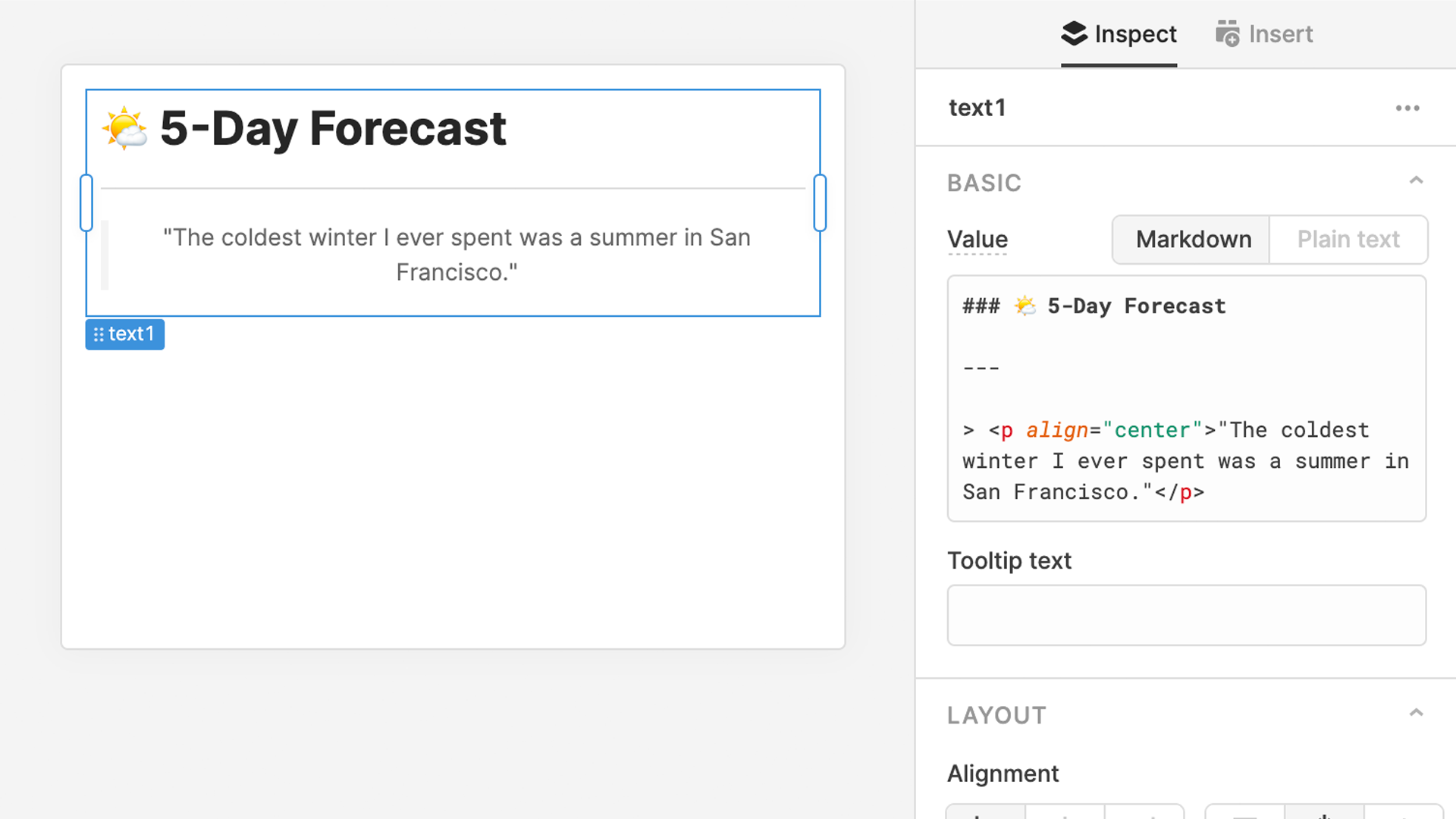
As a quick example, we’ll build a Text component that displays a 5-day forecast for San Francisco. Start by dragging out a new Container onto the canvas, add a Text component, and then type in a simple header:
Next, let’s spice up the presentation a bit by adding a quote. You’ll notice that we can include simple HTML tags mixed in to the Markdown here for presentational purposes, like center aligning:
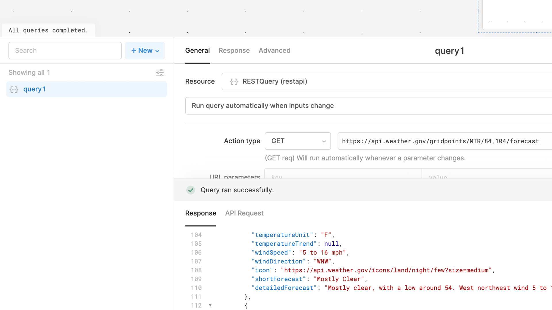
This is a good start, but it’s time to get some live data in here. In the Query Editor, create a new RESTQuery with an action type of GET and copy in the following endpoint: https://api.weather.gov/gridpoints/MTR/84,104/forecast. This will pull in the National Weather Service’s near-term forecast for San Francisco:
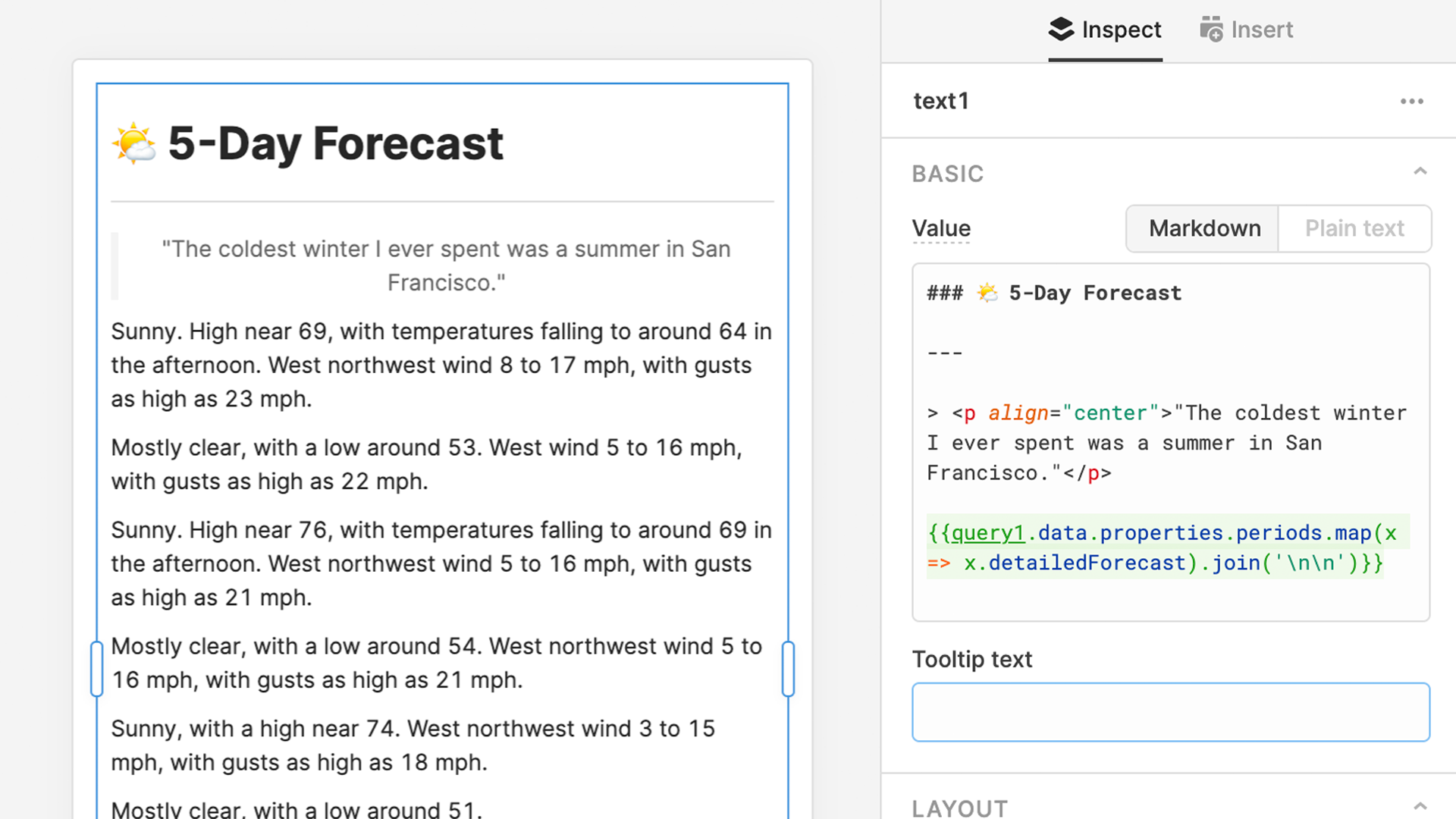
Now we can reference this query right inside the Text component’s value property to get the raw text. Set the parent Container component to "Hug contents" so it'll grow with the new content, then we'll use the map method to list out the detailed forcast for each day: {{query1.data.properties.periods.map(x => x.detailForecast}}.
This obviously isn’t very readable in its current state, so let’s clean it up a bit. First, we can use join() to convert the array to a string separated by line breaks: {{query1.data.properties.periods.map(x => x.detailedForecast).join('\n\n')}}
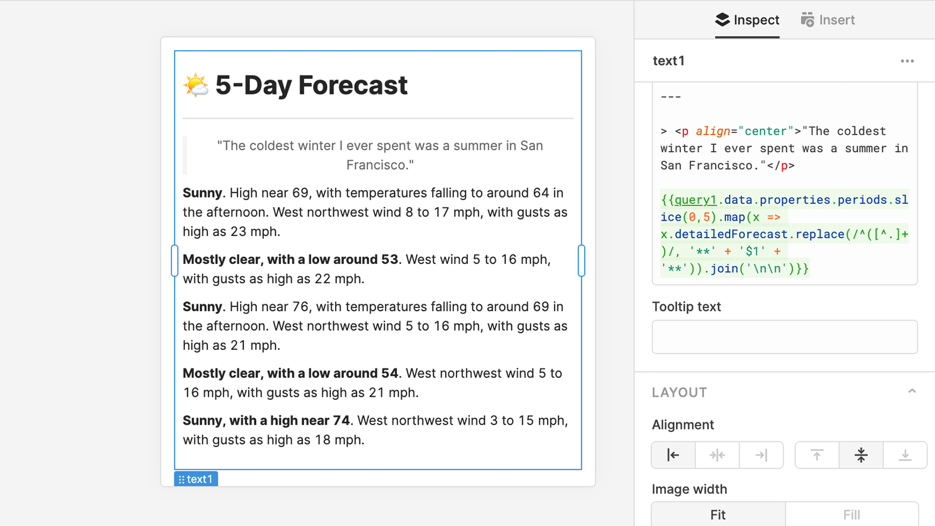
That’s looking better, but this is currently a 14-day forecast, which is a lot more data than we need. Let’s use the slice() method to trim things down to the next 5 days. While we're at it, we can touch up the appearance a bit by bolding everything before the first period on each day using replace(), a regular expression, and Markdown bold syntax.
Taken together, the query reference should now read like this: {{query1.data.properties.periods.slice(0,5).map(x => x.detailedForecast.replace(/^([^.]+)/, '**' + '$1' + '**')).join('\n\n')}}
Last, but not least, let’s throw in an icon from the API on the top of the list that shows the current conditions. For this, we can use the Markdown image syntax and a reference to the icon URL from our query:  To make it fill the whole width of the component, we'll set the Image Width property to "Fill".
With just a few lines of Markdown and JS, we’ve built a lovely little 5-day weather forecast inside of our Retool app. Now that you're ready to put the new Text component to work in your Retool apps, be sure to let us know how it's going over on the Retool community.