Recently, I set out on a mission to reconstruct a color system in Postmark. This project addressed several problems with our design system, involved a lot of research, and even required building a few custom tools. Now that this project is finished, I want to share the most important lessons I learned about color and present a new design and accessibility tool Accessible Palette born out of this work.
The main problems with our old palette were inconsistent perceived lightness of colors (blues and reds are much darker than yellows and greens) and unpredictable contrast ratios between color variants. When picking a color pair, we couldn’t easily tell if it would meet the recommendations from Web Content Accessibility Guidelines (WCAG) and had to manually check the contrast ratio. (Or, most likely… not check.)
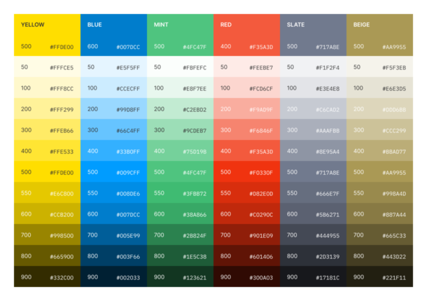
Postmark Color System v1 with inconsistent lightness
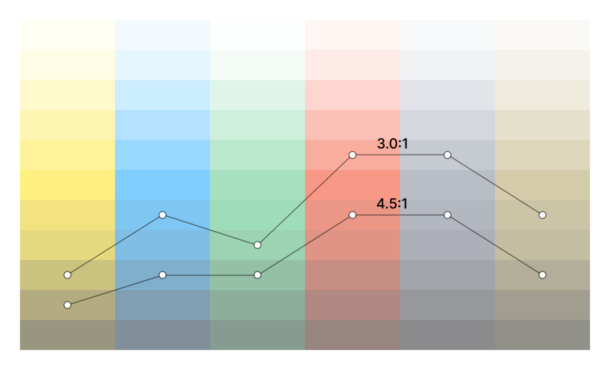
Contrast ratios against white background
In fact, both of these problems were caused by the inherent fault in the HSL color model and lack of support for better alternatives in the design tools. While HSL and HSV are fine choices for choosing a single color, they’re not suitable for building a color system, as they simply transform the RGB model and ignore the complexities of human perception. To see what’s wrong with them and find an alternative, we need to look at color theory and consider other color spaces.
Stop using HSL for color systems!
The RGB color model reflects how screens work and is not trying to be user-friendly or intuitive. Instead, in the 1970s, researchers came up with HSL (Hue, Saturation, Lightness) and HSV/HSB (Hue, Saturation, Value or Brightness) models as alternative representations of RGB, based on how humans think of colors. The intention was good, but they had to trade off perceptual relevance for computation speed, as more sophisticated models would have been too computationally expensive for that time. The resulting HSL and HSV models are easy mathematical transformations of RGB that don’t reflect a human perception of lightness or saturation.
Consider colors in this scale with the same Saturation (100) and Lightness (50) in HSL:

While this scale may have consistent lightness according to the color model, it definitely feels wrong for a human — visually, blue (#00F) is much darker than yellow (#FF0) or cyan (#0FF). This happens because in HSL, fully saturated colors are mapped to the peak RGB values and placed around a Hue circle at a Lightness value of 50, with values of 0 and 100 corresponding to fully black and white, respectively. When a lighter or darker variant of the color is needed, it gets “mixed” with white or black. The central vertical axis comprises the range of neutral or gray colors with a Saturation of zero. (The difference between HSL and HSV is insignificant for this discussion, but instead of “mixing” colors, HSV represents how colors appear under bright light, so the most saturated colors have a Value of 100.)
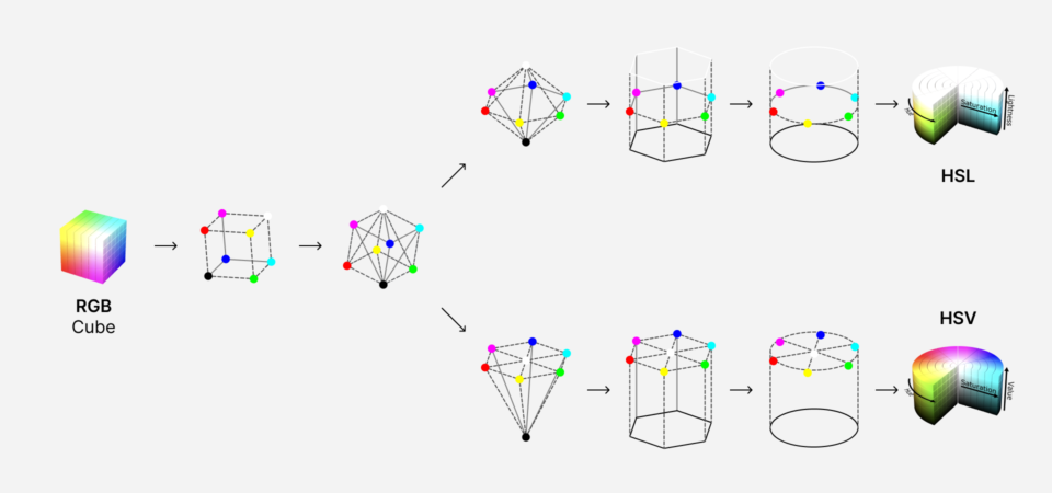
Based on illustrations by Jacob Rus and Michael Horvath (SharkD), CC BY-SA 3.0, Wikimedia Commons.
Luckily, we’re not limited by computational speed anymore and can use better tools for this job.
Meet CIELAB and LCh
By the time HSL and HSV models were formalized, a better alternative already existed. The International Commission on Illumination (abbreviated CIE) defined the CIELAB or L*a*b* color space back in 1976. It was designed as a perceptually uniform color space, where a given numerical change corresponds to a similar perceived change in color. Unlike the RGB color model, CIELAB is designed to cover the entire range of visible colors, and its Lightness (L*) component closely matches human perception.
Here is how this color space is defined, according to Wikipedia:
The lightness value L* defines black at 0 and white at 100. The a* axis is relative to the green-red opponent colors, with negative values toward green and positive values toward red. The b* axis represents the blue-yellow opponents, with negative numbers toward blue and positive toward yellow.
Earlier, I said that RGB isn’t user-friendly or intuitive. Well, CIELAB really put things into perspective.
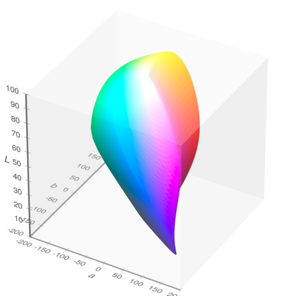
Visible gamut within CIELAB color space (see also as a video). a and b are the horizontal axes; L is the vertical axis. Michael Horvath (SharkD), Christoph Lipka, CC BY-SA 4.0, via Wikimedia Commons.
Just as HSL and HSV are easier-to-use cylindrical representations of the RGB, CIELCh or LCh or Lch(ab) color space is a cylindrical representation of CIELAB. Chromaticity components a* and b* are replaced with Chroma (relative saturation) and Hue angle, while Lightness remains unchanged. The Hue angle is similar to the one in HSL, but they’re not identical — HSL/HSV uses the three additive primary colors red, green, and blue (H = 0, 120, 240°). Instead, the LCh system uses the four colors red, yellow, green, and blue (h = 0, 90, 180, 270°). (It’s worth mentioning there is a similar HCL or LCh(uv) color space with a Chroma on a uniform scale from 0 to 100, unlike an LCh(ab) where it varies based on Hue and Lightness.)
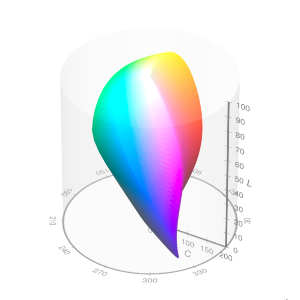
Visible gamut within CIELCh color space (see also as a video). L is the vertical axis; C is the cylinder radius; h is the angle around the circumference. Michael Horvath (SharkD), Christoph Lipka, CC BY-SA 4.0, via Wikimedia Commons.
You may notice that, unlike HSL and HSV, LCh fits inside a cylinder but doesn’t fill it. This is expected, as some combinations of Lightness, Chroma, and Hue produce impossible colors — for example, a dark saturated yellow just doesn’t exist. The closer the visible gamut gets to black and white on a Lightness scale, the fewer colors can be distinguished by a human eye. In reality, not even all of these visible colors can be displayed on a screen — the sRGB gamut represents a typical screen and includes only about ⅓ of the LCh color space. That’s what we’re limited to in CSS as well, at least for now.
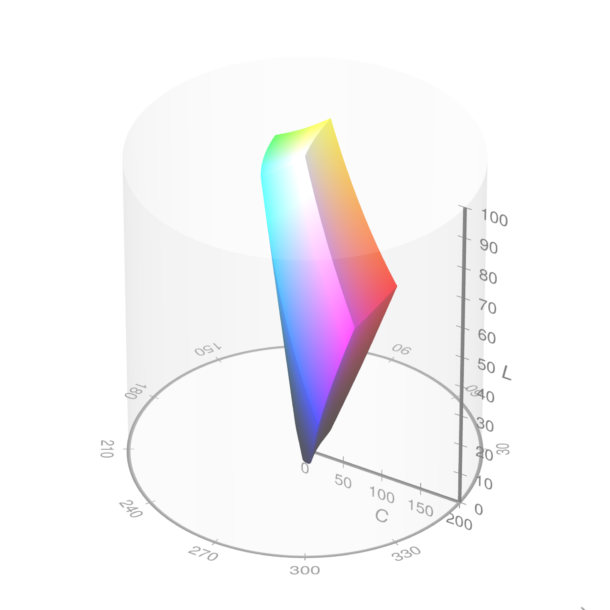
The sRGB gamut plotted within the cylindrical LCh color space (see also as a video). Michael Horvath (SharkD), Christoph Lipka, CC BY-SA 4.0, via Wikimedia Commons.
Let’s go back to our HSL color scale with Saturation of 100 and Lightness of 50 and see what its Lightness is in LCh:

Now, these numbers make more sense — yellow is the lightest color, blue is the darkest, greens are almost three times lighter than blue or twice than reds. Let’s rebuild this scale in LCh with a consistent level of Lightness:
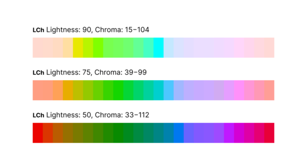
Because of the varied Chroma component, some of these colors are more saturated than others, but their lightness is visually consistent. This doesn’t look good as a gradient but may be desirable in a color system — I want my colors for notifications and warnings more saturated than shades of the base text. Just for curiosity sake, let’s see how these scales look with more consistency in Chroma:
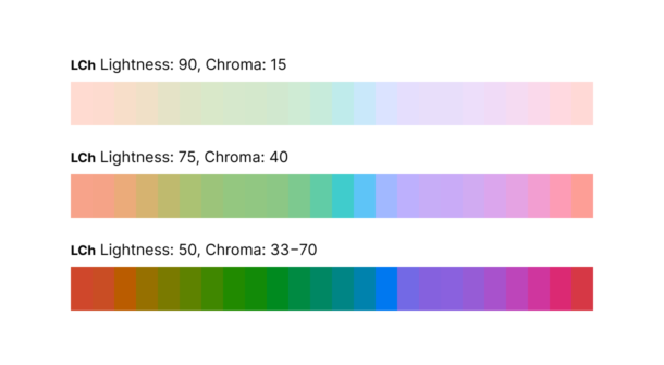
Smooth as butter, even while we’re dealing with a limited sRGB color space. This is a great foundation for building a color system.
At this point, you may wonder why the design community does not widely use this powerful color space. As of today, neither Figma, Sketch, or Adobe XD support CIELAB or LCh. There is an LCH color picker and Chromatic plugins for Figma, but I didn’t find them sufficient to construct a flexible color system. The ideal tool for the job would generate color variants with persistent lightness, let me control the contrast ratio between them, and be flexible enough to accommodate existing brand colors. That’s when I discovered a Chroma.js library with great LCh support and decided to write a simple tool to generate a new palette from code. After using this tool internally and sharing it with a few friends, we decided to turn it into an app and share it publicly as a project from our Labs.
Introducing Accessible Palette
Accessible Palette is an app for building color systems with consistent lightness and predictable contrast ratios across color levels. It’s flexible enough to accommodate existing brand colors and lighter or darker palettes. Let’s see how it works:
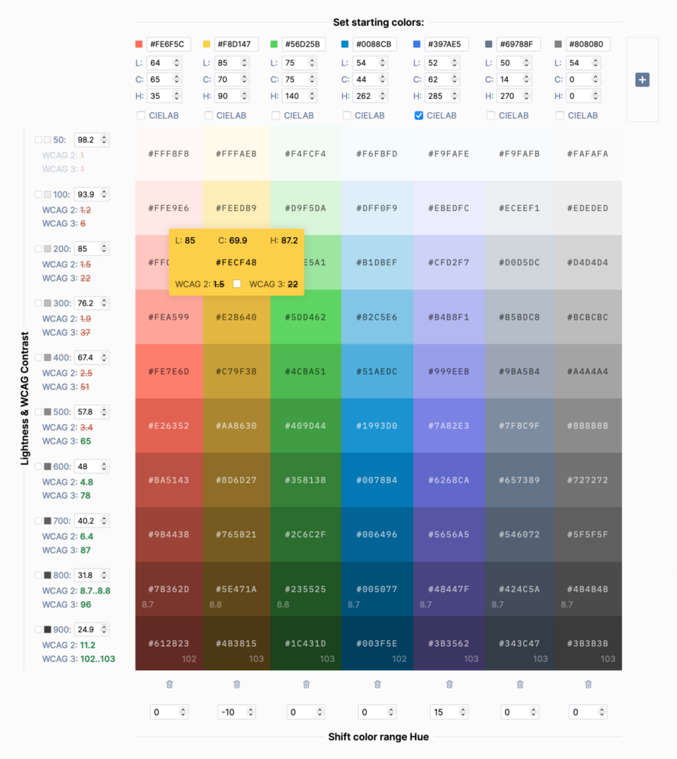
The interface of the Accessible Palette app
- You begin by tweaking one of the starting colors or pasting the existing color from your design. The tool will use color’s Chroma and Hue to calculate a scale with multiple lightness levels.
- Lightness is completely customizable and can work both with light and dark palettes. It also provides granular control over a palette to include existing brand colors. In our case, I wanted to preserve the three most used colors from the original Postmark palette — yellow
#FFDE00, blue#007DCC, and green#4FC47F. After taking them as starting colors, I used their Lightness values (88.6, 75.2, and 50.6, respectively) as lightness for levels 200, 400, and 600. - Contrast ratio depends on Lightness and is calculated for every level using both current WCAG 2.1 Recommendations and a new algorithm in an upcoming 3.0 Working Draft. (The current way of measuring contrast is flawed, but we’ll talk about this later.) By default, the contrast of every color is measured against a white background, but you can select any color swatch to measure the contrast ratio against it.
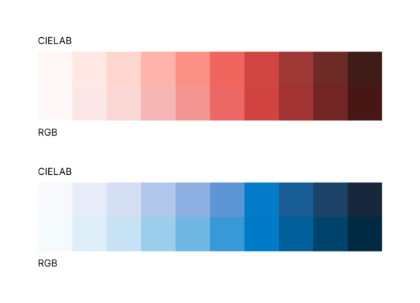
- Levels can be generated using RGB or CIELAB color space. In some cases, the results can be different, so it’s worth experimenting. In the Postmark color scheme, using CIELAB reduced purplish tint in lighter reds (good) but increased in blues (bad).
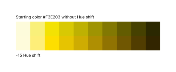
- For some colors, you may want to shift Hue across the range. Our bright yellow is a good example — as it gets darker, colors get a greenish shade. To shift them a little closer to orange, I use a negative Hue compensation.
- As you use the app, it updates the URL to save changes. Share it with your team, or add it to your Figma library and a CSS file with color variables for future reference.
The app can be used to generate all kinds of color palettes. Use them as a final color system or as a foundation to build upon. To see some real-world examples, check out a new Postmark color palette or palettes based on Google’s Material Design or TailwindCSS. They’re not exact replicas, but alternative takes inspired by the original colors and levels of lightness.
Bonus: How are contrast ratios calculated?
So why does Accessible Palette show two different contrast ratios? WCAG 2.1 calculates the contrast ratio by dividing the luminance of the foreground color by the luminance of the background. The problem is this formula provides a linear response, while humans perceive the contrast between lighter colors as higher than between darker colors. Consider these examples:
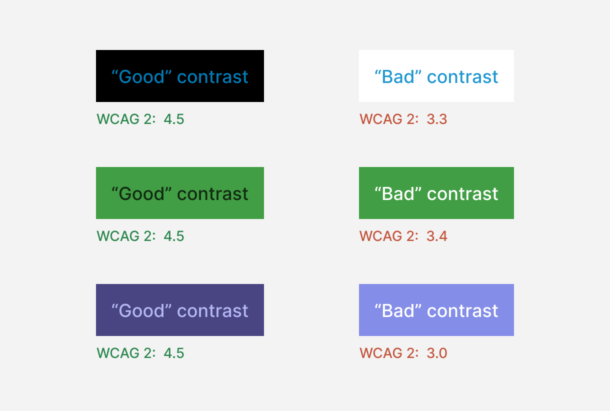
In practice, samples meeting the WCAG 2.1 recommendations are harder to read than those with an “insufficient” contrast ratio. Luckily, W3C is aware of this problem, as Andrew Somers started an open discussion back in 2019. (It’s a fascinating and deep reading if you have a spare evening or two.) He proposed a better working algorithm that is now a part of the WCAG 3 Working Draft and built an APCA Contrast Calculator that is perceptually accurate and also takes font size and weight into account. Accessible Palette uses his Advanced Perceptual Contrast Algorithm (APCA) and considers score 60 as the minimum level recommended for readable text, similar to the old 4.5:1 contrast ratio recommendation in WCAG 2.1.
Let’s see how our examples will hold up with the new algorithm:
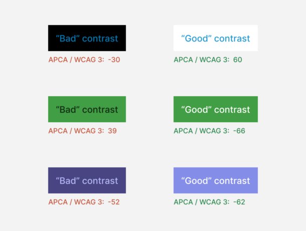
Does it mean that WCAG 2.1 contrast ratio is useless? No, it’s still fairly accurate for mid-range colors, but overall the new algorithm is a massive improvement. Keep in mind that it’s still a Working Draft and may change over time. For maximum future-proofness and compliance with current guidelines, try building your color system with both guidelines in mind.
As I started working on Postmark’s new color system, I didn’t expect to give up on the most commonly used color model or question WCAG’s current guidelines. This project led me down the rabbit hole of color theory and resulted in a tool that can help build consistent and accessible color palettes with very little effort. This is a rare situation when both designers and users win in the end. If you end up using Accessible Palette for your project or have questions about it, please send me an email or reach out on Twitter!

