[Article] 0. Firefox UI UX history
The history of Firefox UI is important because my project compensates for the shortcomings of this Proton UI and inherits the strengths of the existing Firefox UIs.
It's also one of the ways to prevent divisions in the community, given that there have been forks every time the UI changes big.
Big orange buttons stand out.
For a history from Netscape, see: A Visual Browser History, from Netscape 4 to Mozilla Firefox

v1~v3 are classic UI that we remember when we were in the early 2000s.
There are colors in the icon, and abstraction is not achieved.
It was similar to Internet Explorer 6.

- Clear as the icons do only one thing
- Unique color for each icon
- Not fused with OS UI
- UI height
- Contrary to the modern interface philosophy as there is no abstraction
- Inconsistent icon size and texture
Interface issues in 3.0 are well documented in 3.0 Windows Default Theme Issues.


As you can see,
- Menu bar takes up space
- Not compatible with Aero Glass
- Complex toolbar structure
Problems like this were scattered.


A fork that still retains the UI from this time is SeaMonkey, which forked to keep Mozilla suite features like mail, newsgroups and feeds, and IRC chat.

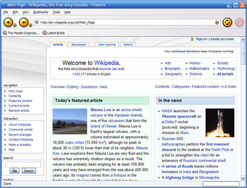
Thus, v4.0 was released after a large-scale UI reconstruction project was launched!!
It is the longest-lived UI and loved by many people.
Commonly called a Classic theme.

- Orange app button at the top left like the symbol
- Calmer tone
- Win7 Aero Glass support
- Stop / Reload / Go with one button
- Tab moved to the top
- Unfamiliar interface with large-scale changes
The most encouraging thing in the Classic UI is the design of the app button.
The existing menu bar serves to include all menus that are difficult to include in the basic UI, occupies a considerable amount of space and is difficult to explore with submenus.
Unlike Safari and Chrome, where all menu items were divided into individual pages or tool buttons, they were pushed into the app button, preserving the configuration of the existing menu bar as much as possible, while supplementing the shortcomings.
- Less complex
- Takes up less space
- Matches the UI of Windows
- Organize and clean up menu groups

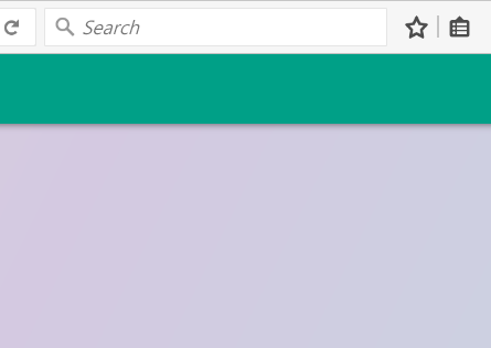
Also, like general Firefox (orange), privacy mode (purple), and nightly (blue), the color changed depending on the program status or distribution channel, and it served as an identity, so we can judge that it was good for branding.


It's very symbolic, but it's well designed, so if userChromeJS is introduced in the future, I definitely want to create an option to restore the app menu button (no menu bar - menu bar - menu button).
However, I plan to take some of the advantages of a modern UI and design it in a way that makes the most of the space with the mega dropdown, and maximizes the responsiveness / space utilization of the menu through a slope-based approach like Amazon.

The second most important change is the introduction of UI abstractions and systematic interactions.
The Stop / Go / Reload buttons on the URL bar are combined into one, so that Go when entering an address, Stop during loading, and Reload button after loading are displayed for simplicity.
And the interaction has been changed to be systematic when hovering or clicking.

In addition, you can see that mozilla have worked hard to provide a UI optimized for Windows, Linux, and Mac.

A fork that retains the Classic UI well is Pale Moon.
Australis, which had a lot of likes and dislikes compared to Proton UI.
It was a change that put a lot of effort into simplicity.

- Curved Tab
- Drag & Drop customizing UI
- Change settings UI pop-up to contents(tab) format
- Animation
- Panel UI that looks like a tablet
- Remove status bar
The Firefox team wanted it to feel fast and soft.

Currently (2021), the UI with rounding is a trend (Apple Bigsur, Microsoft Fluent, Google Material You), so the decision to make it feel soft seems good.

The overall menu layout was done using heatmaps. It may be difficult to maintain the design balance due to the slightly different sizes, but it has been carefully designed to minimize side effects.


Also called light theme, an API is provided to set the color and background of the main menu, making customization easier.

The customizable UI that allows you to freely arrange functions on panels and toolbars by drag and drop is a huge advantage compared to other browsers that are still difficult to customize.

You can also see the panel UI (pop-up of the hamburger menu), which has been greatly divided between likes and dislikes.
I've heard a lot of people say it's like a tablet, but in fact, the Firefox team's intention was also an ambitious decision to move away from existing PCs (Windows, Linux, Mac) and have continuity with mobile (Android phones and tablets, Windows 8 Metro UI, Firefox OS).
In the end, the goal was a failure in that there were many different likes and dislikes.
Another notable change is the Settings UI.
In the existing Firefox, the following nightmare unfolded when the setting screen was configured in a pop-up method and new functions were added.

However, with the creation of a content-based UI that manages tabs,

improvements have been made in various aspects.
- Consistency between devices/OS: can be displayed with a similar interface whether it is PC or mobile
- Manage as tabs: Shows as tabs, eliminating the need to find and manage separate windows and increase consistency with the web
- Functional: Larger than a pop-up window, so more content can be displayed and less functional limitations.
Parts where you can feel other details

- Go forward only when it is possible to go forward.
- Download button is available only when there is a download
- Combine Bookmarks and Bookmarks menu
There is a fork browser called Basilisk.

Photon was a generally well-received update to the UI that was used until June of this year(2021), when Proton appeared.

- Components: List based panel and page actions, library menu
- Animation: Add animation to actions of buttons, tabs, panels, etc.
- Visual redesign: tabs, icons, density, etc.
- Performance: improved initialization, synchronization reflow, etc.
- It looks a bit complicated
- Only light weight themes are allowed.
For a visual redesign, the tab shape has been changed to a right angle, and the icon has been changed from PNG to SVG based.

Grid type panels, which many people hated, have been changed to list format.
There may be disagreements, but I think the list form is appropriate.
Grid vs List
When to use a grid view:
- If the image of the result item is most important to the user.
- If a user needs to be able to compare items visually (e.g. to compare shoes).
When to use a list:
- If your results need descriptions or supporting text.
- If your images are all similar and need a description to differentiate.
- List View Prevents Overscrolling: Many designers use grid view because it’s more appealing to the eye. But the problem is that grid view forces users to scroll more. Grid view includes images which make the page much longer.
- List View Prevents Hasty Selections: Not only does grid view force users to scroll more, but it causes them to make hasty selections. Users get so stimulated by images that they’ll select the first option that appeals to them.

The page action menu was an element that could keep the address bar neat and customizable.

As for the combined bookmark menu, a library menu that bundles several things at once has appeared.

When the Photon design is adopted, the point of differentiation from other browsers is the animation.
The cubic curve values show that it is designed to stand out and be responsive, and it takes full advantage of the compositor with the SVG filmstrip technique.

Tab loading indicator that differentiates it from other browsers

Photon
|
|

Chrome
|

Edge
|

Baslisk
|

Whale
|
Personally, I love fullscreen animations in Firefox.
Clear and soft

Photon
|
|

Chrome
|

Edge
|

Palemoon
|

Basilisk
|
The title bar is designed to take advantage of OS-specific features such as highlight color in Windows and transparent background in Mac.


In addition, it supports various screen sizes and input devices thanks to the density setting and the drag space setting.


Photon also actively tried performance improvements as part of Firefox Quantum.
At that time, XUL had a lot of problems(1, 2, 3), so XPCOM/XUL-based extensions were removed, and Chromium's Web extension was moved to, and the UI began to be replaced with Web component-based.
Waterfox G3 is a photon based fork with Australis tab shape.

This is the moment I started working on themes.

- Neatly organized menu
- Icon that are pretty enough to remind of the edge
- Some of animations that I like & skeleton screens
- Stylish color scheme
- Moderate rounding
- Meticulous implementation
- Excessively wide padding
- Remove icons from menu
- Feels like a button rather than a tab with a connected look
- Confusion of tab indicators
- Remove page action menu in address bar
- Delete bookmarks / library animations and illustrations
- The icon size of the new tab contents
- Changed the search bar of the new tab to be performed on the URL bar.
The disadvantages of proton design will be dealt with separately, so we will focus on the positive aspects.
What I like the most about Proton is that the menus and modal boxes are also styled and the messages are clearer.


Comparing colors and icons, more consistent color tones, thinner icons, and rounding stand out.


I also like the overall animation change, which is pretty neat.

Another important change is the introduction of a skeleton screen to make the start feel fast. (Only windows)


Other small but useful changes are when there is no favicon information, it is properly processed and displayed in a new tab.


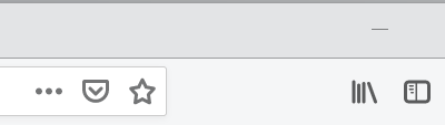
One of Proton's most puzzling decisions was the removal of the Page Actions menu button.
From heatmaps via telemetry

The significance of the page action menu was to serve as a kind of overflow menu to cleanly drive infrequently used functions.
The low frequency of the heatmap was justified for its purpose and is not a reason to remove it.
Existing Australis also organized the menu based on the heat map, but it was limited to combining functions or changing the layout, and did not remove functions that were playing a sufficient role.

Here, we only dealt with the UI of Firefox, but we are trying to achieve a competitive advantage by analyzing the strengths and weaknesses of at least 10 different browsers excluding Firefox and including them in the roadmap.
Discuss on Hacker News.