
I know what you might be thinking, “Math?! Yuck. Get it out of my sight.”. But, ask yourself – do you have the willpower to resist the satisfaction of perfectly aligned nested containers?
You know, after I wrote my piece on various CSS tricks (it got picked up by a few publications) I saw traffic coming to the site for keywords like “how to center a div element”, which is funny because I never mentioned that in the article specifically. But it goes to show that developers need access to quick snippets that can be reimplemented with ease.
As such, that is going to be the premise for this tutorial.
Update: I've gotten around to writing a detailed tutorial for centering elements in CSS.
I’ll be focusing on the topic of CSS math functions in the context of achieving various layout outcomes. E.g. How to create a responsive container with a few lines of CSS, how to add adaptive padding, and how to get that sidebar to actually behave like a sidebar.
Let’s have a look.
calc()
The calc() function supports four arithmetic operations: addition (+), subtraction (-), multiplication (*) and division (/). The function is primarily used to calculate the dynamic width and height of the container to create adaptive layout experiences.
Code example
.calc {
background: #c8e6f5;
padding: 10px 20px;
width: calc(100% - 200px);
}
.no-calc {
background: #c8e6f5;
padding: 10px 20px;
margin-top: 10px;
}
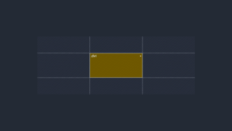
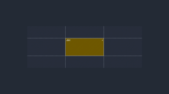
<div class="calc">100% – 200px</div>
<div class="no-calc">Default container width</div>And this would be the outcome:
But, where calc() stands out the most is when it is used for arranging elements with a specific value in mind. Typically, a responsive design would be achieved by looking for specific breakpoints and then writing their logic individually. With calc() – we can achieve a responsive layout with only one specification, which makes it a lot more maintainable.
Let’s look at a concrete example using display: flex;. Our goal is to create 3 side by side elements that are tied to the width (100%) of the container. We also want to add a 30px gap between each element, and of course, we need it to be responsive!
Code example
<style>
.calc-container-flex {
  display: flex;
  justify-content: center;
}
.calc-container-style .item {
  background: #fff2ea;
  padding: 20px 0;
  width: calc((100% - 90px)/3);
  text-align: center;

}
.calc-container-style .item + .item {
  margin-left: 30px;
}
</style>

<div class="calc-container-flex calc-container-style">
<div class="item">1</div>
<div class="item">2</div>
<div class="item">3</div>
</div>
And here you can resize the outcome to see how it works:
Because we want to have the 30px gap between each element, we subtract 90px from the initial container width (100%) and divide it by 3 to specify how many elements we have.
As you resize the outcome above, you’ll notice that all elements respect their respective gap while remaining responsive to the container width. Pretty neat.
min()
The min() function is used to set the smallest acceptable value. It takes 2 different specifications separated by a comma and supports arithmetic expression.
Let’s say you specify font-size: min(25px,1vw); – in this example, the font-size will never be larger than 25px and will shrink to 1vw depending on the viewport size.
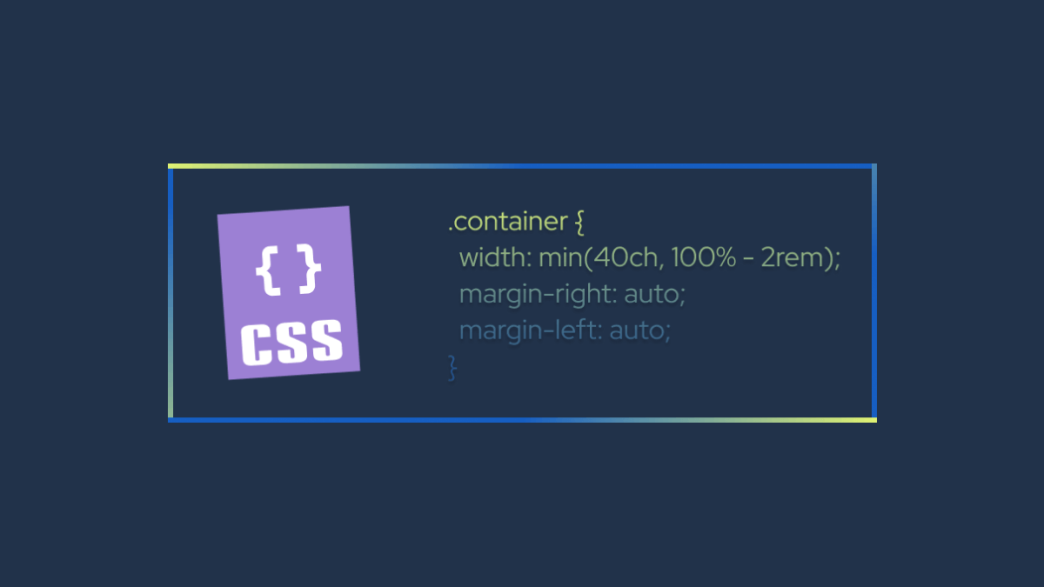
We can also use min() to manipulate the width of container elements.
Code example
.min-sample-box-container {
    width: 100%;
    max-width: 1000px;
}
.min-sample-box {
  background: #fff2ea;
  padding: 15px 30px;
  width: min(70%, 800px);
}

<div class="min-sample-box-container">
<div class="min-sample-box">min() example - 800px limit</div>
</div>
Try to resize this:
In this context, the div element inside our container cannot exceed 800px in width despite the container having a max-width of 1000px.
max()
The max() function lets us do the exact opposite. Out of the two values, we specify inside max() – the largest one will be prioritized.
Code example
.max-sample-box-container {
    width: 100%;
    max-width: 1000px;
}
.max-sample-box {
  background: #fff2ea;
  padding: 15px 30px;
  width: max(70%, 200px);
}

<div class="max-sample-box-container">
<div class="max-sample-box">max() example - 200px limit</div>
</div>
Try to make resize this into a smaller container to see what happens:
As you can see – the container respects the width: 100%; but does not go below the specified 200px mark as it is the largest value for the container.
The max() feature is particularly useful when applying responsive margins. Typically, what happens is when you use a lot of smaller elements on a layout is that they clog up the screen once resized. With max() we can prioritize a specific margin to respect the container width.
Code example
.max-margin-container {
  display: flex;
  flex-wrap: wrap;
  width: 100%;
}
.max-margin-container li {
  background: #fff2ea;
  color: #fff;
  padding: 3px 25px;
  min-width: 60px;
  text-align: center;
  margin: 0 max(4px,1vw) max(4px,1vw) 0;
}

<ul class="max-margin-container"><li>calc()</li><li>min()</li><li>max()</li><li>clamp()</li>
<li>sin()</li><li>cos()</li><li>tan()</li><li>acos()</li><li>asin()</li><li>atan()</li>
<li>atan2()</li><li>hypot()</li><li>sqrt()</li><li>pow()</li></ul>
Try to resize the list to see it in action:
- calc()
- min()
- max()
- clamp()
- sin()
- cos()
- tan()
- acos()
- asin()
- atan()
- atan2()
- hypot()
- sqrt()
- pow()
Changing your browser viewport is a better example of this demo in action. And, yes, those are in fact all the available math functions in CSS!
As you can see, despite the width of the viewport changing, the buttons keep their 4px margin at all times.
clamp()
The clamp() function is used to define the acceptable range of various values for a layout element: minimum, preferred, and maximum. Most commonly, clamp() is used to set a range of acceptable values for typography, to create the effect of fluid typography.
It is, in essence, the culmination of both min() and max() features.
An example:
font-size: clamp(1rem, 4vw + 1rem, 4rem);
And here is what it looks like:
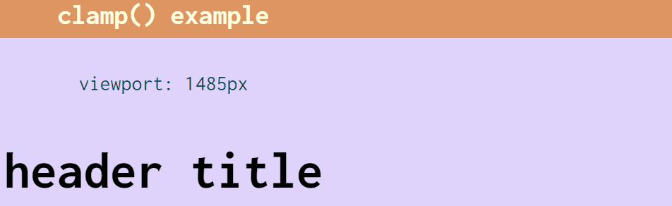
In this context, we style our h2 heading with a minimum value of 1rem, a maximum of 4rem and we set our preferred size to 4vw (viewport units) + 1rem. As you can see from the demo above, as our viewport changes so does the size of the font-size of the heading.
This also concludes our introduction to the most widely supported math functions in CSS.
The next section is dedicated entirely to examples and various use cases in which these functions can be applied. Overall, our focus is on creating responsive design elements that would otherwise need to be written through media queries.
Creating a Responsive Sidebar with Grid
Can you implement a fully functional responsive sidebar with only 2 lines of CSS?
Absolutely.
For this demo, we’re going to create a responsive sidebar using display: grid; and customizing the responsiveness with grid-template-columns. Specifically, we will use the functions of fit-content and minmax() to set our constraints.
Code example
.grid-sidebar-demo {
  display: grid;
  grid-template-columns: fit-content(25ch) minmax(min(55vw, 35ch), 1fr)
}
Here is the result:
Let’s understand what’s going on here.
First, we apply fit-content to declare the preferred size of our sidebar. The value we specify here will either push the sidebar to grow (based on viewport size) or shrink on smaller screens. All the while considering the amount of content you have in the sidebar.
After, we apply minmax() because we don’t want the sidebar to overlap with the on-page content area. In our case, wet set a value of 55vw which will be used for mobile display, and 35ch which will be used for bigger viewports. And lastly, we apply the Grid-specific fraction unit to fill up the space when the viewport allows it.
Applying a Responsive Gap for Flexbox Layouts
This is a similar example to the responsive padding we looked at earlier. But for this demo, we’re using flexbox and the gap property together with clamp().
Code example
.gap-boxes-container {
  display: flex;
  flex-wrap: wrap;
  gap: clamp(5px, 1vw, 25px);
  place-content: center;
}

.gap-box {
  display: inline-flex;
  width: 100px;
  height: 100px;
  background-color: #fff2ea;
  align-items: center;
  justify-content: center;
}

<div class="gap-boxes-container">
  <div class="gap-box">1</div>
  <div class="gap-box">2</div>
  <div class="gap-box">3</div>
  <div class="gap-box">4</div>
</div>
Try it out:
Once again, this demo works best when you resize the actual browser viewport.
By specifying gap: clamp(5px, 1vw, 25px); we are telling the browser to adapt the gap between each column based on the viewport size. So, if the window exceeds 1vw – the gap increases to 25px whereas a small viewport will decrease it to 5px (on mobile, for example).
Btw, you might have noticed I used an interesting property to center the container boxes, it is place-content: center;. This is a shorthand property that supports content positioning in various directions. You can read more about it on MDN.
Can I Use: The support is there
Conclusion
Are you excited to try some of these concepts in your next project?
I have to say, CSS has come a long way since the early 2010s. In fact, if we can do most of our responsive styling without media queries, it will attract even more developers who want to write code and not worry about compatibility between various devices.
Thanks for reading, and have fun!