The Power of CSS Blend Modes

I knew CSS blend modes could create some cool effects, but even so, a CodePen I saw recently left me shocked at what they’re capable of.
Apple-Inspired Pride Clock
See the Pen Apple inspired Pride clock by Scott Kellum (@scottkellum) on CodePen.
This CodePen, by Scott Kellum, really caught my eye. I could see it was HTML text for the numbers, but I wasn’t sure how he created the radial line effect. When I dug into the code, I was shocked by how little CSS it took to create the effect. Here’s a layered breakdown to make it easier to visualize:
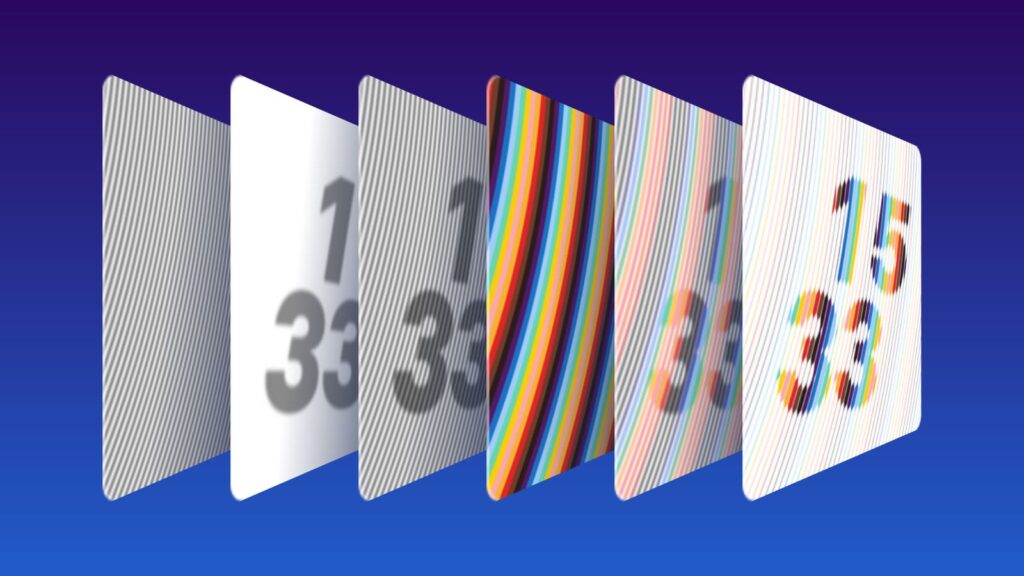
The bottom-most layer is a simple repeating radial gradient, alternating between gray and white:
background: repeating-radial-gradient(
  circle at -150% -25%,
  #fff,
  #777 0.025em,
  #fff 0.05em
);Code language: CSS (css)
If you’re not familiar with the syntax, this says “make a gradient going from white, to gray at the midpoint, and back to white, then repeat that gradient radiating from the origin point, which is offscreen.” That’s what gives us the first layer in the illustration above.
The second layer is just some HTML text displaying the current time. The text is rotated (to roughly match the angle of the radial gradient), blurred, and a bit see-through:
filter: blur(0.0125em);
transform: rotate(6deg);
opacity: 0.46;Code language: CSS (css)
When you stack those two layers together, you get the third layer in the diagram.
Here’s where it gets interesting. The fourth layer uses the same repeating radial gradient, but rather than alternating between white and gray, it steps through the rainbow, with hard color stops so there’s no blending.
This rainbow layer gets a blend mode, which causes it to act as a filter on the layers behind it:
mix-blend-mode: lighten;Code language: CSS (css)That’s all it takes to produce the fifth layer in the diagram, which colorizes the background lines and the text.
And the final step is perhaps the simplest of all: The container for the entire thing gets an extreme contrast filter applied:
filter: contrast(2000%);Code language: CSS (css)This forces all the gray colors in the background and the text to pure black or white — and anywhere they overlap, gets that neat effect that makes the line look like it’s thickening or thinning to make the numbers, while the rainbow overlay makes each line into a single solid color.
Edit: Scott pinged me on Twitter and let me know I got the order slightly wrong here. The contrast filter is applied before the color layer, because the contrast impacts how the colors are rendered. Thanks, Scott!
It’s elegant! Just a few lines of CSS and a simple set of layers are converted into something much more complex! It immediately got me thinking: could I use this technique to make a photo filter?
Radial Engraving Filter
See the Pen CSS Radial Engraving Photo Filter by Scott Vandehey (@spaceninja) on CodePen.
My first experiment was basically replicating the radial lines effect from the previous example and applying it to a photo to make a sort of radial engraving effect, similar to what you might see on a bank note or a newspaper hedcut.
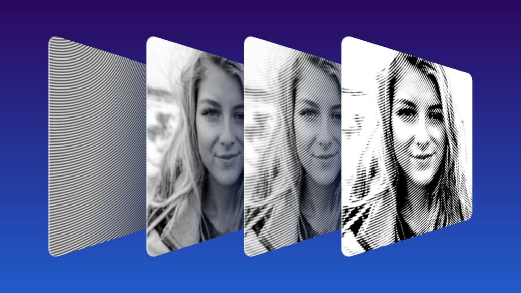
The first step is exactly the same. Create a repeating radial gradient that goes behind the image:
background: repeating-radial-gradient(
  circle at 0 -25%,
  #fff,
  #333 0.25em,
  #fff 0.5em
);Code language: CSS (css)
I set a different origin point and a darker shade of gray, but it’s otherwise the same.
Next, I positioned the image on top and added some filters. I converted the image to grayscale, tweaked the brightness and contrast a bit, and applied a bit of a blur (this effect works better with softer focus).
filter:
  grayscale(1)
  brightness(90%)
  contrast(150%)
  blur(3px);Code language: CSS (css)
Then I applied a blend mode of hard-light, which let the background gradient bleed through the entire photo.
mix-blend-mode: hard-light;Code language: CSS (css)What you see in the third layer is the result, which should look similar to the previous example before the rainbow overlay and contrast were added.
The final step is still an extreme contrast filter applied to the entire container:
filter: contrast(500%);Code language: CSS (css)And hey presto! Look at that! A convincing woodcut or engraving effect applied to a photo from just a few lines of CSS!
But it got me thinking. Being a comic book fan, I wondered… could this same technique produce a halftone filter?
Halftone Filter
See the Pen CSS Halftone Filter by Scott Vandehey (@spaceninja) on CodePen.
I’m pleased to say the answer is yes!
Update: This halftone filter is now available as a web component!
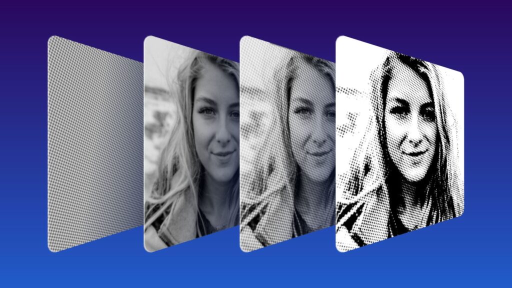
My second experiment made only one change to the formula. Rather than a radial gradient to make lines in the background, I used a single gradient “dot” as a repeating background.
background: radial-gradient(circle at center, #333, #fff);
background-size: 0.5em 0.5em;
transform: rotate(20deg);Code language: CSS (css)
By setting a background size, the single gray circle gradient I’ve defined is repeated across the entire canvas. The rotation is optional, but halftone dots can look unnatural if they’re straight. (When halftone is used for color images, each color is always offset a few degrees from the others to avoid a moiré pattern.)
When these uniform dots are overlaid with the photo and run through an extreme contrast filter, the same effect happens — all shades of gray are forced to either pure black or pure white. But rather than thickening and thinning of lines, it now results in the size of the dots growing and shrinking!
Conclusion
I couldn’t be more pleased with these experiments. I consider myself pretty well informed about what CSS is capable of, but I was shocked to discover how easily you can create something like an engraving or halftone photo filter using just a few lines of CSS!
Either of these could be fun effects for a design like an old newspaper page or a xeroxed punk show flyer.
Have you created any cool filters using CSS blend modes?
Sidenote: Even the illustrations for this blog post were created by Tyler using CSS!
Scott Vandehey is a front-end architect and CSS specialist with over 20 years of experience. He curates Friday Front-End, sharing front-end development tips and links every day. He is the author of “How to Find a Better Job in Tech.” Follow him on mastodon or bluesky.

