
Visually-hidden styles are used to hide content from most users, while keeping it accessible to assistive technology users.
It works because the content is technically visible and displayed — it appears in the accessibility tree and the render tree, both of which are used by assistive technologies — it’s just that the rendered size is zero.
Our industry has largely settled on a standard CSS pattern for this, refined over years of testing and iteration, by many people. This pattern:
.visually-hidden {
    clip: rect(0 0 0 0);
    clip-path: inset(50%);
    height: 1px;
    overflow: hidden;
    position: absolute;
    white-space: nowrap;
    width: 1px;
}
Most libraries and frameworks include a rule like this, or something very similar, either with the same name, or it’s often called .sr-only (screen reader only
, but that’s not a good name, because visually-hidden content is not just for screen readers).
This article is not about when or why you would use visually-hidden content. There’s a number of excellent articles that discuss these questions in detail, notably Scott O’Hara’s Inclusively Hidden. But most of them don’t go into much detail about the specific CSS involved — why do we use this particular pattern, with these specific properties? So today I’m going to dissect it, looking at each of the properties in turn, why it’s there, and why it isn’t something else.
Position
The most significant property is position.
.visually-hidden {
    position: absolute;
    ...
}
This removes the element from the document flow, so it doesn’t take up any space in the layout. Further top and left positions are explicitly not defined; they default to auto, which means that the element’s initial position in the layout doesn’t change.
And that is critically important.
The original technique for visually-hidden was to use “off-left positioning”, whereby an element was shifted out of the viewport using left:-100em or similar. However that approach has several problems:
- It causes horizontal scrollbars to appear on RTL (Right to Left) pages.
- Assistive software that programmatically scrolls content into view may not work correctly, if it’s trying to show content that’s outside the viewport. This can affect screen magnification software used by some people with low vision or reading difficulties.
- Screen readers cannot show visual indication of their read cursor position, because the read cursor is outside the viewport. In JAWS, this feature is known as Visual Tracking, and it draws a red border around whatever element is being read (whether or not it’s focusable; this is not the same as focus indication).
Keeping the element in the same position avoids all those issues.
Size and overflow
Since we can’t move the element, we visually hide its content by reducing the size and overflow:
.visually-hidden {
    width: 1px;
    height: 1px;
    overflow: hidden;
    ...
}
Those 1px values are significant. We can’t set zero dimensions on an element with overflow:hidden, because that may cause it to be removed from the accessibility tree (and therefore hidden from assistive technology users).
Update — February 2023: Prompted by a conversation on Mastodon, I re-tested this and found that it doesn’t happen anymore. All current browsers and screen readers continue to keep content in the accessibility tree even if it has zero dimensions.
However, I don’t know how far back this problem resolves, so I’m reluctant to recommend permanently changing the pattern. The safest bet is to continue to use 1px dimensions, even though it’s probably not necessary.
Further update — July 2023: Manuel Matuzović’s article Visually hidden links with 0 dimensions demonstrates that Safari doesn’t focus elements with zero dimensions. Skip links with zero width or height will not be keyboard accessible to Safari users.
Therefore, the 1px dimensions are still necessary, and will remain necessary for the foreseeable future.
Pixel clipping
The sizing and overflow still preserves a single rendered pixel, which could be visible. If the element has a green background, for example, you would still get one green pixel. We get rid of that using clip and/or clip-path:
.visually-hidden {
    clip: rect(0 0 0 0);
    clip-path: inset(50%);
    ...
}
All that does is visually clip the element to 0 × 0, without affecting its content in the accessibility tree.
Note that clip is actually redundant here, because the clip-path definition produces the same result. The clip is a legacy hangover, from when clip-path didn’t exist. But now that it does exist and is widely supported (and clip is deprecated anyway), there’s no need to include it unless you need to support Internet Explorer (IE).
If you don’t support IE, then clip-path is all you need:
.visually-hidden {
    clip-path: inset(50%);
    ...
}
Text wrapping
The last thing in the pattern is to prevent text wrapping, using white-space:
.visually-hidden {
    white-space: nowrap;
    ...
}
The purpose of this is not obvious. Text wrapping is a visual layout property, why would we need it for content that cannot be seen?
The first reason is that it might affect text processing in NVDA. Reducing the size of an element causes the text to wrap. Wrapping in such a small space means that every word is on its own line, and this may cause NVDA to re-interpret spaces as line-breaks, removing them, and thereby causing the entire text to become a single word.
J. Renée Beach’s article, Beware smushed off-screen accessible text, describes this issue in more detail, and they recommend using white-space to prevent the text from wrapping in the first place. However I haven’t been able to reproduce this problem in my own testing, so it’s possible that it only applies to older versions of NVDA (the article is from 2016).
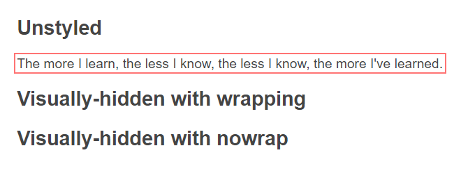
The second reason is that text wrapping affects the size of the Visual Tracking indicator in JAWS. To give an example, let’s take three sentences with exactly the same text, where the first is unstyled and the others are visually-hidden. In the first case, the tracking indicator surrounds the whole sentence:
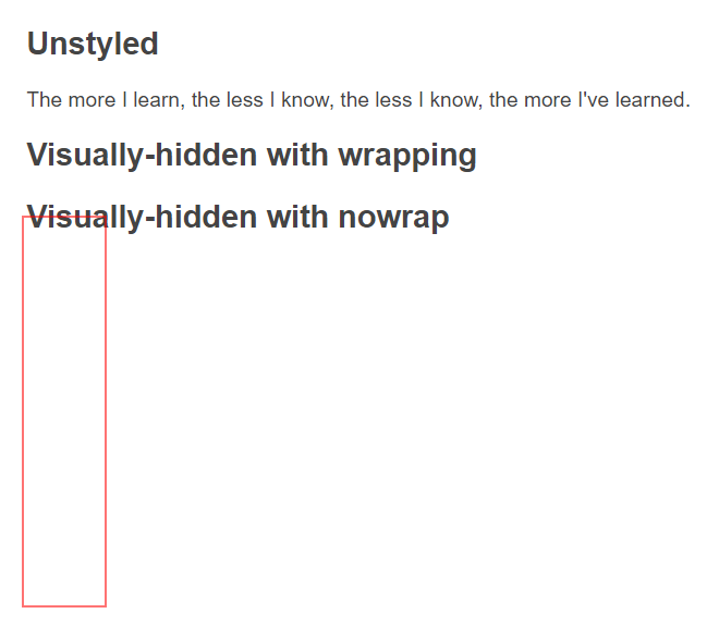
In the second case, if the text is allowed to wrap, then the tracking indicator matches the space that the text layout requires, as though its overflow were visible. This doesn’t seem to fit the text, it doesn’t look like a sentence, and its extended height would overlap other content:
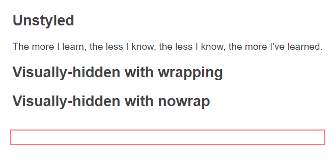
But if we add white-space:nowrap, then now the tracking indicator seems to fit the content:
Screen readers are sometimes used to help with visual reading or comprehension (i.e., by people who are not blind), so it’s very important that the visual tracking should be as consistent as possible with the spoken output.
This consideration affects other kinds of hidden content as well. For example, when custom checkboxes are implemented with zero opacity on the native control, they should be given the same size and position as the apparent control (see linked example). This provides pointer support without needing any scripting, but it also benefits JAWS users by ensuring that the tracking indicator matches the apparent control, while the read cursor is actually on the native control.
A short note on focus
Visually-hidden content must not have keyboard focus, otherwise sighted keyboard users could TAB to an element they can’t see. If focusable content is visually-hidden, then it must become visible when it receives focus (this is common behavior with skip links).
The simplest way to enforce that is to negate the :focus state in the selector:
.visually-hidden:not(:focus):not(:active) {
    ...
}Where we came in
And with all of that done, here’s the recommended pattern:
.visually-hidden:not(:focus):not(:active) {
    clip-path: inset(50%);
    height: 1px;
    overflow: hidden;
    position: absolute;
    white-space: nowrap;
    width: 1px;
}
This is almost identical to the example I showed you at the start, except that I’ve added the :focus and :active negation, and removed the unnecessary clip.
Where we’re going?
It’s all a bit of a hack really. But at least it’s a robust and proven hack, that does what it says on the tin.
At least until the fabled day when this becomes reality:
.visually-hidden {
    display: visually-hidden;
}
Although opinion is divided on whether it’s a good idea to entrench this as a standard, rather than to address the shortcomings that visually-hidden content is intended to work around. For example, having form controls that are fully styleable, or providing native skip-to-content functionality in the browser, would avoid the need for this kind of hack in the longer term.
For more about this debate, check out the following articles:
Comments
Nice explanation. I’ve always just used this hack without bothering to investigate why the properties are the way they are. Thanks.
Thorough as always, thanks!!
“An element with these styles cannot be in the active state, unless it’s already in the focus state.”
This is not true on Safari. On Safari, the focused item will switch from
:focusto:active(= lose:focus, gain:active) starting the moment you “mousedown” (= hold your finger on the mouse main click) on it.If you use
.visually-hidden:not(:focus), the element will disappear before you release your mouse, and the interaction will not occur.If you use
.visually-hidden:not(:focus):not(:active), the element will disappear after you release the mouse pointer, and the interaction will occur.I have tested this on button (
<button>) and links (<a>). From what I remember, this behaviour exists on Safari because it follows the platform (macOS) one: all Apple native apps behave this way, so they kept this in Safari.That’s where preserving
:activemakes sense, I think. But then, aside from skip links, what could be the usages where.visually-hiddenis needed on buttons or links?