You know what’s important with type? That you can read it! And not only you, as many people as possible. This is the idea behind accessibility and having a minimum color contrast. But this also goes for UI components 😳, which was news for me.
In this article and video you will learn what’s crucial and required about color contrast. You get practical examples, how to meet accessibility standards for your next web or UI design project. So that it will be more robust, and future-proof, while meeting legal requirements.
TL;DR: Avoid my mistake – I made a video about color contrast in buttons, and only focused on the text contrast, starting at 4.5:1 or 3:1 for large text. Totally missing, that the button itself needs to have a minimum contrast of 3:1 against its background. Not always, if you have additional signifiers, or a clear enough context. But strive to make your UI components easy to identify.
Web accessibility for love and law
Why you should care about accessibility? Short and drastic answer: because it’s the law. There are already various national laws and policies in place that require accessible digital products for the governmental sector at least. Additionally, from 2025 on, accessibility will be required for many companies – also in the private sector – with the European Accessibility Act. This makes knowledge about web accessibility a requirement for designers.
“Make your website as broadly welcome as possible.”
– Eric Eggert, web accessibility specialist
But much more interesting than the legal stuff, is the mindset behind accessibility. It is about making your digital product or website as broadly welcome as possible. I heard this from Eric Eggert, a specialist who worked for the Web Accessibility Initiative, and the part that is responsible for the Web Content Accessibility Guidelines, short WCAG, which are the set of rule to follow. He told me that about twenty percent of the word’s population have some short of disability, and everyone can be disabled at some point. Doing accessibility design makes your design better and more robust, while broadening the audience.
So the idea that technology is equally accessible for people with and without disabilities makes sense, but still …
It feels so fuzzy and hard to designers
At least that’s what it felt to me. There are so many of these rules, intimidating and hard to grasp. Most of them are covering the technical part, while the visual aspect feels less clear.
With the goal that most users are covered by the standard view of the site, your work as a designer is very relevant to people with a visual impairment or a certain degree of blindness. Because there are a lot of states between fully sighted and a complete vision loss. It can go from simple short-sightedness, a color blindness, not seeing contrast that well, light sensitivity to something even more severe or a combination of it.
This is hard to imagine, which is why there are these guidelines that should make it easier for us as designers to create better digital products. To have a middle ground that works for more people, not all, since there naturally will be limitations. And the guidelines with the biggest impact, are about color contrast.
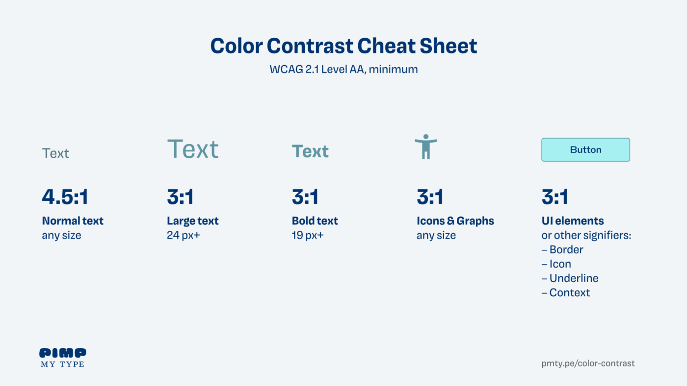
Text contrast is crucial
The first step in your accessibility journey as a visual designer is text contrast. This is pretty straight forward, and you might already be familiar with it. Your text should have a minimum contrast of:
- 4.5:1 for normal text
- 3:1 for text larger than 24 pixels
- 3:1 for bold text larger than 19 pixels
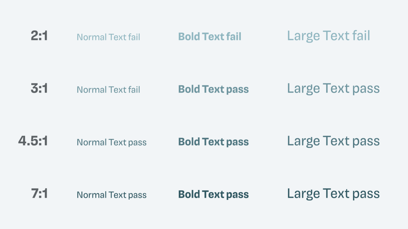
One thing to pay attention is, that large text is larger than you might think. The WCAG defines large text in 18 point which are not the same as pixel. A lot of false information is out there about this, that’s why it’s important to look it up in the WCAG. Another interesting site note – there is no minimum font size required, but I’d recommend starting at 16 px for body text.
Check if your minimum contrast is met by using the accessibility inspector in your browser. During the design, I use a plugin like Stark, or the free A11y Color Contrast Checker in Figma.
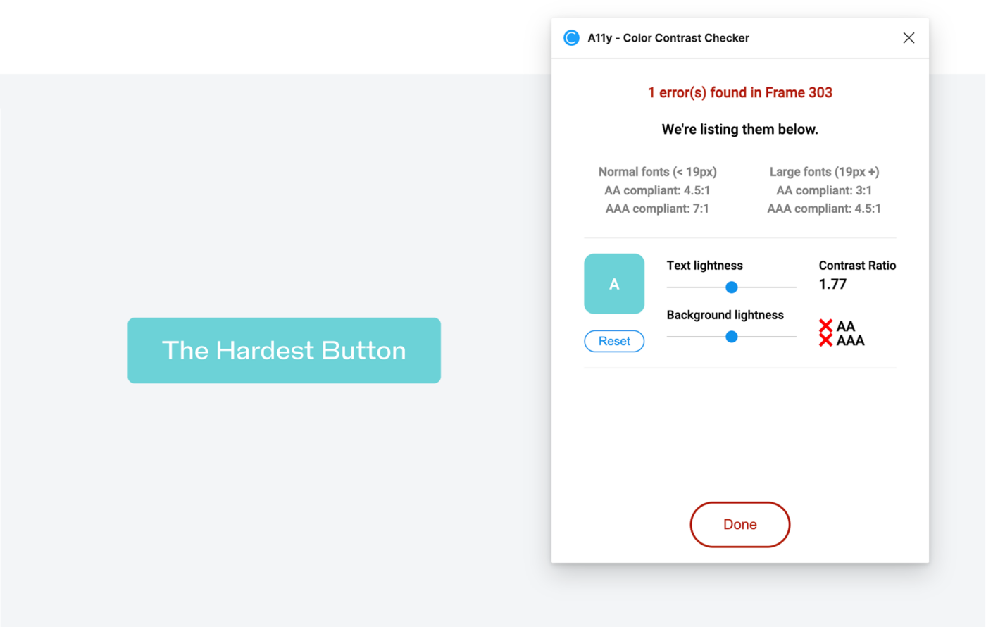
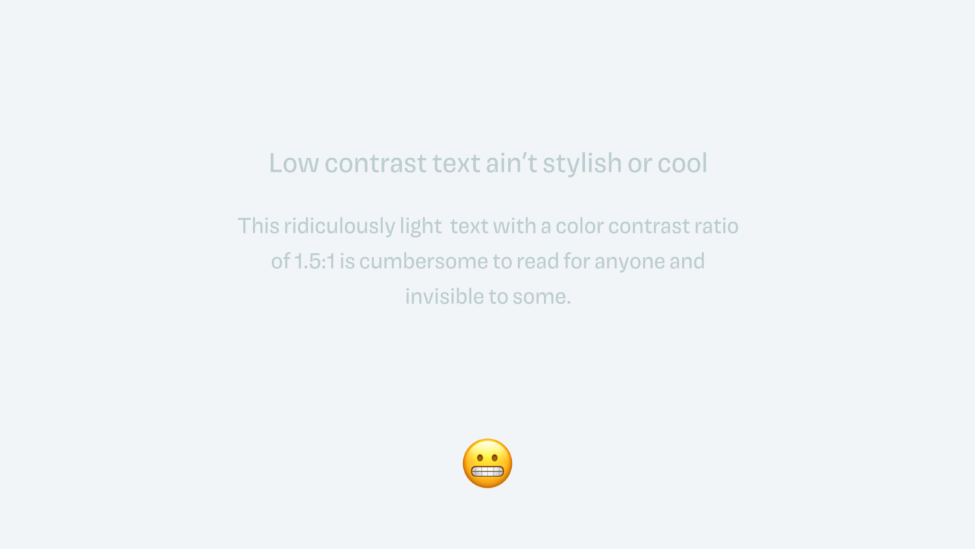
Coming back to The Hardest Button, you can see that this text contrast by far does not pass 4.5:1. Not only is the button failing accessibility, it is generally hard to read, also for non-impaired viewers. To fix that, I created three different versions, that I also show in the video.
My three approaches to make the text contrast sufficient were:
- Darker background, and medium weight text
- Lighter background, and dark text in medium weight
- Increased font size, so I can use a less dark background, meeting 3:1
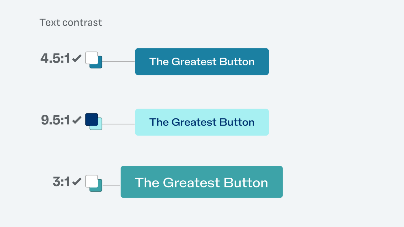
Looking good, right? Also with that pretty typeface, NaN Holo which I set that supremely contrasting text with. I pat myself on the back, satisfied, until … I got a tweet from Mike Mai, and realized I got it wrong 😳.
UI components need a minimum contrast too
What?! Mike was talking about my second design, with the light background and the dark text, referring to the Success Criterion for Non-text Contrast. These Success criteria are the things your digital product actually has to pass, so that it counts as accessible, like the one with the text contrast. It reads:
Visual information required to identify user interface components and states needs to have a contrast ratio of at least 3:1 against adjacent color(s).
Success Criterion 1.11.4, WCAG 2.1
Also, Google’s Material 3 Design System mentions that you should meet a contrast ratio of 3:1 at least for buttons or other interactive components against their background. And my second design is no exception to that.
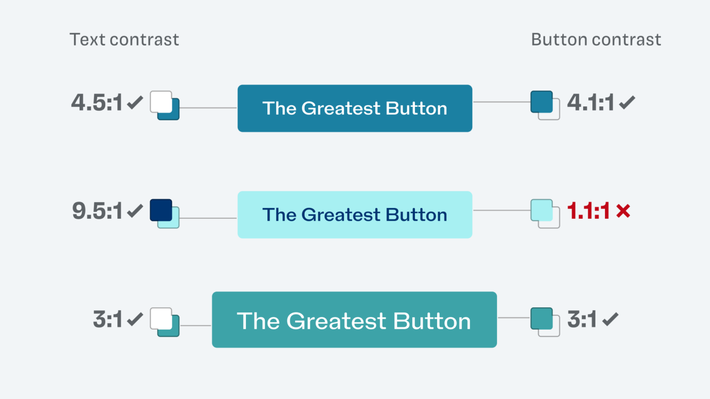
And since the container is crucial to identify this as an interactive component, it is required. Because if you would remove the background, you just see text. And when it comes to accessibility, you treat everything that is below a contrast ration of 3:1 as the background color.
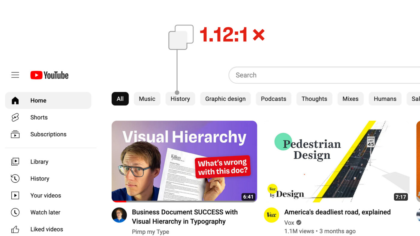
Now knowing that, I was surprised to see more and more interactive UI components on the web with a super low contrast. Like ridiculous 1.12:1 in these category filters on YouTube! How can they get away with that?
There is an explanation, but to understand it better, let’s go back to my failed button example, and discover a few options how we could make it work.
Making UI components accessible
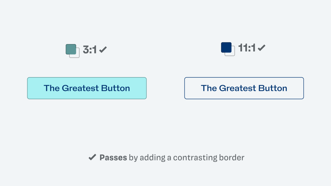
The easiest way would be to add a border, to make the boundary of that button better visible. You can use whatever color you like, as long as it again has a contrast ratio of at least 3:1 against the surrounding background. Both version are much clearer now.
Now, if the button background was not the only signifier to mark this as an interactive component, you could also pass accessibility guidelines. By adding an icon or underline, for example.
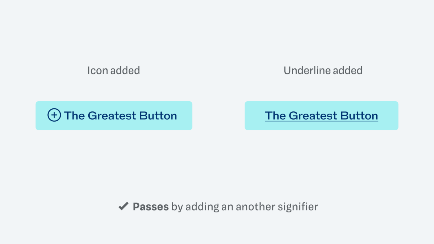
And now the trickiest one – if we did not change anything about the light button, and just arrange it with the first button in a row, it probably would conform to WCAG as well 🤯! Because of its context.
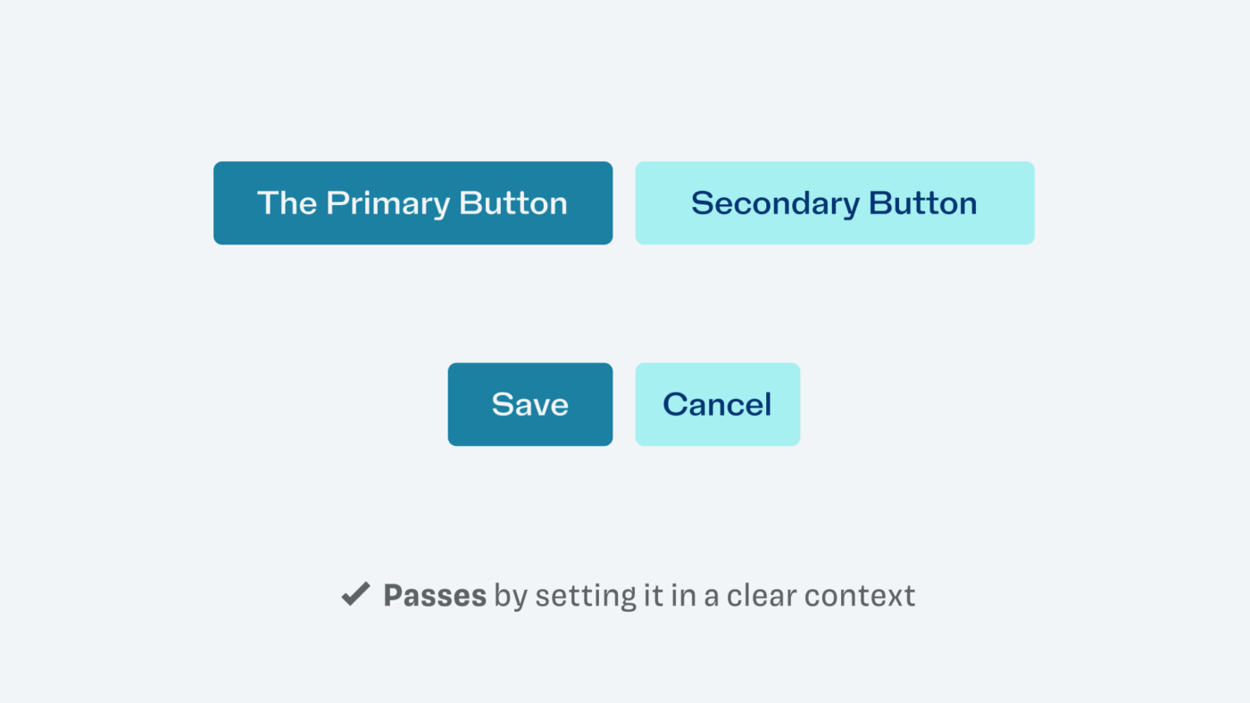
This now is not about looking for loopholes in the guidelines, and we certainly don’t want to behave like lawyers here (don’t tell my lawyer brother-in-law). But let’s reflect on what lies behind all of this. If you can not see low color contrast, and you might confuse an interactive element on a page with plain text, this is problematic. Like not seeing, if a link is underlined or that there is a button. And that’s the whole reason for it.
This is why the minimum contrast is not required for the component’s background. But only if it is clearly to understand due to the position or labeling. Like in a navigation, the filters, or if it was a Save and Cancel button next to each other. This naturally depends on the specific situation, while the text contrast of 4.5:1 has always to be met. So this is the reason why the filters on YouTube would pass an accessibility audit, based on Eric’s assessment.
The YouTube filters pass, but …
… you should also not use that as an excuse to be lazy. WCAG is only a minimum standard, which means you could and should strive to make it better and clearer to as many users as possible, while also testing it. And YouTube could also improve, like I did it with my button. By adding border or changing the background?
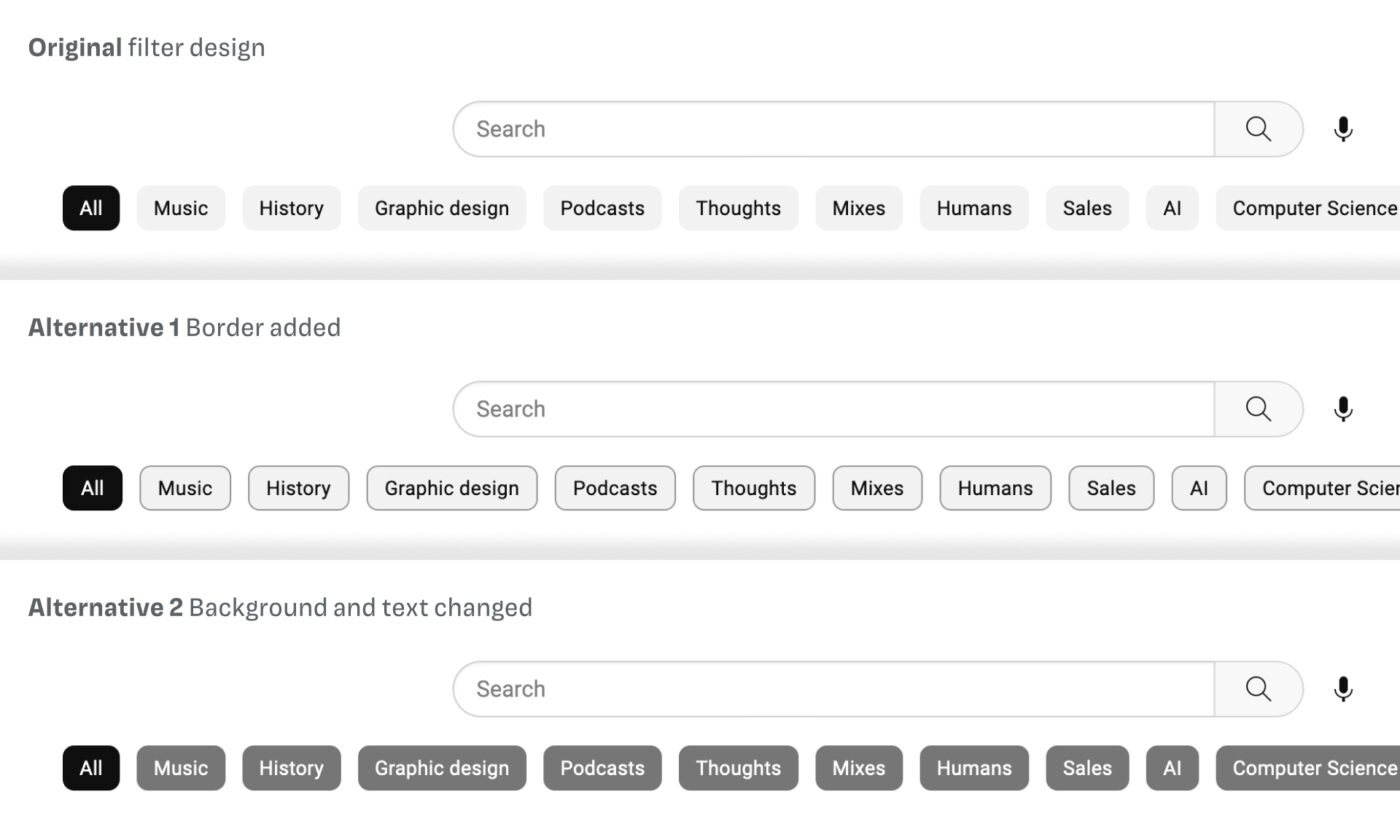
This might now be a bit too striking or not working with the rest of the page. But it also shows that all these things happen in a certain aesthetic context, and you’ll have to figure it out for your own design. The guidelines are not that hard, only coming with very little requirements for visual design. This is also intentional, as Eric Eggert told me, so they don’t hinder innovation. And having a 3:1 color contrast should be easy … right, YouTube?
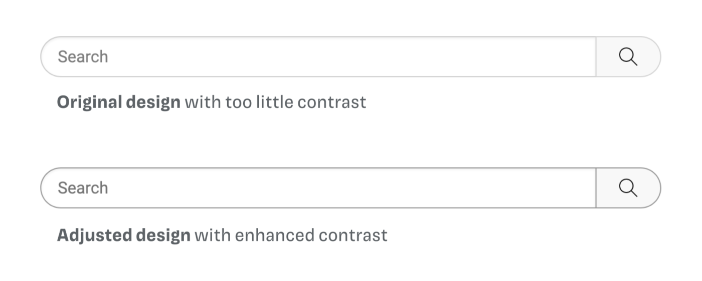
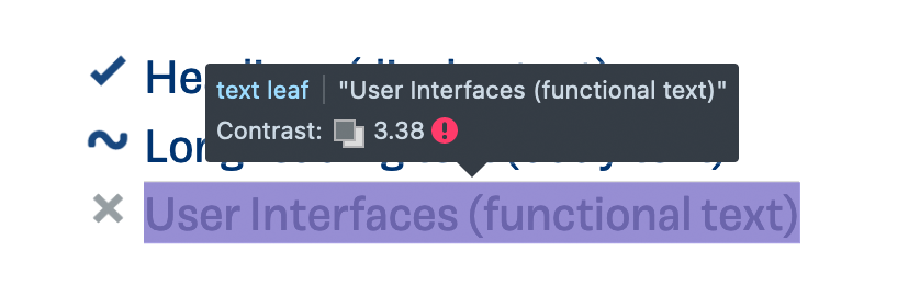
The search box is a clear fail. The border of the search input, maybe the most essential interactive component on this page, is much too light. Also, the text contrast does not pass. Viewers with a visual impairment might have a very hard time to differentiate it from the page background, as my simulation shows.
Increasing the contrast of the text and the border will not only make it accessible, it also becomes clearer to all other visitors. With the “Search” label, the difference of 4:1 and 4.5:1 is not so big either, but it is crucial and proves that you should measure it.
Your action step with color contrast
Contrast guides visual hierarchy. These minimum requirements are there that most users are covered by the standard view of your digital product. So follow these five simple guidelines, and you’re good to go.
Diving into this topic, also made me aware of some flaws on this site, where color contrast was not met. I fixed them, and even if I might have missed some, this is a good starting point. Like with typography, see accessibility as a journey. Apply this newly gained knowledge about color contrast to your next project, and fix older ones.
This is your next opportunity to grow as a designer. Contrast guides visual hierarchy, this skill will make your designs more accessible for more people and better for everyone!
More resources
- Understanding Docs are super helpful to make that dry non-text contrast guideline clearer and practical.
- The A11Y Project is not only beautifully designed, it is also very helpful with color contrast but also with its checklist.
- Designing for accessibility is not that hard by Pablo Stanley is a wonderful, easy-going, and practical article.
❤️
Thanks to Mike Mai for his feedback that go this all started. He has a beautiful website, with a great typography manual. Many thanks to Joschi Kuphal, and Manuel Matuzović for their advice, and mostly to Eric Eggert, for answering all my questions in several calls. I recommend Eric’s YouTube channel about accessibility, if you want to dive deeper.
Do you have questions, feedback, additions, corrections 😉? Looking forward to reading them in the comments.
Where contrast fails, UX writing – Content design saves the day😉
Oh yes, Jana. This then will make the context clearer. Thanks for adding that!
Amazing analysis and examples, very well done!
Oh, thank you, Roman! Really appreciate it. Hope it helps you in an upcoming project, or were you mostly familiar with it?
Nice article! A little comment to make you a bigger pro 😀. About the example with the Endurance test (no background on a button). It’s bad UI but its bad for everybody not only for the visually impaired. Therefore it will pass an accessibility audit.
Thanks for your comment, Joost! So if it’s bad for everyone it is not inaccessible, because it does not exclude certain groups. You’re right in that image. I changed that part of the article and put in an image comparison slider, so then it is clear that it actually should not be that way.
Unfortunately WCAG 2 contrast specs had no empirical testing, were not peer reviewed, and otherwise are not supported by vision science.
4.5:1 is woefully inadequate for body text for instance, and in dark mode 4.5:1 is illegible (WCAG 2 contrast is wrong by as much as 250% in dark mode).
It is unfortunate that the EU is trying to push it into law on its member states without following appropriate legislative process. While much of WCAG 2 is useful, the material related to perception and perception based impairments is very weak.
Thanks for sharing that point of view, Andrew. I already heard and read about that. I agree, that 4.5:1 is definitely insufficient for body text. Maybe I should make it clearer that it starts there. But in many cases not even 4:5:1 is reached, as I observed …
There are cases were 4.5 to one is more than what is needed, and there are cases where 4.5:1 is grossly insufficient. This is because human perception of contrast is a function of the spatial frequency, in other words the thickness & size, and the white space, well before luminance or colors are involved.
I discussed this in the article “The Realities And Myths Of Contrast And Color”: https://www.smashingmagazine.com/2022/09/realities-myths-contrast-color/