Building custom responsive layouts is always exciting. This article examines a technique that we can use to take full control of the distance between grid columns. To demonstrate this, I’ll use the example of a responsive image gallery.
For more on responsive layouts. Watch our screencast Creating Multiple Column Layouts in Flexbox.
Building a Responsive Layout
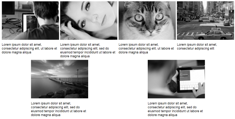
To begin with, let’s assume on large screens our gallery should look something like this:
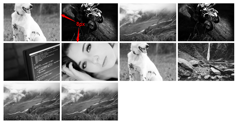
On smaller screens (i.e. <50em), it should have the following appearance:
The markup is simple:
<div>
  <a href="path-to-the-image">
    <figure>
      <img src="path-to-the-image" alt="">
    </figure>
  </a>

  <!-- other anchors here ... -->

</div>
As you probably already know, we can take advantage of different layout methods for generating the desired result. Before I examine two of those possible methods, let’s take note of our initial requirements (see previous visualizations):
- I want a 2-column layout on medium screens and smaller (i.e. <50em), and a 4-column layout on large screens (50em or above).
- The distance between columns should be 8px.
Using inline-block
I’ll first use the display:inline-block method to build our gallery. Consider the following CSS:
div {
  font-size: 0;
}

a {
  font-size: 16px;
  display: inline-block;
  margin-bottom: 8px;
  width: calc(50% - 4px);
  margin-right: 8px;
}

a:nth-of-type(2n) {
  margin-right: 0;
}

@media screen and (min-width: 50em) {
  a {
    width: calc(25% - 6px);
  }

  a:nth-of-type(2n) {
    margin-right: 8px;
  }

  a:nth-of-type(4n) {
    margin-right: 0;
  }
}
Here’s an explanation of what I’ve done:
By default, there’s a space between inline-block elements. One way to override this is to set the font size of the parent element to zero. This might also require that we reset the font size of any child elements (not necessary in our case).
On small screens I have a 2-column layout and I specify 8px of space between columns.
The width of our columns is calculated as follows:
- Total space between columns per row = 1 * 8px => 8px. The derived value is 8px and not 16px because I remove the right margin for every second column on small screens.
- The width of each column = calc(50% – 4px). The value 4px derived by calculating: Total space between columns per row / Number of columns per row (8px / 2 => 4px).
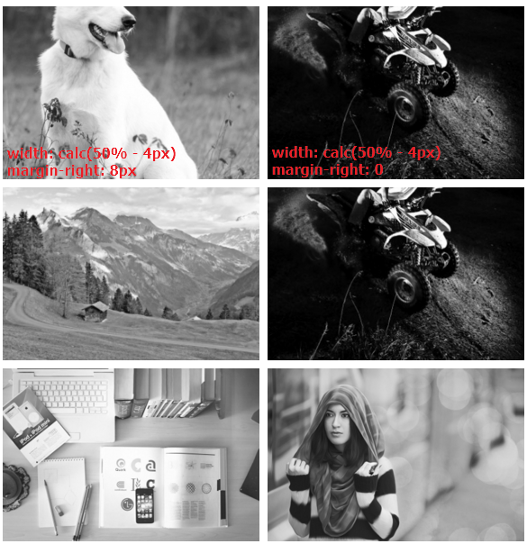
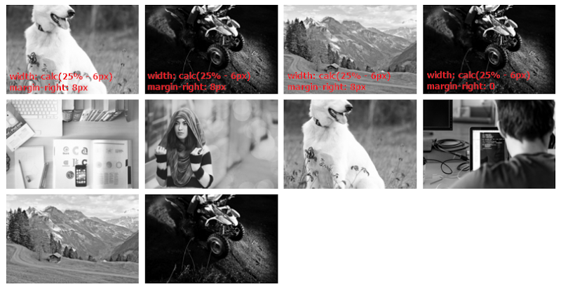
On large screens I have a 4-column layout and I specify 8px space between columns. So, the width of our columns is calculated as follows:
- Total space between columns per row = 3 * 8px => 24px. Again, the derived value is 24px and not 32px because I remove the right margin for every fourth column.
- For column widths, I’m using calc(25% – 6px). The value 6px derived by making this simple calculation: Total space between columns per row / Number of columns per row (24px / 4 => 6px).
See the CodePen demo for the inline-block method here
Using Flexbox
The solution above works pretty well, but there are some disadvantages. To demonstrate one disadvantage, let’s assume that each image contains a caption as well.
Consider this slightly updated markup:
<div>
<a href="path-to-the-image">
<figure>
<img src="path-to-the-image" alt="">
<figcaption>Some text here</figcaption>
</figure>
</a>
<!-- other anchors here ... -->
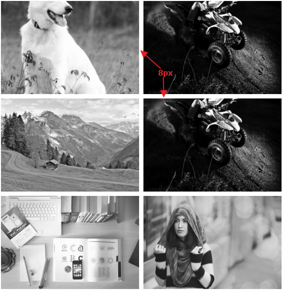
</div>Here’s the new version of our gallery on large screens:
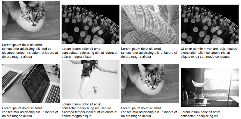
View the CodePen demo using inline-block with captions
The result isn’t so attractive because the grid items have different heights. We can fix this with flexbox, a modern layout method, which will allow us to overcome many common layout problems (e.g. default gap between inline-block elements). In order to activate this method, I simply have to update the CSS of the parent element (the flex container):
div {
  display: flex;
  flex-wrap: wrap;
}
Happily enough, if we now preview the gallery, we’ll get the expected result (i.e. equal height columns) across all screens. Here’s how it looks on large screens:
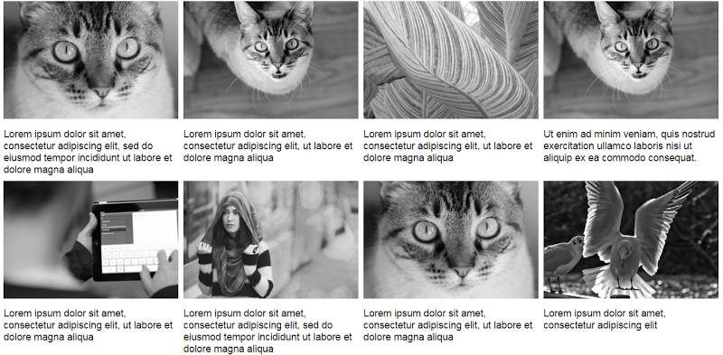
View the CodePen demo using flexbox with improved captions
At this point, there’s one last thing I have to clarify. Flexbox provides the justify-content property that aligns flex items along the main axis of the current line of the flex container. However, note that this property doesn’t define a value that will allow us to build the desired gallery layout. For example, the space-between value results in this layout:
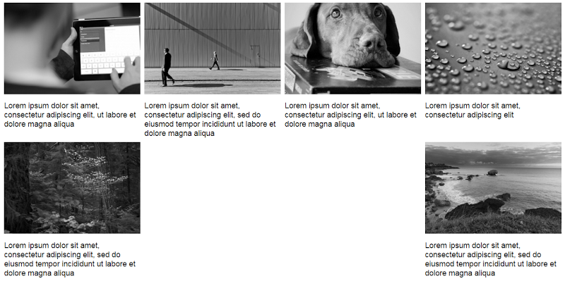
While the space-around property results in this one:
In both cases, the last two items are distributed awkwardly on the final row. The CSS for this method would look like this:
div {
  display: flex;
  flex-wrap: wrap;
  justify-content: space-between; /* or space-around */
}

a {
  display: inline-block;
  margin-bottom: 8px;
  width: calc(50% - 4px);
}

@media screen and (min-width: 50em) {
  a {
    width: calc(25% - 6px);
  }
}
In this case I didn’t assign a margin-right property to the flex items. This happens because, depending on the value of the justify-content property, the browser takes care of distributing the flex items across their container.
View the CodePen demo using the justify-content property
Conclusion
This post has covered a couple of techniques for controlling the distance between grid columns in a responsive image grid. While the inline-block method is sufficient, flexbox makes it much easier and more convenient, especially when combined with the calc() function.
Get the most out Flexbox layouts and watch our screencast on Creating Multiple Column Layouts in Flexbox.
If you have another solution to this problem, feel free to mention it in the comments.
Frequently Asked Questions (FAQs) about Building a Responsive Image Grid with Modern CSS
How can I make my image grid responsive using CSS?
Making an image grid responsive using CSS involves using media queries and the CSS grid layout. Media queries allow the page to use different CSS style rules based on the device’s characteristics, such as its screen size. The CSS grid layout, on the other hand, allows you to create complex responsive designs with ease. You can define columns and rows and place items in any cell you want, and they will automatically adjust to fit different screen sizes.
What is the role of the ‘object-fit’ property in CSS?
The ‘object-fit’ property in CSS is used to specify how an image or video should be resized to fit its container. It has five possible values: fill, contain, cover, none, and scale-down. The ‘fill’ value stretches the image to fit the container, possibly distorting the image. The ‘contain’ value increases or decreases the size of the image to fill the box while preserving its aspect-ratio. The ‘cover’ value increases or decreases the size of the image to fill the box, potentially cropping the image in the process.
How can I create a fully responsive grid image gallery with pure CSS?
Creating a fully responsive grid image gallery with pure CSS involves using the CSS grid layout and media queries. The CSS grid layout allows you to define columns and rows and place items in any cell you want. Media queries allow the page to use different CSS style rules based on the device’s characteristics, such as its screen size. By combining these two features, you can create a fully responsive grid image gallery that adjusts to fit different screen sizes.
How can I use CSS Flexbox to create a responsive image gallery?
CSS Flexbox is a layout model that allows you to easily create complex layouts. To create a responsive image gallery using Flexbox, you would first define a container and set its display property to ‘flex’. Then, you would use the ‘flex-wrap’ property to allow the items to wrap as needed. You can also use the ‘justify-content’ and ‘align-items’ properties to align the items within the container. Finally, you would use media queries to adjust the layout for different screen sizes.
How can I use JavaScript to create an image grid?
JavaScript can be used to create an image grid by dynamically generating HTML elements and applying CSS styles to them. You would first create an array of images, then use a loop to iterate over the array. For each image, you would create an ‘img’ element, set its ‘src’ attribute to the image’s URL, and apply any necessary CSS styles. Then, you would append the ‘img’ element to a container element in the HTML document.
What are the advantages of using CSS Grid over Flexbox for creating an image gallery?
While both CSS Grid and Flexbox can be used to create an image gallery, CSS Grid offers more flexibility and control. With CSS Grid, you can define both columns and rows, and place items in any cell you want. This allows you to create complex layouts with ease. Flexbox, on the other hand, is a one-dimensional layout model, meaning it can only handle rows or columns, not both at the same time.
How can I add captions to the images in my grid?
Adding captions to the images in your grid can be done by using the ‘figure’ and ‘figcaption’ elements in HTML. The ‘figure’ element represents self-contained content, like an image, and the ‘figcaption’ element represents a caption for the content in the ‘figure’ element. You would place the ‘img’ element and the ‘figcaption’ element inside the ‘figure’ element, and use CSS to style them as needed.
How can I add hover effects to the images in my grid?
Adding hover effects to the images in your grid can be done by using the ‘:hover’ pseudo-class in CSS. This pseudo-class selects an element when the user’s pointer is over it. You can use it to change the image’s appearance, like its opacity or scale, when the user hovers over it.
How can I make my image grid accessible for screen readers?
Making your image grid accessible for screen readers involves using the ‘alt’ attribute in your ‘img’ elements. The ‘alt’ attribute provides alternative text for an image if the image cannot be displayed. This text is also used by screen readers to describe the image to users who cannot see it. You should provide a short, descriptive text that accurately represents the image’s content and function.
How can I optimize my image grid for performance?
Optimizing your image grid for performance involves several steps. First, you should optimize your images by compressing them and using the appropriate format. Second, you should use CSS instead of JavaScript for your layout and animations, as CSS is generally faster. Third, you should use media queries to serve different images based on the device’s screen size, to avoid loading large images on small screens. Finally, you should use lazy loading to only load images when they are needed.
 George Martsoukos
George is a freelance web developer and an enthusiast writer for some of the largest web development magazines in the world (SitePoint, Tuts+). He loves anything related to the Web and he is addicted to learning new technologies every day.