
This article was peer reviewed by Dave Maxwell and Panayiotis Velisarakos. Thanks to all of SitePoint’s peer reviewers for making SitePoint content the best it can be!
The web has moved a long way from its traditional roots. Where once it was perfectly fine to provide a basic text-only website, now it’s practically expected that your sites convey not only information, but provide a modern, crisp and exciting user experience.
To that end, it’s up to you as the designer or developer to create something that’s visually interesting. This could be something as small as an awesome set of font pairings, or as complex as full-on animations and deep interactions.
Today we’re going to look at a few sites that masterfully use micro-interactions, hover state animations, CSS gradients and transforms to create visual interest and guide users’ actions. The whole point is to create something that users enjoy, either directly through interaction or through subtle effects users might not even notice, which nevertheless contribute to create positive connections with the site.
Stripe
Stripe is a US-based payment processing system for credit cards. It’s a developer-focused solution and this comes across both in their system and their website. Their site is colorful, interactive and generally pretty awesome to use. Let’s see which elements we can pick out and leverage in our designs.
Gradient Backgrounds & CSS Transforms
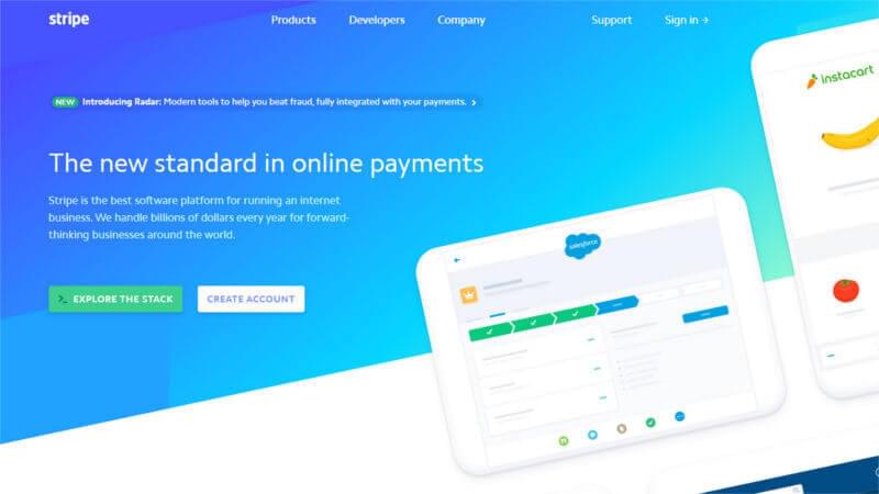
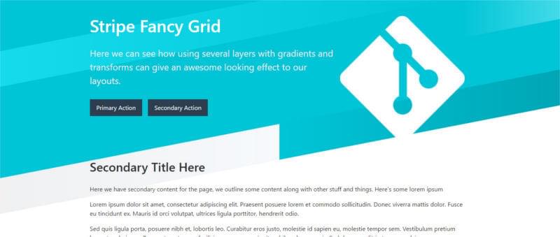
The Stripe website showcases a primary header section with a creative use of layout and design. The header changes colors on a page by page basis and is used as their main call to action element.
At its most basic level, it’s a collection of containers that have been positioned to create a semi mosaic grid. These fragments have each their own linear gradient that blends or contrasts with other parts of the header.
What makes the header look even more visually interesting is the fact that it’s been slanted. To get this type of effect, all you need to do is apply a skew(xdeg) transformation on the top element. Doing so instantly skews the inner elements.
The subtle skew, along with simple yet interesting images and colors, are all you need to bring about this inventive design. Getting a good mixture of low and high contrast sections here is important. If these sections were flat colors the effect wouldn’t look so great. Instead, the gradient flowing from one section to another makes this look visually striking.
If you like the idea, you could incorporate a layout like this in your header, or even use it as a background in a call to action or feature block. Try experimenting with mixtures of colors, positions and transforms and create something that looks interesting and makes you stand out.
Here’s a CodePen demo to get you started right away.
Creating Interactive, Interesting Menus
Menus have come a long way from the old left positioned vertical menu of past ages. Nowadays people expect your menus to be both useful, visually interesting, and of course mobile optimized.
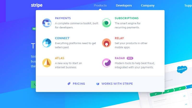
Stripe has an interesting take on their menus.
Each of their main top level categories expands out and showcases several of their sub-pages in unique layouts. Their Products menu, for example, features a large mega-menu style layout. Each of the sub-pages has its own styled icon, title and summary description to entice you to find out more.
As you’d expect, all these menus work perfectly on mobile, dynamically changing as required.
The idea here is that Stripe has taken something generally quite boring such as a drop down menu and turned it into a showcase, something of interest. You could, for example, incorporate a few animations into your menu to subtly change its position or opacity. Or, you can create dynamic layouts for your menu to showcase each page under a unique light.
In a previous article I touched on a few examples of different menus you can use, but the guiding principle is that they should be easy to use and visually interesting.
Help Scout
Help Scout is an easy to implement, dynamic help system. It exposes a front-end widget visitors can use to get help by browsing predefined help articles or sending the contact form.
Their website is fairly simple with a focus on content. However, it uses several subtle animations and icons to draw your attention.
Creating Subtle Repeating Animations
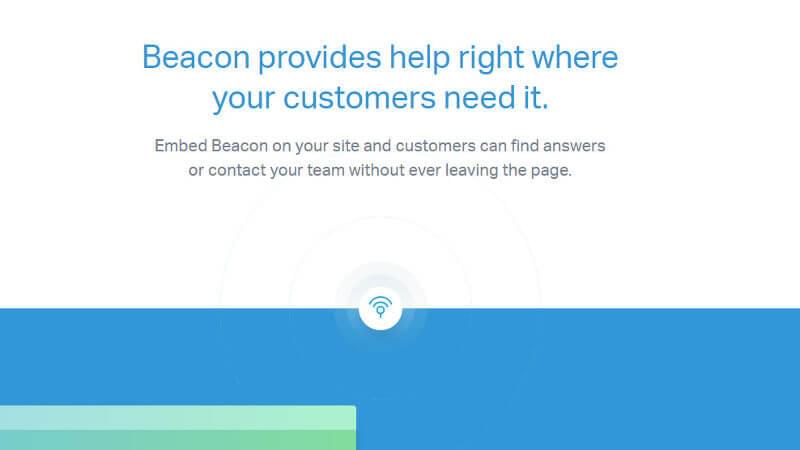
Not all animations have to be triggered from user interaction. Sometimes, creating an animation that runs subtly in the background is enough to endow your page with movement and make it appear dynamic.
When you’re on Help Scout’s Tools page you’ll soon come across the simple pulsing component you can see in the image above. It’s a combination of a nice looking icon, material drop shadow and a simple pulsating ripple animation.
This is a good example of something you can introduce into your design, a subtle animation that looks good without distracting users’ attention away from your content.
I’ve created something similar as a stand-alone widget that you can drop into your projects:
See the Pen CSS Pulsating Sonar by SitePoint (@SitePoint) on CodePen.
These subtle animations can either be used as a centerpiece to draw visitors to accompanying text or as interesting elements in the background, whatever suits your purpose.
Zest
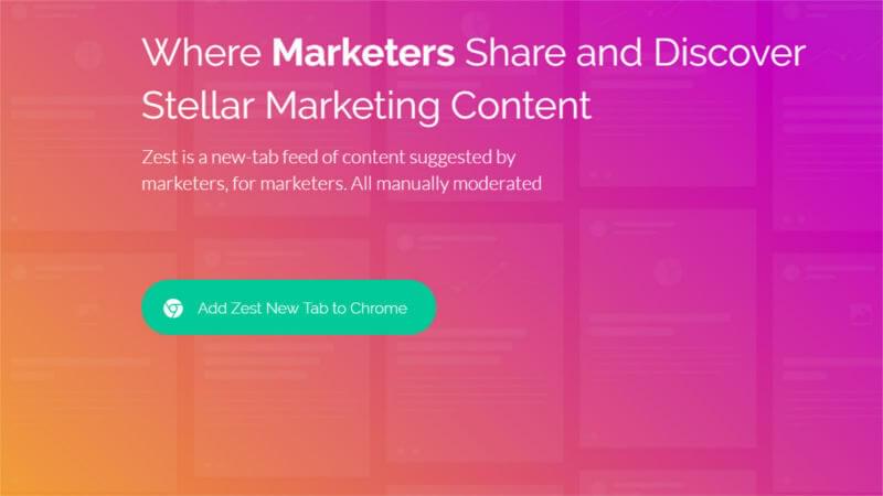
Zest is a web service that showcases content feeds designed for marketers and created by marketers. The overall purpose of their site is to convince visitors to use their Chrome app.
Their site looks amazing as it combines strong colors, iconography and interesting shapes. As you scroll through the site, additional animations come to life and new layers scroll into focus, giving the site a dynamic and lively feel. There are a few elements we can take from this site, let’s look at them.
Scroll Based Animations
Some of the nicest animations are those that fire automatically as you scroll elements into view. Creating animations that start when elements hit the viewport area helps to give a “story” type vibe to your site.
This is especially useful for sites that are selling a product or service and want to guide the user through a path of discovery and engagement.
I’ve already discussed scrolling animations in a previous article, showing how you can use JavaScript and CSS to trigger some interesting effects as the user scrolls. If you’re looking to introduce subtle movements into your designs, this technique works very well.
Here’s a CodePen that illustrates how you can incorporate this into your site:
See the Pen CSS Animations on Scroll – Slide in From Left by SitePoint (@SitePoint) on CodePen.
As the user scrolls down, new testimonial elements slide in from the left and change opacity.
Partially Loaded Content
Another interesting design feature is when the site loads and positions its content in response to scrolling events. This technique is similar to the one referred to above: as soon as the user scrolls to the right position in relation to the viewport, a series of animations gets triggered. There’s heaps of options you can try out here. For example, you can show content bit by bit like Zest does, or you could perform a series of back to back animations.
Micro-Interactions and Animation
One of the potential downsides of flat layouts is that by their own nature they’re fairly static. Some of the methodologies such as Google’s Material Design attempt to overcome this with subtle interactions, an emphasis on layering (via box-shadows) and other techniques aiming to add movement to this kind of layouts.
There are many ways you can introduce movement to your designs. These can be as subtle as changing colors on interaction, or as wild as re-flowing the design with entirely new content to emphasize the interaction.
Simple Card Interactions
In most of your sites you’re likely to make use of lists or grids of cards. Cards are sections of information you want to display, e.g., blog post excepts, service listings, etc. Adding a bit of interactivity to emphasize this type of content can often help with users’ engagement.
Take a look at the following CodePen demo for example: the card displays basic information, but when interacted with, it animates and changes.
See the Pen Fancy Card Animation by SitePoint (@SitePoint) on CodePen.
While it would have been fine to have no animation at all here, having these subtle animations is often very beneficial to users, providing them with visual context. Only, be careful not to overdo it. If the animations are targeting multiple styles, not only will the result look jarring for the user, it can also potentially appear laggy on less powerful devices (e.g., mobiles).
Because of this, subtle animations that change opacity, use transformations, or otherwise aren’t too impactful, are the ones that work best.
More Complex Card Interactions
As we mentioned before, you can use animation on cards or grids of information to enhance their content. Sometimes, you might want to display the most important information upfront and only selectively show more info as users interact with the card (as it is at that point that information becomes relevant).
Here’s a CodePen that shows a series of cards. These cards display an image and primary title. When users interact with them, they change state showing new information and triggering several animations:
See the Pen Animated border lines on hover by SitePoint (@SitePoint) on CodePen.
This type of interactivity helps us show new info in an enticing way by using a few neat things like pseudo elements, box shadows and transforms.
Again, same with the previous set of animations, moderation is the key. For each situation you should weigh up the elements you intend to animate. As a general rule of thumb, using transform will be hardware accelerated, and using transform on elements that don’t change the layout of other elements (such as on absolute positioned items) will yield the best results. Certain CSS properties, for instance box-shadow, can also cause slowness if used excessively.
Animations: When, Where and Why?
The overall idea of when and where to use animation techniques or why use them at all is very subjective.
Some people avoid them like the plague, arguing that the performance hit incurred by running animations is too great, at least just for the sake of aesthetic reasons alone. Other people will use them everywhere, with everything looking interactive or dynamic.
There’s a healthy balance between both extremes, one where you can leverage animations for those key parts of your website where you want to draw users’ attention while leaving the rest to more static content.
There are countless sites that strike a good balance. To keep things simple, let’s use pedrolandaverde.com as an example.
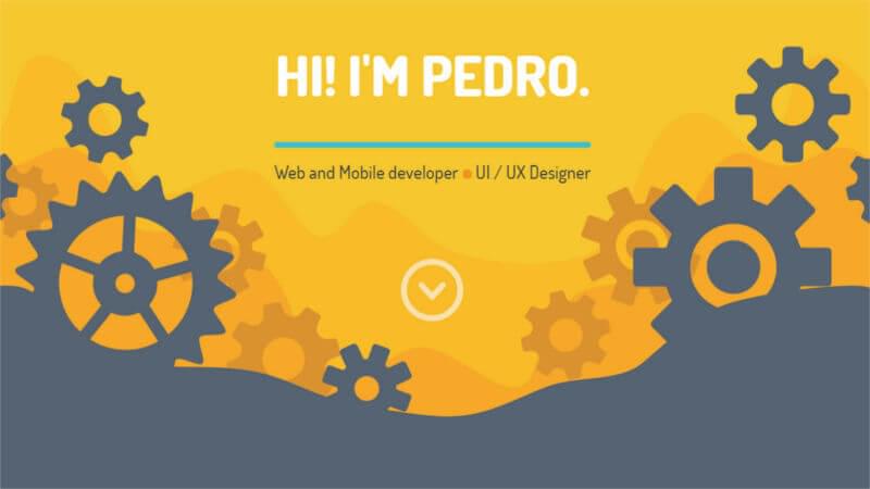
This site triggers basic rotation animations on several graphics as you scroll. The iconography and flat shapes work really well with this animations and give the site a fluid feel. In combination with the subtle parallax elements in the background layers, this site uses animation as a secondary accent, giving you something to look at while you browse the site.
Using animations in the design should enhance your site. Whether this enhancement is to make your content clearer, to liven up your page or just to separate yourself from the hoard of other sites, as long as it’s done in a balanced fashion it will almost always have a positive effect.
Wrapping It All Up
The overall goal should be to create interesting, robust websites that draw in viewers and keep them both focused and entertained. You can leverage a combination of animations, whether they be subtle micro-interactions or full-blown visual experiences, to keep interest high and bounce rates low.
To delve deeper into all there is to know about CSS animation, check out Animating with CSS, a SitePoint Premium video course by Donovan Hutchinson.
Frequently Asked Questions on Creative UI Design Ideas
What are some unique UI design ideas for my website?
There are numerous unique UI design ideas you can incorporate into your website. For instance, you can use a minimalist design approach, which focuses on simplicity and functionality. This design idea eliminates unnecessary elements and focuses on what’s essential. Another unique idea is to use micro-interactions. These are subtle animations or design elements that guide users and provide feedback. They can make your website more engaging and interactive. You can also use a dark mode design, which is becoming increasingly popular. It’s not only stylish but also reduces eye strain for users browsing your website in low-light conditions.
How can I make my UI design more creative?
Creativity in UI design can be achieved through various ways. You can experiment with different color schemes, typography, and layout designs. Try to use colors that evoke the emotions you want your users to feel. Typography can also greatly influence the look and feel of your website. Choose fonts that reflect your brand’s personality. In terms of layout, don’t be afraid to break the grid. Asymmetrical layouts can make your website stand out and look more dynamic. Lastly, incorporate unique and interactive elements like animations and micro-interactions to enhance user engagement.
What are some good resources for UI design inspiration?
There are several online platforms where you can find UI design inspiration. Websites like Dribbble, Behance, and Pinterest are filled with design projects from professionals around the world. You can also check out design blogs and magazines like Smashing Magazine, Web Designer Depot, and UX Design. These platforms not only provide design inspiration but also offer valuable insights and tips on UI design.
How can I improve the usability of my website’s UI design?
Improving the usability of your website’s UI design involves making it easy for users to navigate and interact with your website. This can be achieved by using clear and intuitive navigation, ensuring that your website is responsive and works well on different devices, and using familiar UI patterns. Additionally, make sure that your website loads quickly, as slow loading times can frustrate users and make them leave your website.
What are some common mistakes to avoid in UI design?
Some common mistakes to avoid in UI design include not considering the user’s needs, overloading the user with information, and using inconsistent design elements. Always design with the user in mind and make sure that your design is intuitive and easy to use. Avoid cluttering your website with too much information or too many elements, as this can overwhelm the user. Lastly, ensure that your design elements are consistent throughout your website to create a cohesive look and feel.
How can I incorporate the latest UI design trends into my website?
Incorporating the latest UI design trends into your website can make it look modern and up-to-date. Some of the current trends include dark mode, 3D elements, and micro-interactions. However, it’s important to remember that trends come and go. What’s more important is to focus on creating a design that provides a great user experience and meets your users’ needs.
What are some effective ways to test my UI design?
There are several effective ways to test your UI design. One of the most common methods is user testing, where you observe users as they interact with your design. This can provide valuable insights into how users perceive and use your website. You can also use A/B testing to compare different versions of your design and see which one performs better. Additionally, you can use heatmaps to see where users are clicking and spending time on your website.
How can I make my UI design more engaging?
Making your UI design more engaging involves creating a design that captures the user’s attention and encourages interaction. This can be achieved by using compelling visuals, interactive elements, and storytelling. Visuals like images, videos, and animations can make your website more visually appealing. Interactive elements like buttons, forms, and sliders can encourage users to interact with your website. Storytelling can create a more immersive experience and make your website more memorable.
How can I learn more about UI design?
There are numerous resources available online to learn more about UI design. Websites like Coursera, Udemy, and Skillshare offer online courses on UI design. You can also read design blogs and books, watch tutorials on YouTube, and attend design workshops and conferences. Additionally, you can learn a lot by studying the work of other designers and seeking feedback on your own designs.
How can I keep up with the latest trends in UI design?
Keeping up with the latest trends in UI design involves regularly checking design blogs, magazines, and social media platforms. Websites like Dribbble and Behance are great for seeing what other designers are working on. You can also follow design influencers on social media and subscribe to design newsletters. Additionally, attending design conferences and webinars can provide insights into the latest trends and developments in the field.
 Simon Codrington
Full stack developer and overall web enthusiast. I love everything to do with web / design and my passion revolves around creating awesome websites. Focusing primarily on WordPress, I create themes, plugins and bespoke solutions.