

There’s nothing particularly impressive about horizontally centering your content; you’ve been doing it for years. But what about vertically centering your variable-height content? In this video from my course, 6 Flexbox Projects for Web Designers, you’ll learn how Flexbox tackles this problem with minimal effort.
How to Create Perfectly Centered Content With Flexbox
Introducing the Project in CodePen
In this tutorial, I'll show you just how easy it is using the Flexbox model to horizontally and vertically center any piece of content that you want to center.
Start by going to the starting pen for this project on CodePen, and click on Fork to open a new copy. We'll make our changes to this new copy.
Let's look at the HTML first.


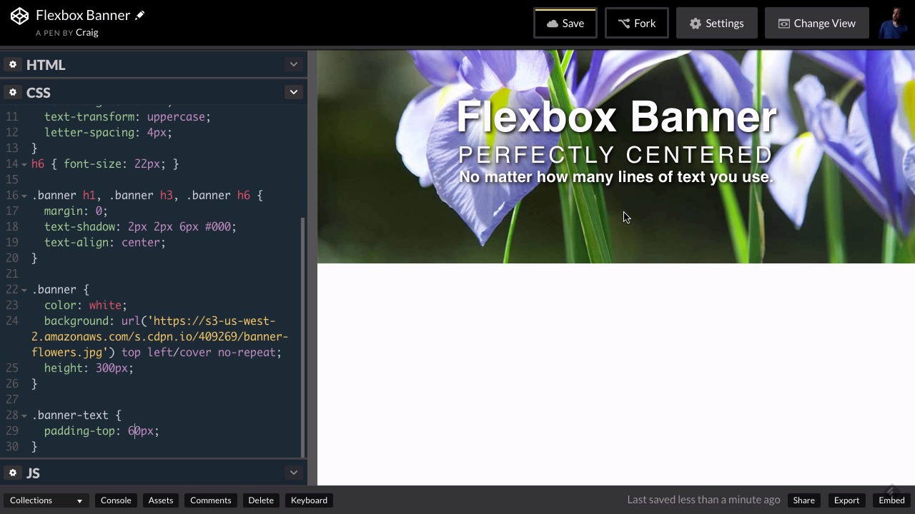
So what we've got here is a banner, and all of it's contained in a div with a class of banner. Inside that we have another div with a class of banner-text. And then we have an h1, h3, and h6 element that contains all of our text. So all three of those text elements are contained within this div that has a class of banner-text.
Then inside our CSS, we've set up the banner.


If we jump down to the banner class, we've set our text color to white. We've created a background image. We've positioned it, and sized it, and set its height to 300 pixels. And we've applied some styles to the three text elements that are inside our banner, our h1, h3, and h6.
We've set the margins to zero so that they're nice and snug right next to each other, and we've set a text shadow behind that text. And then there are other rules as well that you can look through.
The Old Way of Centering Text
What I want to show you at this point is the way that I used to vertically and horizontally align our text.
Horizontally aligning our text is very easy to do. So we could just go into the rule for our three headings, h1, h3, and h6, inside our banner, and simply set the text-align to center.
The hard part is vertically centering our text.
If you just have one line of text, you can easily vertically center it by setting the line height to be the same height as the container. So our container is the banner itself which is 300 pixels tall, so if we only had one line of text we could set our line height to 300 pixels and that text would be vertically centered.
But what if you have several lines of text? What if you have a paragraph of text? What if you have a mixture of text and images, and you want a whole block of content to be vertically centered?
Well, the way I used to do it is just to eyeball it. So I would create a new rule for .banner-text and play with it a little bit, increasing the top padding to various different values until it looked right.
But the old-fashioned way is not always reliable because what if somebody overrides your text sizes to the point where it's not centered anymore? You don't have full control over it that way.
Centering Text With Flexbox
Flexbox allows us to vertically center our text much more easily and more accurately than the old-fashioned way.
When we use the Flexbox model, we don't even need a rule for the banner-text class. All we need to do is we need to deal with the flex container, which is going to be our banner class.
The banner class represents the div that is the parent of that text. So inside the rule for the banner class, we're going to set our display to flex.
Then inside our banner rule, after display: flex, let's do a couple more things. Let's add justify-content: center, which is how we're going to horizontally center everything.
And then the last thing we need to do is figure out how to center things vertically.
So we can align items along the main axis using justify-content. But we can align items along the cross axis using another property called align-items.
If we made it flex-start, the text would appear at the top. If we changed it to flex-end, it would be at the bottom. We also have access to the same value of center, which will vertically center our text.
So this align-items property is the exact same thing as the justify-content property, but it goes along the cross axis instead of the main axis. When we create a flex container using display: flex, by default it is set to a row instead of a column, so that our main axis is our horizontal axis. So the justify-content is going to go along our horizontal axis, and the align-items property goes along the cross axis, which is, in this case, the vertical axis.
Here's how it looks in the end:
You can find all the code for the finished effect on CodePen.
Watch the Full Course
The CSS Flexbox model is starting to see more widespread use and is now supported in all major browsers. In the full course, 6 Flexbox Projects for Web Designers, we'll build upon my earlier CSS: Flexbox Essentials course and outline six practical CSS projects for everyday use.
We've also built a comprehensive guide to help you learn CSS online, whether you're just getting started with the basics or you want to explore more advanced CSS. Check out Learn CSS: The Complete Guide.


