Frameworks reduce development time for projects considerably. A few of them like Bootstrap are quite popular and offer a lot of features, but you might not need all that for your project. Today, we will focus on a new framework called Spectre. It is lightweight, modern, responsive and mobile friendly. It weighs around 6.8kb when served minified and gzipped. Besides the basic grid system, it also has a lot of other useful various components like tabs, modals and cards etc.
This tutorial will provide a brief overview of this framework, followed by some guidance to help you get started quickly.
Installation
You can either download the minified Spectre.css file directly or use npm and Bower to install it. Once you are done, you can include the file in your project like regular stylesheets.
<link rel="stylesheet" href="link/spectre.min.css" />You can also create your own customized version of the framework by editing the Less files in the /src directory or by removing unneeded components from the spectre.less file. Then you can build your CSS file from the command line by using Gulp.
Grid System
Spectre has a flexbox based responsive grid system with 12 columns. The width of each column is determined by its class name. Each class begins with col- and then is followed by a number which represents how many columns wide this particular element should be. For example, col-12 is 12 columns wide which gives it a width of 100% and col-3 is 3 columns wide or a quarter of col-12, which gives it a with of 25%. By default, the different columns will have some gap between them. You can collapse that gap by adding the class col-gapless to their container. Just like Bootstrap, it also offers classes like col-md-[1-12] , col-sm-[1-12] and col-xs-[1-12] to help you control the width of elements when the size of the viewport changes.
It also provides classes such as hide-xs, hide-sm and hide-md to hide elements on specific viewport sizes.
All the columns will show up as a single row when viewport width is less than 480px. The col-xs-* classes will be applicable to all elements with a width greater than 480px. Similarly, col-sm-* will be applicable to viewport width more than 600px and col-md-* will be applicable for viewport width more than 800px.
The following code snippet creates one column with width 33.333% (col-4), two columns with width 25% (col-3) and one column with width 16.66% (col-2).
<div class="container">
  <div class="columns">
    <div class="column col-4">
      <div class="col-content">col-4</div>
    </div>
    <div class="column col-3">
      <div class="col-content">col-3</div>
    </div>
    <div class="column col-3">
      <div class="col-content">col-3</div>
    </div>
    <div class="column col-2">
      <div class="col-content">col-2</div>
    </div>
  </div>
</div>
In the demo below, I have created a basic grid system as well as a nested one. As evident from the demo, it is not hard to create complex layouts.
See the Pen Spectre Framework Grid System by SitePoint (@SitePoint) on CodePen.
Basic Elements
Spectre includes some default styles for typographical elements like headings, paragraphs and blockquotes. The framework is also optimized for Asian fonts. It has a few classes like highlight or lead to make some sections of your text stand out. The following demo shows all these features at once:
See the Pen Spectre – Typography by SitePoint (@SitePoint) on CodePen.
You can also add the class table to any <table> element. The framework will then apply basic styling to your table such as padding and border styles to give your table a cleaner default look. It will also style your table’s header row appropriately. You can use the class table-striped to make the table striped and enable hover styles by adding the class table-hover.
This demo illustrates how easy it is to create fancy responsive tables using Spectre:
See the Pen Spectre – Tables by SitePoint (@SitePoint) on CodePen.
There are a few classes available for buttons as well. To use the default button styles you need to add the btn class. You can control the size of buttons using the classes btn-sm, btn-lg and btn-block. The class btn-block will create full width buttons. To group multiple buttons together, you can use the btn-group class on their container.
Spectre also has style rules for common form elements like labels, input fields and textareas giving them a clean and stylish look. To create a horizontal form, you need to add the form-horizontal class to the <form> element. You can then control the width of child elements using one of the classes from col-[1-12]. Please note that the form will be horizontal only if the viewport is at least 840px wide. Making the form elements bigger or smaller is just a matter of adding the classes input-sm/input-lg or select-sm/select-lg.
You can also attach some text or a button to an input element by adding the class input-group to the input container. You will have to add the class input-group-addon to the accompanying text element and input-group-btn to the button element.
A basic form is shown in this demo:
See the Pen Spectre – Forms by SitePoint (@SitePoint) on CodePen.
Navigation
Navigation is an integral part of even the most basic websites. Keeping this in mind, Spectre offers three navigation components — the navigation bar, vertical menu and breadcrumbs. The navigation bar can contain elements like a logo, navigation links, buttons and other elements like a search box. By default, the navbar will have a very minimal styling so you don’t have to put in a lot of effort to customize it. Here is the markup to create a basic navigation bar:
<header class="navbar">
  <section class="navbar-section">
    <a href="#" class="navbar-brand">SitePoint</a>
  </section>
  <section class="navbar-section">
    <a href="#" class="btn btn-link">HTML5</a>
    <a href="#" class="btn btn-link">CSS3</a>
    <a href="#" class="btn btn-link">JavaScript</a>
    <a href="#" class="btn btn-primary">Sign Up</a>
  </section>
</header>
Besides the navigation bar, you can create vertical menus as well. This requires you to add the class menu to the respective container element. You can add the class menu-item to all the child elements in your menu. The framework uses this class to add its own styling consistent with the rest of the components. Different menu items can be separated using a divider or menu-header.
You can also implement a breadcrumb menu using the breadcrumb class. All the child elements need to have the classname breadcrumb-item.
All three menus that we discussed in this section are shown in the demo below:
See the Pen Spectre – Menus by SitePoint (@SitePoint) on CodePen.
Modals and Cards
Two important components that we have not discussed up to this point are modals and cards. They are similar to their Bootstrap counterparts.
Modals
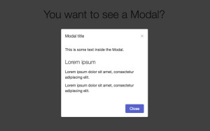
You can add a modal class to container elements to create modals. Inside that container, you can add one actual modal container element with the class modal-container and a modal overlay element with the class modal-overlay. Inside your container, you can add actual elements with the modal-header, modal-content and modal-footer classes. You can control the size of your modals using the modal-sm class. The code below will create a basic modal for you:
<div class="modal modal-sm active">
  <div class="modal-overlay"></div>
  <div class="modal-container">
    <div class="modal-header">
      <button class="btn btn-clear float-right" type="button"></button>
      <div class="modal-title">Modal title</div>
    </div>
    <div class="modal-body">
      <div class="content">
        <p>This is some text inside the Modal.</p>
      </div>
    </div>
    <div class="modal-footer">
      <button class="btn btn-primary" type="button">Close</button>
    </div>
  </div>
</div>
In the demo below, I have added the functionality to make the Modal appear and disappear. It is just a matter of adding and removing the active class.
See the Pen Spectre – Modals by SitePoint (@SitePoint) on CodePen.
Cards
Cards are flexible general purpose content containers. You can use them to store all kinds of things. They can be created by using the class card. The card itself can have children with classes card-header, card-content, card-footer or card-image based on their purpose. Here is a basic snippet to show markup of a typical card:
<div class="card">
  <div class="card-image">
    <img class="img-responsive" src="img-path/bp.jpg">
  </div>
  <div class="card-header">
    <h2 class="card-title">Heading</h2>
    <p class="card-meta">Some Meta Data</p>
  </div>
  <div class="card-body">
    <p>Something related to the image or the heading goes here!</p>
  </div>
</div>
You can wrap the cards up in classes like col-6 and col-md-8 etc. to control their width. You can also put elements like buttons or labels inside the cards if needed. The CodePen demo below shows two cards with images at different positions:
See the Pen Spectre – Cards by SitePoint (@SitePoint) on CodePen.
More Components
Other components like “toasts” are similar to the alerts in Bootstrap. A toast component can contain text and other icons. You can also optionally add a close button to them. Toasts may be used for different purposes. There are classes available to serve each of these purposes. For a success toast, you can use the class toast-success. This will make the toast green. Similarly, there are classes for error messages (toast-danger) and general information (toast-primary) as well.
Spectre also has other common components like badges, labels, pagination and tooltips as well. You can visit the official website to read about all these components.
Additionally, the framework also has utility classes like text-left, text-lowercase , float-left, centered to help you with minor layout adjustments. The utility class float-right can be seen in action in the modal demo above where it is applied on the little x button in the modal header.
One more useful class is loading, which can be added to buttons or divs to show a loading animation.
Final Thoughts
One nice thing about Spectre is that you don’t have to override a lot of default styles. The framework just provides minimal styling for elements which in itself is pretty decent. Considering the number of components that it offers, the size is also very reasonable. Spectre’s only downside is that it does not provide any JavaScript to add interaction to all its components. This means that you will have to write your own code to show or hide modal boxes and other such interactions, but it is not that hard to achieve.
The framework is definitely worth giving a try. What are your views on Spectre? Are you planning on using it in any of your projects? Let us know in the comments.
Frequently Asked Questions about Spectre CSS Framework
What is the Spectre CSS Framework?
Spectre CSS Framework is a lightweight, responsive, and modern CSS framework for faster and extensible development. It provides basic styles for typography and elements, flexbox based responsive layout system, pure CSS components and utilities with best practice coding and consistent design language.
How do I get started with Spectre CSS Framework?
To get started with Spectre CSS, you need to include the CSS file in your HTML file. You can download the CSS file from the official GitHub repository or use a CDN. Once you have included the CSS file, you can start using the classes provided by Spectre CSS in your HTML.
What are the main features of Spectre CSS Framework?
Spectre CSS Framework offers a variety of features including a responsive layout with a flexbox grid system, a variety of pre-designed components like buttons, forms, cards, and modals, and a set of utilities for faster development. It also provides a clean and elegant design that is modern and minimalistic.
How does Spectre CSS Framework compare to other CSS frameworks?
Spectre CSS Framework is lightweight and flexible, making it a great choice for projects that require speed and efficiency. Unlike other frameworks, Spectre does not include any JavaScript, which makes it faster and less bloated. It also uses flexbox for its grid system, which provides more flexibility in layout design.
Can I customize Spectre CSS Framework?
Yes, Spectre CSS Framework is fully customizable. You can easily modify the variables in the SCSS files to change the colors, fonts, and other design elements. You can also add or remove components and utilities as needed.
Is Spectre CSS Framework compatible with all browsers?
Spectre CSS Framework is compatible with most modern browsers, including Chrome, Firefox, Safari, and Edge. However, it does not support Internet Explorer.
Does Spectre CSS Framework provide any pre-designed templates?
No, Spectre CSS Framework does not provide any pre-designed templates. However, it provides a variety of components and utilities that you can use to build your own custom design.
How can I contribute to Spectre CSS Framework?
You can contribute to Spectre CSS Framework by reporting bugs, suggesting new features, or submitting pull requests on the official GitHub repository.
Is Spectre CSS Framework free to use?
Yes, Spectre CSS Framework is free to use. It is open-source and licensed under the MIT license, which means you can use it for both personal and commercial projects.
Where can I find documentation for Spectre CSS Framework?
You can find the documentation for Spectre CSS Framework on the official GitHub repository. The documentation provides detailed information about the features, components, and utilities, as well as examples and usage guidelines.
 Baljeet Rathi
Baljeet is a writer and web developer based in India. Although he is a full-stack developer, he is most passionate about things related to the front-end. He has been involved with web development for more than five years now.