After reading the title of this post, you might ask: Why another grid system? This is a good question.
Basically there are plenty of grids out there and many of them are flexbox grids too. So why have I built another tool that’s similar? The short and best answer is because this tool does one thing and only one thing – it is responsible for building flexbox grids with a semantic approach with only the Stylus preprocessor.
This is exactly what I needed. It’s a clean and light tool without any dependencies so you can use it with many other JavaScript tools and frameworks. What is also important is that it’s a standard npm package, which is essential for me because I usually work in the JavaScript stack. I’m sure you’ll find it useful in your Stylus workflow as well.
What is sGrid?
sGrid is a flexbox grid system for Stylus. It is based on only 3 .styl files, one of which is optional. It’s all wrapped in one simple and small npm package.
This is a standard npm package so you can use it with whatever you like – with the command line, with a Grunt or Gulp build stack, or even with the Meteor JavaScript platform. It’s up to you, it all depends on your workflow of choice.
Starting a Sample Project with sGrid
To introduce sGrid, let’s start with a simple and basic example. We’ll need the .html file and .styl file. I’ll assume that you have Stylus installed. If not, you should install it globally with npm install -g stylus in your terminal.
First, let’s create a folder and name it s-grid. Inside we’ll create the index.html file and the main.styl file. Our index.html file will start with a basic HTML template with a link to main.css, our CSS file. To compile the main.css file, we need to create the main.styl file. Let’s create it in the same folder. For now it can be empty.
Next we need to install sGrid itself and we also need to install the autoprefixer-stylus plugin. This is because we need some flexbox-based vendor prefixes in our main.css file.
To do this, we’ll enter the following in our terminal:
npm install -g s-grid autoprefixer-stylusAfter everything is installed, we can import the sGrid files into the main.styl file. Just open main.styl and paste the following code:
@import 's-grid-settings'
@import 's-grid-functions'
@import 's-grid-classes'
We’ll save the file and from the s-grid directory we can run our Stylus watch command. After that there should be a main.css file created. Inside the s-grid folder, run:
stylus -u s-grid -u autoprefixer-stylus --with "{ browsers: ['last 2 versions'] }" -w main.stylWith this, we’ve told Stylus that it should watch the main.styl file, recompile the main.css file, and it should use Autoprefixer only for the last 2 versions of browsers. Of course it should also use s-grid.
That last command is a somewhat long one but this is only for demo purposes. Normally you’ll use some Node app workflow or some build system for this sort of thing. You can check out the options in the sGrid docs.
As you can see, the main.css file is prepared and it is filled in with some CSS. This is because we have imported s-grid-classes, which is a ready-to-use set of responsive classes. This import is optional. When you comment it out or remove it from the main.styl file, you’ll see that main.css is empty. This is good because we won’t be able to use helper classes but we can still prepare our own classes using sGrid functions. So why do we need these classes? They’re useful in fast prototyping are similar to the ones in Bootstrap and Foundation, so developers who are familiar with those libraries will be accustomed to them from the start. Of course you don’t need to use them; in fact, it is even better not to.
Building a Layout with sGrid
To create some examples that use sGrid, we’ll write the same code using only sGrid functions (semantic approach) and also using helper classes. So we won’t comment out or remove the s-grid-classes import from our main.styl file.
Let’s focus on some basic structure. For this example we want to have a simple centered container with a max width of 500px. Inside we want two equal, but responsive, columns. In the index.html file in the body tag, paste the following code:
<div class="my-grid">
  <div class="my-cell">First cell</div>
  <div class="my-cell">Second cell</div>
</div>
Let’s also add some styling. In the main.style file, after the sGrid imports, we can add the following Stylus code:
.my-grid
  background-color #E9E9EA
  margin-top rem-calc(100)
  center(500)
  grid()
  .my-cell
    stack()
    padding rem-calc(10)
    background-color #D5D5D7
    @media screen and (min-width: rem-calc(breakpoints[md]))
      cell(1, 2)
If you’re still watching the main.styl file, your main.css file should update and you will be able to open the index.html file in your browser. You should see something similar to the CodePen demo below:
See the Pen A Simple Two-column Grid with sGrid by SitePoint (@SitePoint) on CodePen.
sGrid’s Functions
As you can see in the demo, I’ve used some Stylus functions that are declared in the s-grid-functions file. Let’s take a look at these functions:
center()
This function is responsible for centering the main container. You can pass the width as an attribute. You can pass it in px (with or without the suffix).
rem()
This function will calculate rem units from pixels that you pass in. It’s based on a base-font-size variable in the s-grid-settings.styl file. Of course you can overwrite it in your main.styl file; just place it after the s-grid-settings import and before the s-grid-functions import
grid(direction = 'row', cells-align = 'top', justify = '')
This is the main sGrid function. It should be applied to the main grid wrapper. You can pass to it many attributes such as:
- direction:
- ‘row’ (default) – cell direction left to right
- ‘row-reverse’ – cell direction right to left
- ‘column’ – cell direction top to bottom
- ‘column-reverse’ – cell direction bottom to top
- cells-align (works only with ‘row’ and ‘row-reverse’)
- ‘top’
- ‘bottom’
- ‘center’
- ‘stretch’
- justify
- ‘start’ – justify all content left or top
- ‘end’ – justify all content right or bottom
- ‘center’ – justify all content center
cell(i = 1, cols = columns, align = '', g = gutter)
This is the main sGrid function to be applied to all cells in the grid. You can pass to it attributes such as:
- i / cols – fraction, so
cell(1, 2)is half of the container - align – you can vertically align specific cells using the values ‘top’, ‘bottom’, or ‘center’
- g – gutter
stack()
This is a stacking function. It’s a wrapper for cell(1, 1) to achieve a full width cell.
As mentioned, you can find more details and usage examples in the sGrid docs.
sGrid’s Responsive Features
When you view the compiled CSS in the CodePen demo, you’ll notice the use of media queries. This is a mobile first approach. When the viewport is larger than the breakpoints[md] variable, there will be two columns/cells. Otherwise it’s two rows, one after the other.
So what exactly is breakpoints[md]? This is a global variable that comes from the s-grid-settings file, inside which default breakpoints are defined, and which you can overwrite.
Using sGrid’s Helper Classes
Let’s see how we can build the same example using sGrid’s helper classes. If we need to use helper classes, we can replace the body code in the index.html file with something like the following:
<div class="my-grid s-grid-top">
  <div class="my-cell s-grid-cell s-grid-cell-sm-12 s-grid-cell-md-6">
    First cell
  </div>
  <div class="my-cell s-grid-cell s-grid-cell-sm-12 s-grid-cell-md-6">
    Second cell
  </div>
</div>
And in the main.styl file we can use only the center() function. All the other stuff we added can be deleted. So the final code will be:
.my-grid
  background-color #E9E9EA
  margin-top rem-calc(100)
  center(500)
  .my-cell
    padding rem-calc(10)
    background-color #D5D5D7
As you can see with this approach, we have a much more complex HTML structure, but we don’t have to use functions in the Stylus file. The effect is the same in both cases, which you can confirm by opening your index.html file in the browser.
We could also write it in a different way. We can use the block grid style here. Instead of using helper classes for single cells we could do this globally like the following:
<div class="my-grid s-grid-top s-grid-sm-12 s-grid-md-6">
  <div class="s-grid-cell my-cell">First cell</div>
  <div class="s-grid-cell my-cell">Second cell</div>
</div>
The effect is the same here. Check out the docs for more info on the helper classes.
Changing Vertical Alignment of Cells
The next example will demonstrate how easily we can change the vertical alignment of cells. Let’s prepare our index.html and main.styl file. The body of our index.html file should look as follows:
<div class="my-grid">
  <div class="label">
    <strong>Vertical Top</strong>
  </div>
  <div class="my-cell-1">
    First cell
  </div>
  <div class="my-cell-2 top">
    Second cell
  </div>
</div>
<div class="my-grid">
  <div class="label">
    <strong>Vertical Center</strong>
  </div>
  <div class="my-cell-1">
    First cell
  </div>
  <div class="my-cell-2 middle">
    Second cell
  </div>
</div>
<div class="my-grid">
  <div class="label">
    <strong>Vertical Bottom</strong>
  </div>
  <div class="my-cell-1">
    First cell
  </div>
  <div class="my-cell-2 bottom">
    Second cell
  </div>
</div>
And our main.styl file will have the following code:
@import 's-grid-settings'
@import 's-grid-functions'
@import 's-grid-classes'

.my-grid
  background-color #E9E9EA
  margin-top rem-calc(100)
  center(500)
  grid()
  .label
    stack()
    text-align center
  .my-cell-1, .my-cell-2
    stack()
    padding rem-calc(10)
    background-color #D5D5D7
  @media screen and (min-width: rem-calc(breakpoints[md]))
    .my-cell-1
      height rem-calc(300)
      cell(2, 3)
    .my-cell-2
      &.top
        cell(1, 3, align: 'top')
      &.middle
        cell(1, 3, align: 'center')
      &.bottom
        cell(1, 3, align: 'bottom')
Now when we recompile our main.css file and run index.html in the browser, we can see how the second cell is aligned in all three cases. Basically you use the align attribute in the cell() function. You’ll notice that the first cell is also wider. This is because we have set it to 2/3 and the second one to 1/3. The first one has the static height declared just for demo purposes.
You can play around with this example on CodePen in the demo below:
See the Pen sGrid – Changing cell alignment by SitePoint (@SitePoint) on CodePen.
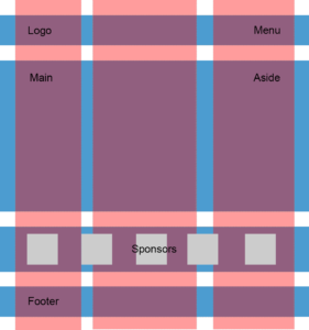
And just for good measure, here is another layout example using sGrid: This is a one-page layout with full-screen cover. Take a look at the responsiveness too.
When Not to Use sGrid
sGrid is not for every use case and sometimes it’s faster and better to use standard native flexbox implementation. sGrid is a tool that provides a quick way to create responsive grids, but many custom use cases could be achieved in a couple of lines without sGrid and only with flexbox. Of course, sGrid is useful if you’re not as familiar with flexbox yet because it provides a handy abstraction on top of flexbox.
You should also remember about browser support. Flexbox is supported by the newest browsers, so if you want to support older versions of IE, you shouldn’t use sGrid. Also, there are problems with flexbox on IE11, which can be fixed. Philip Walton’s flexbox bugs repo is useful for understanding its problems.
Final Words
I hope you’ll find sGrid useful. This is, of course, only an introduction. You can find sGrid in some cool tools like React boilerplate, Grunt boilerplate with Assemble, and other tasks. Also there is a Meteor package.
I’m open to your ideas so let me know in the comments what you think. This grid system probably can’t solve all flexbox use cases, but I think this it’s a good, fast, and light solution when using Stylus and you don’t want to dig into flexbox too much and don’t need to support old browsers. I’m sure you’ll find it to be a useful tool for mobile hybrid apps and also for fast prototyping.
 Julian Ćwirko
Julian is a Front-end and JavaScript developer from Poland, currently living in Wroclaw. He mostly focuses on Front-end and JavaScript/Meteor projects and he writes about front-end technologies on his blog, julian.io.