
 By
By
As the trends for web access via desktop and mobile converge, it is more important than ever for developers to test their code wherever users choose to access content on the web. This is why Mozilla has partnered with BrowserStack to offer free testing on mobile Firefox for Android (iOS upcoming). We understand that not every developer owns a device bank or has the time to test on every OS. Mozilla is committed to ensuring a healthy and robust web and we believe that cross-browser compatibility is a key component of that commitment.
The convenience of access everywhere
People often ask me to recommend a good camera. My answer has always been the same: the best camera, no matter its form factor or its features, is the one you carry around, the one that is always with you. Taking photos, like writing your thoughts, is something you want to be able to do anywhere.
The need to have access to information, to record your thoughts, to communicate with others through the Web doesn’t stop when you step out of your office or home. The convenience of access everywhere is more important than a large screen and a good keyboard.
It no longer makes sense to speak about the mobile Web. Interactions are mediated through many form factors and capabilities, including small screen devices with touch UIs. We need to cater for those and at the same time respect user choices for their devices and software.
The growth (and struggles) of the Web on mobile
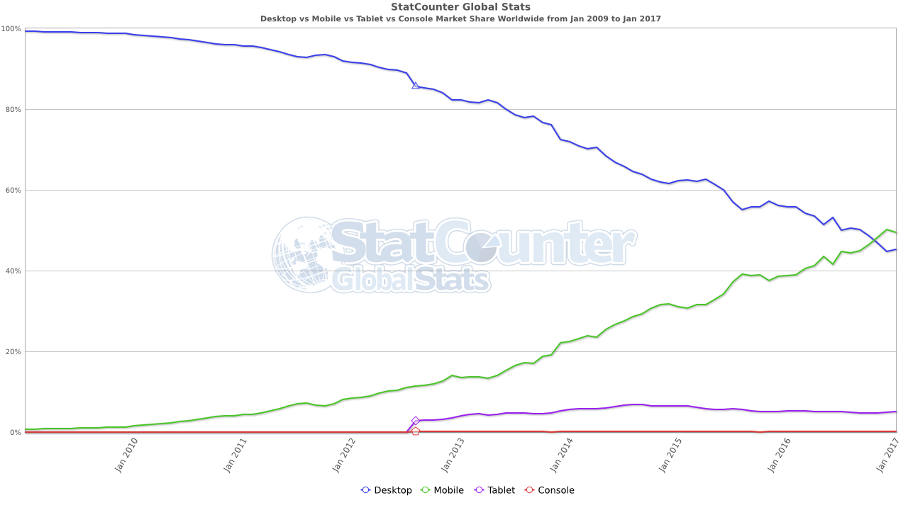
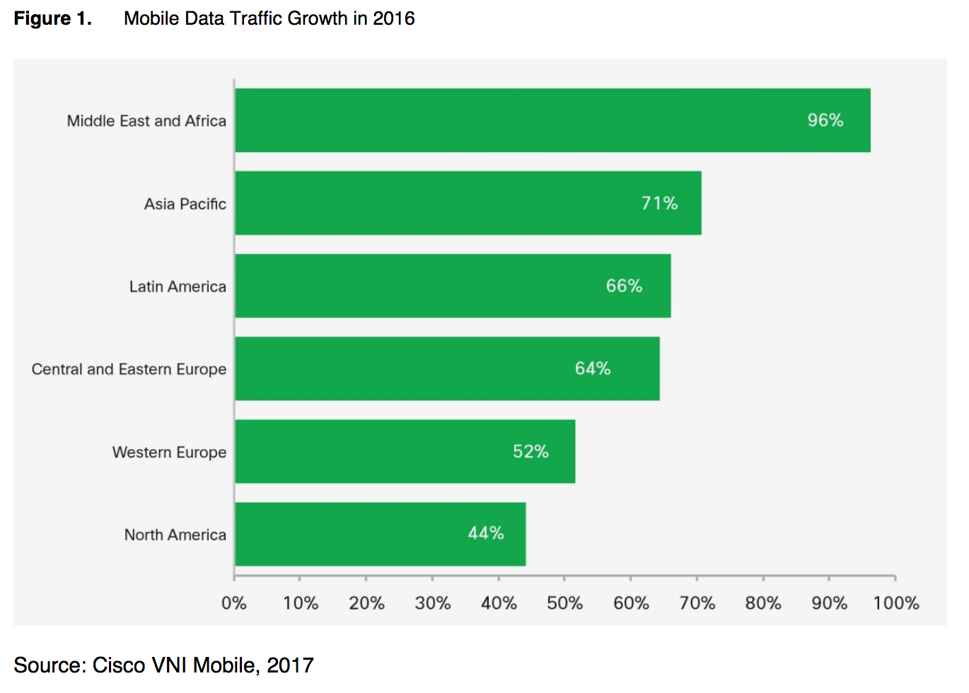
There’s been steady growth in web access via mobile devices since the time that mobile phones first had browsers. And growth of mobile traffic is projected to increase sevenfold before 2021. Increasingly, you can expect users and customers to visit on their mobile devices. Design your sites and apps so that they are flexible enough to adjust to many differing situations. Key design considerations include: layout, connectivity quality, performance, input interactions, and content accessibility. Design these to work responsively across a variety of form factors and OSes.
Historically, testing on mobile has been difficult. The cost of devices makes for an expensive testing pool. There were no great ways to debug web sites with the constraints of mobile browsers – it felt a bit like the pre-Firebug days on desktop. In the last couple of years, new developer tooling and 3rd-party services offering remote testing give developer better options.
Testing for speed, connectivity issues, screen density and size, touch interactions and different mobile user agents gives you the insights you need to optimize your mobile user experience. This kind of testing has become a reliable feature in desktop developer tools.
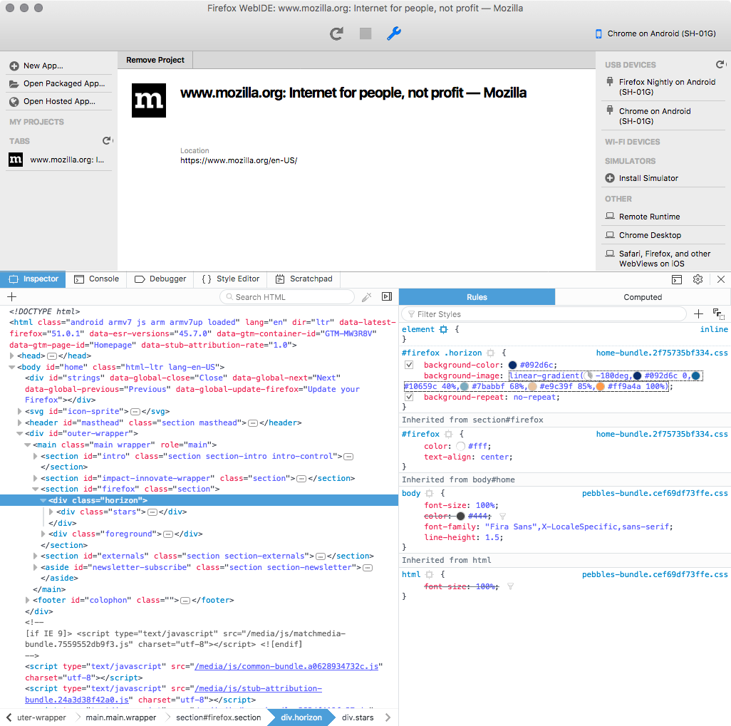
If you prefer to access the devices directly through USB or WIFI, developer tools can give you an overview of the device content that you can directly manipulate and interact with. Testing on a real mobile device from the desktop is essential.
In this example, we access the DOM of Chrome for Android on Firefox Desktop developer tools and modify the stylesheet values for testing.
The cost of not testing
It’s hard to understand all the ways a user may struggle when interacting with a website if you don’t put yourself in the user context. You run the risk of alienating and losing frustrated visitors, and you miss the opportunity to build your brand and connect with people if If you aren’t testing on a variety of browsers and devices.
Be careful with the metrics you are collecting. Statistics are a useful tool, but they can only reflect the reality you’ve created for them to measure. Basically, we measure only what we let in. Does your site work reliably on all modern browsers?
Some questions to ask yourself before you ship:
- Did you check if the menu is working with touch interactions?
- Did you check the layout adjusts well to different screen sizes including the content which has been uploaded by users?
- What is happening if the connection is breaking?
- Or just slow because the person is on a business trip with different network capabilities?
- Have you tested in more than one browsers?
- Is the content still readable once on a small screen at arms length?
These issues are known and are documented for you to be aware of; new issues will come up with future generation devices.
Best Practices
Mobile Development Best practices:
- Learn and use web standards.
- Make cross-browser testing part of your tool-chain.
- Learn how to remote-debug mobile devices (Firefox, Chrome).
- Learn how to use device emulators (Firefox, Chrome).
- Start testing on real mobile devices, on a variety of devices and network speeds, if possible (or simulate these speeds with developer tools).
- Try testing on mobile and desktop with our partner BrowserStack
All of your experience developing sites and apps on desktop should apply to mobile as well: just because something works in one browser, that’s no guarantee it will work for all your users — perhaps not even users of the same browser on different devices or platforms.
About Arcadio Lainez
More articles by Arcadio Lainez…
About Mike Taylor
Mike works at Mozilla as a Web Compatibility Engineer from Austin, TX.