The following is an extract from our book, CSS Master, written by Tiffany B. Brown. Copies are sold in stores worldwide, or you can buy it in ebook form here.
Let’s take a look at some pseudo-classes that are specific to form fields and form field input. These pseudo-classes can be used to style fields based on the validity of user input, whether the field is required or currently enabled.
All of the pseudo-classes that follow are specific to forms. As a result, there’s less of a need to limit the scope with a selector. Using :enabled won’t introduce side effects for span elements. Limiting the scope is helpful, however, when you want to syle various types of form controls differently.
:enabled and :disabled
As their name suggests, these pseudo-classes match elements that have (or lack) the disabled HTML5 attribute. This can be an input control such as input, select, or button element (seen shortly), or it can be a fieldset element:
<button type="submit" disabled>Save draft</button>Form elements are enabled by default; that is, they only become disabled if the disabled attribute is set. Using input:enabled will match every input element that is without a disabled attribute set. Conversely, button:disabled would match all button elements with a disabled attribute:
button:disabled {
    opacity: .5;
}
The figure shows the :enabled and :disabled states for our button element.

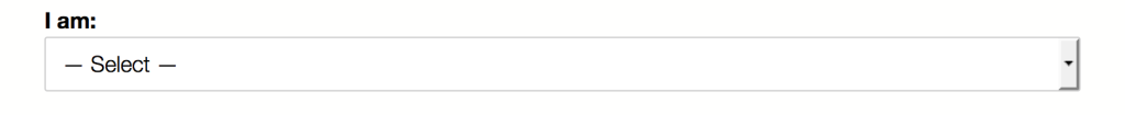
:required and :optional
Required and optional states are determined by the presence or absence of the required attribute on the field.[6] For example:
<p>
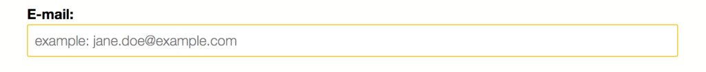
<label for="email">E-mail:</label>
<input type="email" id="email" name="email" placeholder="example: jane.doe@example.com" required>
</p>Most browsers only indicate whether a field is required once the form is submitted. With the :required pseudo-class, we can indicate to the user that the field is required before submission. For example, the following CSS will add a yellow border to our email field from above, and is shown in the figure below:
input:required {
    border: 1px solid #ffc107;
}
The :optional class works similarly, by matching elements that do not have a required attribute. For example, the CSS that follows gives us the results seen below.
select:optional {
    border: 1px solid #ccc;
}
:checked
Unlike the other pseudo-classes that we’ve covered, :checked only applies to radio and checkbox form controls. As the name indicates, this pseudo-class lets us define separate styles for selected inputs.
Unfortunately, styling radio controls and checkboxes in most browsers is about as pleasant as a trip to the dentist for a filling. CSS Basic User Interface Module Level 4 attempts to address this with the appearance property, but this property is not yet supported. WebKit/Blink-based browsers and Firefox do, however, support nonstandard, vendor-prefixed versions of it.
In order to create custom radio button and checkbox inputs that work well across browsers, we need to become clever with our selectors. We’ll use a sibling combinator, a pseudo-element, and :checked to create custom radio button and checkbox controls. For example, to change the style of a label when its associated radio button is checked, we could use the following CSS:
[type=radio]:checked + label {
    font-weight: bold;
    font-size: 1.1rem;
}
This makes the label bold and increases its size when its associated control is checked. We can improve this, though, by using the ::before pseudo-element with our label element to inject a custom control:
[type=radio] { opacity: 0; }

[type=radio] + label::before {
    background: #fff;
    content: '';
    display: inline-block;
    border: 1px solid #444;
    height: 1.2rem;
    margin-right: 1em;
    vertical-align: middle;
    width: 1.2rem;
}

[type=radio]:checked + label::before {
    background: #4caf50;
}
This gives us the customized controls you see below.

In order for this technique to work, of course, our HTML needs to be structured appropriately:
-
The
labelelement must be immediately adjacent to its input control. -
The form control must have an
idattribute in addition to thenameattribute (for example,<input type="radio" id="chocolate" name="flavor">). -
The
labelmust have aforattribute, and its value must match theidof the form control (for example,<label for="chocolate">Chocolate</label>).
Associating the label using for with the input ensures that the form input will be selected when the user clicks or taps the label or its child pseudo-element (::before).
:in-range and :out-of-range
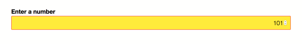
The :in-range and :out-of-range pseudo-classes can be used with range, number, and date input controls. Using :in-range and :out-of-range requires setting min and/or max attribute values for the control. Here’s an example using the number input type:
<p>
  <label for="picknum">Enter a number from 1-100</label>
  <input type="number" min="1" max="100" id="picknum" name="picknum" step="1">
</p>
Let’s add a little bit of CSS to change styles if the values are within or outside of our range of one to 100:
:out-of-range {
    background: #ffeb3b;
}

:in-range {
    background: #fff;
}
Should the user enter -3 or 101, the background color of #picknum will change to yellow as defined in our :out-of-range rule set (see the figure below). Otherwise, it will remain white as defined in our :in-range rule set.
:valid and :invalid
With the :valid and :invalid pseudo-classes, we can set styles based on whether or not the form input meets our requirements. This will depend on the validation constraints imposed by the type or pattern attribute value. For example, an input with type="email" will be invalid if the user input is “foo 123,” as represented in teh figure below.
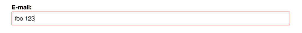
A form control will have an invalid state under the following conditions:
-
when a required field is an empty field
-
when the user’s input does not match the
typeorpatternconstraints -
when the field’s input falls outside of the range of its
minandmaxattribute values
Optional fields with empty values are valid by default. Obviously, if user input satisfies the constraints of the field, it exists in a valid state.
Form controls can have multiple states at once. So you may find yourself managing specificity (discussed in the next section) and cascade conflicts. A way to mitigate this is by limiting which pseudo-classes you use in your projects. For example, don’t bother defining an :optional rule set if you’ll also define a :valid rule set.
It’s also possible, however, to chain pseudo-classes. For example, we can mix the :focus and :invalid pseudo-classes to style an element only while it has focus: input:focus:invalid. By chaining pseudo-classes, we can style an element that has more than one state.
[6] Remember that in HTML5, the presence or absence of the attribute determines its value. In other words, required="false" has the same effect as required="true", required="required" and required.
Frequently Asked Questions on CSS Pseudo-Classes and Styling Form Fields
What are CSS Pseudo-Classes and how do they work?
CSS Pseudo-Classes are keywords that are used to select and style specific states of an element. They are added to CSS selectors to allow you to apply styles to elements based on their state, such as when they are hovered over, focused, or active. For example, the “:hover” pseudo-class is used to apply styles to an element when the user’s mouse is over it. Pseudo-classes can be used with any CSS selector, and they are always preceded by a colon (:).
How can I use CSS Pseudo-Classes to style form fields based on their input?
CSS Pseudo-Classes can be used to style form fields based on the user’s input. For example, the “:valid” and “:invalid” pseudo-classes can be used to apply styles to form fields based on whether the user’s input is valid or invalid. The “:required” pseudo-class can be used to style form fields that are required, and the “:optional” pseudo-class can be used to style form fields that are optional. These pseudo-classes can be very useful for providing visual feedback to users as they fill out a form.
What are some common CSS Pseudo-Classes and what do they do?
There are many CSS Pseudo-Classes, each with a different purpose. Some common ones include “:hover”, which applies styles when the user’s mouse is over an element; “:active”, which applies styles when an element is being activated by the user; “:focus”, which applies styles when an element has focus; “:visited”, which applies styles to links that the user has visited; and “:link”, which applies styles to links that the user has not yet visited.
Can I use multiple CSS Pseudo-Classes on a single element?
Yes, you can use multiple CSS Pseudo-Classes on a single element. For example, you could use the “:hover” and “:active” pseudo-classes together to apply different styles when the user’s mouse is over an element and when the element is being activated. When using multiple pseudo-classes, they should be listed in the order that they should be applied.
How can I use CSS Pseudo-Classes to style links?
CSS Pseudo-Classes can be used to style links in various states. The “:link” pseudo-class can be used to style links that the user has not yet visited, the “:visited” pseudo-class can be used to style links that the user has visited, the “:hover” pseudo-class can be used to style links when the user’s mouse is over them, and the “:active” pseudo-class can be used to style links when they are being clicked.
What are the differences between CSS Pseudo-Classes and Pseudo-Elements?
CSS Pseudo-Classes and Pseudo-Elements are both used to select and style specific parts of an element, but they are used in different ways. Pseudo-Classes are used to select and style specific states of an element, while Pseudo-Elements are used to select and style specific parts of an element’s content. For example, the “::before” pseudo-element can be used to insert content before an element’s content, and the “::after” pseudo-element can be used to insert content after an element’s content.
How can I use CSS Pseudo-Classes to style form fields that are required or optional?
The “:required” and “:optional” CSS Pseudo-Classes can be used to style form fields that are required or optional. The “:required” pseudo-class selects form fields that have the “required” attribute, and the “:optional” pseudo-class selects form fields that do not have the “required” attribute. These pseudo-classes can be used to provide visual cues to users about which fields are required and which are optional.
Can I use CSS Pseudo-Classes with other CSS selectors?
Yes, CSS Pseudo-Classes can be used with any CSS selector. For example, you could use the “:hover” pseudo-class with the “a” selector to apply styles to links when the user’s mouse is over them. You could also use the “:valid” and “:invalid” pseudo-classes with the “input” selector to apply styles to form fields based on the validity of the user’s input.
How can I use CSS Pseudo-Classes to style form fields based on the validity of the user’s input?
The “:valid” and “:invalid” CSS Pseudo-Classes can be used to style form fields based on the validity of the user’s input. The “:valid” pseudo-class selects form fields that contain valid input, and the “:invalid” pseudo-class selects form fields that contain invalid input. These pseudo-classes can be used to provide visual feedback to users about the validity of their input.
Are there any browser compatibility issues with CSS Pseudo-Classes?
Most modern browsers support CSS Pseudo-Classes, but there may be some compatibility issues with older browsers. It’s always a good idea to test your CSS in multiple browsers to ensure that it works as expected. If you find that a certain pseudo-class is not supported in a particular browser, you may need to use a different approach or provide a fallback for that browser.
 Tiffany Brown
Tiffany B. Brown is a freelance web developer and technical writer based in Los Angeles. Brown offers web development and consulting services to larger agencies and small businesses. A former member of the Opera Software developer relations team, Brown is also co-author of SitePoint's JumpStart HTML5 book. She sporadically writes about web development technology on her blog. You can follow her on Twitter at @webinista.


