This article was peer reviewed by Adrian Sandu, Giulio Mainardi and Tom Hodgins. Thanks to all of SitePoint’s peer reviewers for making SitePoint content the best it can be!
We are all familiar with using media queries in CSS to change the appearance of an element based on screen width. Element queries are similar to media queries, however, now the responsive conditions apply to individual elements on a web page instead of the viewport. For example, you can now apply different style rules to an element based on its own width, the number of characters that it contains or how much the user has scrolled.
Why Do We Need Element Queries?
As I mentioned in the introduction, element queries can help you style elements based on a number of properties instead of just the width and height of the viewport. Other than that, there are a few other situations where the library can prove to be of great use.
Let’s say you have just created a beautiful responsive layout where all the elements fit together perfectly. Now, you are asked to add another column to the web page alongside existing ones. This will reduce the space available for all columns.
Your images and text which had perfect proportions for an 800px wide column on 1366px wide viewport may not look so good inside a 600px wide column on the same viewport. In such cases, the viewport width has not changed at all but individual columns are narrower because they had to make space for the sidebar. Using element queries instead of media queries in situations like this one can save you a lot of time because you won’t have to rewrite the CSS every time there is a change in the layout.
In the following demo, if we have a smaller viewport (narrower than 500px), we set the image width to 100% and move it all into a single column. However, on a larger viewport, if you click on the “Add Sidebar” button, the width of our main column reduces significantly without any change in viewport width. Therefore, the image looks too small because the viewport width has not changed.
See the Pen Adding More Columns to a Layout by SitePoint (@SitePoint) on CodePen.
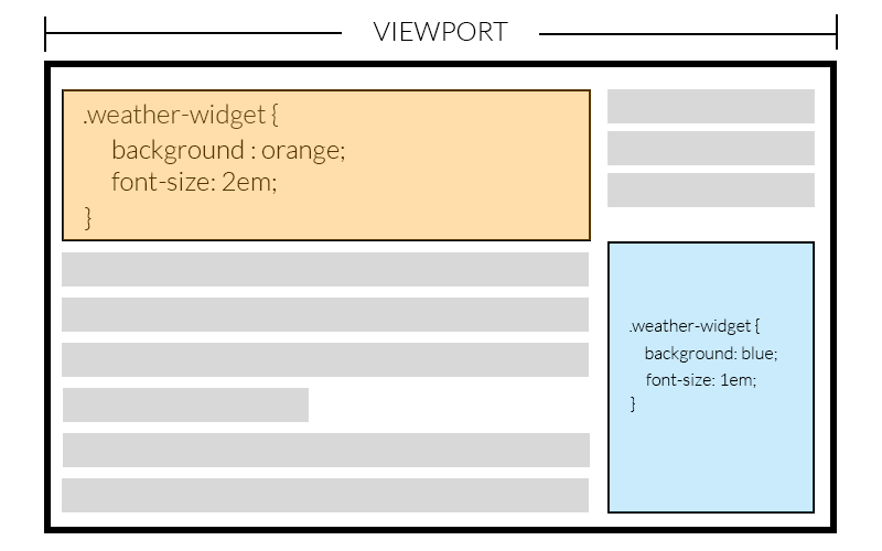
Now, let’s assume you are creating a widget or plugin and you are using media queries to make it responsive. The problem here is that the widget can be inside a container whose width is equal to the viewport or a container whose width is just one-fourth of the viewport. If the width of the widget depends on the width of its container, relying on the size of the viewport to style it properly won’t work. Element queries can now come to the rescue! Element queries can work well here because they use the widget’s own width to style it.
In the image below, the same widget has been placed twice on a web page. You can see that the viewport width is the same but the width of these two widgets is different. Since the style rules are being applied based on the width of widget, both of them fit perfectly in the layout.
Using element queries, the responsive conditions for an element become independent of the page layout. Therefore, you can create and style components like navigation bars and tables without worrying about surrounding elements. This means that a pricing table created for website A can be used directly in website B. It can be of immense help when you are creating templates.
Getting Started with EQCSS
To use element queries in your projects, you will have to include EQCSS.js in your HTML. You can download the file from their GitHub repository or link directly to the minified file hosted on CDNjs.
The plugin supports all modern browsers including IE9 and above. If you intend to support IE8, you will also have to include a polyfill in your project. The polyfill needs to be included before the actual plugin.
<!‐‐[if lt IE 9]>
  <script src="https://cdnjs.cloudflare.com/ajax/libs/eqcss/1.4.0/EQCSS-polyfills.min.js"></script>
<![endif]‐‐>
<script src="https://cdnjs.cloudflare.com/ajax/libs/eqcss/1.4.0/EQCSS.min.js"></script>
Once you have included the necessary files, you can start using EQCSS in your projects. There are two ways to do so. The easier one is to just write EQCSS in your regular CSS inside <style> or <link> tags. The other method is to separately include EQCSS styles inside a <script> tag with a custom type like this:
<script type=text/eqcss>
/* Put your EQCSS here */
</script>

or

<script type="text/eqcss" src="path/to/styles.eqcss"></script>
By default, the script executes and calculates all the styles once the content loads and after that, on resize and scroll events. Starting from version 1.2, the plugin has also started listening to input, click, mouseup and mousemove events as well. For scroll events, if the query is applied to either the body or html, the scroll event is attached to the window. In other cases, the scroll event is attached to the element specified in the query.
If you need to recalculate the styles based on any other event, you can call EQCSS.apply().
Writing Element Queries
The syntax of element queries closely resembles that of media queries. For example, each element query begins with @element followed by at least one selector that the styles are applied to.
@element {selector} and {condition} {
  /* All your valid CSS */
}
The image in the first demo that I created above could be made to fill the width of our container completely using the following query:
@element ".content" and (max-width: 480px) {
  .content img {
    width: 100%;
  }
}
With the above query, as soon as the width of our content goes below 480px, all the images inside it are set to have a width of 100%. The only problem now is that EQCSS recalculates styles only when the browser resizes or there is a click or scroll event. In our case, we will have to call EQCSS.apply() inside our “click” event for the button. Here is a demo to show how well our image adapts to the addition of another column (you might need to reduce the size of your SitePoint window if the element still isn’t below 480px):
See the Pen Managing More Columns with EQCSS by SitePoint (@SitePoint) on CodePen.
Conditions inside element queries are not limited to the width and height of the element. You can also style an element based on the number of characters inside it. One example that comes to mind is the card based layout on SitePoint’s homepage. All the cards under the featured section have the same width and height but the length of the card’s title can vary. When the title is too long to fit inside the card, you can use EQCSS to reduce its font size:
@element ".card h2" and (min-characters: 50) {
  $this {
    font-size: 1em;
  }
}
See the Pen Card Layout With Headings by SitePoint (@SitePoint) on CodePen.
Some of you might have noticed that I used $this instead of .card h2 here. That’s because using .card h2 will change the font size of all card headings and $this will only change the font size of headings that have more characters than the specified limit. Other selectors similar to $this are $parent , $prev and $next. All these selectors are collectively called meta-selectors.
Using Element Queries
Before deciding to give element queries a shot, SitePoint readers will likely want to know how the plugin actually works so they can decide for themselves if it is the right solution for their project (and understand how to avoid using it incorrectly). Here’s what it’s up to behind the scenes:
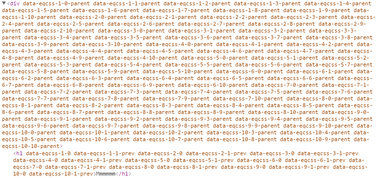
It loops through all element queries and finds the elements targeted by each query. After that, it loops through all those elements and assigns a unique identifier in the form of an attribute to each of them. The format of that identifier is data-eqcss-{element-query-index}-{matched-element-index}. To identify the parent of an element, a data attribute is added to the parent which is obtained by adding -parent to the element’s identifier. Similar attributes are also added to the previous and next sibling. Finally, each element and its query is matched against all the possible conditions like min-height, max-height, min-scroll-x and so on to apply proper styles to it.
The styles are added inside the <head> of the document. Throttling ensures that EQCSS.apply() is not called more than once every 200ms (the default timeout value). Unlike resize, input and click events, scroll events are only listened on elements which are using a scroll element query.
Since the styles for different elements are computed using JavaScript, this means that the performance depends on the number of elements to which the styles are being applied. With too many elements, there is noticeable lag in both Firefox and Edge. The performance has improved in the latest versions of Firefox and is expected to get better in future.
Ideally, the plugin should be adding one or two EQCSS data attributes per element. If you are not using them carefully, you might end up with a single element having tens of EQCSS attributes which will make the markup very messy. You don’t want your markup to end up like this image:
Please keep in mind that you don’t have to add any of these attributes manually in your original HTML. They are added automatically by the plugin at the time it runs.
Debugging element queries is a bit difficult compared to debugging media queries. At present, browsers are only aware of media queries — not element queries, so they only know about the styles that EQCSS has applied.
After reading about all these features, it might be tempting to completely replace media queries with element queries. Please avoid doing so. Firstly, media queries will run faster than element queries, as they rely on JavaScript to compute the styles. Using too many element queries can cause your site’s performance to take a dive (in Firefox and IE).
(As a side note: In 2015, the plugin worked smoothly in Firefox. However, at the start of 2016, they made some changes in the browser which resulted in the performance drop of the plugin and the developers had to add EQCSS.throttle() to the library to control how often the plugin recomputes the styles.
Secondly, media queries are not used just to style elements on a screen. They are also used to provide styles for other media types and features. As one example of this — you still need media queries to dictate the styles applied to a web page for printing.
Conclusion
EQCSS is a great tool when used properly. It helps you do a lot of things that are not possible with media queries. Performance can be an issue when there are a lot of elements on a web page but on the plus side, the syntax is similar to media queries so the learning curve isn’t too steep.
In future, browsers may gain features like ResizeObserver which will help the developers create better plugins for the min-width, max-width, min-height, and max-height conditions and Houdini which will let them add support directly into the browser. The developers will be working on creating a plugin which will take advantage of all these features but they plan to continue supporting the current EQCSS plugin too. Their aim is to develop a family of plugins which each suit the specific browsers we are looking to support.
What’s your opinion about this library? Have you used it in any of your projects? Let us know in the comments.
Frequently Asked Questions about EQCSS
What is EQCSS and how does it differ from regular CSS?
EQCSS, or Element Query CSS, is a JavaScript plugin that allows developers to write element queries. Unlike regular CSS, which applies styles based on the viewport’s size, EQCSS applies styles based on the size of an element itself. This means that you can create more responsive designs that adapt to the size of the content, rather than the size of the screen. This is particularly useful for components that may appear in different contexts or sizes on a page.
How do I install and use EQCSS?
EQCSS can be installed via npm or downloaded directly from the EQCSS GitHub repository. Once installed, you can include it in your project by linking to the EQCSS.js file in your HTML. To use EQCSS, you write your element queries in a separate .eqcss file, which you then link to in your HTML. The syntax for writing element queries is similar to regular CSS, but with some additional features and syntax.
What are the benefits of using EQCSS?
EQCSS offers several benefits over regular CSS. Firstly, it allows for more responsive designs that adapt to the size of the content, rather than the size of the screen. This can lead to a better user experience, as components will always be displayed in a way that suits their content. Secondly, EQCSS can help to reduce code duplication, as you can write styles that apply to all instances of a component, regardless of its size or context.
Can I use EQCSS with other CSS preprocessors?
Yes, EQCSS can be used alongside other CSS preprocessors like Sass or Less. You can write your element queries in your .eqcss file, and then include that file in your main CSS file using the @import rule. This allows you to take advantage of the features of both EQCSS and your preprocessor of choice.
Are there any browser compatibility issues with EQCSS?
EQCSS is compatible with all modern browsers, including Chrome, Firefox, Safari, and Edge. However, it may not work correctly in older browsers or versions of Internet Explorer. If you need to support these browsers, you may need to use a polyfill or fallback styles.
Can I use EQCSS for mobile-first design?
Absolutely! EQCSS is perfect for mobile-first design. Because it allows you to style elements based on their size rather than the viewport size, you can create designs that adapt to the content, regardless of the screen size. This can lead to a better user experience on mobile devices, where screen real estate is often limited.
How does EQCSS handle nested elements?
EQCSS handles nested elements in the same way as regular CSS. If you write an element query for a parent element, it will apply to that element and all of its children. However, you can also write element queries for individual child elements, which will override any styles inherited from the parent.
Can I use EQCSS with JavaScript frameworks like React or Vue?
Yes, EQCSS can be used with any JavaScript framework or library. You can include the EQCSS.js file in your project and then write your element queries in a separate .eqcss file. You can then import that file into your components using the standard import syntax.
Are there any performance issues with EQCSS?
EQCSS is designed to be lightweight and fast, so it should not have a significant impact on your site’s performance. However, as with any JavaScript plugin, it’s important to use it judiciously and test your site’s performance regularly.
Where can I find more resources on EQCSS?
The official EQCSS GitHub repository is a great place to start. It includes a detailed readme, examples, and links to further resources. You can also find tutorials and articles on sites like SitePoint and Smashing Magazine.
 Baljeet Rathi
Baljeet is a writer and web developer based in India. Although he is a full-stack developer, he is most passionate about things related to the front-end. He has been involved with web development for more than five years now.