A Clean Responsive Web Design Menu Tutorial with CSS, HTML, and jQuery
Thursday January 19th, 2017
In this article, we’ll break down Brolik’s new responsive web design menu and explain how the code works line by line.
This blog is a re-examination of the “slide in” approach to a responsive web design menu which I wrote about two years ago. Since then, some things have changed in the web design world and at Brolik we’ve developed:
An agile, cross browser responsive web design menu.
Below you’ll find explanations of all the HTML, CSS, and jQuery that make this menu function.
The Approach
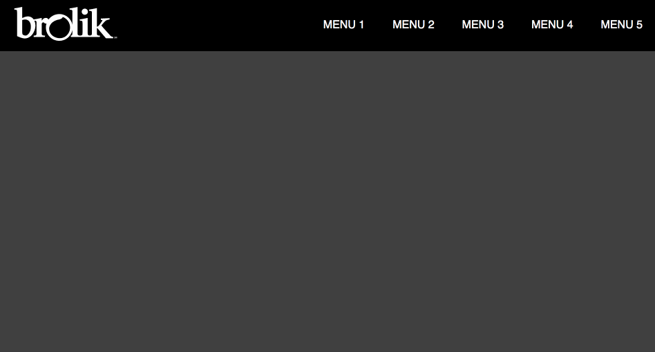
This responsive header solution is purposefully basic in its design. Generally, we like simple, utilitarian menus for their usability and versatility. As always, the logo is positioned in the top left for maximum brand recall. The menu options slide all the way to the right to take advantage of the screen real estate at hand. The submenus are revealed with a hover on desktop sizes and a click/tap on mobile sizes. Through some SCSS plus a bit of Flexbox, a few embedded SVGs, and a couple lines of jQuery we get a clean and powerful responsive web design menu system that works in all modern browsers.
Here’s the CodePen Demo. Now, let’s break down the code.
The HTML
Here is the HTML to set everything up for the various responsive techniques. The first element is the “header” that contains the two sections, “logo” and “menu.” Inside of “menu” we use an unordered list to hold all of the menu and submenu options.
See the Pen Responsive Web Design Menu by Alex Caldwell (@ACaldy) on CodePen.
Menu options that have a submenu get the class “withSubmenu.” Within the menu list items we have the “flexbox-container” div that will assist us with some flexbox positioning for the mobile menu. There’s also the “icon-arrow” that holds the down arrow SVG which we’ll use to reveal the submenu at mobile sizes. Obviously, menu and submenu options can be added or deleted based on your needs. After “menu,” the “hamburger” menu icon and background “dimmer” sit hidden for use at mobile size.
The CSS
Here is the CSS that does all of the heavy lifting. The first few lines are variables used mainly for controlling colors, as well as the mobile border, font family, and the mobile breakpoint. Most of the changes and customization that you’ll want to do to the menu can be done here without needing to edit the CSS below.
See the Pen Responsive Web Design Menu by Alex Caldwell (@ACaldy) on CodePen.
Desktop: Lines 31-89
We start with the .header and .logo classes. The main thing to note with the .header class is the use of flexbox to space out the .logo and .menu elements within it. We use compass mixins to write the flexbox shorthand, which will output the browser specific prefixes. The flexbox attribute justify-content:space-between will float .logo to the left and .menu to the right.
The next few lines from 44-89 are where we set up .menu for desktop sizes. The list items get display:inline-block so that they fall nicely inline. The main menu options get display:block and some padding to increase their hit area.
Below that on line 57, we style and position the .submenus. They’re initially hidden with display:none and we make them stick in place on hover with position:absolute. The width:150px is an arbitrary number and could be increased or decreased depending on the width of the submenu options. If they get close to the edge of the browser you can move them left with a negative margin-left. On line 70, the submenus are revealed with the &:hover on the li by overwriting the display:none with a display:block.
Mobile: Lines 91-227
This is where most of the heavy lifting occurs. The first thing we do is hide the unordered list by making it position:fixed, left:0 and adding margin-left:-1000px.
The Menu Slide Out
On line 103 we introduce the .active class that we’ll apply to .menu. Essentially, it positions the menu to the left of the screen with position:fixed and left, bottom, top set to zero. Inside the ul, we change the margin-left to zero which will slide the entire ul menu holder out from right to left. We also make sure the menu doesn’t overlap the hamburger icon by setting it to width: 75vw, which is 75% of the width of the viewport. And lastly, we make the menu scrollable if it is taller than the screen with overflow-y: scroll.
Inside of the ul, the li’s stack with display:block. We also override the submenu hover on line 117 by keeping it display:none, we’ll display it on click later.
Toggling the Submenus
On line 128, we use the the .flexbox-container class in order to target the menu options with submenus and use flexbox to position them next to the down arrows.
On Line 150, we hide the .submenus by forcing max-height:0 and overflow:hidden. Next, the .showSubmenu class on line 155 is what we’ll use to open and close the submenu with a jQuery toggle function. The .submenu class gets a max-height:1000px (or a value larger than its actual height) as well as display:block and overflow:inherit. The last thing to note here is on line 174 where we rotate the .icon-arrow’s 180 degrees.
The Animated Hamburger Icon
The animated hamburger icon we use is adapted from Elijah Manor’s CodePen. On line 181, we position:absolute the .hamburger class and position it to the right:10px. To create the hamburger icon we use a span and the :before and :after pseudo elements to create three horizontal bars. We move the top and bottom bars -14px in either direction to create the icon. Then, on line 209, when the .active class is applied to the .hamburger container, we hide the middle span by changing the background-color to transparent. We then set top:0 for the :before and :after elements and rotate them each 45 degrees to create the ‘X’.
Dimmer and no-scrolling
The last bit of CSS on line 229 is for the dimmer div that will fill the entire screen with a transparent background-color. Which, we’ll toggle on and off with the .active class and some jQuery. We apply the .no-scrolling class on line 242 to the body element in order to stop interactions with the background and put all of the focus on the mobile menu.
The jQuery
I prefer to write in jQuery, but you could certainly do this in basic javascript if you wanted. Here we’re simply using the toggleClass method to add and remove classes.
See the Pen Responsive Web Design Menu by Alex Caldwell (@ACaldy) on CodePen.
When the .hamburger div is clicked we call the function showHideMobile() and add the respective .active classes to .hamburger, .menu, .dimmer as well as the class .no-scrolling to the body. We use a function, so that if the user clicks on the .dimmer div when the menu is open, we can call the same function and close the mobile menu. We use the same toggleClass technique with the .submenus, where we toggle the class .showSubmenu to slide the .submenus up and down when the icon-arrow is clicked.
In Conclusion
At Brolik, we are passionate about giving back to the web design community whenever we can. The techniques outlined above have been learned and borrowed over the years from generous thought leaders within the responsive web design community, which we’re very grateful for. Hopefully, this approach allows you to create a clean and usable responsive menu for your own website. Feel free to take the code and use it however you would like.
If you have any questions or comments feel free to reach out to me on twitter @ACaldy.