Far too often I see people don’t quite understand the differences between width and device-width (and expanding upon that, other examples such as min-device-width and max-device-width), when using CSS media queries. This misunderstanding results in poor code and ultimately more work for the developer. I’ve seen this question quite often over on the SitePoint Forums, so I felt it was time to give some further explanation. I’ll be touching on this, along with expanding on which option you should be using when building your responsive websites.
Basic Definitions
Let’s define what we mean when we talk about media queries based on “width” and “device-width”. The following quotes are from MDN’s article on Media Queries and below is the definition of “width”:
The
widthmedia feature describes the width of the rendering surface of the output device (such as the width of the document window, or the width of the page box on a printer).
And following is MDN’s definition of “device-width”.
Describes the width of the output device (meaning the entire screen or page, rather than just the rendering area, such as the document window).
So what does this really mean? Well, in basic terms, width and device-width refer to the width of the device and not the width of the viewport, which could be something totally different. All you are essentially interested in is the width of the viewport no matter the device.
However the main difference between width and device-width is that device-widths don’t always match the layout viewport of said device.
Many tablets and mobile devices don’t always have 1 device pixel per CSS pixel. The iPhone 4, for example, has 2 device pixels per CSS pixel. For reference, you should know that the iPhone 4 has a regular screen layout viewport of 640×960. This means that, in this example, the device-width of the iPhone4 is 320×480. This is the case because Apple realizes that not every website is built responsively (shame on them) and tries to please everyone by having around 980px width to accommodate the desktop view of the website. This means, that if there is no meta viewport tag in place, the iPhone4 will take your website, render it as if it were 980px wide, squish it into a 320px display, and as a result, would be zoomed out to the user.
Getting Started
First, as with getting all websites to become responsive and adhere to media queries, the viewport meta tag must be placed in the <head> section of your web page. The basic standard version of this is shown below.
<meta name="viewport" content="width=device-width,initial-scale=1">Once we have this snippet of code in our webpage, if we view the page with different devices, the different media queries will be able to have the correct effect. Without this, viewing the page in the specific device would basically just display a zoomed-out version of your page; it would be attempting to cram your entire website into its 320px wide display. Not good for you or your users! Users don’t like having to zoom to view your website’s content, and they certainly don’t want to deal with the vertical scrolling that would result.
For example, let’s take the iPhone 4, which has a 980px width default viewport. Without the meta tag in place, your attempt at media queries would go horribly wrong and it would incorrectly reference the default viewport. Most mobile media queries target around 500px or under. This is usually accomplished by a simple max-width media query. Without themeta tag, you wouldn’t see this query take effect, since the iPhone 4 would still be displaying the 980px width version of your website. Take a look at the below example:
body {
  background: white;
}

@media screen and (min-width: 980px) /* Desktop */ {
  body {
    background: red;
  }
}

@media screen  and (max-width: 979px) /* Tablet */ {
  body {
    background: blue;
  }
}

@media screen and (max-width: 500px) /* Mobile */ {
  body {
    background: green;
  }
}
There are two demo links with accompanying screenshots below, taken using an iPhone 4. Both pages have the above CSS, but one uses the viewport meta tag while the other does not. Please note that if you test the demos, you need to test on a small mobile device to see the correct results.
Here’s the first demo (without the meta tag)
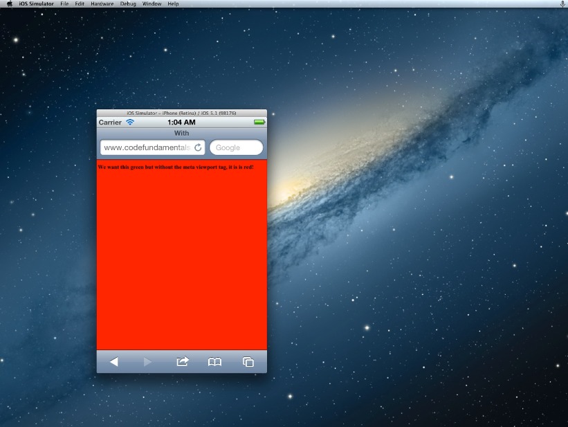
The above page did not have the meta tag and, as a result, the background is red and is emulating the 980px wide default layout viewport instead of using the 500px mobile media query!
Here’s the second demo (with the meta tag)
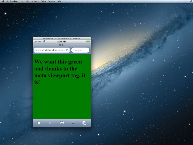
Now the meta tag is in place and iOS is correctly showing the page how we want it: It’s based on the 320px width and allowing our media queries to work the way we expect it to.
Why Choose device-width?
I’ll be honest from the get-go and let you know that this article is headed towards not using device-width. device-width does have its place; if you intend on targeting specific devices, then yes by all means use device-width.
From a CSS and RWD standpoint, a good website is one that is essentially ‘device-agnostic’ and does not attempt to pander to each individual device width. Targeting the specific breakpoints for different ‘types’ of devices (e.g. tablets or mobile devices) is achieved by focusing on how the content displays at certain viewport widths and then making changes with media queries as appropriate. So the device does not dictate the breakpoint, the layout and content does, and ultimately this will produce the best results; both from your perspective and for your users.
This might also be why I see people having issues building responsive designs, complaining how difficult it is. But if they are trying to style devices individually, they’re fighting a losing battle: the number of devices you would have to account for (to be thorough) is just too overwhelming and just amounts to poor coding. Also I should mention that if you were to go with device-width, you would have to also provide separate rules for orientation (portrait vs. landscape): device widths do not change simply because you rotate the device sideways. That’s adding even more code, and more headaches!
However, let’s look at the other option we have.
What About “width”?
I’m of the opinion, along with many other seasoned developers, that having a fully responsive page that behaves as expected throughout all possible screen sizes is the easiest and most beneficial way to go about getting the most effective layouts on all devices.
To build a fully responsive and fluid page, the developer simply has to ensure that all viewports are accounted for and the page restructures and resizes as needed to suit the content and the design.
All you need for a fully responsive web page is a fluid website, and some well targeted media queries to target the normal range of mobile devices, tablet devices, and desktop+ viewports. I prefer using Foundation’s Media Queries, which I find to be quite accurate and encompasses all the necessary viewports.
Of course, like anything in development, using width-based queries alone is not a solution to all layout bugs. It likely will still be necessary to test on individual mobile devices for random bugs and rendering quirks, But as far as seeing how the different mobile devices will look, it’s as easy as taking your browser window and resizing it.
For testing, I use the Chrome extension Responsive Web Design Tester. It lets you select a specific device and you’ll see the device size and the way your page will display in that device.
One more quick benefit I’d like to add is that using width-based queries ensures future devices will still display the website fine. It’s essentially future-proof, because you’re targeting something that’s universal — the general viewport size — not something that’s specific to the device.
In Conclusion
Do you still plan on using device-width in your media queries? Were my arguments not compelling enough? Using the regular “width” and the viewport of the device simplifies responsive design and, ultimately, I feel like is the better choice, and something that should be used almost exclusively. Feel free to leave a comment in the discussion below and let me know your thoughts and whether or not you agree.
Frequently Asked Questions on Media Queries: Width vs Device Width
What is the difference between width and device-width in media queries?
In CSS media queries, ‘width’ and ‘device-width’ are two properties that help in creating responsive designs. ‘Width’ refers to the viewport width, which is the visible area of your web page on the screen. It changes as you resize your browser window. On the other hand, ‘device-width’ refers to the screen resolution of the device, which remains constant regardless of the size of the browser window.
When should I use width and when should I use device-width in my CSS?
The choice between ‘width’ and ‘device-width’ depends on your design needs. If you want your design to adapt to the size of the browser window, use ‘width’. This is useful for fluid layouts that adjust to different window sizes. If you want your design to adapt to the physical characteristics of the device, use ‘device-width’. This is useful for designs that need to look consistent across different devices.
Can I use both width and device-width in the same media query?
Yes, you can use both ‘width’ and ‘device-width’ in the same media query. However, it’s important to understand how they work together. The ‘width’ query will override the ‘device-width’ query if both conditions are met. This means that if your device-width is 800px and your width is 600px, the styles for 600px will be applied even if the device-width condition is also met.
How do I write a media query using width or device-width?
Writing a media query using ‘width’ or ‘device-width’ is straightforward. Here’s an example of a media query using ‘width’:@media screen and (max-width: 600px) {
body {
background-color: lightblue;
}}
And here’s an example using ‘device-width’:@media screen and (max-device-width: 480px) {
body {
background-color: lightblue;
}}
In both examples, the background color of the body changes to light blue when the conditions are met.
What are min-width and max-width in media queries?
Min-width’ and ‘max-width’ are properties used in media queries to apply styles within a specific range of viewport widths. ‘Min-width’ applies styles for viewport widths greater than or equal to the specified value, while ‘max-width’ applies styles for viewport widths less than or equal to the specified value.
What are min-device-width and max-device-width in media queries?
Similar to ‘min-width’ and ‘max-width’, ‘min-device-width’ and ‘max-device-width’ are used to apply styles within a specific range of device screen resolutions. ‘Min-device-width’ applies styles for device widths greater than or equal to the specified value, while ‘max-device-width’ applies styles for device widths less than or equal to the specified value.
Can I use width and device-width in the same media query?
Yes, you can use both ‘width’ and ‘device-width’ in the same media query. However, it’s important to understand how they work together. The ‘width’ query will override the ‘device-width’ query if both conditions are met. This means that if your device-width is 800px and your width is 600px, the styles for 600px will be applied even if the device-width condition is also met.
How do I write a media query using width or device-width?
Writing a media query using ‘width’ or ‘device-width’ is straightforward. Here’s an example of a media query using ‘width’:@media screen and (max-width: 600px) {
body {
background-color: lightblue;
}}
And here’s an example using ‘device-width’:@media screen and (max-device-width: 480px) {
body {
background-color: lightblue;
}}
In both examples, the background color of the body changes to light blue when the conditions are met.
What are min-width and max-width in media queries?
Min-width’ and ‘max-width’ are properties used in media queries to apply styles within a specific range of viewport widths. ‘Min-width’ applies styles for viewport widths greater than or equal to the specified value, while ‘max-width’ applies styles for viewport widths less than or equal to the specified value.
What are min-device-width and max-device-width in media queries?
Similar to ‘min-width’ and ‘max-width’, ‘min-device-width’ and ‘max-device-width’ are used to apply styles within a specific range of device screen resolutions. ‘Min-device-width’ applies styles for device widths greater than or equal to the specified value, while ‘max-device-width’ applies styles for device widths less than or equal to the specified value.
 Ryan Reese
Web developer based in Maryland with a passion for HTML and CSS. He spends his free time learning and bettering himself, and enjoying some Netflix while he does it. He blogs about front-end web development topics at codefundamentals.com.