In the last couple of years we’ve often heard about hardware acceleration and how it helps to improve animation on web pages, making them nice and smooth even on mobile browsers. But I think a lot of less experienced developers don’t know how hardware acceleration works and how we can use it properly to make our animations shine.
The term itself sounds like something overly complicated, close to higher mathematics. In this article, I’ll shed some light on this subject and demonstrate how to utilize this technique in your front-end projects.
Why Should I Care?
Let’s look at a simple animation example containing several balls stacked on top of one another (that is, on the z-axis, so it looks like one ball). The goal is to move this group of balls with animation. The easiest way to do this is to adjust the left and top properties. We could do this with JavaScript, but we’ll use CSS animations instead. Please note that I’m excluding any vendor prefixes but you should use something like Autoprefixer to ensure full compatibility.
.ball-running {
  animation: run-around 4s infinite;
}

@keyframes run-around {
  0%: {
    top: 0;
    left: 0;
  }

  25% {
    top: 0;
    left: 200px;
  }

  50% {
    top: 200px;
    left: 200px;
  }

  75% {
    top: 200px;
    left: 0;
  }
}
Here is a live demo that uses a button to initiate the animation with JavaScript:
See the Pen Animating overlapping balls with top/left Properties by SitePoint (@SitePoint) on CodePen.
After clicking the “Start Animation” button, you’ll notice that the animation doesn’t look very smooth, even on a desktop browser. If you test the animation on your mobile device, you’ll see that it’s far from 60fps. To fix this, we can use CSS transform using the translate() function, instead of animating the top and left values.
.ball-running {
  animation: run-around 4s infinite;
}

@keyframes run-around {
  0%: {
    transform: translate(0, 0);
  }

  25% {
    transform: translate(200px, 0);
  }

  50% {
    transform: translate(200px, 200px);
  }

  75% {
    transform: translate(0, 200px);
  }
}
Try the above code in the demo below:
See the Pen Animating overlapping balls with CSS transforms by SitePoint (@SitePoint) on CodePen.
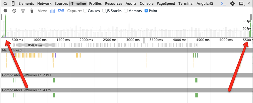
Now the animation is nice and smooth. Great! So why did this help? Well, CSS transforms don’t cause repaints, unlike animations with the left and top properties. Let’s look at the Timeline panel in Chrome’s DevTools during the animation execution:
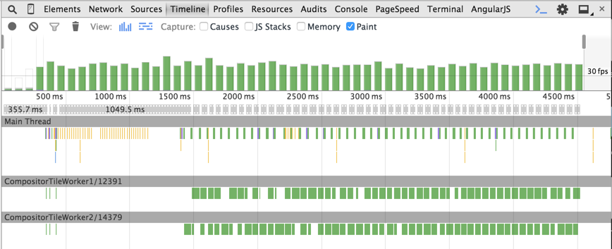
In the left and top example, we can see green bars at each animation step. This is an expensive repainting operation. The animation frame rate is less than 60fps, which we always aim at achieving to make the animation smooth.
Now look at the timeline in the case of CSS transforms:
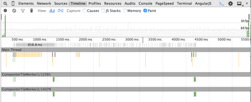
As you can see, there are no green bars during the animation.
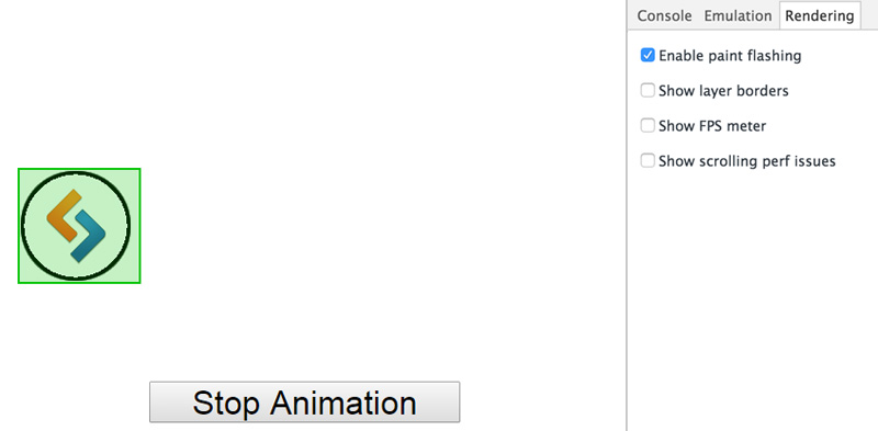
Another feature available in Chrome’s DevTools to track the repainting process is “Enable paint flashing”. You can find this option by opening the DevTools, hitting the ESC key, then choosing the “Rendering” tab. When this feature is turned on, green boxes (i.e. paint rectangles) will appear around repainted areas. In the left and top example, the balls have a green box for the entire animation process, indicating the repaints.
On the other hand, in the CSS transforms example, the paint rectangle is displayed only on the first and last animation frames.
So how exactly do transforms render the animation without repaints? The basic answer is that CSS transforms occur directly in the GPU memory that utilizes hardware acceleration, which avoids software rendering. Let’s look at this in more detail.
How Hardware Acceleration Works
When the browser receives a page’s markup, it parses it to build the DOM Tree. The DOM Tree and CSS allow the browser to build the Render Tree. The Render Tree consists of render objects – the elements to be rendered on the page. Each render object is assigned to a graphic layer. Each layer is uploaded to GPU as a texture. The trick here is that the layer may be transformed in the GPU without repainting, like in the case of 3D graphics. These transformations are made by the separate Compositor process. You can find more information about the composition in Chrome here.
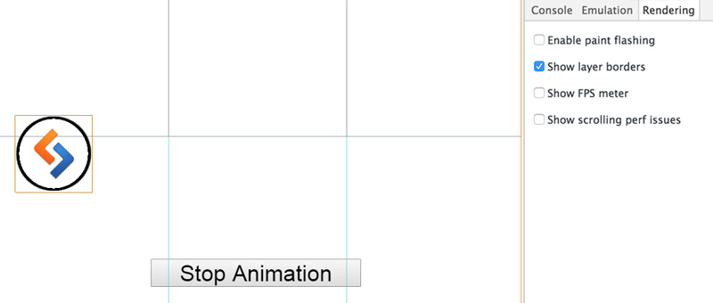
In our example, the CSS transform creates a new composite layer that can be transformed directly in the GPU. Chrome’s DevTools allow for viewing composite layers using the “Show layer borders” option. Each composite layer has an orange border.
Our balls with the CSS transformation have orange borders and are moved to separate composite layers:
At this point, you might ask: When does a browser create a separate composite layer?
It does so in the following cases:
- For 3D or perspective CSS transforms (in our example)
- For
<video>or<canvas>elements - When using CSS filters
- For an element that overlaps another element extracted to a composite layer (e.g., using
z-index)
You might be thinking, ‘Hold on. This example used 2D translation, not 3D transforms’. And you’re right. That’s why there are two extra repainting operations – at the start and end of the animation process in our timeline.
The difference between the 3D and 2D transforms is that 3D transforms make the browser create a separate composite layer beforehand, while 2D transforms do it on the fly. At the start of the animation, a new composite layer is created and the textures are loaded to the GPU, which initiates the repainting. Then the animation is performed by the Compositor in the GPU. When the animation is finished, the additional composite layer is removed, which results in another repainting operation.
Rendering Elements in the GPU
Not all CSS property changes on elements can be handled directly in the GPU. Only the following properties are supported:
transformopacityfilter
And so to ensure the best chance for a smooth, high-quality animation, we should always try to use these GPU-friendly properties.
Forcing an Element to Be Rendered in GPU
In certain cases, it may be required to render an element in the GPU even before the animation has begun. This helps avoid the first repainting operation caused by the new layer creation. To achieve this, the so called “transform hack” may come in handy.
.example1 {
  transform: translateZ(0);
}

.example2 {
  transform: rotateZ(360deg);
}
What this does is let the browser know that we want to perform a 3D transform. This makes the browser create a separate layer and move the element to the GPU beforehand, thus triggering hardware acceleration.
This technique can also be useful when the repainting of one element is too expensive due to another element behind it. Let’s go back to the first example, and slightly change it so that it contains a single ball and a container with a background image blurred using CSS filters. The ball is animated with the left and top properties.
See the Pen Animating a ball with top/left properties by SitePoint (@SitePoint) on CodePen.
Again, the ball movement is jerky. This happens because each repainting operation costs too much due to the blurred background.
Now let’s add the transform hack to the container.
See the Pen Animating left/top properties with hardware acceleration by SitePoint (@SitePoint) on CodePen.
The result is not too bad and the animation works well. Why? Because now the blurred paint-expensive background is moved to another composite layer, and the repainting of the ball at each animation step is cheap.
Use Hardware Acceleration with Caution
Nothing comes for free. There are some issues related to hardware acceleration.
Memory
The most important issue is related to memory. Loading too many textures to the GPU may cause memory issues. This is really critical on mobile devices and can even crash a mobile browser. Mind the consequences and don’t use hardware acceleration for every element on a page.
Font rendering
Rendering in the GPU influences font anti-aliasing. This happens because GPU and CPU have different rendering mechanisms. Thus, even if you turn off hardware acceleration at the end of an animation, the text will be displayed blurred during the animation. You can read more about font rendering issues in this post by Keith Clark.
The Near Future
The necessity to use the “transform hack” to create separate composite layers is cumbersome. Browsers should definitely provide a straightforward way to do this. That’s why the will-change property has been introduced. This feature allows you to inform the browser which property is going to change, so the browser can make corresponding optimizations beforehand. Here’s an example that informs the browser that the transform property will be changed:
.example {
  will-change: transform;
}
Unfortunately, not all browsers support will-change. You can learn more about will-change in the following resources:
- An Introduction to the CSS will-change Property by Nick Salloum
- Everything You Need to Know About the CSS will-change Property by Sara Soueidan.
Conclusion
To summarize what we covered:
- Utilizing GPU can improve the quality of your animations
- GPU-rendered animations should be 60fps on every device
- Use GPU-friendly CSS properties
- Understand how to force an element to be rendered in the GPU using the “transform hack”.
If you’ve used these techniques, or have any feedback, please feel free to offer your comments.
Frequently Asked Questions on Hardware Acceleration and CSS Animations
What is the role of GPU in hardware-accelerated CSS animations?
The Graphics Processing Unit (GPU) plays a crucial role in hardware-accelerated CSS animations. It is responsible for rendering graphics and image processing. When CSS animations are hardware-accelerated, the GPU takes over the task of rendering the animations from the Central Processing Unit (CPU). This results in smoother, faster, and more efficient animations as the GPU is specifically designed to handle such tasks.
How does hardware acceleration improve the performance of CSS animations?
Hardware acceleration improves the performance of CSS animations by offloading some of the graphical processing tasks from the CPU to the GPU. This allows the CPU to focus on other tasks, thereby improving the overall performance of the website or application. Additionally, the GPU is better equipped to handle graphical tasks, resulting in smoother and more efficient animations.
Are there any drawbacks to using hardware-accelerated CSS animations?
While hardware-accelerated CSS animations can greatly improve performance, there are potential drawbacks. One of the main concerns is compatibility issues. Not all devices or browsers support hardware acceleration, which could lead to inconsistent user experiences. Additionally, overuse of hardware acceleration can lead to increased power consumption, which could be a concern for mobile devices.
How can I enable hardware acceleration for CSS animations?
Enabling hardware acceleration for CSS animations can be done by using the ‘transform’ property in your CSS code. This property triggers the GPU to take over the rendering of the animation. For example, you could use ‘transform: translateZ(0)’ or ‘transform: rotate(0deg)’ to enable hardware acceleration.
What types of CSS animations benefit most from hardware acceleration?
CSS animations that involve complex graphical tasks, such as 3D transformations, transitions, and keyframe animations, can greatly benefit from hardware acceleration. These tasks can be resource-intensive when handled by the CPU, but the GPU can process them more efficiently, resulting in smoother animations.
How can I ensure compatibility when using hardware-accelerated CSS animations?
To ensure compatibility when using hardware-accelerated CSS animations, it’s important to test your website or application on various devices and browsers. You can also use fallbacks in your CSS code to provide alternative animations for devices or browsers that do not support hardware acceleration.
Can hardware acceleration be used with CSS transitions?
Yes, hardware acceleration can be used with CSS transitions. By using the ‘transform’ property, you can trigger the GPU to render the transition, resulting in a smoother and more efficient animation.
How does hardware acceleration affect battery life on mobile devices?
While hardware acceleration can improve the performance of CSS animations, it can also increase power consumption, potentially affecting battery life on mobile devices. It’s important to strike a balance between performance and power consumption when using hardware acceleration.
Can I use hardware acceleration for 2D animations?
Yes, hardware acceleration can be used for 2D animations. By using the ‘transform’ property in your CSS code, you can trigger the GPU to render the animation, resulting in a smoother and more efficient animation.
How can I optimize my CSS code for hardware acceleration?
Optimizing your CSS code for hardware acceleration involves using the ‘transform’ property to trigger the GPU for rendering animations. It’s also important to avoid overusing hardware acceleration, as this can lead to increased power consumption. Additionally, testing your website or application on various devices and browsers can help ensure compatibility.
 Artem Tabalin
Artem is a web developer with 8 years experience in back-end and front-end development. He worked at DevExpress creating DevExtreme and currently works at Criteo. He loves learning new web-related things and believes in open source.