- What’s In It For Me with Foundation 6?
- Optimizing Foundation: A Full Overhaul
- Motion UI: Easy Animations and Transitions
- Yeti Launch: Getting You Up and Running Faster
- Collaboration and Feedback with Notable Code
- Accessibility Improvements
- Templates and Building Blocks
- New Public JavaScript Utilities to Create Plugins
- Orbit Slider: a Refreshed Purpose
- Updated Responsive Breakpoints
- Unique Designs with Fewer Styles
- What About Foundation Grids and Menus?
- Final Thoughts
- Frequently Asked Questions about Foundation 6
As much as I love building systems from the ground up, controlling every part of the design and development, sometimes it’s faster, better, and easier to let a framework handle control of the basics so that you can focus on the fun stuff.
CSS frameworks have been around for a while and they aim to provide a solid foundation that you can implement in your projects to take care of the basics (resets, grid layouts, media elements, typography, etc). While there are heaps of frameworks out there, the two big guns Bootstrap and Zurb Foundation have been battling it out for a while, improving, refining, and updating their frameworks with each release.
The 6th version of the Foundation framework is now out and today I’m going to run through the most important parts and see what has changed and what’s been introduced.

What’s In It For Me with Foundation 6?
Unlike previous versions that focused on an incremental upgrades, Foundation 6 brings with it a heavy rework of the framework. Zurb has pretty much gone back to the drawing board and used all of their skills, feedback from the community, and advances in browser tech to redevelop Foundation.
The framework has been given a big overhaul with multiple components being pared back to provide a base structure only. Most elements have been streamlined to make them faster, smaller, easier to use, and overall better than before. The core mantra of this version seems to be getting things back to basics.
Along with the changes to the existing components come cool new features such as the Flex Grid, Motion UI, Yeti Launch, and additional building blocks and templates.
Optimizing Foundation: A Full Overhaul
One of the main complaints I’ve heard from people when they talk about frameworks is their size. They are worried about download times and bloat weighing down their sites. Overall it’s a valid concern with several frameworks wasting up to 90% of their assets. With this latest version, Zurb have been able to significantly reduce the overall size of their system, dropping over 50% in comparison to Foundation 5.
If you wanted everything in Foundation 5, the CSS and JavaScript files would both be 160KB and 110KB, respectively. With Foundation 6, these have dropped to 68KB and 92KB. The reduction in size is due to several fundamental changes that Zurb have discussed in their build-up to its release, including:
- Redefining several larger components into smaller modular components (such as the navigation menu).
- Reducing specificity. Instead of having deeply nested selectors and styles, the framework will now lightly handle the styling (letting you more easily customize your site).
- Simplifying Sass variables and mixins to create fewer options (its purpose is to be a framework that you customize yourself). Most of the components have been changed in some form to make it more streamlined and less bloated.
- Redefining their JavaScript so that instead of each component using its own functionality, they all share universal utilities (to cut down on wastage and keep things modular).
In a nutshell, the improvements have been fairly drastic. The optimizations have saved thousands of lines of rendered styles and bring the various JavaScript utilities together.
Motion UI: Easy Animations and Transitions
A really great feature that’s finally made its way to production is the new Motion UI library. In essence this library is a series of transitions and animations that Foundation uses to power several of their own components (such as the Reveal, Toggler, and Orbit elements).
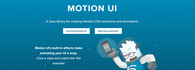
Motion UI actually came from Zurb’s Foundation for Apps branch, but has found its way into Foundation as an optional (but highly recommended) library. Zurb knows that having movement is important and that when used correctly can give your site that extra bit of interactivity and re-activity.
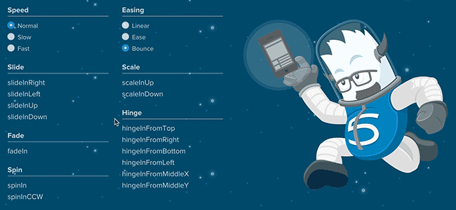
You can leverage its multiple options to control the speed of animations, easing effects, and a range of actions such as sliding, fading, scaling, etc. Using movement subtly can bring a feeling of depth to your site and enhance your user experience.
Motion UI is optional so you need to select that when downloading your custom package. If you have the Sass version it should be as simple as making sure it’s included in your app.scss file.
@include motion-ui-transitions;
@include motion-ui-animations;
Prebuilt transitions
One of the easiest ways to use the library is just to leverage the pre-built classes. It’s as simple as adding your desired transition (for example, scale-in-up). Motion UI will do the rest.
Custom transitions
If you’re feeling adventurous, you can build your own transitions by using the various Sass mixins and customizing them. The documentation for transitions outlines what you need to do (basically you include the mixin and define your options to create your effect).
Custom Animations
You can also use the library to create custom animations and effects, using various Sass mixins to create your own customized effects. For example, you might want to make something slide in, shake, and then bounce. You can do this by creating your own animation. View the documentation to see how this all pieces together.
Motion UI and JavaScript
Motion UI also comes with a small JavaScript plugin for helping you handle your transitions or animations. Its main purpose is that you can trigger a transition dynamically and listen for its end event (which you might use to trigger more animations or do something else). Since the fade-in and fade-out transitions show and hide elements, this script is included.
Yeti Launch: Getting You Up and Running Faster
You might be asking, What’s Yeti Launch? Basically it’s a companion app that you can run to remove some of the complexity of installing and configuring Foundation via the command line.

While you can just download the precompiled CSS and JavaScript, one of the strengths of Foundation is that it can be customised with Sass, letting you configure exactly what you want (custom grids, layouts, colours, mixins, etc). With Yeti Launch, Zurb will help you get up and running with a new project faster than ever.
Not only can you build sites using this, but also web apps, and email templates using Foundation’s sister frameworks, making it a one-stop-shop for your development.
Sass Foundation or Zurb Development Stack
Another cool feature Yeti offers is that when creating your new project, it offers you the choice of using either a standard Sass-powered Foundation setup or their own development framework.
Zurb’s development stack comes with a few nifty additions such as :
- UnCSS (to remove unused CSS styles)
- UglifyJs (for JavaScript compression)
- Image compression
- Static site generator (based on templates)
- Handlebar Templates (for building dynamic templates)
This is the same setup that Zurb uses in their projects so it should prove interesting how it’s adopted by the community.
Platform Support
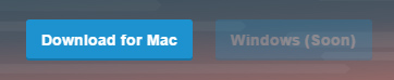
If Yeti Launch sounds like something you’re keen on trying, then you should download the app from their website. One small caveat is that if you’re on Windows, you’re out of luck, they are still in the process of getting their Windows app sorted.
It’s hard to complain since they’ve provided so many new and refined tools in this update, however it would be nice for Windows users to be able to take Yeti for a spin.
Collaboration and Feedback with Notable Code
Another new service that Zurb is offering is the ability to push your development site to an online repository and then allow members of your team to access it to provide feedback. This service is called Notable Code and offers a unique way of handling project feedback and collaboration.
Notable’s core concept consists of a few easy steps: Upload, invite, collaborate.
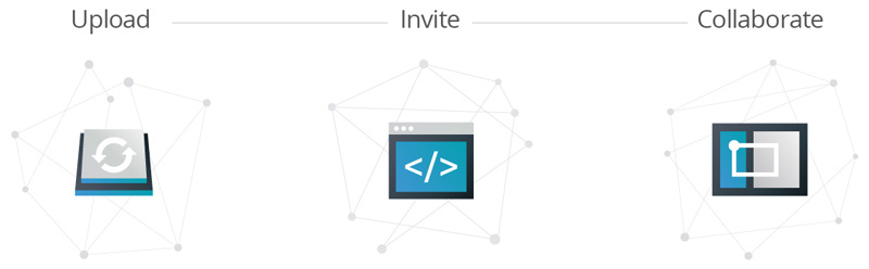
Notable lets you push your development site to an online repository, using either their Yeti Launch export (OSX only), export via the Foundation command line interface (CLI), or zip your site up and upload it.
You can also invite people to view your project online. Each team member will get a secure URL to your site and also will be notified when you update the project.
A big part of Notable’s appeal will be that users will be able to access your prototype on any device they choose and then be able to provide annotations on your design.
Another feature is that Notable will let users change their screen size so they can view the site at different breakpoints. Users will be able to make annotations on each device size so you can easily get feedback on the responsiveness of your site.
Accessibility Improvements
Sometimes accessibility can get overlooked during our development (in our haste to get it all sorted we forget that the web should be for everyone). Zurb have focused on accessibility during their reconstruction of several of their key components.
In previous versions of Foundation, several of the components were accessible to keyboards and screen readers, however a few of them have issues (such as the JavaScript-powered menus).
With Foundation 6, all of the components work with accessibility in mind. The site documentation outlines several useful resources about accessibility and the sample snippets across the site are all ARIA enabled (with appropriate roles and attributes). This focus on accessibility should help you create sites that just about anyone can enjoy.
Templates and Building Blocks
Zurb offers a series of free complete code examples that you can download from their website. You can download either Templates (full websites) or Building Blocks (components) that you can drop directly into a project.
While these elements were offered in older version of Foundation (such as Foundation 5), these have been updated to use the updated framework so they will be smaller, easier to customize and overall better than ever.
Templates
Templates are a quick way for you to start a new project. They contain a basic layout with common elements like sliders, navigation bars, social media icons, etc. You can either pick them apart and take features that you like or use them as your base and customize.
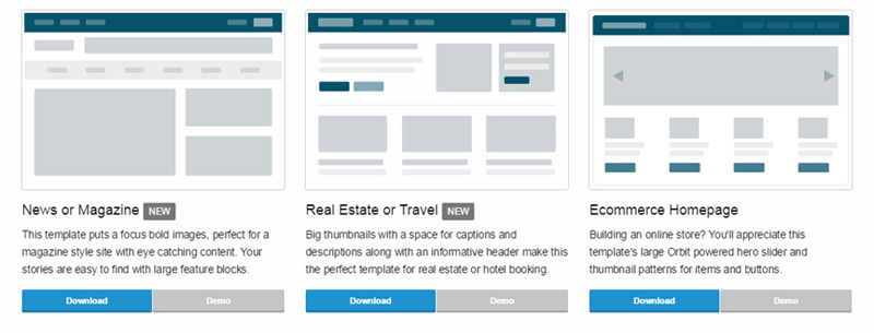
Two interesting templates you might want to look at are the News/Magazine and Real Estate/Travel templates. They are both fully responsive and utilize the latest menus and components.
Building Blocks
Building blocks are used to showcase particular components such as menus, sliders, scrolling regions, and other fancy UI things.
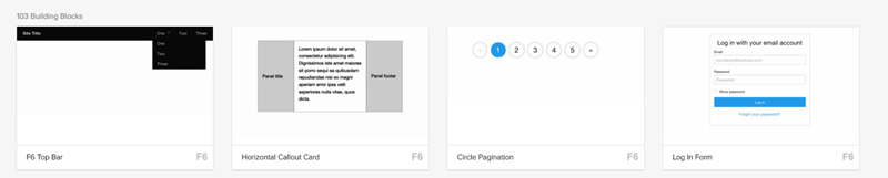
There are heaps of various examples on their repository, but they are not all based on the updated Foundation 6. Zurb are slowly releasing new ones based on their updated components but several really cool ones exist such as the Top Menu and Login Form blocks.
New Public JavaScript Utilities to Create Plugins
One way Foundation managed to make their code base smaller was to pull their plugins out of the universal functions and make them into utilities. Utilities are now publicly exposed, meaning that you can use them when building your interactivity.
There are a heap of these helper Utilities that you can leverage to speed up your development. You should take a moment to have a look through them to see which ones interest you.
I’ve outlined a few of the more useful ones below.
Media Query utility
The media query utility is especially useful in combination with the updated breakpoint change settings. The main benefit of this utility is that it gives you an easy way to interact with breakpoints.
We hook into this by accessing Foundation.MediaQuery. Here are the functions you will find useful:
get– Returns the minimum pixel value for the chosen breakpoint.atLeast– checks to see if the current breakpoint is at least as big as a passed in breakpoint (e.g small or medium).
We can also get the current breakpoint name by getting the current property. This will return the name such as small or medium.
We can also hook onto the event that’s called when we switch to another breakpoint. The changed.zf.mediaquery event provides us with the event itself, the new size we moved to and the old size we moved away from.
Overall this is a great utility to help you interact with your responsive design elements and should help you get the most out of your breakpoints.
Times & Images Loaded utility
This utility library lets you access timers and triggers for actions. The Timer object lets you run simple timers. These timers act like setInterval except they give you more control (such as being able to pause them and resume).
For example, you might want to fetch new images every 10 seconds, however if some action occurs you want to stop the timer and go back to it only when you’re good. Here we execute a checkStuff() function every 10 seconds:
var imagesTimer = new Foundation.Timer(myElement, 10000, checkStuff);Using the timer function means you can start, pause, and continue to control the experience. This is used internally by the Orbit slider.
The onImagesLoaded function can be used to execute a function when all of your passed-in images have been loaded. For example you might have a gallery grid of 6 images and only after they are all rendered do you want to trigger some functionality (or display a message):
var $images = $('.gallery-image');
Foundation.onImagesLoaded($images, processGallery);

// called once all gallery images are loaded.
function processGallery() {
  alert('Loaded!');
}
This utility proves useful mainly for knowing when your elements are loaded and reacting accordingly.
Touch utilty
The touch utility is exactly what it sounds like, a quick and easy way to add touch interactivity for your elements.
We can bind touch events by calling the addTouch() method on our selector and then pass in a function to process our logic:
// let's handle a right swipe
$('.my-element').addTouch().on('swiperight', 'handleSwipeFunction');
As you can see, it’s pretty simple to bind basic touch controls for processing by using this utility. Other components such as the Orbit Carousel also use this so it should work reliably.
Orbit Slider: a Refreshed Purpose
While there’s a heap of new tools and systems that’s been introduced in Foundation 6, there are several existing features that have been upgraded and refined to make them even better than before. Let’s take a look at some of the highlights
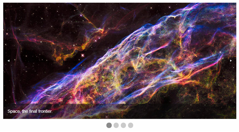
In Foundation 5, the Orbit Slider was a complex component that let users create fully responsive, interactive image, video, and content sliders. Orbit had been in Foundation for a long time and over the years had been ballooning out with dozens of configuration options, leading to a whole lot of work maintaining it.
Zurb announced that for Foundation 6 they were discontinuing Orbit, which, as you can imagine, upset many people who loved the flexibility it provided.
However, instead of removing it entirely, Foundation 6 re-purposed Orbit into a lightweight, simple slider that, while basic, still offered great customization. It’s now more of a wire-framing tool instead of a comprehensive slider.
Updated Responsive Breakpoints
Foundation 5 defined a range of different breakpoints for your responsive design, including small, medium, large, xlarge, and xxlarge. Overall when using its Sass variant, it worked by defining the device profile you wanted to target and then adding your styling inside like this:
// target small profiles
@media #{$small-only} {
  .primary{
    border: solid 1px red;
  }
}
// target medium profiles
@media {$medium-only} {
  .primary{
    padding: 25px;
  }
}
// standard styles
.primary {
  position: relative;
  margin-bottom: 15px;
  padding: 15px;
}
With Foundation 6, the mixin has been updated to make it much easier and more intuitive. Instead of calling these device profiles and adding your styling for each element, you now include the mixin directly inside your element like this:
.primary {
  // small profiles
  @include breakpoint(small only) {
    border: solid 1px red;
  }
  // medium profiles
  @include breakpoint(medium only) {
    padding: 25px;
  }
  // standard styles
  position: relative;
  margin-bottom: 15px;
  padding: 15px;
}
The benefit of this is that you keep all of your styling together, instead of hunting around your files where what styles relate to each profile. It’s all kept together for you.
The Breakpoint mixin lets you pass in a wide range of different values that will affect what will be styled.
the device profile sizes you want such as small, medium, large, and also optionally additional modifiers such as down, up, or only (to specify that you want to select breakpoint sizes smaller, greater, or exactly this size). If you’re feeling particularly fussy about your design, you can even supply landscape, portrait, or retina options as well.
Your own custom sizes
Since we’re talking about breakpoints, with Foundation 6 you can specify what size profiles will be used for your site by customizing the $breakpoints variable inside your _settings.scss file.
This file is essentially the configuration point for the Sass version of Foundation (it uses these settings to build the generated CSS). Inside here you can redefine your breakpoint values or even include new ones.
// the default Foundation 6 breakpoint ranges
$breakpoints: (
  small: 0,
  smedium: 420px, // my custom size
  medium: 640px,
  large: 1024px,
  xlarge: 1200px,
  xxlarge: 1440px,
);
As you can see, it’s easy to add a new size (in this case I’ve added smedium to target devices at the 420px range). Even though you have defined your sizes here, they won’t output any CSS until you also add them to the $breakpoint-classes() variable defined just below in the settings file.
By default, only the small, medium, and large profiles are used so you need to add your custom ones in here to get it all rolling.
// including a new size (smedium)
$breakpoint-classes: (small smedium medium large);
The more sizes you define, the more CSS you will generate so be mindful about including heaps of new sizes in your site.
Unique Designs with Fewer Styles
A common complaint about websites built with popular frameworks is that ‘they all look the same’.
Zurb has taken note of feedback in this matter and drastically pulled back their styles. Beforehand, where the base foundation would provide you with a heap of default styles and design elements, the updated styled in Foundation 6 leave with you more of a wireframe design instead of a final product.
That’s great news for everyone since this means you will have the support of the base structure and layout of the framework, but still the creative control to easily customise your site. As part of these changes, the specificity of styles has been reduced (because of several changes to Sass mixins and variables) making it even easier to customise the look and feel of your site.
While only time will tell how the community will embrace these changes, for now it seems everyone will have to step up their game and branch out from tired old cliche designs.
What About Foundation Grids and Menus?
Conspicuously missing from this list of new and improved features in Foundation 6 are the grid features and menus. There have been some significant changes in those areas too – which I’m going to cover in detail in the coming weeks.
So stay tuned!
Final Thoughts
While there are still some lingering small bugs and quirks that appear in the framework (that are being quickly resolved by the Zurb team), overall this release is a strong step in the right direction. Zurb have pulled back from offering dozens of options for each component and instead opted to provide the bare minimum for your structure.
While Some developers may be disappointed that components were pared back, thus reducing your options and forcing you to style your own elements, overall the trade-off was that the system works much better, performing more as a framework instead of a complete website solution. And in the process they’ve shed heaps of weight, increased speed, and made Foundation more maintainable.
Long story short, Foundation 6 is awesome and you should give it a try!
Frequently Asked Questions about Foundation 6
What are the new features in Foundation 6?
Foundation 6 comes with a host of new features designed to make web development easier and more efficient. These include a new flexbox grid, a revamped typography system, and a more streamlined codebase. The flexbox grid allows for more flexible layout options, while the new typography system makes it easier to style text. The streamlined codebase, meanwhile, reduces the overall size of the framework, making your websites load faster.
How does Foundation 6 compare to previous versions?
Compared to previous versions, Foundation 6 is more efficient and easier to use. It has a smaller footprint, meaning it uses less code, which can help your websites load faster. It also includes new features like the flexbox grid and revamped typography system, which provide more flexibility and control when designing your websites.
How can I get started with Foundation 6?
To get started with Foundation 6, you’ll first need to download the framework from the official website. Once you’ve done that, you can start building your website using the various components and features provided by the framework. There are also plenty of tutorials and guides available online to help you get started.
What are the benefits of using Foundation 6 for web development?
Foundation 6 offers several benefits for web development. Its streamlined codebase can help your websites load faster, while its new features like the flexbox grid and revamped typography system provide more flexibility and control when designing your websites. It’s also easy to learn and use, making it a great choice for both beginners and experienced developers.
Can I use Foundation 6 for mobile development?
Yes, Foundation 6 is designed to be responsive, meaning it can be used for both desktop and mobile development. It includes features like a mobile-first grid and responsive navigation, which make it easy to create websites that look great on any device.
How does Foundation 6 compare to other web development frameworks?
Foundation 6 stands out from other web development frameworks due to its focus on efficiency and flexibility. Its streamlined codebase helps websites load faster, while its new features like the flexbox grid and revamped typography system provide more control over your designs. It’s also easy to learn and use, making it a great choice for developers of all skill levels.
What kind of support is available for Foundation 6?
Foundation 6 is backed by a large and active community of developers, who can provide support and help answer any questions you might have. There are also plenty of tutorials and guides available online to help you get started with the framework.
Is Foundation 6 free to use?
Yes, Foundation 6 is free to use. It’s an open-source framework, meaning you can use it for any project, whether personal or commercial, without having to pay any fees.
How can I customize Foundation 6 to suit my needs?
Foundation 6 is highly customizable. You can easily modify the framework’s CSS and JavaScript files to suit your needs, and there are also plenty of plugins available that can add additional functionality to your websites.
What are the system requirements for Foundation 6?
Foundation 6 can be used on any system that supports HTML, CSS, and JavaScript. This includes all modern web browsers and operating systems. However, to take full advantage of all the features offered by the framework, it’s recommended to use a modern web development environment with support for tools like Sass and Gulp.
 Simon Codrington
Full stack developer and overall web enthusiast. I love everything to do with web / design and my passion revolves around creating awesome websites. Focusing primarily on WordPress, I create themes, plugins and bespoke solutions.