Chris Youderian is a web developer living in Cincinnati, Ohio. He is the founder of SimpleMaps, an interactive map library and customization tool. He loves the …
More about
Chris ↬
Interactive maps can be intimidating, but they don’t have to be a black box. You can create your own custom SVG maps with open data and software. In no time at all, you will have enhanced your website with a beautiful, fully customizable, interactive map. In this article Chris Youderian will explain how to create your own SVG maps using Natural Earth data and open source tools. You will then be able to create SVG maps of any area of the world, using any projection, at any resolution. As an illustration, he will create an SVG world map.
Interactive maps are a fantastic way to present geographic data to your visitors. Libraries like Google Maps and Open Street Maps are a popular choice to do this and they excel at visualizing street-level data. However, for small-scale maps, SVG maps are often a better option. They are lightweight, fully customizable and are not encumbered by any licensing restrictions.
It’s possible to find a number of SVG maps released under permissible licenses in the Wikimedia Commons. Unfortunately, it’s likely that you will eventually find these options lacking. The map you need may not exist, may be out of date (as borders change), or may not be well-formatted for web use. This article will explain how to create your own SVG maps using Natural Earth data and open source tools. You will then be able to create SVG maps of any area of the world, using any projection, at any resolution. As an illustration, we will create an SVG world map.
The process will require us to:
Download geographic data from Natural Earth data
View and edit the geographic data using QGIS
Convert the geographic data into SVG using Kartograph.py
Getting The Geographic Data
To start, we need geographic data for country borders. This data is available from Natural Earth. Natural Earth is built by volunteers and supported by the North American Cartographic Information Society. It specializes in small-scale maps that are well-suited for the web. This means the maps will look great at the country or province level, but aren’t of a high enough resolution to show the neighborhoods of a city. Natural Earth releases its maps into the public domain.
Many borders in the world are hotly contested. Natural Earth’s policy is to draw borders based on who controls the situation on the ground. We will be primarily working off of a small-scale cultural map, which contains all 247 countries in the world, and has boundary lakes removed. You can download it as a zip file (186KB).
The data you download is stored in the shapefile (.shp) format. Shapefile is an open standard geospatial vector data format created by Esri. The shapefile is accompanied by complementary files with the following extensions: .dbf, .prj and .shx. Together, these files contain the vector geometry, attributes (name, id, etc.) and geospatial information for each country. For simplicity, when people refer to a shapefile, they are really referring to this group of files.
Viewing The Geographic Data
To see the data we just downloaded, we need to use GIS (geographic information systems) software. QGIS is open source GIS software. It runs on Linux, Mac OS X and Windows. Download it from QGIS. This tutorial will be using QGIS 2.8.2 Wien.
After you have installed QGIS, open the QGIS Desktop application. QGIS is a powerful program that can work with many types of geographic data. Because of this, it can be quite intimidating. We’ll only be using a small fraction of its functionality and can ignore much of what QGIS offers. For example, since we aren’t working with any raster images (like satellite photography), we can ignore tools related to raster images.
To get started, we’ll add our shapefile as a vector layer to our project.
Select Layer → Add Layer → Add Vector Layer (from the menu bar)
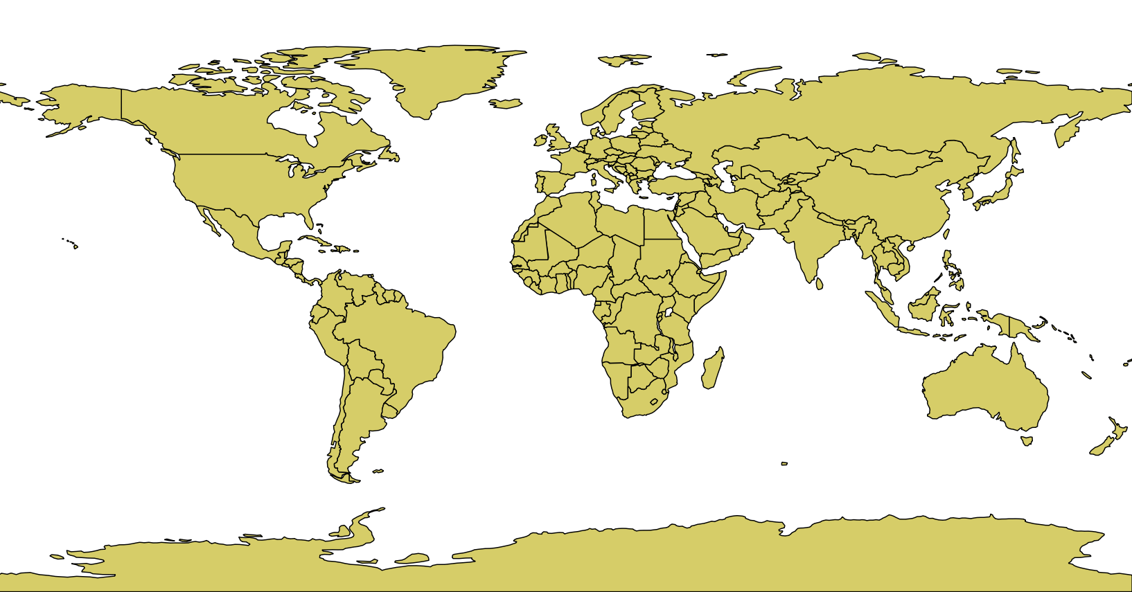
Browse to and open ne_110m_admin_0_countries_lakes.shp
The map should appear in the window (it may be a different color for you)
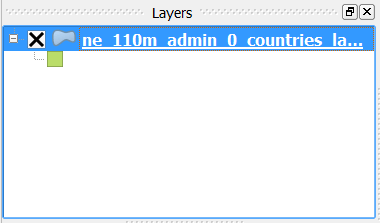
Notice that ne_110m_admin_0_countries_lakes.shp has been added to the Layers dialog.
The new layer.
Layers in QGIS are similar to layers you find in photo editing software like Photoshop or GIMP. You must select a layer before you can work on it. As you go through this tutorial, if you find a tool isn’t working properly, you have likely neglected to select the current layer.
It’s also possible to hide layers from view by unchecking the box. This allows you to add multiple shapefiles to your project and view them individually.
After adding a vector layer, it’s a good idea to save your work: Project → Save
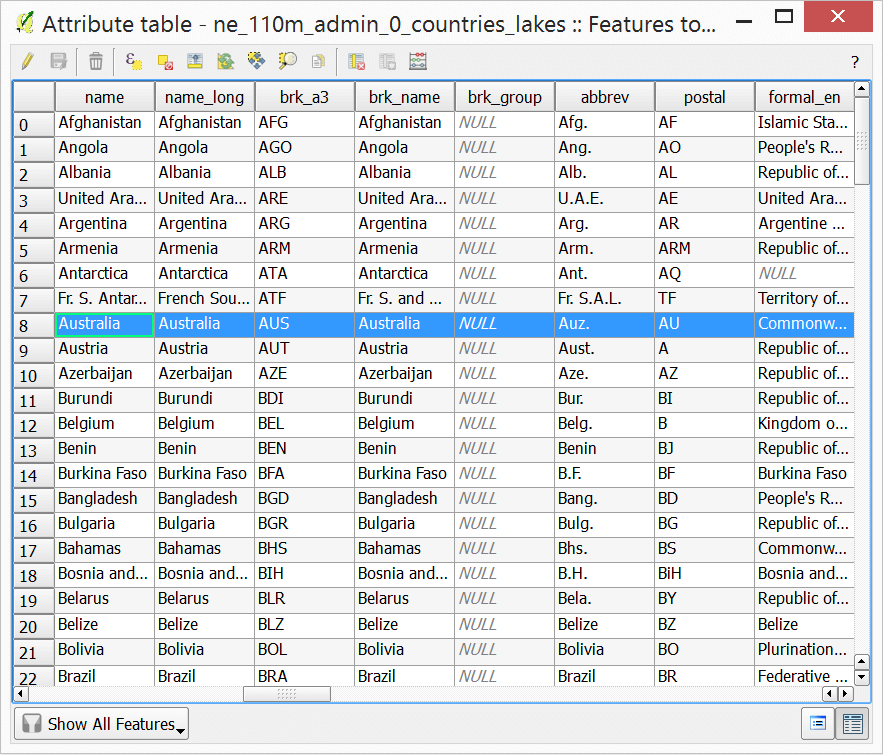
Each country contains a list of attributes. You can view these attributes in a table: Layer → Open Attribute Table
The Natural Earth data contains a wealth of information about each country. We’ll be using two-letter ISO codes to uniquely identify countries. These are stored in the iso_a2 variable. We’ll also use the country name (name) to label countries in our SVG file. Feel free to explore the table to get a sense of the data. When you’re done, close the table.
Editing The Geographic Data
(You can skip this section if you are happy with the Natural Earth data defaults.)
It’s possible to edit the individual geographic shapes using QGIS. You will probably not need to redraw borders, but you may want to split a country into parts.
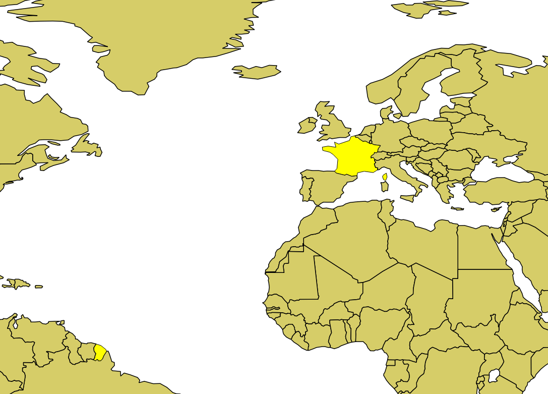
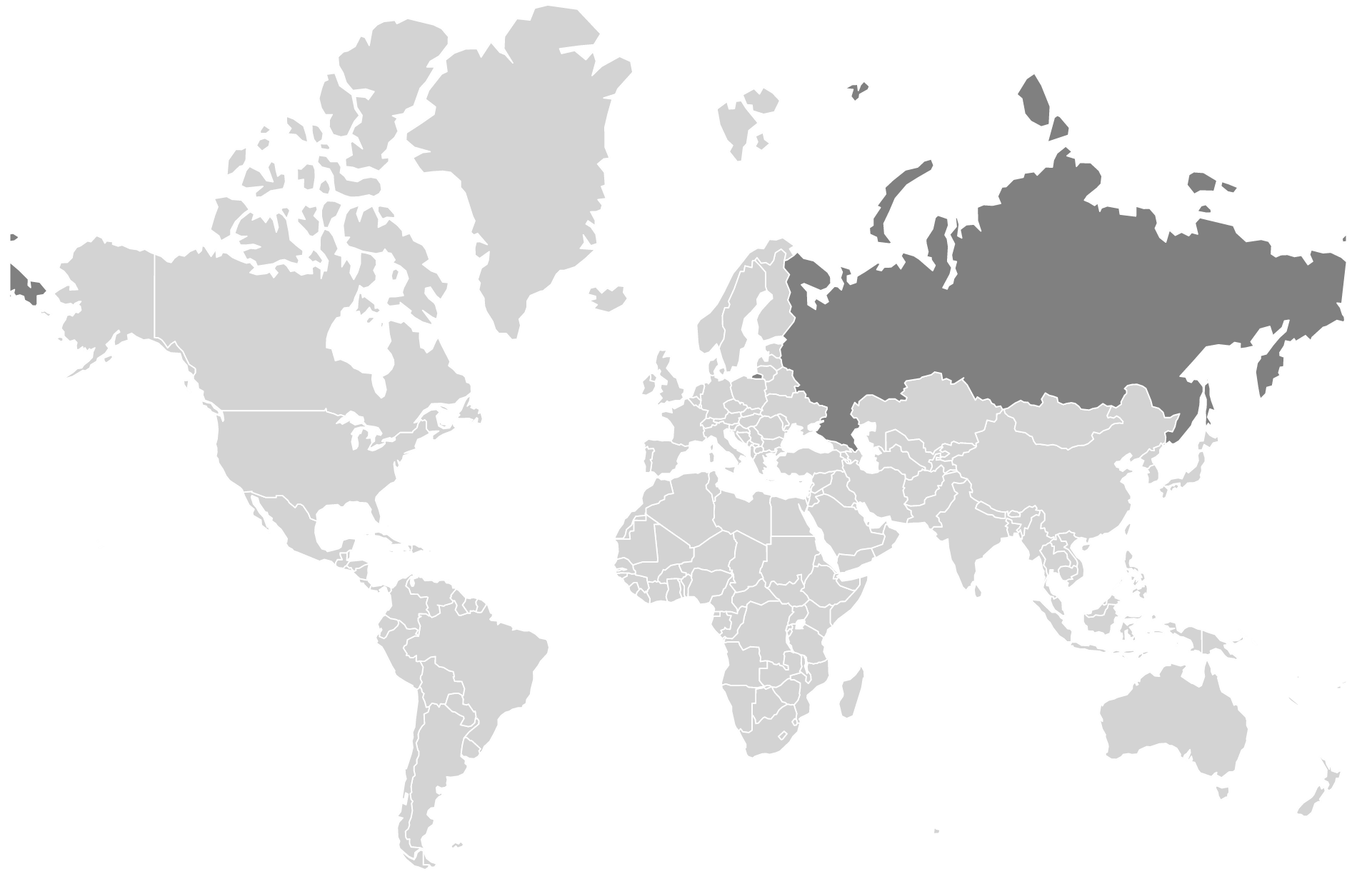
Each shape in our shapefile is referred to as a feature in QGIS. To select a feature, choose: View → Select → Select Feature(s) and then click on your target. The entire feature should turn yellow. For example, this is what France looks like when you click on it:
Notice that France includes French Guiana in South America. This is because French Guiana is an overseas département and region of France (French Guiana on Wikipedia). Nonetheless, French Guiana has its own unique ISO code and, for many applications, it makes sense to display it as a separate entity.
Splitting France into two separate entities is a straightforward process, but it requires a number of steps:
Install the Digitizing Tools QGIS Plugin:
Plugins → Manage and Install Plugins
Search for Digitizing Tools
Select Digitizing Tools
Install Plugin
Display editing tools in the toolbar: View → Toolbars → Advanced Digitizing; and View → Toolbars → Digitizing Tools
Put the map in edit mode: Layer → Toggle Editing
Select France: View → Select → Select Feature(s)
Click on France in the map view
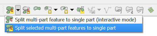
Choose Split selected multi-part features to single part from the toolbar.This will split all parts of France into separate entities.
Put France back together:
Select both the mainland of France and the island of Corsica. To select multiple features, hold down Ctrl (Cmd on Mac).
Merge the mainland of France and the island Corsica (Edit → Merge Selected Features) – you will be alerted that the feature attributes will also be merged. Click OK.
Edit French Guiana’s attributes:
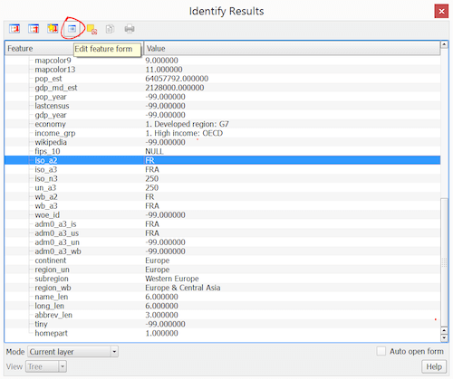
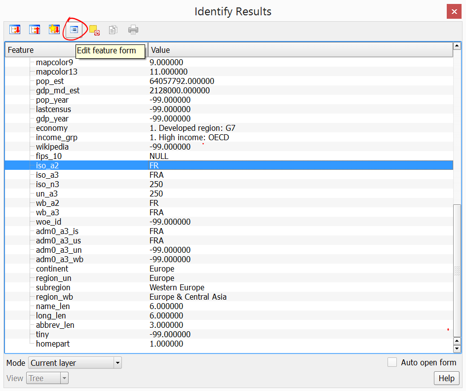
View → Identify Features
Click on French Guiana. This will bring up the attributes for French Guiana. It currently has the attributes for France. We need to replace these with attributes for French Guiana. Click on the Edit feature form icon as shown in the screenshot. Replace the ISO code with “GF” and the name with “French Guiana”.
That’s all! French Guiana is now its own feature and we’ve given it unique attributes. To learn more about editing, check out the QGIS documentation.
Creating SVG Files With Kartograph.py
Kartograph.py is a lightweight Python library that will convert our shapefile into a web-friendly SVG file. It was created by New York Times graphics editor Gregor Aisch and is available under an AGPL license.
To install Kartograph.py, follow these installation instructions. This process will require you to install a number of dependencies. If you’re not ready to commit to so many installations, you can install Kartograph.py in a virtual machine. Or, you can just download the SVG output shown as images in this article. This tutorial was created using Kartograph.py installed in Ubuntu 14.04 LTS.
Kartograph is a command line program that requires a JSON configuration file. Name this file config.json and place it in the same directory as the shapefile. This file must contain a layers property with a dictionary of the layers we want to convert and the location of each layer’s shapefile. To convert ne_110m_admin_0_countries_lakes.shp we can use the following config.json:
You may notice that this map looks somewhat different from the map in QGIS. There are a number of different ways to project our three-dimensional Earth into two-dimensional space. By default, Kartograph uses the Robinson projection, an aesthetically pleasing projection commonly used for world maps. However, you may prefer to work with the Mercator projection (used by Google Maps) which projects latitude and longitude as straight lines. To do so, add a proj object after the layers object in the config.json file:
"proj": {
  "id":"mercator"
}
Reducing The File Size
Often, the SVG file you create may be too large to be practical for web use. Kartograph includes the Visvalingam-Whyatt simplification algorithm. This tool makes it possible to dramatically reduce the size of a file with only subtle visual changes to country borders. Our file is already quite small (231KB), but we can simplify it further by adding a simplify property to the end of the countries property:
"simplify": 1
The higher the value of simplify, the more country borders will be simplified and the smaller the file will become.
Filtering Out Features
By default, the map will include all the features present in the shapefile. You may, however, want to exclude certain features from the SVG file. For example, we may wish to remove Antarctica since it is of less relevance to our task. Kartograph includes a filter tool that makes it possible to filter features based on their attributes. We can exclude Antarctica using its ISO code. To do this, add a filter property to the countries layer:
"filter": ["iso_a2", "not in", ["AQ"]],
Saving Data Within The SVG File
Finally, we want our SVG map to include data attributes with each country’s ISO code and name. This will allow us to identify SVG elements in the browser. To do this, add an attributes property to the countries layer:
"attributes": {
  "id": "iso_a2",
  "name": "name"
},
Putting It All Together
After making these changes, config.json will consist of the following:
If you open this file in a text editor, you will see that each <path> now includes identifying data in the following form:
data-id="US" data-name="United States" id="US"
This introduction only scratches the surface of what is possible with Kartograph. You can use multiple layers, join features together, and frame the map using latitude and longitude. You can learn about these options and more in the Kartograph.py documentation.
Adding The SVG Map To A Website
Now that you’ve created an SVG map, you’ll probably want to customize it and add it to your website. Modern browsers support SVG natively so you can add an SVG image to your webpage just like you would add any other image:
<img src="world.svg" alt="World Map">
However, embedding the map this way makes it difficult to style the map and make it interactive. A simple way to apply CSS and JavaScript to the map is to first embed the SVG file inline. Simply open world.svg in a text editor, copy the entire <svg> element, and paste it directly into your webpage.
The <svg> element contains a separate <path> for every country. To style the map, simply apply CSS to all <path> elements. Use the fill and stroke properties to style each country’s color and border respectively. For example, we can make all countries light gray and add a hover effect:
Similarly, we can use JavaScript to define event handlers. The following snippet will alert each country’s name with a click:
<script>
 // <![CDATA[
  var countryElements = document.getElementById('countries').childNodes;
  var countryCount = countryElements.length;
  for (var i = 0; i < countryCount; i++) {
   countryElements[i].onclick = function() {
    alert('You clicked on ' + this.getAttribute('data-name'));
   }
  }
 // ]]>
</script>
This should be placed after the inline <svg> element and right before the closing <body> tag. Your full HTML file should look like the example provided in this Gist.
Open this file in a browser, and you should see an interactive map of the world.
Hopefully, this simple example illustrates how you can easily manipulate your SVG map with JavaScript and CSS. For more advanced interactions, such as animating SVG paths, check out an SVG JavaScript library like Snap.js.
Conclusion
Interactive maps can be intimidating, but they don’t have to be a black box. You can create your own custom SVG maps with open data and software. In no time at all, you will have enhanced your website with a beautiful, fully customizable, interactive map.


 Register!
 Flexible CMS. Headless & API 1st