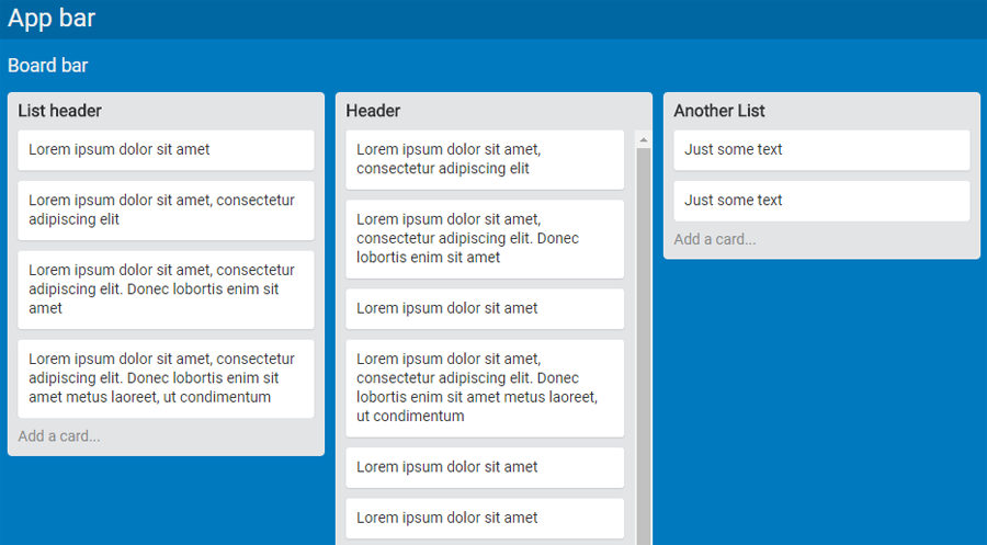
In this tutorial, I’ll walk you through an implementation of the basic layout of a Trello board screen (see example here). This is a responsive, CSS-only solution, and only the structural features of the layout will be developed.
For a preview, here is a CodePen demo of the final result.
Besides Grid Layout and Flexbox, the solution employs calc and viewport units. To make the code more readable and efficient, I’ll also take advantage of Sass variables.
No fallbacks are provided, so make sure to run the code in a supporting browser. Without further ado, let’s dive in, developing the screen components one by one.
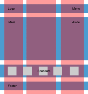
The Screen Layout
The screen of a Trello board consists of an app bar, a board bar, and a section containing the card lists. I’ll build this structure with the following markup skeleton:
<div class="ui">
  <nav class="navbar app">...</nav>
  <nav class="navbar board">...</nav>
  <div class="lists">
    <div class="list">
      <header>...</header>
      <ul>
        <li>...</li>
        ...
        <li>...</li>
      </ul>
      <footer>...</footer>
    </div>
  </div>
</div>
This layout will be achieved with a CSS Grid. Specifically, a 3×1 grid (that is, one column and three rows). The first row will be for the app bar, the second for the board bar, and the third for the .lists element.
The first two rows each have a fixed height, while the third row will span the rest of the available viewport height:
.ui {
  height: 100vh;
  display: grid;
  grid-template-rows: $appbar-height $navbar-height 1fr;
}
Viewport units ensure that the .ui container will always be as tall as the browser’s viewport.
A grid formatting context is assigned to the container, and the grid rows and columns specified above are defined. To be more precise, only the rows are defined because there is no need to declare the unique column. The sizing of the rows is done with a couple of Sass variables for the height of the bars and the fr unit to make the height of the .lists element span the rest of the available viewport height.
The Card Lists Section
As mentioned, the third row of the screen grid hosts the container for the card lists. Here’s the outline of its markup:
<div class="lists">
  <div class="list">
    ...
  </div>
  ...
  <div class="list">
    ...
  </div>
</div>
I’m using a full viewport-width Flexbox single-line row container to format the lists:
.lists {
  display: flex;
  overflow-x: auto;
  > * {
    flex: 0 0 auto; // 'rigid' lists
    margin-left: $gap;
  }
  &::after {
    content: '';
    flex: 0 0 $gap;
  }
}
Assigning the auto value to the overflow-x property tells the browser to display a horizontal scrollbar at the bottom of the screen when the lists don’t fit in the width provided by the viewport.
The flex shorthand property is used on the flex items to make the lists rigid. The auto value for flex-basis (used in the shorthand) instructs the layout engine to read the size from the .list element’s width property, and the zero values for flex-grow and flex-shrink prevent the alteration of this width.
Next I’ll need to add a horizontal separation between the lists. If a right margin on the lists is set, then the margin after the last list in a board with horizontal overflowing is not rendered. To fix this, the lists are separated by a left margin and the space between the last list and the right viewport edge is handled by adding an ::after pseudo-element to each .lists element. The default flex-shrink: 1 must be overridden otherwise the pseudo-element ‘absorbs’ all the negative space and it vanishes.
Note that on Firefox < 54 an explicit width: 100% on .lists is needed to ensure the correct layout rendering.
The Card List
Each card list is made up of a header bar, a sequence of cards, and a footer bar. The following HTML snippet captures this structure:
<div class="list">
  <header>List header</header>
  <ul>
    <li>...</li>
    ...
    <li>...</li>
  </ul>
  <footer>Add a card...</footer>
</div>
The crucial task here is how to manage the height of a list. The header and footer have fixed heights (not necessarily equal). Then there are a variable number of cards, each one with a variable amount of content. So the list grows and shrinks vertically as cards are added or removed.
But the height cannot grow indefinitely, it needs to have an upper limit that depends on the height of the .lists element. Once this limit is reached, I want a vertical scrollbar to appear to allow access to the cards that overflow the list.
This sounds like a job for the max-height and overflow properties. But if these properties are applied to the root container .list, then, once the list reaches its maximum height, the scrollbar appears for all .list elements, header and footer included. The following illustration shows the wrong sidebar on the left and the correct one on the right:
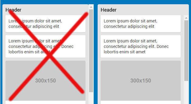
So, let’s instead apply the max-height constraint to the inner <ul>. Which value should be used? The heights of the header and the footer must be subtracted from the height of the list parent container (.lists):
ul {
  max-height: calc(100% - #{$list-header-height} - #{$list-footer-height});
}
But there is a problem. The percentage value doesn’t refer to .lists but to the <ul> element’s parent, .list, and this element doesn’t have a definite height and so this percentage cannot be resolved. This can be fixed by making .list as tall as .lists:
.list {
  height: 100%;
}
This way, since .list is always as high as .lists, regardless of its content, its background-color property cannot be used for the list background color, but it is possible to use its children (header, footer, cards) for this purpose.
One last adjustment to the height of the list is necessary, to account for a bit of space ($gap) between the bottom of the list and the bottom edge of the viewport:
.list {
  height: calc(100% - #{$gap} - #{$scrollbar-thickness});
}
A further $scrollbar-thickness amount is subtracted to prevent the list from touching the .list element’s horizontal scrollbar. In fact, on Chrome this scrollbar ‘grows’ inside the .lists box. That is, the 100% value refers to the height of .lists, scrollbar included.
On Firefox instead, the scrollbar is ‘appended’ outside the .lists height, i.e, the 100% refers to the height of .lists not including the scrollbar. So this subtraction would not be necessary. As a result, when the scrollbar is visible, on Firefox the visual space between the bottom border of a list that has reached its maximum height and the top of the scrollbar is slightly larger.
Here are the relevant CSS rules for this component:
.list {
  width: $list-width;
  height: calc(100% - #{$gap} - #{$scrollbar-thickness});

  > * {
    background-color: $list-bg-color;
    color: #333;
    padding: 0 $gap;
  }

  header {
    line-height: $list-header-height;
    font-size: 16px;
    font-weight: bold;
    border-top-left-radius: $list-border-radius;
    border-top-right-radius: $list-border-radius;
  }

  footer {
    line-height: $list-footer-height;
    border-bottom-left-radius: $list-border-radius;
    border-bottom-right-radius: $list-border-radius;
    color: #888;
  }

  ul {
    list-style: none;
    margin: 0;
    max-height: calc(100% - #{$list-header-height} - #{$list-footer-height});
    overflow-y: auto;
  }
}
As mentioned, the list background color is rendered by assigning the $list-bg-color value to the background-color property of each .list element’s children. overflow-y shows the cards scrollbar only when needed. Finally, some simple styling is added to the header and the footer.
Finishing Touches
The HTML for a single card simply consists of a list item:
<li>Lorem ipsum dolor sit amet, consectetur adipiscing elit</li>Or, if the card has a cover image:
<li>
  <img src="..." alt="...">
  Lorem ipsum dolor sit amet
</li>
This is the relevant CSS:
li {
  background-color: #fff;
  padding: $gap;

  &:not(:last-child) {
    margin-bottom: $gap;
  }

  border-radius: $card-border-radius;
  box-shadow: 0 1px 1px rgba(0,0,0, 0.1);

  img {
    display: block;
    width: calc(100% + 2 * #{$gap});
    margin: -$gap 0 $gap (-$gap);
    border-top-left-radius: $card-border-radius;
    border-top-right-radius: $card-border-radius;
  }
}
After having set a background, padding, and bottom margins, the cover image layout is ready. The image width must span the entire card from the left padding edge to the right padding edge:
width: calc(100% + 2 * #{$gap});Then, negative margins are assigned to align the image horizontally and vertically:
margin: -$gap 0 $gap (-$gap);The third positive margin value takes care of the space between the cover image and the card text.
Finally, I’ve added a flex formatting context to the two bars that occupy the first rows of the screen layout. But they are only sketched. Feel free to build your own implementation of this by expanding on the demo.
Conclusion
This is only one possible way to accomplish this design and it would be interesting to see other approaches. Also, it would be nice to finalize the layout, for instance completing the two screen bars.
Another potential enhancement could be the implementation of custom scrollbars for the card lists.
So, feel free to fork the demo and post a link in the discussion below.
Frequently Asked Questions (FAQs) about Building a Trello Layout with CSS Grid and Flexbox
How can I create a Trello-like layout using CSS Grid and Flexbox?
Creating a Trello-like layout using CSS Grid and Flexbox involves several steps. First, you need to create a basic HTML structure for your layout. This includes creating a container for your board and individual containers for your lists and cards. Next, you apply CSS Grid to the board container to create a grid layout. You can then use Flexbox to arrange your lists and cards within their respective containers. This allows you to create a responsive, flexible layout that can accommodate any number of lists and cards.
What are the benefits of using CSS Grid and Flexbox for creating a Trello-like layout?
CSS Grid and Flexbox offer several benefits for creating a Trello-like layout. They allow you to create a responsive layout that can adapt to different screen sizes and orientations. They also provide a flexible layout system that can accommodate any number of lists and cards. Additionally, they offer powerful alignment and distribution controls, making it easy to create a clean, organized layout.
Can I use CSS Grid and Flexbox to create other types of layouts?
Yes, CSS Grid and Flexbox are versatile layout systems that can be used to create a wide variety of layouts. They can be used individually or in combination to create complex, responsive layouts. Whether you’re creating a simple two-column layout or a complex grid layout, CSS Grid and Flexbox can provide the tools you need.
How can I make my Trello-like layout responsive using CSS Grid and Flexbox?
Making your Trello-like layout responsive using CSS Grid and Flexbox involves using media queries to adjust your layout based on the screen size. You can use media queries to change the number of grid columns or adjust the flex properties of your lists and cards. This allows your layout to adapt to different screen sizes and orientations, ensuring a consistent user experience across all devices.
How can I add interactivity to my Trello-like layout?
Adding interactivity to your Trello-like layout can be achieved using JavaScript. You can use JavaScript to add drag-and-drop functionality to your cards, allowing users to move cards between lists. You can also use JavaScript to add other interactive features, such as the ability to add new cards or lists.
Are there any limitations to using CSS Grid and Flexbox for creating a Trello-like layout?
While CSS Grid and Flexbox are powerful layout systems, they do have some limitations. For example, they may not be fully supported in older browsers. Additionally, while they provide a flexible layout system, they may not be suitable for all types of layouts. It’s important to understand these limitations and consider alternative solutions if necessary.
How can I customize the appearance of my Trello-like layout?
Customizing the appearance of your Trello-like layout can be done using CSS. You can use CSS to change the colors, fonts, and other visual elements of your layout. You can also use CSS to add effects, such as shadows or transitions, to enhance the user experience.
Can I use CSS Grid and Flexbox to create a Trello-like layout without any prior experience?
While CSS Grid and Flexbox are relatively advanced CSS features, they can be learned with some study and practice. There are many resources available online, including tutorials and guides, that can help you learn how to use these features. With some time and effort, you can create a Trello-like layout using CSS Grid and Flexbox, even if you’re a beginner.
How can I troubleshoot issues with my Trello-like layout?
Troubleshooting issues with your Trello-like layout can be done using developer tools in your browser. These tools allow you to inspect your HTML and CSS, making it easier to identify and fix issues. You can also use online forums or communities, such as Stack Overflow, to ask questions and get help from other developers.
How can I optimize my Trello-like layout for performance?
Optimizing your Trello-like layout for performance can involve several strategies. This includes minimizing your CSS and JavaScript, using efficient CSS selectors, and optimizing your images. You can also use performance tools, such as Google Lighthouse, to analyze your layout and identify areas for improvement.
 Giulio Mainardi