
 By
By
This is the second post in a two-part article for getting started with CSS Grid Layout. If you are interesting in learning more about CSS Grid and the new CSS Grid Layout feature in Firefox DevTools, visit the Firefox DevTools Playground.
Understanding grid lines
If you’ve read Part 1, you should now be comfortable creating a grid and defining the row and column sizes. We can now move on to placing items on a grid. There are several ways to place items, but we will start with a basic example. Consider a grid with six items:
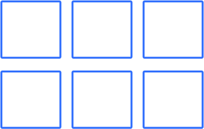
Each item within this grid will be placed automatically in the default order.
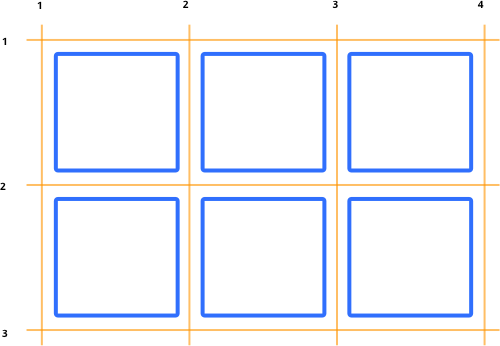
If we wish to have greater control, we can position items on the grid using grid line numbers. Grid lines are numbered left to right and top to bottom (if you are working in a right-to-left language, then grid lines are numbered right to left). The above example would be numbered like so:
Position an item
Here is the HTML we will be using for this example:
<div class="container">
  <div class="item item1">1</div>
  <div class="item item2">2</div>
  <div class="item item3">3</div>
  <div class="item item4">4</div>
  <div class="item item5">5</div>
  <div class="item item6">6</div>
</div>
Say we want to position our first grid item (with a class of item1) to be in the second row and occupy the second column. This item will need to start at the second row line, and span to the third row line. It will also need to start at the second column line and span to the third column line. We could write our CSS like so:
.item1 {
  grid-row-start: 2;
  grid-row-end: 3;
  grid-column-start: 2;
  grid-column-end: 3;
}
Shorthand property
We can also rewrite this with shorthand properties:
.item1 {
  grid-row: 2 / 3;
  grid-column: 2 / 3;
}
Here is the result:
See the Pen CSS Grid Layout – Position Items by Mozilla Developers (@mozilladevelopers) on CodePen.
Creating a Basic Layout
Now that we have a basic understanding of how to position items, we can create a basic layout. Let’s create the same layout using three different methods.
Method 1: Position Items
For our first layout method, we won’t be introducing any new concepts. We’ll simply be using the grid-row and grid-column shorthand properties to manually place items such as a header, footer, and so on.
Here is the HTML:
<div class="container">
  <div class="header">header</div>
  <div class="sidebar">sidebar</div>
  <div class="content-1">Content-1</div>
  <div class="content-2">Content-2</div>
  <div class="content-3">Content-3</div>
  <div class="footer">footer</div>
</div>
Here is the CSS:
.container {
  display: grid;
  width: 750px;
  height: 600px;
  grid-template-columns: 200px 1fr 1fr;
  grid-template-rows: 80px 1fr 1fr 100px;
  grid-gap: 1rem;
}

.header {
  grid-row: 1 / 2;
  grid-column: 1 / 4;
}

.sidebar {
  grid-row: 2 / 4;
  grid-column: 1 / 2;
}

.content-1 {
  grid-row: 2 / 3;
  grid-column: 2 / 4;
}

.content-2 {
  grid-row: 3 / 4;
  grid-column: 2 / 3;
}

.content-3 {
  grid-row: 3 / 4;
  grid-column: 3 / 4;
}

.footer {
  grid-row: 4 / 5;
  grid-column: 1 / 4;
}
Here is the result:
See the Pen CSS Grid Layout – Basic Layout by Mozilla Developers (@mozilladevelopers) on CodePen.
Quick tip: If you are using Firefox Quantum, you can try out the ‘display line numbers’ setting on the Firefox CSS Grid Layout Panel. Inspect the result above and select the layout panel. Here you can activate the overlay grid and check the box to ‘display line numbers’. Handy right? This tool makes it very easy to visualize your grid when positioning items. You’ll need to use Firefox Quantum to access this feature. Don’t have Quantum yet? Download Firefox Quantum Developer Edition here.
Method 2: Named Lines
Another method for positioning items is to use named grid areas with the grid-template-areas and grid-area properties. The best way to explain this is with an example. Let’s recreate the grid from our previous example with the grid-template-areas property:
.container {
  display: grid;
  width: 100%;
  height: 600px;
  grid-template-columns: 200px 1fr 1fr;
  grid-template-rows: 80px 1fr 1fr 100px;
  grid-gap: 1rem;
  grid-template-areas:
  "header header header"
  "sidebar content-1 content-1"
  "sidebar content-2 content-3"
  "footer footer footer";
}
Here we have defined three columns and four rows. Instead of placing each individual item, we can define the entire layout using the grid-template-areas property. We can then assign those areas to each grid item using the grid-area property.
Our HTML:
<div class="container">
  <div class="header">header</div>
  <div class="sidebar">sidebar</div>
  <div class="content-1">Content-1</div>
  <div class="content-2">Content-2</div>
  <div class="content-3">Content-3</div>
  <div class="footer">footer</div>
</div>
The rest of our CSS:
.header {
  grid-area: header;
}

.sidebar {
  grid-area: sidebar;
}

.content-1 {
  grid-area: content-1;
}

.content-2 {
  grid-area: content-2;
}

.content-3 {
  grid-area: content-3;
}

.footer {
  grid-area: footer;
}
Here is the result:
See the Pen CSS Grid Layout – Template Areas by Mozilla Developers (@mozilladevelopers) on CodePen.
Quick Tip: Did you know that FireFox DevTools can display the area names? Try it out! Inspect the grid above and open the layout panel. From here you can toggle the overlay grid and the ‘Display Area Names’ feature. You’ll need Firefox Quantum to have access to this feature. You’ll need to use Firefox Quantum to access this feature. Don’t have Quantum yet? Download Firefox Quantum Developer Edition here.
Method 3: Named Lines
We have placed an item on the grid by providing the grid-column and grid-row properties with specific grid lines. We can also name some or all of those grid lines when defining a grid. This allows us to use those names instead of grid lines.
To name a grid line, we simply provide the name in square brackets:
.container {
  display: grid;
  width: 100%;
  height: 600px;
  grid-gap: 1rem;
  grid-template-columns:
  [main-start sidebar-start] 200px
  [sidebar-end content-start] 1fr
  [column3-start] 1fr
  [content-end main-end];
  grid-template-rows:
  [row1-start] 80px
  [row2-start] 1fr
  [row3-start] 1fr
  [row4-start] 100px
  [row4-end];
}
Now that we have line names, we can use those names when placing items. Let’s recreate our basic layout using named lines, instead of line numbers:
.header {
  grid-column: main-start / main-end;
  grid-row: row1-start / row2-start;
}

.sidebar {
  grid-column: sidebar-start / sidebar-end;
  grid-row: row2-start / row4-start;
}

.content-1 {
  grid-column: content-start / content-end;
  grid-row: row2-start / row3-start;
}

.content-2 {
  grid-column: content-start / column3-start;
  grid-row: row3-start / row4-start;
}

.content-3 {
  grid-column: column3-start / content-end;
  grid-row: row3-start / row4-start;
}

.footer {
  grid-column: main-start / main-end;
  grid-row: row4-start / row4-end;
}
Here is our HTML:
<div class="container">
  <div class="header">header</div>
  <div class="sidebar">sidebar</div>
  <div class="content-1">Content-1</div>
  <div class="content-2">Content-2</div>
  <div class="content-3">Content-3</div>
  <div class="footer">footer</div>
</div>
Here is the result:
See the Pen CSS Grid Layout – Named Lines by Mozilla Developers (@mozilladevelopers) on CodePen.
Quick Tip: Did you know you can customize the color of the grid overlay in Firefox DevTools? The above example is on a white background, and the default purple may not be the best color to use. When selecting an overlay grid to display, you will see a circle next to the grid name that indicates the color of the overlay. Click on that circle, and you can customize the color to whatever you’d like. Try a different color, such as red. You’ll need to use Firefox Quantum to access this feature. Don’t have Quantum yet? Download Firefox Quantum Developer Edition here.
That’s a wrap on getting started with CSS Grid Layout. You can visit our playground for the full guide on how to get started with CSS Grid Layout. If you are ready to dive deeper intoCSS Grid Layout is completely changing the game for web design. It allows us to create complex layouts on the web using simple CSS. Part 2 CSS Grid Layout, check out the excellent guides on MDN.
About Dan Brown
Creator, developer, strategist, homebrewer, runner, sock enthusiast, beard evangelist, writer, drummer, adventurer, Oxford comma advocate, and human Swiss Army Knife.
2 comments