 First, let’s install Bulma. You can quickly do so from the command line with npm install Bulma, or you can import the project like I have, with the following lines of code. The first line imports the Font Awesome library so we can use their icons.
<link rel="stylesheet" href="https://maxcdn.bootstrapcdn.com/font-awesome/4.7.0/css/font-awesome.min.css"/>

<link rel="stylesheet" href="https://cdnjs.cloudflare.com/ajax/libs/bulma/0.5.1/css/bulma.min.css"/>hero and a div with the class of hero-body.
<section class="hero">
   <div class="hero-body"></div>
</section>is-primary, and we’ll adjust its size with is-medium. Bulma’s class names and modifiers are readable and quite literal.
<section class="hero is-primary is-medium">
  <div class="hero-body"></div>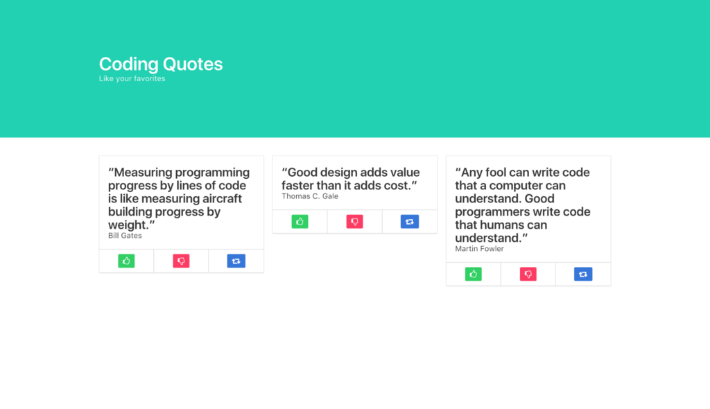
</section>hero-body div, we’ll add a container div for our h1 and h2, which we’ll style as a title and subtitle, respectively. Giving the title an is-1 modifier will make it large.
<div class="container">
     <h1 class="title is-1">
        Coding Quotes
     </h1>
     <h2 class="subtitle">
        Like your favorites
     </h2>
 </div>
That completes the top of our site, now let’s build some columns. First, we’ll
 section them off, then we’ll make a container for them.
<section class="section">
    <div class="container"></div>
</section>container, we’ll put our columns parent div.
<section class="section">
    <div class="container">
        <div class="columns"></div>
    </div>
</section>column divs within as children. They’ll automatically divide into thirds of their viewport, whether viewed horizontally or vertically (on mobile). Bulma is inherently fully responsive.
<section class="section">
<div class="container">
<div class="columns">
<div class="column">1</div>
<div class="column">2</div>
<div class="column">3</div>
</div>
</div>
</section>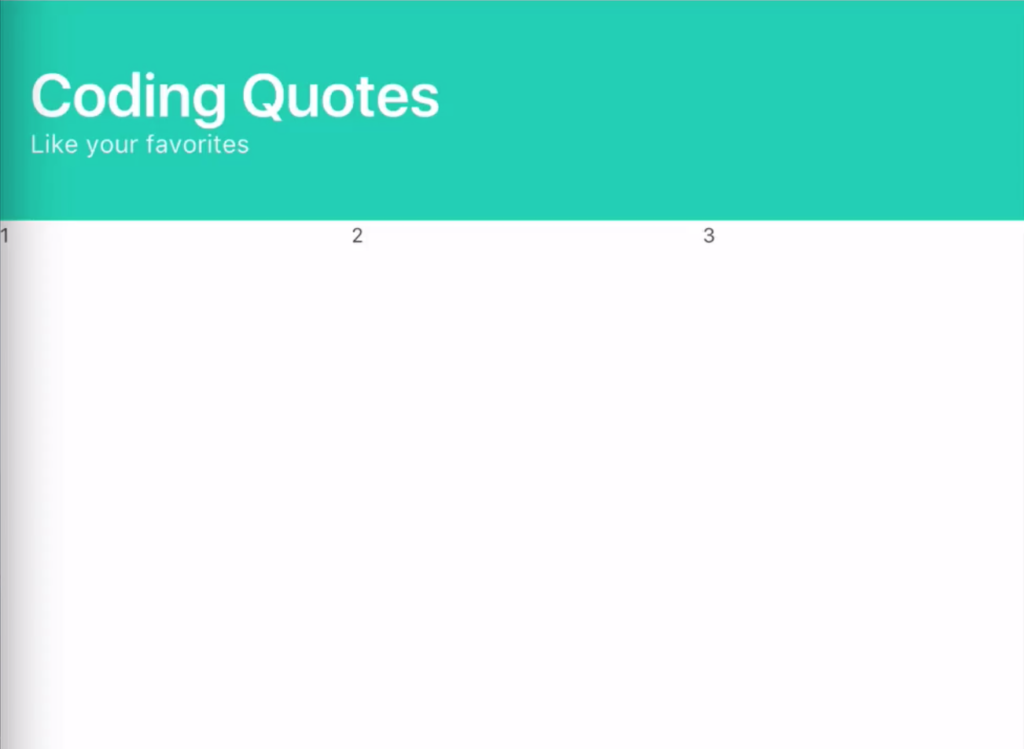 Within each column, we’ll insert a Bulma
 card, whose card-content will be a title and subtitle, for the quote and the programmer who said the quote.
<div class="card">
    <div class="card-content">
        <h2 class="title">"Quote"</h2>
        <h3 class="subtitle">Programmer</h3>
    </div>
</div>card-footer, then three card-footer-items, one for each button to live in. To color the buttons, we’ll add Bulma modifiers to turn them green (is-success), red (is-danger), and blue (is-info). Within the buttons, we’ll use Font Awesome’s classes to get a thumbs-up, thumbs-down and share icon.
<div class="card">
<div class="card-content">
<h2 class="title">"Quote"</h2>
<h3 class="subtitle">Programmer</h3>
</div>
<footer class="card-footer">
<span class="card-footer-item">
<a href="#" class="button is-success">
<i class="fa fa-thumbs-o-up"></i>
</a>
</span>
<span class="card-footer-item">
<a href="#" class="button is-danger">
<i class="fa fa-thumbs-o-down"></i>
</a>
</span>
<span class="card-footer-item">
<a href="#" class="button is-info">
<i class="fa fa-retweet"></i>
</a>
</span>
</footer>
</div>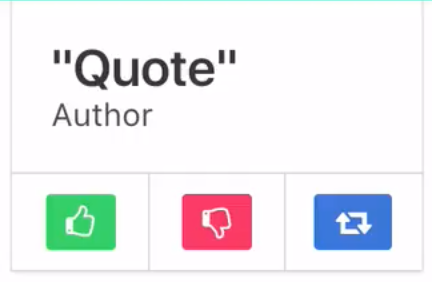 Now that we’ve successfully crafted one column, we can simply copy and paste that column’s code to make our three columns, and our site is ready.
<section class="section">
    <div class="container">
        <div class="columns">

            <div class="column">
                <div class="card">
                    <div class="card-content">
                        <h2 class="title">"Quote"</h2>
                        <h3 class="subtitle">Programmer</h3>
                    </div>
                    <footer class="card-footer">
                        <span class="card-footer-item">
                            <a href="#" class="button is-success">
                                <i class="fa fa-thumbs-o-up"></i>
                            </a>
                        </span>
                        <span class="card-footer-item"> <!-- these will automatically resize just like columns -->
                            <a href="#" class="button is-danger">
                                <i class="fa fa-thumbs-o-down"></i>
                            </a>
                        </span>
                        <span class="card-footer-item">
                            <a href="#" class="button is-info">
                                <i class="fa fa-retweet"></i>
                            </a>
                        </span>
                    </footer>
                </div>
            </div>

            <div class="column">
                <div class="card">
                    <div class="card-content">
                        <h2 class="title">"Quote"</h2>
                        <h3 class="subtitle">Programmer</h3>
                    </div>
                    <footer class="card-footer">
                        <span class="card-footer-item">
                            <a href="#" class="button is-success">
                                <i class="fa fa-thumbs-o-up"></i>
                            </a>
                        </span>
                        <span class="card-footer-item">
                            <a href="#" class="button is-danger">
                                <i class="fa fa-thumbs-o-down"></i>
                            </a>
                        </span>
                        <span class="card-footer-item">
                            <a href="#" class="button is-info">
                                <i class="fa fa-retweet"></i>
                            </a>
                        </span>
                    </footer>
                </div>
            </div>

        </div>
    </div>
</section>Frequently Asked Questions (FAQs) about Bulma CSS Framework
What makes Bulma CSS Framework unique compared to other CSS frameworks?
Bulma CSS Framework stands out due to its simplicity and ease of use. Unlike other CSS frameworks, Bulma is purely CSS, meaning it doesn’t come with any JavaScript. This makes it lightweight and easy to integrate into any project. It’s also modular, allowing you to import only the components you need, reducing the overall size of your CSS. Furthermore, Bulma uses Flexbox for its grid system, providing a more efficient way to layout, align, and distribute space among items in a container.
How can I start using Bulma in my project?
To start using Bulma, you need to include it in your project. You can do this by either downloading the CSS file from the Bulma website and linking it in your HTML file, or by using a CDN. If you prefer to use npm, you can install Bulma by running the command npm install bulma.
How can I customize Bulma to fit my project’s needs?
Bulma is highly customizable. You can override the default variables to match your project’s style. These variables are available in the sass/utilities/initial-variables.sass and sass/utilities/derived-variables.sass files. You can also create your own components or extend existing ones using Sass.
What is the Bulma grid system and how does it work?
Bulma uses a 12-column grid system, similar to other CSS frameworks. However, Bulma’s grid system is based on Flexbox, which provides more flexibility and control over alignment and distribution of items. In Bulma, you can create a grid layout using .columns and .column classes.
How can I contribute to the Bulma project?
Bulma is an open-source project and welcomes contributions from the community. You can contribute by reporting bugs, suggesting new features, improving documentation, or submitting pull requests. To contribute, you can fork the Bulma repository on GitHub, make your changes, and submit a pull request.
How can I use Bulma with React or Vue.js?
Bulma can be used with any JavaScript framework, including React and Vue.js. There are also libraries like react-bulma-components and vue-bulma that provide Bulma components as React and Vue.js components, making it easier to use Bulma in these frameworks.
Does Bulma provide a set of icons?
Bulma itself does not come with a set of icons. However, it is compatible with any icon set. You can use Font Awesome, Material Design Icons, or any other icon set with Bulma.
How can I create a responsive layout with Bulma?
Bulma provides a set of responsive classes that you can use to create a responsive layout. These classes are based on the screen size: mobile, tablet, desktop, and widescreen. You can use these classes to specify different layouts for different screen sizes.
How can I use Bulma’s variables and mixins in my custom CSS?
Bulma’s variables and mixins are defined in Sass and can be used in your custom CSS. You need to import Bulma’s Sass files in your custom Sass file before you can use the variables and mixins.
Is Bulma actively maintained?
Yes, Bulma is actively maintained. The project is hosted on GitHub and you can check the commit history to see the frequency of updates. You can also check the issue tracker to see the current issues and the project’s roadmap.
 Gregg Pollack
Gregg is a serial entrepreneur, host of Open SourceCraft. Founder of Envy Labs, Code School, Starter Studio, Orlando Ruby Users Group, BarCamp Orlando, and the Orlando Tech Events newsletter. He's passionate about startups, explaining things on the internet, fostering self-awareness, and being a father.
 Adam Jahr
Adam is a coding Instructor, React developer, music producer, audiovisual artist, VR enthusiast. You'll find Adam in his element when he's fusing sleek UI with smooth UX.