
Images — whether large pictures or thumbnails — have become an integral part of modern web design. In particular, when companies describe a complex topic or explain their offerings on storytelling pages such as the homepage or the How it works page, it is common to see a piece of descriptive text accompanied by an associated image, followed, on the next row, by another similar text–image pairing, and so on.
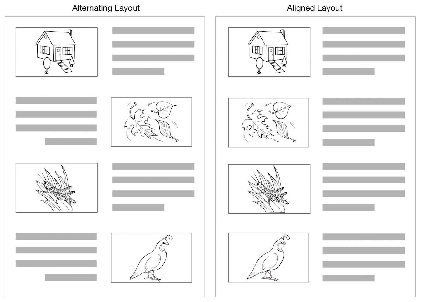
The traditional pattern (that we call the aligned layout) shows rows one under the other, with all images on one side of the layout and all text on the opposite site. A more recent and increasingly common alternative to the aligned pattern is the zigzag layout, which alternates the placement of image and text on each horizontal row. The zigzag layout’s recent popularity is likely due to the fact that it breaks monotony and adds visual interest to a long page.
Eyetracking research shows that predictable layouts help users read and scan information efficiently. We knew that aligning similar items (like in the aligned layout) makes them easier to scan. We wondered whether items that are not aligned but that alternate within a consistent pattern (like in the zigzag layout) are also easy to scan. Consistency is usually good for usability, so this is a plausible hypothesis. To answer that question, we ran an eyetracking study that investigated scanning patterns for pages using zigzag versus aligned layouts.
About the Study
We selected 4 different webpages from live websites that used the zigzag pattern. For each page, we created a variation that displayed the content in an aligned layout, with all text and images maintaining position on the right or left in each row.
A group of about 30-35 participants was shown only one variation of each web page, and the other version of the design was not mentioned or discussed with them. On each page, users had to do a basic information-gathering task such as “Find out how the Splitwise service works.” Then we observed users’ reading patterns as they used these pages.

Image Value Affects Reading Patterns
Participants’ scanning patterns were influenced by the quality of the images and their informational content.
- Informational value is more important than alignment. Images with informational value were looked at more than images with no informational value. It didn’t matter if the images with informational value were aligned or alternating: images with a lot of information about the product were studied in detail and referenced multiple times as users’ eyes moved down the page. Thus, when images were more than just decoration, both layouts worked equally well. (Increased attention to informational images replicates the finding of a different eyetracking study we ran 7 years ago, showing that many basic UX guidelines remain constant over time.)
For example, Boxycharm.com, a website for a monthly subscription service specializing in beauty products, used imagery that garnered a lot of attention from users in both the zigzag and aligned variations of the page. The pictures of the beauty products were studied carefully by users trying to understand what would be included in the monthly box. The images of the smartphone and tablet app that illustrated digital offerings and perks received fewer fixations, but were still looked at and referenced several times.


On BoxyCharm.com, there was no distinct reading pattern among participants learning about the service. Many participants were initially drawn to the eye-catching image of the beauty products in the first row, but beyond that, their eyes moved between text and images several times and navigated to the next row based on whatever drew their attention first.
Users quickly learned that the images were valuable to understanding the service, so they devoted time to look at them. Thus, neither pattern showed to be more efficient or beneficial because users looked at both the pictures and the associated text description.
- Users prefer to ignore decorative images. On pages where images were primarily decorative in nature, users quickly learned that these were not important for their task and dedicated most of their fixations to the text. This is an example of the “hot potato” reading pattern, described in our Eyetracking Web Usability book.
For instance, on HelloFresh.com, the imagery was decorative and had little informational value. Heatmaps for both the zigzag and aligned versions of Hellofresh.com showed how users fixated on the image in the first row of content, and then chose to mostly ignore the rest of the images on the page.
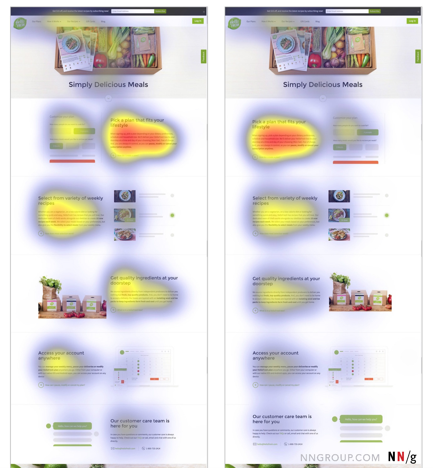
If you look closely at the heatmaps, you will notice that the images in the zigzag layout have slightly more purple "heat” over them — that is, they attracted more gazes than the corresponding ones in the aligned layout. These gazes are likely accidental: as people moved their eyes to the next row, they first encountered the image and then quickly redirected their attention to the text. Thus, the images in the zigzag layout acted much like obstacles for the eye. This behavior is discussed in detail below.
Decorative Images in a Zigzag Layout Are Harder to Ignore
Users optimize scanning patterns to the task at hand and spend the minimum effort (i.e., fixations) to achieve their goals. As soon as people have determined that images aren't valuable for their task, they will start avoiding them. (This scanning pattern where the eyes go around unhelpful images is called “images as obstacle course,” because users must work around the pictures to get to the meaningful text on the page.)
For example, on Waze.com, our study participants began avoiding the images as their eyes moved down the page. In the aligned layout, images were easy to ignore, and users could effortlessly scan down the aligned bodies of text, as shown in the gaze plot below. However, in the zigzag layout, images were more problematic. In the gaze plot below, it appears that the participant did fixate on the images in the zigzag layout. However, the video of his gaze shows that he stumbled over some of these images accidentally: immediately after his gaze was captured by a picture, he redirected his eyes away from it and toward the text.

A clip of the participant's gaze on the zigzag layout of Waze.com shows how he fixated on the images in the first and second rows as he was scrolling down the page, and then immediately redirected his gaze to the text. This clip is slowed down to 90% it's original speed.
Redirect behavior is due to two factors:
- The zigzag layout is less predictable, making it difficult to scan around image obstacles.
- Image placement causes residual fixations. After users are finished reading the text from one row, they scroll down. The page moves down while the eye stays in the same place, fixating on whatever replaces the content it was looking at before the scroll. For zigzag layouts, images replace the text as the user scrolls the page down. This type of accidental fixation is called a residual fixation, and is not deliberate.
The same stumbling and redirect behavior was observed on Hellofresh.com (see the sidebar for gazeplots from Hello Fresh).
Complex Imagery Overwhelms the Eye
Although users stumbled on Waze and HelloFresh, the stumbling and redirect behavior was even more pronounced on Splitwise.com. The unpredictability of the layout and the residual fixations caused stumbling on Splitwise.com. However, an additional factor made it more difficult to avoid images: most of the photos contained text and some were positioned close to the text bodies. In other words, the images looked like the text and competed with it, so people had a hard time identifying the next chunk of text in the story.
Some of the images contained screenshots of the application or relevant emails sent by the service to its subscribers. Although these images seem informational, they’re too complex. As expected, users looked at the first image to gauge value, but the level of complex detail in the photos was presented too early for users trying to understand the basics of the service, so they did not find them helpful at this point. As a result, participants tended to avoid these pictures as well.


A clip showing the participant's gaze as she reads the zigzag version of the page shows her redirecting her attention to the text after looking at pictures 2 and 3 for only a moment. This clip is slowed down to 90% it's original speed.
Other Common Behaviors
There were a few other common behaviors we observed on all tests regardless of the type of layout used. These behaviors give us additional insights about the utility of images on informational pages and how to position them for maximum efficiency.
Many users started scanning on the left. 3 of the 4 web pages we tested had an introductory hero space at the top, with the rows of text–image pairs starting below the fold. Most participants naturally began fixating on the left side of the page. Because Western cultures read from left to right, users were preparing to read whatever content was to come.

However, when the content on the right side of the first row was positioned significantly higher than the content on the left, users were forced to start on the right side (simply because the left side looked empty, while all the information seemed concentrated on the right).

Many users scanned images as they scrolled back up the page. Once users reached the bottom of the page (or the end of what they perceived as relevant content), they often scrolled back up the page. During this “down” time, their eyes fixated more on the images than on the text, getting a few last glances at the pictures before they were done.

Summary of Findings
After observing users reading content in both zigzag and aligned layouts, there are a few things we can learn and apply to content pages like the ones we’ve evaluated:
- Informational imagery gets more attention than decorative imagery. Decorative images were looked at less and users preferred to ignore them in both aligned and zigzag layouts.
- Zigzag layouts made it more difficult to ignore decorative imagery and caused users to stumble over these unhelpful images and immediately redirect their fixations.
Design Takeaways
Although stumbling fixations on a page may seem insignificant, a lot of accidental fixations can really add up just like clutter in an untidy room, making reading messier and less efficient. Many items out of place can slow you down, whereas a clean and clear room is much more pleasant and functional.
Determining how to lay out a page begins with being thoughtful about your content. Decide whether it would benefit from imagery and, if so, think twice about which pictures will add information value.
- Informational imagery works well in aligned and zigzag layouts. Meaningful images that support the text and tell a visual story are beneficial and will garner a lot of attention. Valuable imagery works well in both an zigzag and aligned layout. Users want to spend time looking at pictures to understand the offering, so accidental fixations causing redirects are not a problem in either layout.
- The first images in the list set the tone and make users decide whether to ignore the rest. Pay particular attention to the information value of the images used in the first rows.
- Align decorative imagery down the page. Decorative images can be beneficial for establishing brand identity on a web page even if users only look at the first few of them, see them in their peripheral vision, or glance at them briefly as they scroll back up the page. However, it’s best to align the images to support efficient scanning, since users prefer to ignore these images. One exception may be if you have a page with only 2–3 rows of content. In these cases, a zigzag layout may be OK because it’s only a short list.
- Avoid overly complex imagery. Some images may have too much information: you may consider them crucial to the understanding of the offering, but users may be overwhelmed, especially when they are less familiar with your offerings or your content. These complex images may also compete with the informational text. Select informational images that complement the text and don’t increase too much the users’ cognitive load.
- Don’t use imagery for the sake of the layout. In some cases, you may have a meaningful image to pair with a blurb of text. If so, that’s great. A picture can be worth a thousand words — sometimes. But if you don’t have a meaningful image, don’t just use filler images because the layout you’ve envisioned calls for them. Each image should have a purpose, even if it is establishing brand.
- Top-align text with decorative images. Think of users scrolling down the page and uncovering content. If your images are decorative, do not position them at a higher point in the row than the corresponding text. Horizontally align them with corresponding text to avoid drawing the eye and then causing the user to redirect.
- Always position high-information content on the left side of the first row. Many people started fixating on the left even before the content scrolled up, and then had to redirect if a decorative image happened to be positioned where they were looking. Whether you choose to put an image or text on the first row, make sure that it carries enough informational value so that it does not cause wasted fixations.


