Making Avengers ID Card In HTML And CSS

Email Newsletter
Weekly tips on front-end & UX.
Trusted by 200,000+ folks.
 Register!


 Flexible CMS. Headless & API 1st
Let’s suppose Tony Stark would like to redesign the ID cards of the Avengers, and he needs our help to create them in HTML and CSS. So, how can we help? In this tutorial, we’ll be using Flexbox to create the desired layout while diving into nested flexboxes for some advanced layouts. We will also be using rounded as well as transparent borders to create sci-fi arcs in CSS, and then animating them by using CSS animations around the picture of the Avenger. Last but not least, we’ll be using the box-shadow and text-shadow properties to give our ID card a final sci-fi touch.
By the end of the tutorial, we will build a sci-fi animated Avengers ID card, and also learn the basics of Flexbox, nested Flexbox, CSS animations, borders, shadows, and many other frequently used CSS properties.
Here’s how our final Avengers ID card will look like:
See the Pen Avengers ID Card by Kunal Sarkar (@supersarkar) on CodePen.
Let’s get started!
Full-Page Background
We need a div that covers the entire screen. We will use this div as the background to place the ID card:
<div class="id-card-wrapper">
</div>
Let’s make the div cover the entire page and give a dark background:
body {
  margin:0px;
}
.id-card-wrapper {
  height: 100vh;
  width:100%;
  background-color: #122023;
}
Why Use 100vh And Not 100% For Height?
If you look closely, you will notice that we used 100% for width, but 100vh for height. The vh unit stands for “viewport height”. It is a viewport unit, some other viewport units are: vw, vmin, and vmax.
So, why should we use 100vh instead of 100% for the height? Well, a % based dimension is relative to its parent element. So, if we set the height of the id-card-wrapper to 100%, that would mean it will make the height of id-card-wrapper cover 100% of the height of its parent element (which is the body element).
The problem is — by default — the body element doesn’t cover entire screen’s height. The width of the body element is by default 100% that’s why we can use width: 100% on id-card-wrapper, but since the height is not 100% by default the same won’t work for height.
Since a viewport unit is relative to the viewport, not the parent element, setting the height to 100vh will make the element cover entire height of the visible area (viewport), regardless of the parent’s dimensions.
Note: If you want to dive deeper into the viewport units, checkout this Fun with Viewport Units article on CSS-Tricks. One more thing, there are many ways to create a full page background, Chris Coyier lists them well in this post.
Why margin: 0px On Body?
The browsers by default display some margin around the body. If we don’t set this margin to 0, we will get a white gap around the id-card-wrapper div.
Centering Using Flexbox
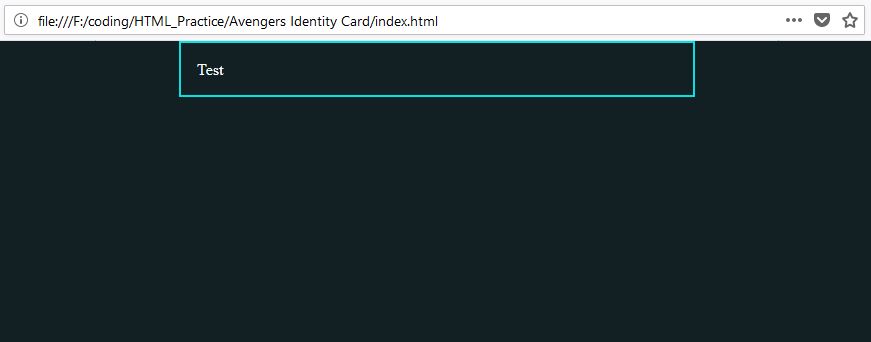
There are many ways to center. Now that our full-page background is ready, let’s create the div that will contain our ID Card. We will put only “Test” as content, and build the layout first:
<div class="id-card-wrapper">
    <div class="id-card">
        Test
    </div>
</div>
And add some styles to it:
.id-card {
  border: 2px solid #0AE0DF;
  max-width: 30em;
  margin: auto;
  color: #fff;
  padding: 1em;
}
We are using the border property to give a 2px solid border of #0AE0DF color to the id-card element.
Since a “div” is a block element, it will cover the entire width of the parent element by default. But we don’t want it to go beyond 30em, so we’ll set the max-width property to 30em.
Wait, What Is em Again?
Here’s what W3C has to say about the “em” unit:
“Theemis simply the font size. In an element with a2infont,1emthus means2in.”
This means that if your browser has a default font size of 14px, then 30em will be equal to 30×14 = 420px.
But, why use em unit instead of px?
Look, the em unit is relative to the font size. Let’s suppose you are using a browser with 14px default font size. Now if someone views your project from another browser that has 16px as default font size, then guess what would happen?
The content inside will need more space, but your div has a fixed width, i.e. the content will either spill out or break the layout.
It’s always a good idea to have dimensions that scale along with the content, instead of fixing it to arbitrary pixels.
Why Doesn’t margin: auto Center The div Vertically?**
We already know that we can center a block element horizontally using margin: auto, but it doesn’t work for vertical centering.
What if I told you that margin: auto works vertically, too? Actually, in normal layout mode, it doesn’t. But in new layout modes like Flexbox, the margin: auto works for vertical centering, too. Go ahead and make the id-card-wrapper a flexbox to see it yourself:
.id-card-wrapper {
  height: 100vh;
  width:100%;
  background-color: #122023;
  display: flex;
}
Output:
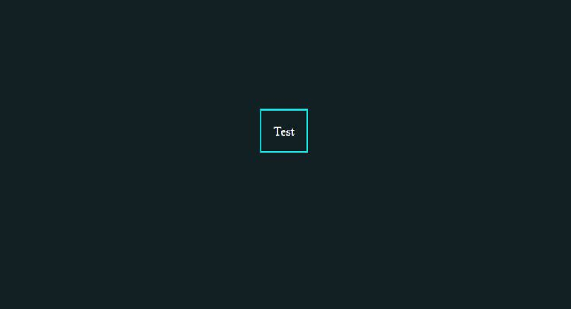
As you can see, our id-card div is now centered horizontally and vertically. We simply set display: flex on the id-card-wrapper div. When you set display: flex to an element, that element becomes a flex-container and its child elements become flex-items. Check out “Basic Concepts Of Flexbox” on MDN.
Okay, this did center our element, but why did it lose its width? The id-card div is a block element, and since block elements are by default 100% wide, why did the div lose this block level behavior when it became a flex-item?
Actually, it hasn’t lost its block behavior. What’s happening is, as soon as the div comes into the flexbox context, the flexbox algorithm notes that the div doesn’t have any width property set to it (we are giving it only max-width), and then it sets the initial width to 0.
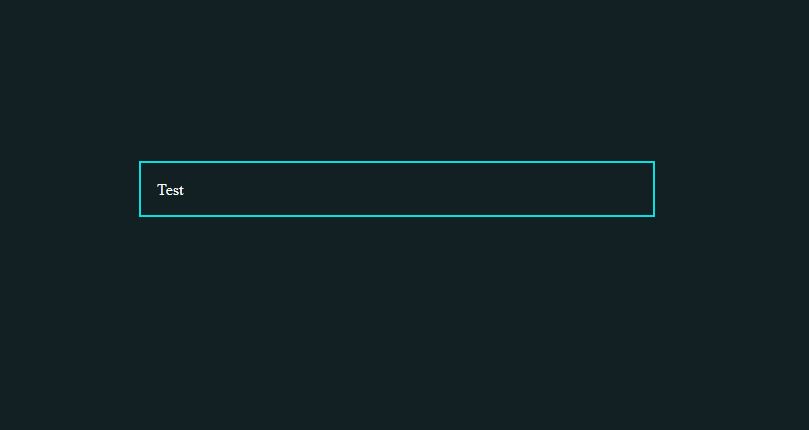
We can change this behavior by explicitly defining the initial width of the element using the flex-basis property, like this:
.id-card {
  flex-basis: 100%;
  border: 2px solid #0AE0DF;
  max-width: 30em;
  margin: auto;
  color: #fff;
  padding: 1em;
}
And now the result looks just as expected:
Nested Flexboxes
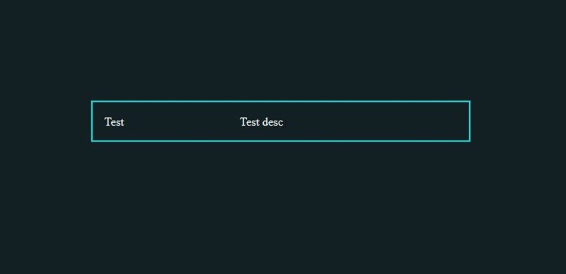
Now our id-card div is ready for content. Let’s create a profile-row div and two sections in it dp and desc. The dp div will contain the profile photo of the Avenger while the desc div will contain the description of that Avenger:
<div class="id-card-wrapper">
    <div class="id-card">
        <div class="profile-row">
            <div class="dp">
                Test
            </div>
            <div class="desc">
                Test desc
            </div>
        </div>
    </div>
</div>
We know that the id-card div is a flex-item, but the div we just created inside id-card (the profile-row div) isn’t a flex-item. Yes, only the direct decedents of the flex-containers become flex-items, but not the grandchildren.
Therefore, profile-row is a normal div, and we will make it a flex-container by setting display: flex to it. This will make its child elements, dp and desc, flex-items:
.profile-row {
  display: flex;
}
Now we can use the flex-basis property to make the dp div 33.3% wide and the desc div 66.6% wide:
.profile-row .dp {
  flex-basis: 33.3%;
}
.profile-row .desc {
  flex-grow: 66.6%;
}
Here’s what we get:
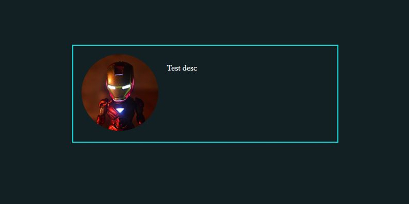
Profile Image
For the profile image, we will use a cute Iron Man picture for Stark’s ID card (download it here). Include the image using img tag inside the dp div:
<div class="id-card-wrapper">
    <div class="id-card">
        <div class="profile-row">
            <div class="dp">
                <img src="img/iron-man-dp.jpg">
            </div>
            <div class="desc">
                Test desc
            </div>
        </div>
    </div>
</div>
And give some styles to it:
.profile-row .dp img {
  max-width: 100%;
  border-radius: 50%;
}
.profile-row .desc {
  padding: 1em;
}
We set max-width: 100% for the img element because the img element by default displays the image in its original resolution.
If the image is 500px×500px then it will be displayed in that dimension. But we don’t want that. Instead, we want the image to be only as wide as the dp div, that’s why we set its max-width to 100%.
Also, we set the border-radius property to 50%. We are doing this to display the image as a circle:
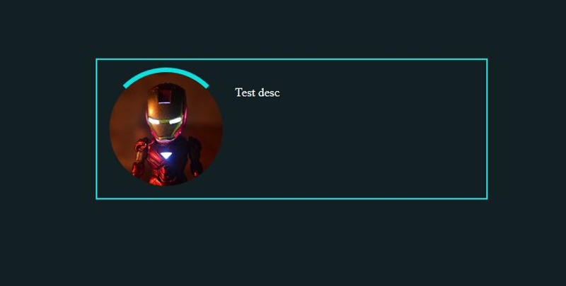
Making Arcs In CSS
Eventually, Tony visits us while we’re still working on this ID card, and says that this doesn’t look sci-fi enough. Alright, no problem. Let’s make it more sci-fi. We can make two arcs rotate around the image by inserting the first arc dp-arc-inner inside the dp element:
<div class="id-card-wrapper">
    <div class="id-card">
        <div class="profile-row">
            <div class="dp">
                <div class="dp-arc-inner"></div>
                <img src="img/iron-man-dp.jpg">
            </div>
            <div class="desc">
                Test desc
            </div>
        </div>
    </div>
</div>
Position it in CSS:
.profile-row .dp {
  flex-basis: 33.3%;
  position: relative;
}
.profile-row .dp img {
  max-width: 100%;
  border-radius: 50%;
  display: block;
}
.profile-row .dp .dp-arc-inner {
  position: absolute;
  width: 100%;
  height: 100%;
  border: 6px solid #0AE0DF;
  top: -6px;
  left: -6px;
}
We want the arc div to overlap on the dp div. The only problem is that elements don’t overlap in HTML. However, if we set the position of an element as absolute then that element is taken out of the normal flow of the document and we can set its position as we desire.
The default positioning of HTML elements is static. We set position: absolute on dp-arc-inner to make it absolutely positioned. Now we can use left, top, bottom, and right properties to set its position.
One caution: The left, top, bottom, and right properties are relative the first parent element in the hierarchy which is “relatively” positioned. That’s why we’ve set position: relative on the dp div. If we don’t do this, the left, top, bottom, and right properties will be set respectively to the screen, not the dp element.
One more thing: we are setting display: block on the img element. Why? Because img elements are inline-block by default, and inline-block elements display a tiny gap on its sides and bottom.
This gap generally doesn’t cause any problem, but a little gap around the image in our case will offset the arc’s position. So we set the img element as block element.
Next, let’s make the dp-arc-inner div look like an arc:
.profile-row .dp .dp-arc-inner {
  position: absolute;
  width: 100%;
  height: 100%;
  border: 6px solid transparent;
  border-top-color: #0AE0DF;
  border-radius: 50%;
  top: -6px;
  left: -6px;
}
What we are doing is, instead of setting the border for all the sides with #0AE0DF color, we are setting all the sides as transparent, and then giving only the top border the color #0AE0DF. Then we set the border-radius: 50% to make it round:
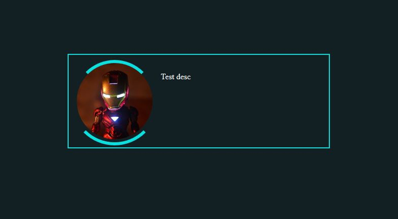
Okay, let’s create one more arc, dp-arc-outer:
<div class="id-card-wrapper">
    <div class="id-card">
        <div class="profile-row">
            <div class="dp">
                <div class="dp-arc-outer"></div>
                <div class="dp-arc-inner"></div>
                <img src="img/iron-man-dp.jpg">
            </div>
            <div class="desc">
                Test desc
            </div>
        </div>
    </div>
</div>
And style it the same way:
.profile-row .dp .dp-arc-outer {
  position: absolute;
  width: calc(100% + 12px);
  height: calc(100% + 12px);
  border: 6px solid transparent;
  border-bottom-color: #0AE0DF;
  border-radius: 50%;
  top: -12px;
  left: -12px;
}
Wow, what’s that calc thing there?
Calc is a CSS function that calculates the mathematical expression given to it. Look, we had the inner arc with width and height of 100% and a border of 6px, right? That makes the inner arc’s total width 6px + 100% + 6px.
Now if we want the outer arc to be bigger than the inner arc then we need some way to make it 100% + 12px wide. This is where the calc() function comes to the rescue.
Also, notice that we are using border-bottom-color for this arc since we want the arc to display on the bottom.
Output:
Animating The Arcs
Now that our arcs are ready, let’s make them rotate around the image. We can do this with the help of CSS animations.
Any animation requires three basic things:
- The start state of the animation,
- The end state of the animation,
- How long it should take to go from start to end state (speed of the animation).
We can provide these data in CSS like this:
.profile-row .dp .dp-arc-inner {
  position: absolute;
  width: 100%;
  height: 100%;
  border: 6px solid transparent;
  border-top-color: #0AE0DF;
  border-radius: 50%;
  top: -6px;
  left: -6px;

  animation-duration: 2s;
  animation-name: rotate-clock;
}
@keyframes rotate-clock {
  from {
    transform: rotate(0deg);
  }
  to {
    transform: rotate(360deg);
  }
}
We use @keyframes to define the animation. The from and to keywords are used to set the start and end state of the animation.
In the start state, we are rotating the arc 0-degree using transform: rotate(0deg), and in the end state we are rotating the arc 360-degree using transform: rotate(360deg).
To use this animation on an element, we need to give the name of the animation (rotate-clock in our case) to the animation-name property of that element. That’s what we are doing with animation-name: rotate-clock .
We also need to know how long it should take the animation to complete. We can do this by setting animation-duration property to 2s.
See the Pen Avengers ID Card - 1 by Kunal Sarkar (@supersarkar) on CodePen.
You will notice two problems in the output. One, the arc is rotated only one time, we want it to keep rotating, and two, the animation is not linear. The animation is fast at beginning and end, we want it to rotate with same speed throughout the animation.
To solve these problems, we will use the animation-iteration-count property to keep the animation repate itself infinite times, and animation-timing-function property to get a linear animation:
.profile-row .dp .dp-arc-inner {
  position: absolute;
  width: 100%;
  height: 100%;
  border: 6px solid transparent;
  border-top-color: #0AE0DF;
  border-radius: 50%;
  top: -6px;
  left: -6px;

  animation-duration: 2s;
  animation-name: rotate-clock;
  animation-iteration-count: infinite;
  animation-timing-function: linear;
}
See the Pen Avengers ID Card - 2 by Kunal Sarkar (@supersarkar) on CodePen.
Okay, the inner arc is now rotating as expected. Now let’s animate the outer arc in the same way, but in the opposite direction:
.profile-row .dp {
  flex-basis: 33.3%;
  position: relative;
  margin: 24px;
}
.profile-row .dp .dp-arc-outer {
  position: absolute;
  width: calc(100% + 12px);
  height: calc(100% + 12px);
  border: 6px solid transparent;
  border-bottom-color: #0AE0DF;
  border-radius: 50%;
  top: -12px;
  left: -12px;

  animation-duration: 2s;
  animation-name: rotate-anticlock;
  animation-iteration-count: infinite;
  animation-timing-function: linear;
}
@keyframes rotate-anticlock {
  from {
    transform: rotate(0deg);
  }
  to {
    transform: rotate(-360deg);
  }
}
We only changed the to state for the outer arc. Instead of rotating it a positive 360 degree, we rotated it a negative 360 degree, to get an anti-clockwise animation.
Note that we also added 24px margin to the .dp so that it doesn’t get too congested. Here’s what our result looks like now:
See the Pen Avengers ID Card - 3 by Kunal Sarkar (@supersarkar) on CodePen.
Using A Sci-Fi Google Font
Tony visits again, and this time he is happy with where we are heading. Only one thing though: he asks to use a sci-fi font.
Not a problem. Let’s use the Orbitron font from Google Fonts. Google Fonts gives a wealth of fonts for free and this particular font fits our requirement quite well.
Click on “Select this Font”:
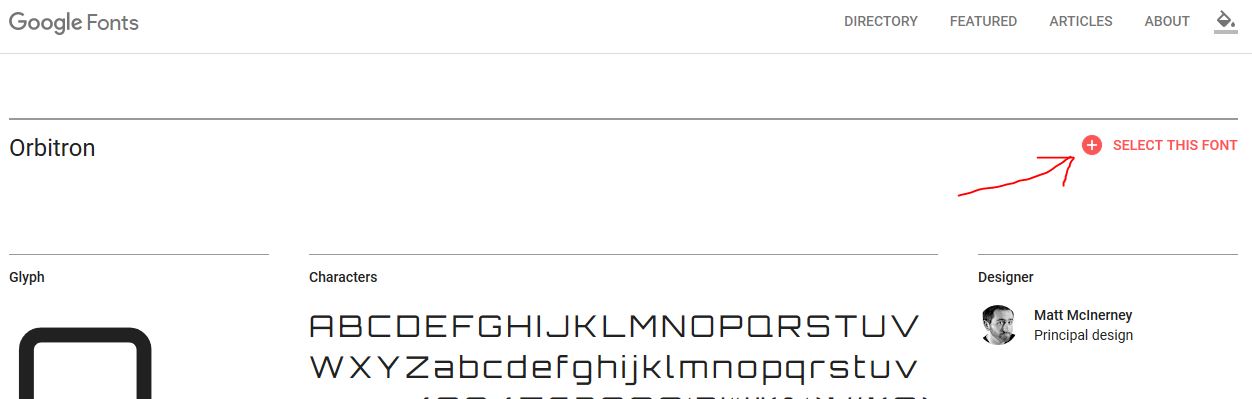
A popover will appear at the bottom. Click on it. You will get two codes: the <link> code to copy into your HTML, and the font-family code to use in your CSS:
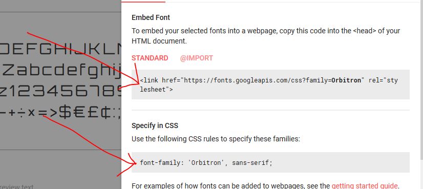
Copy the <link> code into your HTML file just above the line where you are including your stylesheet.
Now let’s add some details of Iron Man inside the desc div:
<div class="id-card-wrapper">
    <div class="id-card">
        <div class="profile-row">
            <div class="dp">
                <div class="dp-arc-outer"></div>
                <div class="dp-arc-inner"></div>
                <img src="img/iron-man-dp.jpg">
            </div>
            <div class="desc">
                <h1>Tony Stark</h1>
                <p>Strength: Ironman Suit</p>
                <p>Weakness: None</p>
                <p>Known as: Iron Man</p>
            </div>
        </div>
    </div>
</div>
In our CSS, we will use the font-family code from Google Fonts to set the font of desc div:
.profile-row .desc {
  font-family: 'Orbitron', sans-serif;
  color: #a4f3f2;
}
.profile-row .desc h1 {
  margin: 0px;
}
Wait a sec, why are we setting the margin of h1 to 0?
You see, all the heading elements (h1, h2, h3, h4, and h5) are displayed with some margin around it by the browsers. This is usually not a problem, but we don’t want the top and bottom gaps around the heading elements right now. That’s why we zeroed the margin for h1 element.
Let’s have a look at the output:
See the Pen Avengers ID Card - 4 by Kunal Sarkar (@supersarkar) on CodePen.
Uh oh! What happened?
Looks like the height of the dp div is increasing. Normally, if the content in the desc div is of more height than the height of the dp div then nothing happens to the dp div. However, in Flexbox layout, the height of the dp div will also increase along with the height of the desc div.
We don’t want the dp div to increase in height with the desc div, so we can control this by using the align-self sub-property of flexbox like this:
.profile-row .dp {
  flex-basis: 33.3%;
  align-self: center;
  position: relative;
  margin: 24px;
}
See the Pen Avengers ID Card - 5 by Kunal Sarkar (@supersarkar) on CodePen.
The align-self: center makes the dp div to center keeping its height the same.
Adding Glow
Now, let’s add some glow.
But wait, CSS doesn’t have any glow property.
No problem, it does have the text-shadow property. If we give a bright color to the shadow, the shadow will look like it’s glowing:
.profile-row .desc {
  font-family: 'Orbitron', sans-serif;
  color: #d3f8f7;
  text-shadow: 0px 0px 4px #12a0a0;
  letter-spacing: 1px;
}
In the text-shadow property, the first value, 0px, is the x-offset, how much the shadow is away from text in the x-direction. The second value, 0px, is the y-offset, telling us how much the shadow is away from the text in the y-direction. The third value, 4px, is the amount of blur you want to give to the shadow. The fourth value, #12a0a0, is the color of the shadow.
Note that we also added a 1px space between the letters of text using the letter-spacing property because the text was looking a bit congested.
Next, let’s add some shadow to the ID card and the image:
.id-card {
  flex-basis: 100%;
  max-width: 30em;
  border: 1px solid rgb(97, 245, 245);
  margin: auto;
  color: #fff;
  padding: 1em;
  background-color: #0D2C36;
  box-shadow: 0px 0px 3px 1px #12a0a0, inset 0px 0px 3px 1px #12a0a0;
}
.profile-row .dp img {
  max-width: 100%;
  border-radius: 50%;
  display: block;
  box-shadow: 0px 0px 4px 3px #12a0a0;
}
The text-shadow property gives shadow to the text, and the box-shadow property gives shadow to the elements.
The first three values for box-shadow are the same as text-shadow x-offset, y-offset, and blur. The fourth value is how much you want the shadow to spread, and the fifth value is the color of the shadow.
Notice how we are giving two shadows (outer and inner) to the id-card div in a single line:
box-shadow: 0px 0px 3px 1px #12a0a0, inset 0px 0px 3px 1px #12a0a0;
The first five values create an outer shadow. Then the “inset” keyword specifies that the next five values are for inside shadow. We separate both with a ,.
See the Pen Avengers ID Card by Kunal Sarkar (@supersarkar) on CodePen.
The Avengers ID card is ready. Yay!
Wrapping Up
In this tutorial, we learned an effective way of making a full-page background, and centering elements with Flexbox and auto margins. We saw the basic usage of Flexbox and nested Flexboxes to make single dimension layouts.
If you want to dive deeper into Flexbox, check out “A Complete Guide to Flexbox” by Chris Coyier at CSS-Tricks. If you are more of a video learner, then you will enjoy the free 20 video course by Web Bos at Flexbox.io.
We also used CSS animations and the rotate transform to make animated arcs, however, we used a limited number of CSS properties and values. If you want to explore more about CSS animations then you will love this detailed MDN guide.
Finally, the glowing elements gave our ID card a unique sci-fi look. We used the box-shadow property to give the glow to our elements. Sometimes manually setting the values of the box-shadow property can be cumbersome, so try using CSSmatic’s Box Shadow CSS Generator to easily generate box shadows.
Further Reading
- Recreating YouTube’s Ambient Mode Glow Effect
- CSS Blurry Shimmer Effect
- A Primer On CSS Container Queries
- What Happens When You Create A Flexbox Flex Container?
 (rb, ra, il, mrn)

