
In this article, we’ll learn how CSS transforms can be used in the real world to solve various tasks and achieve interesting results. Specifically, you’ll learn how to adjust elements vertically, create nice-looking arrows, build loading animations and create flip animations.
Transformations of HTML elements became a CSS3 standard in 2012 and were available in some browsers before then. Transformations allow you to transform elements on a web page — as explained in our 101 article on CSS transforms. You can rotate, scale, or skew your elements easily with just one line of code, which was difficult before. Both 2D and 3D transformations are available.
As for browser support, 2D transforms are supported by all major browsers — including Internet Explorer, which has had support since version 9. As for 3D transformations, IE has only partial support since version 10.
This article won’t focus on the basics of transformations. If you don’t feel very confident with transformations, I recommend reading about 2D and 3D transforms first.
Vertically Aligning Children
Any web designer knows how tedious it can be to vertically align elements. This task may sound very simple to a person who’s not familiar with CSS, but in reality there’s a jumble of techniques that are carefully preserved between generations of developers. Some suggest using display: inline with vertical-align: middle, some vote for display: table and accompanying styles, whereas true old school coders are still designing their sites with tables (just joking, don’t do that!). Also, it’s possible to solve this task with Flexbox or Grids, but for smaller components, transforms may be a simpler option.
Vertical alignment can be more complex when element heights are variable. However, CSS transformations provide one way to solve the problem. Let’s see a very simple example with two nested divs:
<div class="parent">
  <div class="child">
    Lorem ipsum dolor sit amet, consectetur adipiscing elit, sed do eiusmod tempor incididunt ut labore et dolore magna aliqua. Ut enim ad minim veniam, quis nostrud exercitation ullamco laboris nisi ut aliquip ex ea commodo consequat. Duis aute irure dolor in reprehenderit in voluptate velit esse cillum dolore
  </div>
</div>

<div class="parent">
  <div class="child">
    Lorem ipsum dolor sit amet, consectetur adipiscing elit, sed do eiusmod tempor incididunt ut labore et dolore magna aliqua. Ut enim ad minim veniam
  </div>
</div>
Nothing complex: just two nested blocks with a Lorem Ipsum text of different length.
Let’s set width, height, and border for the parent, as well as some spacing to make it look nicer:
.parent {
  height: 300px;
  width: 600px;
  padding: 0 1em;
  margin: 1em;
  border: 1px solid red;
}
Also, enlarge the children font size a bit:
.child {
  font-size: 1.2rem;
}
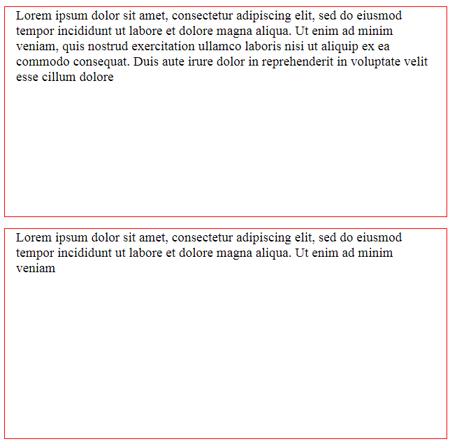
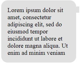
As a result, you’ll see something like this:
And now your customer says: “Please align the text vertically so that it appears in the middle of these red boxes”. Nooo!. But fear not: we’re armed with transformations! The first step is to position our children relatively and move them 50% to the bottom:
.child {
  font-size: 1.2rem;
  position: relative;
  top: 50%;
}
After that, apply a secret ingredient — the translateY function — which will reposition the elements vertically:
.child {
  font-size: 1.2rem;
  position: relative;
  top: 50%;
  transform: translateY(-50%);
}
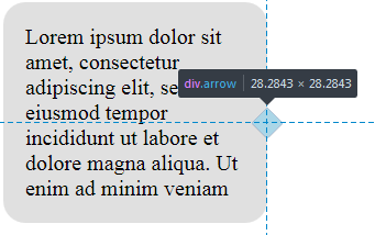
So, what’s happening here? top: 50% moves the top of the child element to the center of the parent:
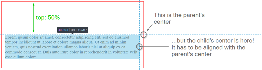
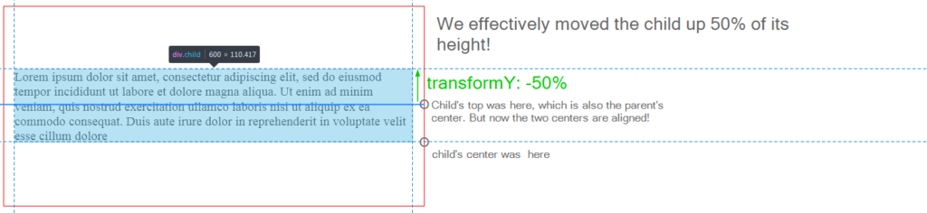
But this is not enough, because we want the child’s center to be aligned with the parent’s center. Therefore, by applying the translateY we move the child up 50% of its height:
Some developers have reported that this approach can cause the children to become blurry due to the element being placed on a “half pixel”. A solution for this is to set the perspective of the element:
.child {
  // ...
  transform: perspective(1px) translateY(-50%);
}
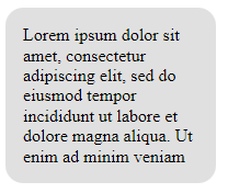
This is it! Your children are now aligned properly even with variable text, which is really nice. Of course, this solution is a little hacky, but it works in older browsers in contrast to CSS Grid. The final result can be seen on CodePen:
See the Pen CSS Transforms: Vertical-Align by SitePoint (@SitePoint) on CodePen.
Creating Arrows
Another very interesting use case for transformations is creating speech bubble arrows that scale properly. I mean, you can definitely create arrows with a graphical editor, but that’s a bit tedious, and also they may not scale well if you use a bitmap image.
Instead, let’s try to stick with a pure CSS solution. Suppose we have a box of text:
<div class="box">
  <div class="box-content">
    Lorem ipsum dolor sit amet, consectetur adipiscing elit, sed do eiusmod tempor incididunt ut labore et dolore magna aliqua. Ut enim ad minim veniam
  </div>
</div>
It has some generic styling to make it look like a speech bubble:
html {
  font-size: 16px;
}

.box {
  width: 10rem;
  background-color: #e0e0e0;
  padding: 1rem;
  margin: 1rem;
  border-radius: 1rem;
}
I’m using rem units here so that if the root’s font size is changed, the box is scaled accordingly.
Next, I’d like to make this bubble become more “bubble-ish” by displaying an arrow to the right. We’ll achieve that by using a ::before pseudo-selector:
.box::before {
  content: '';
  width: 1rem;
  height: 1rem;
  background-color: #e0e0e0;
  overflow: hidden;
}
The larger the width and height you assign, the larger the arrow will be.
Now move the arrow to the right:
.box {
  // ...
  position: relative;
}

.box::before {
  // ...
  position: absolute;
  right: -0.5rem;
}
Currently, however, this element doesn’t look like an arrow at all:
Let’s align this small box vertically. As long as its dimensions are static, this is a simple task:
.box::before {
  // ...
  top: 50%;
}
It is not precisely aligned, but we’ll fix that later.
Now it’s time for transformation to step in. All we need to do is rotate this small box to turn it to a triangle, which will look just like an arrow:
.box::before {
  // ...
  transform: rotate(45deg);
}
Here’s a screenshot from the developer console (the box is highlighted with blue so you can see how it’s actually positioned):
Then, just move the arrow a bit to the top using negative margin so that it’s positioned precisely at the middle of the box:
.box::before {
  // ...
  margin-top: -0.5rem;
}
That’s it! Now, even if you need to adjust font size on the page, your box and the arrow are going to be scaled properly! Here’s the final result:
See the Pen CSS Transformations: Arrows by SitePoint (@SitePoint) on CodePen.
Creating a “Jumping Ball” Loader
Unfortunately, things on the web don’t happen instantly. Users often have to wait for an action to complete, be it sending an email, posting their comment, or uploading photos. Therefore, it’s a good idea to display a “loading” indicator so that users understand they’ll have to wait for a few seconds.
Previously, when there were no CSS animations and transformations, we would probably use a graphical editor to create an animated GIF loader image. This is no longer necessary because CSS3 offers powerful options. So, let’s see how transformations can be utilized in conjunction with animations to create a nice-looking jumping ball.
To start, create an empty div:
<div class="loader"></div>
Balls are usually round (Captain Obvious to the rescue!), so let’s give it width, height, and border radius:
.loader {
  border-radius: 50%;
  width: 50px;
  height: 50px;
}
Let’s also use a CSS background gradient editor to generate some gradient:
.loader {
  border-radius: 50%;
  width: 50px;
  height: 50px;
  background: linear-gradient(to bottom, #cb60b3 0%,#c146a1 50%,#a80077 51%,#db36a4 100%);
}
Here’s our shiny purple ball that resembles pokeball:

How do we make it jump? Well, with a help of CSS animations! Specifically, I’m going to define an infinite animation called jump that takes 1.5 seconds to complete and performs the listed actions back and forth:
.loader {
  // ...
  animation: jump 1.5s ease-out infinite alternate;
}
Next, let’s ask ourselves: what does it mean when we say “to jump”? In the simplest case, it means moving up and down on the Y axis (vertically). So, let’s use the translateY function again and define keyframes:
@keyframes jump {
  from {
    transform: translateY(0px)
  }
  to {
    transform: translateY(-50px)
  }
}
So, initially the ball is at coordinates (0,0), but then we move it up to (0,-50). However, currently we might not have enough space for the ball to actually jump, so let’s give it some margin:
.loader {
  margin-top: 50px;
}
Of course, we can do more. For instance, let’s rotate this ball while it jumps:
@keyframes jump {
  from {
    transform: translateY(0px) rotate(0deg)
  }
  to {
    transform: translateY(-50px) rotate(360deg)
  }
}
Also, why don’t we make it smaller? For that, let’s utilize a scale function that changes the element’s width and height using the given multipliers:
@keyframes jump {
  from {
    transform: translateY(0px) rotate(0deg) scale(1,1);
  }
  to {
    transform: translateY(-50px) rotate(360deg) scale(0.8,0.8);
  }
}
Note, by the way, that all functions should be listed for the transform property in both from and to sections, because otherwise the animation won’t work properly!
Lastly, let’s add some opacity for the ball:
@keyframes jump {
  from {
    transform: translateY(0px) rotate(0deg) scale(1,1);
    opacity: 1;
  }
  to {
    transform: translateY(-50px) rotate(360deg) scale(0.8,0.8);
    opacity: 0.8;
  }
}
That’s it! Our loader element is ready, and here’s the final result:
See the Pen CSS Transformations: Loader Ball by SitePoint (@SitePoint) on CodePen.
Creating a “Spinner” Loader with SVG
We’ve already seen how to create a simple “jumping ball” loader with just a few lines of code. For a more complex effect, however, you can utilize SVGs which are defined with a set of special tags.
This article isn’t aimed at explaining how SVG images work and how to create them, but Sitepoint has a couple of articles on the topic.
As an example, let’s create a spinner loader. Here’s the corresponding SVG:
<svg class="spinner" viewBox="0 0 66 66" xmlns="https://www.w3.org/2000/svg"> <!-- 1 -->

  <circle class="path spinner-border" cx="33" cy="33" r="31" stroke="url(#gradient)"></circle> <!-- 2 -->

  <linearGradient id="gradient"> <!-- 3 -->
    <stop offset="50%" stop-color="#000" stop-opacity="1"></stop>
    <stop offset="65%" stop-color="#000" stop-opacity=".5"></stop>
    <stop offset="100%" stop-color="#000" stop-opacity="0"></stop>
  </linearGradient>

  <circle class="path spinner-dot" cx="37" cy="3" r="2"></circle> <!-- 4 -->

</svg>
Main things to note here:
- Our canvas has a viewport of 66×66.
- This defines the actual circle that’s going to spin. Its center is located at
(33,33)and the radius is 31px. We’ll also have a stroke of 2px, which means31 * 2 + 2 * 2 = 66.stroke="url(#gradient)means that the color of the stroke is defined by an element with an ID of#gradient. - That’s our gradient for the spinner’s stroke. It has three breakpoints that set different opacity values, which is going to result in a pretty cool effect.
- That’s a dot that’s going to be displayed on the spinner’s stroke. It will look like a small “head”.
Now let’s define some styling for the canvas and scale it up to 180×180:
.spinner {
  margin: 10px;
  width: 180px;
  height: 180px;
}
Now the .spinner-border, .spinner-dot, and some common styles for them:
.spinner-dot {
  stroke: #000;
  stroke-width: 1;
  fill: #000;
}

.spinner-border {
  fill: transparent;
  stroke-width: 2;
  width: 100%;
  height: 100%;
}

.path {
  stroke-dasharray: 170;
  stroke-dashoffset: 20;
}
Here’s how our spinner looks at this stage. For now it doesn’t spin, of course:
Now let’s make it spin, which effectively means rotating it by 360 degrees:
.spinner {
  // ...
  animation: rotate 2s linear infinite;
}

@keyframes rotate {
  to {
    transform: rotate(360deg);
  }
}
This is an infinite animation that takes 2 seconds to complete.
Also, we can achieve an interesting effect of a “snake trying to bite its tail” with a skew function. Remember that I’ve called that small dot a “head”? Why don’t we pretend that it is a snake’s head then? In order to make it look more realistic, we’ll skew it on the X axis:
.spinner-dot {
  // ...
  animation: skew 2s linear infinite alternate;
}

@keyframes skew {
  from {
    transform: skewX(10deg)
  }
  to {
    transform: skewX(40deg)
  }
}
Now it seems like the snake is really trying to drag to its tail:
Here’s the final result of our spinner:
See the Pen CSS Transformations: Loaders with SVGs by SitePoint (@SitePoint) on CodePen.
Creating a Flip Animation
The last example is a photo with a flip animation. When you hover over a photo, it flips and its description is shown. It can be useful for Instagram-like websites.
So, first of all, let’s create a layout:
<section class="container">

  <figure class="photo">
    <img src="https://images.freeimages.com/images/large-previews/535/natural-wonders-1400924.jpg" class="front side">

    <figcaption class="back side">
      Lorem ipsum dolor sit amet, consectetur adipiscing elit, sed do eiusmod tempor incididunt ut labore et dolore magna aliqua.
    </figcaption>
  </figure>

  <figure class="photo">
    <img src="https://images.freeimages.com/images/large-previews/6d5/lake-at-the-cottage-1372381.jpg" class="front side">

    <figcaption class="back side">
      Lorem ipsum dolor sit amet, consectetur adipiscing elit, sed do eiusmod tempor incididunt ut labore et dolore magna aliqua.
    </figcaption>
  </figure>

  <figure class="photo">
    <img src="https://images.freeimages.com/images/large-previews/a0d/autumn-tree-1382832.jpg" class="front side">

    <figcaption class="back side">
      Lorem ipsum dolor sit amet, consectetur adipiscing elit, sed do eiusmod tempor incididunt ut labore et dolore magna aliqua.
    </figcaption>
  </figure>

</section>
Here we have a container with three photos. These photos are going to actually have two sides: front and back, just like a coin has heads and tails. The front contains the actual image, whereas the back (which is not visible initially) contains the description.
Style the container by giving it some margin:
.container {
  margin: 10px auto;
}
Each photo adjusts according to the viewport’s width and floats to the left:
.photo {
  width: 22vw;
  height: 20vw;
  min-width: 130px;
  min-height: 100px;
  float: left;
  margin: 0 20px;
}
The images themselves should maintain the aspect ratio and try to fill the parent:
.photo img {
  object-fit: cover;
}
Each side should occupy 100% of the parent’s width and height:
.side {
  width: 100%;
  height: 100%;
}
Now we have images with descriptions below which looks pretty generic:

Next, what I’d like to do is place the description right above the image (on the Z axis). For that, let’s adjust some position rules:
.photo {
  // ...
  position: relative;
}

.side {
  // ...
  position: absolute;
}
The text is now displayed right over the image:
Now it’s time for some magic. I’d like children of the .photo block to be positioned in 3D with the help of transform-style property. This will allow us to achieve a feeling of perspective:
.photo {
  // ...
  transform-style: preserve-3d;
}
The backface should not be visible initially:
.side {
  // ...
  backface-visibility: hidden;
}
As for the .back itself, rotate it 180 degrees on the Y axis:
.back {
  transform: rotateY(180deg);
  text-align: center;
  background-color: #e0e0e0;
}
This will result in the description being hidden.
Next, define the hover animation:
.photo:hover {
  transform: rotateY(180deg);
}
Now when you hover over the container, the .photo will rotate and you’ll be able to see its back with the description. You’ll probably want this to happen more smoothly, so add a simple CSS transition:
.photo {
  // ...
  transition: transform 1s ease-in-out;
}
Here’s the final result:
See the Pen CSS Transformations: 3D and flip by SitePoint (@SitePoint) on CodePen.
A Word of Caution
Without any doubts, CSS transformations and animations are very powerful tools that can be used to create interesting and beautiful effects. However, it’s important to be reasonable about their usage and not abuse them. Remember that you’re creating websites for users and not for yourself (in most cases, anyway). Therefore, CSS should be utilized to introduce better user experience, rather than to show all the cool tricks you’ve learned so far.
For one thing, too many effects on the page distracts the users. Some visitors may have motion sickness or vestibular disorders, so they’ll find it very hard to use a website with fast animations. On top of that, you should make sure that the page works with older browsers, because it may happen that some important element is hidden or inaccessible when the animations don’t work.
Conclusion
In this article, we have seen how CSS transformations in conjunction with other techniques can be used to solve various design tasks. We’ve seen how to vertically align elements on the page, create scalable arrows, bouncing and spinning loaders, and how to implement flip animation. Of course, you’ve learned only some techniques, but the only limit is your imagination.
If you have additional questions, don’t hesitate to post them in the comments.
Frequently Asked Questions about CSS Transforms
What are the different types of CSS transforms?
CSS transforms are a powerful tool that allows you to manipulate the shape, size, and position of an element. There are two main types of CSS transforms: 2D and 3D. 2D transforms work on the x and y axes, allowing you to move, rotate, scale, and skew elements. 3D transforms, on the other hand, add a z-axis, enabling you to move elements in three dimensions. Each type of transform comes with its own set of properties and functions, giving you a wide range of possibilities for manipulating elements on your webpage.
How do I use the rotate function in CSS transforms?
The rotate function in CSS transforms allows you to rotate an element around a fixed point. The point of rotation is defined by the transform-origin property. By default, this is set to the center of the element. The rotate function takes a single parameter, which is the angle of rotation. This can be specified in degrees (deg), radians (rad), or turns. For example, to rotate an element 45 degrees clockwise, you would use the following code:.element {
transform: rotate(45deg);}
Can I combine multiple transform functions?
Yes, you can combine multiple transform functions by listing them within the transform property. The functions are applied in the order they are listed. For example, if you wanted to scale an element by 2 and then rotate it 45 degrees, you would use the following code:.element {
transform: scale(2) rotate(45deg);}
What is the difference between translate and position in CSS transforms?
The translate function in CSS transforms and the position property in CSS both allow you to move an element, but they work in different ways. The position property changes the element’s position in the document flow, which can affect the layout of other elements. The translate function, on the other hand, moves the element without affecting the document flow. This makes it a powerful tool for creating animations and transitions.
How do I use the perspective function in CSS transforms?
The perspective function in CSS transforms allows you to create a sense of depth in your 3D transformations. It takes a single parameter, which is the distance from the viewer to the z=0 plane in the 3D space. The smaller the value, the more pronounced the perspective effect. The perspective function is typically used in conjunction with other 3D transform functions. For example, to rotate an element 45 degrees around the y-axis and apply a perspective of 500px, you would use the following code:.element {
transform: perspective(500px) rotateY(45deg);}
What is the transform-origin property in CSS transforms?
The transform-origin property in CSS transforms allows you to specify the point around which a transformation is performed. By default, this is set to the center of the element, but you can change it to any point within the element or even outside it. The transform-origin property takes one, two, or three values, which represent the x, y, and (for 3D transforms) z coordinates of the origin. These can be specified in lengths, percentages, or keywords.
Can I animate CSS transforms?
Yes, you can animate CSS transforms using CSS transitions or animations. This allows you to create smooth, dynamic effects that can greatly enhance the user experience. To animate a transform, you need to specify the initial and final states of the element and the duration of the transition or animation. You can also control the timing function, which determines how the intermediate states are calculated.
How does the skew function work in CSS transforms?
The skew function in CSS transforms allows you to distort an element by tilting it along the x and/or y axes. It takes one or two parameters, which are the skew angles. If only one angle is provided, the second angle is assumed to be zero. The skew function can create interesting visual effects, but it can also distort the content of the element, so it should be used with caution.
What is the matrix function in CSS transforms?
The matrix function in CSS transforms allows you to specify a transformation in a concise way. It takes six parameters, which represent the elements of a 2×3 transformation matrix. The matrix function can perform any 2D transformation, including translation, rotation, scaling, and skewing. However, it can be difficult to understand and use correctly, so it’s usually recommended to use the simpler transform functions unless you have a good understanding of linear algebra.
Are CSS transforms supported in all browsers?
CSS transforms are widely supported in all modern browsers, including Chrome, Firefox, Safari, and Edge. However, some older browsers, such as Internet Explorer 9 and earlier, do not support CSS transforms. If you need to support these browsers, you may need to use fallbacks or alternative techniques. It’s always a good idea to test your code in multiple browsers to ensure it works as expected.
 Ilya Bodrov-Krukowski
Ilya Bodrov is personal IT teacher, a senior engineer working at Campaigner LLC, author and teaching assistant at Sitepoint and lecturer at Moscow Aviations Institute. His primary programming languages are Ruby (with Rails) and JavaScript. He enjoys coding, teaching people and learning new things. Ilya also has some Cisco and Microsoft certificates and was working as a tutor in an educational center for a couple of years. In his free time he tweets, writes posts for his website, participates in OpenSource projects, goes in for sports and plays music.