In this tutorial we’re going to retrofit a grid-based design to a layout inspired by the What’re you into? Tumblr page, where the user was able to select a set of topics to tailor their recommended content.
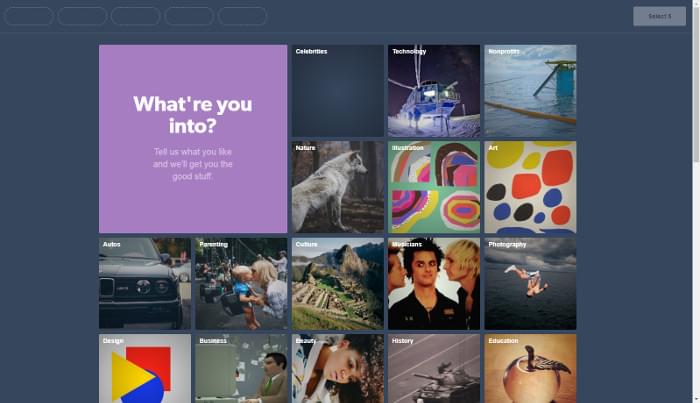
Only the visual design of the grid is executed, not the selection functionality, as shown in the Pen we’ll be building:
See the Pen MBdNav by SitePoint (@SitePoint) on CodePen.
The main goal is to implement the design with CSS Grid, but a fallback layout with floats is outlined in the Support section below.
Markup
Essentially, the page content consists of a list of cards:
<ul class="grid">
  <li class="card header">
    <h1>Which foods do you like?</h1>
    <p>Tell us what you crave for and we'll get you the tasty bits</p>
  </li>
  <li class="card">
    <a href="...">
      <h2>Pizza</h2>
      <img src="..." alt="A salami pizza">
    </a>
  </li>
  <!-- ... -->
</ul>
A card that represents a topic proposed to the user (food in our example) has a title and an illustrative image, both wrapped in a link element. Others could be adopted; see for instance the excellent article on the card component on Inclusive Components, where the pros and cons of such alternatives are analyzed.
Structural Layout
In this section, the foundations of the grid design will be implemented. The next section will style the cards. This Pen shows the bare-bones layout using placeholders for grid items. Run it on a browser that supports CSS Grid.
See the Pen JBqgGm by SitePoint (@SitePoint) on CodePen.
Before going ahead with the code, it’s important to specify the features and the responsive behavior of the grid. Let’s try to write down some properties it must satisfy.
Design Specs
Two kinds of cards are featured in the design: a series of topic cards, and an introductory cover card. We arrange them on an underlying grid composed of square cells of fixed size. Each topic card occupies just one of these cells, while the cover spans a larger area of adjacent cells, whose extent depends on the viewport width. Furthermore, rows and columns are separated by the same fixed-size gutter.
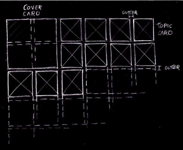
The grid has as many (fixed-sized) columns as they fit into the viewport:
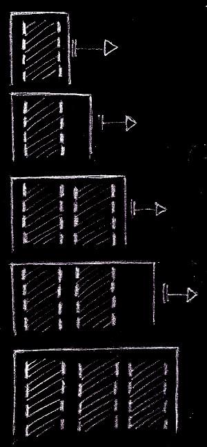
But we don’t want a zillion columns on large screens, so let’s limit the maximum number of columns:
The columns are always horizontally centered in the viewport:
Only the columns are centered, not the grid items. This means that the cards on an incomplete row are aligned to the left of the grid, not at the center of the viewport:
Check out these requirements in the above Pen. Also, it’s useful to inspect the layout with the CSS Grid tools provided by some browsers, such as the Firefox’s Grid Inspector.
Keeping in mind this checklist, we can fire up our favorite development environment and start coding.
Implementation
Let’s introduce a couple of Sass global variables to represent the layout parameters defined in the specs, namely:
$item-sizefor the size of the side of the grid cells$col-gutterfor the gutter between the tracks of the grid$vp-gutterfor a safety space to leave between the grid items and the viewport edges$max-colsfor the maximum number of columns the grid can have
We could use CSS custom properties for these variables, avoiding the need of a preprocessor and allowing us to edit them with the in-browser development tools and watch the changes happen instantly. But we’re going to use these values even for a fallback layout suitable for older browsers, where CSS variables aren’t supported. Moreover, we use expressions with these values even in media query selectors, where custom properties and the calc() function aren’t fully available even on recent browsers:
$item-size: 210px;
$col-gutter: 10px;
$vp-gutter: $col-gutter;
$max-cols: 5;
We must establish a grid formatting context on the grid element:
.grid {
  display: grid;
}
The grid-gap property separates the grid tracks by the specified amount of space.
But these gutters are only inserted between the tracks and not before the first track and after the last one. A horizontal padding on the grid container prevents the columns from touching the viewport edges:
.grid {
  grid-gap: $col-gutter;
  padding: 0 $vp-gutter;
}
The columns of the grid can be defined with the grid-template-columns property and the repeat function with the auto-fill value as the repetition number and the $item-size variable for the track list argument:
.grid {
  grid-template-columns: repeat(auto-fill, $item-size);
}
This tells the browser to fill the grid container (the .grid element) width with as many fixed-size columns as possible, keeping account of the vertical gutters.
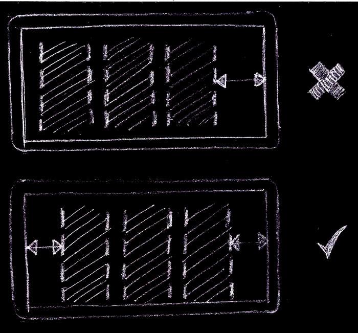
It’s worth pointing out that we could have used the auto-fit mode, and in many combinations of viewport sizes and number of grid items we could not tell the difference with auto-fill. But when there are only a few items in the grid, with just an incomplete row, with auto-fit the items would be centered, instead of starting from the left of the grid, as detailed in the design specs. This happens because, while with auto-fill the grid has always as many columns as possible, with auto-fit empty columns are removed, and the centering of the remaining columns places the items at the center of the viewport:
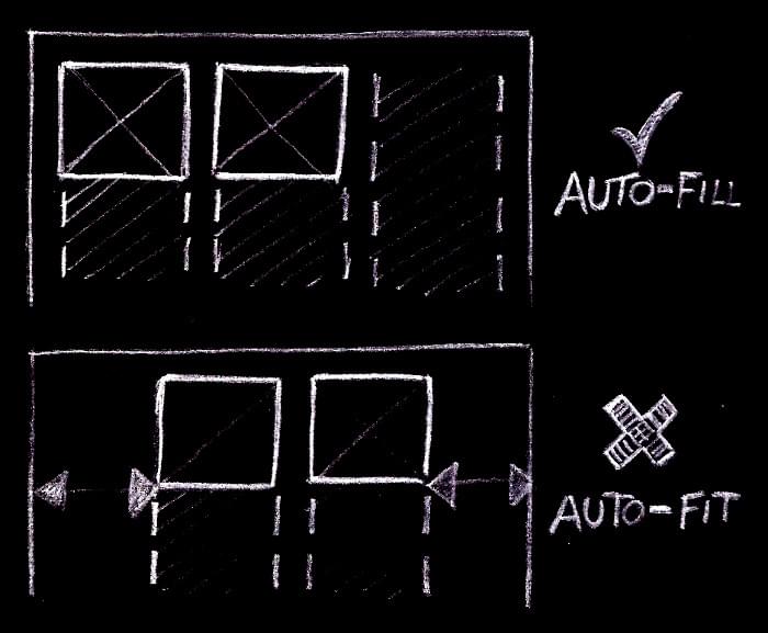
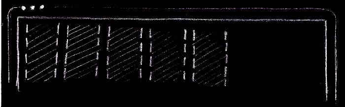
If the first row of the grid is complete, no columns are removed and there’s no difference between the two modes:
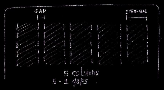
Back to the grid columns. Up to this point, the number of columns had no limit. It can arbitrarily grow as the viewport width increases. But according to the spec, the grid must have a maximum number of columns. It’s possible to fix this with the max-width property:
.grid {
  max-width: grid-width($max-cols);
}
grid-width is a custom Sass function that returns the width of a grid with n columns:
@function grid-width($num-cols) {
  @return $num-cols * $item-size + ($num-cols - 1) * $col-gutter;
}
The first multiplication accounts for the size required by the columns, while the second one represents the space required by the gutters.
According to the specs, the grid must be always horizontally centered. We can combine the old auto margins trick with justify-content to accomplish this task:
.grid {
  justify-content: center;
  margin: 40px auto;
}
justify-content centers the columns when there’s available space left inside the grid container. This happens when the container bleeds from one viewport edge to the other. The lateral auto margins center the .grid container itself when it has reached its maximum width.
Now for the rows. They’re not explicitly specified, as done with the columns. Rather, they’re implicitly added by the browser as needed, and we just tell it their size with the grid-auto-rows property. Reusing the $item-size variable, each grid cell is shaped like a square, as per the specs:
.grid {
  grid-auto-rows: $item-size;
}
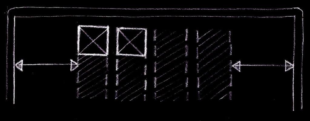
Let’s move on by sizing the cards. On small viewports, when the grid configures itself on a single column, the cover card spans only a grid cell, while when there are two or more columns, it must span a 4×4 grid area:
@include when-n-cols(2) {
  .grid .header {
    grid-row: span 2;
    grid-column: span 2;
  }
}
when-n-cols() is a Sass mixin to express a media query suitable for a grid with the given number of columns:
@mixin when-n-cols($n) {
  @media screen and (min-width: #{grid-width($n) + 2 * $vp-gutter + $scrollbar-size}) {
    @content;
  }
}
The CSS rules represented by @content are active whenever the viewport width is equal or greater than the width of a grid with $n columns plus the two safety spaces to separate the grid items from the viewport edges. $scrollbar-size is just an upper bound on the size of a vertical scrollbar, to account for the fact that the width reported in the media query is the entire viewport width, including an eventual vertical scrollbar.
Regarding the topic cards, there’s nothing to do, because the default Grid behavior makes them the same size as their assigned grid cells.
Okay, we got it! Refer to the structural Pen at the beginning of this section to see all these code snippets put together in the complete code.
The Cards
Here we build the cards — or their inner content, to be more precise.
Let’s address the topic cards first. To make them clickable, the link element is expanded to fill the entire card area:
.grid .card a {
  display: block;
  width: 100%;
  height: 100%;

  position: relative;
}
Then we make sure the card image covers all the card surface:
.grid .card img {
  display: block;
  width: 100%;
  height: 100%;
  object-fit: cover;
}
In the example, the thumbnails have a square aspect ratio, and therefore they scale nicely inside their grid items. To handle arbitrary image sizes, object-fit: cover scales (preserving the aspect ratio) and eventually clips the image to fit inside the container.
It’s the turn of the card title:
.grid .card h2 {
  margin: 0;

  position: absolute;
  top: 0;
  left: 0;
  right: 0;
  bottom: 0;

  padding: 10px;

  text-decoration: none;
  font-family: Raleway, sans-serif;
  font-size: 1em;
  letter-spacing: 1px;

  color: #fff;
}
With the absolute positioning, the heading element is removed from the flow and positioned above the image, at the top left corner of the card.
In order to improve the contrast between the label and an arbitrary underlying card image, a partially transparent layer is sandwiched between these two graphic elements.
Here I’m using the same exact technique employed on the original Tumblr page, where this overlay consists in a radial gradient which starts completely transparent at the center of the card and ends with a partially opaque black towards the borders, in a circular fashion, giving the image a sort of subtle spotlight effect. Let’s render this layer as a background image of the card link, which it has just been extended to cover all the card surface:
.grid .card h2 {
  background-image: radial-gradient(ellipse at center, transparent 0, rgba(0,0,0, .36) 100%);
}
As for the cover card, plenty of techniques could be used here, but let’s keep it simple. The card features two centered blocks of text. With a side padding their horizontal extent is limited, and with text-align their content is centered. After that, the blocks are vertically centered just by pushing them down with a bit of top padding applied to the card container:
.grid .header {
  box-sizing: border-box;

  text-align: center;
  padding-top: 23px;

  font-size: 1.6875em;
  line-height: 1.3;

  background: radial-gradient(ellipse at center, transparent 0, rgba(0,0,0, 0.48) 100%) hsla(0, 0%, 27%, 1);
}

.grid .header h1 {
  margin-top: 0;
  margin-bottom: 0.67em;

  font-family: 'Cherry Swash', cursive;
  text-transform: capitalize;
  font-size: 1em;
  font-weight: normal;

  padding-left: 28px;
  padding-right: 28px;
}

.grid .header p {
  margin: 0;

  font-family: 'Raleway', sans-serif;
  font-size: 0.52em;

  padding-left: 34px;
  padding-right: 34px;
}
With a media query, the font size is increased and the padding adjusted when the grid displays two or more columns:
@include when-n-cols(2) {
  .grid .header {
    font-size: 2.5em;

    padding-top: 100px;
  }

  .grid .header h1 {
    padding-left: 80px;
    padding-right: 80px;
  }

  .grid .header p {
    padding-left: 120px;
    padding-right: 120px;
  }
}
It’s time to add some interactivity to the topic cards. They must reduce the size on hover:
.grid .card:hover {
  transform: scale(0.95);
}

.grid .header:hover {
  transform: none;
}
With a CSS transition, this change of visual state is smoothed out:
.grid .card {
  transition-property: transform;
  transition-duration: 0.3s;
}
The cards can be navigated with a keyboard, so why not customize their focus style to match the same look and feel of the mouse over? We must scale a .card container when the anchor link inside it receives the focus. Hmmm … we need to style an element only when one of its children gets the focus — and we have the :focus-within pseudo-class for doing just that:
.grid .card a:focus {
  outline: none;
}
.grid .card:focus-within {
  transform: scale(0.95);
}
First the default link focus style is reset, and then the same transform as before is used when the card (its link) gets the focus.
Support
CSS Grid
Nowadays, CSS Grid has wide support, but what can we do with the other browsers? In the demo pen, there’s a fallback layout, implemented with floats, that behaves exactly as the Grid layout. Let’s have a quick look at how it works and interacts with the Grid implementation.
The cards are sized, floated to the left and have a bottom margin for the horizontal grid gutter:
.card {
  float: left;
  width: $item-size;
  height: $item-size;
  margin: 0;
  margin-bottom: $col-gutter;
}
At this point, we could just set a max-width on the .grid container to limit the number of columns on a large screen, use auto margins to center the grid, and the layout would be almost the same as the Grid one, but with the important difference that, when the container doesn’t reach its maximum width, the cards are aligned to the left of the viewport. This is a fallback layout for browsers not supporting CSS Grid, so we could be happy with this. Otherwise, we could go on and add some more code to fix this difference. Let’s have a try.
We set the width of the .grid container when there’s only one column, center it into the viewport, and separate it from the screen edges:
.grid {
  width: grid-width(1);
  margin: 40px auto;
  padding-left: $vp-gutter;
  padding-right: $vp-gutter;
}
Note how we reused the grid-width Sass function introduced above.
Now, reusing the media query mixin, we define the width of the .grid container when there are two columns:
@include when-n-cols(2) {
  width: grid-width(2);
  .card:nth-child(2n) {
    margin-right: $col-gutter;
  }
  .header {
    $header-size: grid-width(2);
    width: $header-size;
    height: $header-size;
  }
}
We also doubled the size of the header card and assigned the right margin for the grid’s horizontal gutter.
This pattern is repeated for a grid of two, three, … $max-cols columns, taking care of resetting and assigning the margin-rights of the proper cards. For instance, when the grid has three columns:
@include when-n-cols(3) {
  width: grid-width(3);
  .card {
    margin-right: $col-gutter;
  }
  .card:nth-child(2),
  .card:nth-child(3),
  .card:nth-child(3n + 6) {
    margin-right: 0;
  }
}
Please refer to the pen for the rest of code.
Now that we have two blocks of CSS that implement the same layout on the same page, we must be sure that they don’t conflict with each other. In particular, on a browsers that supports Grid, the float layout must not disturb the Grid layout. Thanks to CSS Grid’s inherent overriding capabilities, it’s sufficient to reset the grid container width, to set its max-width, and to reset the margins of the cards (grid-gap takes care of the grid gutters now):
@supports (display: grid) {
  .grid {
    width: auto;
    max-width: grid-width($max-cols);
    .card {
      margin: 0 !important;
    }
  }
}
These overrides have to occur only when CSS Grid is supported, as they would otherwise break the float layout. This conditional overriding is performed with the @supports rule.
The code in the pen is organized so that these two blocks of code for the layout are independent. That is, one of them can be removed without affecting the other. To achieve this, the CSS rules common to both layout implementations were grouped together:
.grid {
  margin: 0;
  padding: 0;
  list-style: none;

  margin: 40px auto;
  padding-left: $vp-gutter;
  padding-right: $vp-gutter;
}
So, if some day we want to get rid of the float layout, it’s easy to do so.
To end this discussion on the fallback layout, note how its code looks more complicated and not as intuitive as the CSS Grid. This highlights the power of a CSS technique specifically developed for layout, as opposed to an older CSS feature (floats) whose original intent was (ab)used for many years for the lack of more specific methods.
Other Features
Regarding :focus-within, it’s not supported on Microsoft browsers. With the CSS defined above, on these user agents the user misses the visual feedback when a grid item link receives the focus. Here’s a way to fix this:
.grid .card a:focus {
  outline: 2px solid #d11ee9;
}
.grid .card:focus-within {
  transform: scale(0.95);
}
.grid .card:focus-within a:focus {
  outline: none;
}
A non-supporting browser uses only the first rule, which customizes the look of the default focus outline. Even a supporting browser uses this rule, but the outline is reset again in the third line.
Another alternative is to use the :hover and :focus pseudo classes on the link element, not on the card root element. In fact, for more generality, I preferred to scale the entire card, but in this particular case, where the link stretches to cover the full extent of the card, we could just do this:
.grid .card a:hover {
  transform: scale(0.95);
}
.grid .card a:focus {
  outline: none;
  transform: scale(0.95);
}
This way, there’s no need for focus-within, and the card on focus behaves the same way as when it’s hovered, even in older browsers.
object-fit has some troubles on Microsoft browsers too, so if the images don’t have the same aspect ratio as the cards, they may appear stretched.
Finally, on IE9 and below the CSS gradients aren’t implemented. As a consequence, the transparent layer which improves the contrast between the card title and the underlying image isn’t visible. On IE9 this can be fixed by adding a background color specified with the rgba() color function:
.grid .card h2 {
  background: rgba(0,0,0, 0.2);
  background: radial-gradient(ellipse at center, transparent 0, rgba(0,0,0, .36) 100%);
}
Final Words
We have already pointed out the power of CSS Grid in the previous section. Furthermore, we may also note how the responsive behavior of the grid outlined in the design specs was achieved without media queries. In fact, the only two queries utilized in the previous snippets were both for the cover card — one to assign the card to its grid area, and the other for its content.
So, after some coding, and lots of pizzas and cakes, we’ve come to the end. But an end is just a beginning of something else, and we could go ahead with further work, such as adding some entrance animations to the cards, performing an accessibility review, and trying to carry out a selection functionality similar to the original Tumblr page.
Thanks to Freepik for the tasty pictures. Follow the card links to view the original images.
Frequently Asked Questions about CSS Grid Tumblr Card Layout
How can I create a responsive CSS grid layout for my Tumblr blog?
Creating a responsive CSS grid layout for your Tumblr blog involves using CSS Grid properties. Start by defining a container element as a grid with display: grid, then set the column and row sizes with grid-template-columns and grid-template-rows, and the gap between them with grid-gap. You can make the layout responsive by using media queries to adjust the grid properties based on the screen size.
What are the benefits of using a CSS grid layout for my Tumblr cards?
CSS grid layout offers a lot of flexibility and control over your Tumblr card layout. It allows you to create complex layouts with less code, align items perfectly, and create responsive designs without having to use floats or positioning. This makes your site more efficient, easier to design, and more user-friendly.
How can I add images to my CSS grid layout on Tumblr?
To add images to your CSS grid layout on Tumblr, you can use the HTML img tag within your grid items. Then, you can use CSS to style and position your images. Remember to use the object-fit property to control how your images resize and fit the grid area.
Can I use CSS grid layout to create a masonry-style layout on Tumblr?
Yes, you can use CSS grid layout to create a masonry-style layout on Tumblr. This involves setting the grid-auto-rows property to a small value and the grid-auto-flow property to dense. Then, you can span multiple rows or columns for your grid items to create the masonry effect.
How can I create a card layout with CSS grid?
To create a card layout with CSS grid, you need to define a grid container and create grid items for each card. You can then use grid-template-columns and grid-template-rows to specify the size of the columns and rows, and grid-gap to set the space between the cards. You can also use grid-template-areas to specify the layout of the cards.
How can I make my CSS grid layout compatible with older browsers?
To make your CSS grid layout compatible with older browsers, you can use feature queries (@supports rule) to provide fallback styles. This way, if a browser doesn’t support CSS grid, it will use the fallback styles instead.
How can I align items in my CSS grid layout?
You can align items in your CSS grid layout using the align-items, justify-items, and place-items properties. These properties allow you to control the alignment of items along both the horizontal and vertical axis.
How can I create a responsive card layout with CSS grid?
To create a responsive card layout with CSS grid, you can use media queries to adjust the grid properties based on the screen size. For example, you can set the number of grid columns to change at different screen widths, making your card layout adapt to different devices.
Can I use CSS grid layout to create a Pinterest-style layout on Tumblr?
Yes, you can use CSS grid layout to create a Pinterest-style layout on Tumblr. This involves creating a grid with multiple columns and varying row heights, similar to a masonry layout. You can then populate the grid with your content, creating a dynamic, visually appealing layout.
How can I add animations to my CSS grid layout on Tumblr?
You can add animations to your CSS grid layout on Tumblr using CSS animations or transitions. For example, you can animate the grid items when they’re hovered over, or animate the grid layout when the page loads. This can add a dynamic, interactive element to your Tumblr blog.
 Giulio Mainardi