Form layout and design is a fundamental yet frustrating part of web design and development. Ask anyone who’s ever tried to style a <select> box or align a label consistently in all browsers.
In 2016, I wrote “Make Forms Fun with Flexbox”, which identified how several form difficulties could be solved with Flexbox. A key benefit was HTML source order consistency, with the <label> always following its associated field tag in a container:
<div>
  <input id="name" name="name" type="text" />
  <label for="name">name</label>
</div>

<div>
  <select id="experience" name="experience"><!-- options --></select>
  <label for="experience">experience</label>
</div>

<div>
  <input id="html" name="html" type="checkbox" />
  <label for="html">HTML</label>
</div>
Flexbox could then be used to:
- reposition the label if necessary — that is, move it to the left of the field on text inputs, select boxes, and textareas
- vertically align the label and field.
It also became possible to style labels based on the state of their field using adjacent sibling selectors — for example, applying bold to a label when its associated checkbox is checked:
input:checked + label {
  font-weight: bold;
}
Flawed Flexboxed Forms
Unfortunately, there are a number of problems using Flexbox for form layout. Flexbox creates a one-dimensional layout where each item follows another and wraps to a new line when necessary. Field/label pairs must be placed in container elements with display: flex; applied to guarantee each appears on a new row.
It was also necessary to define a fixed label width, such as 10em. If a long label required more room, its text would either overflow or resize the element and push the field out of alignment with others.
Finally, forms are normally laid out in a grid. Shouldn’t we be using CSS Grid now that it’s fully supported in all mainstream browsers? Absolutely!
Development Approach
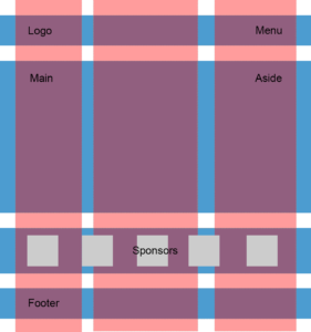
Most CSS Grid articles demonstrate the concepts and may provide graceful degradation fallbacks for older browsers. That approach is ideal when the layout is mostly decorative — for example, positioning page content, headers, footers and menus. It rarely matters when oldBrowserX shows linear blocks in an unusual order because the page content remains usable.
Form layout is more critical: a misaligned label could lead the user to enter information in the wrong box. For this reason, this tutorial takes a progressive enhancement approach:
- An initial floated form layout will work in all browsers including IE8+ (which doesn’t support Flexbox either). It will not be perfect, but floats never were!
- Enhance the form layout using CSS Grid in all modern browsers.
The examples below contain very few CSS classes, and styling is applied directly to HTML elements. That’s not the BEM way, but it is intentional to keep the code clean and understandable without distractions.
You could consider using similar code as the base for all forms on your site.
The HTML
A typical HTML form can be kept clean, since there’s no need for containing (<div>) elements around field/label pairs:
<form action="get">
  <fieldset>
    <legend>Your web development skillset</legend>

    <div class="formgrid">

      <input id="name" name="name" type="text" />
      <label for="name">name</label>

      <select id="experience" name="experience">
        <option value="1">1 year or less</option>
        <option value="2">2 years</option>
        <option value="3">3 - 4 years</option>
        <option value="5">5 years or more</option>
      </select>
      <label for="experience">experience</label>

      <input id="html" name="html" type="checkbox" />
      <label for="html">HTML</label>

      <input id="css" name="css" type="checkbox" />
      <label for="css">CSS</label>

      <input id="javascript" name="javascript" type="checkbox" />
      <label for="javascript">JavaScript</label>

      <textarea id="skills" name="skills" rows="5" cols="20"></textarea>
      <label for="skills">other skills</label>

      <button type="submit">SUBMIT</button>

    </div>

  </fieldset>
</form>
The only additional element is <div class="formgrid">. Browsers can’t apply display: grid or display: flex to fieldset elements. That may eventually be fixed, but an outer container is currently required.
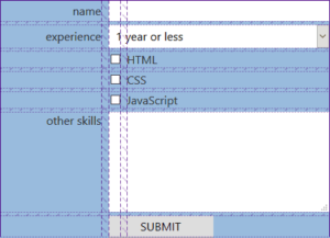
Form Layout Float Fallback
After some initial font and color styling, the float layout will allocate:
- 70% of the space to fields which are floated right
- 30% of the space to labels which are floated left.
/* fallback 30%/70% float layout */
input, output, textarea, select, button {
  clear: both;
  float: right;
  width: 70%;
}

label {
  float: left;
  width: 30%;
  text-align: right;
  padding: 0.25em 1em 0 0;
}
Checkbox and radio buttons are positioned before the label and floated left. Their intrinsic width can be used (width:auto) but a left margin of 30% is required to align correctly:
button, input[type="checkbox"], input[type="radio"] {
  width: auto;
  float: left;
  margin: 0.5em 0.5em 0 30%;
}

input[type="checkbox"] + label, input[type="radio"] + label {
  width: auto;
  text-align: left;
}
The form layout works in all browsers including IE8+:
See the Pen form grid 1: float layout by SitePoint (@SitePoint) on CodePen.
A less conscientious developer would go home for the day, but this form layout has several problems:
- the padding and margin tweaks are fragile and can look inconsistent across browsers
- if longer labels or different-sized fonts are ever required, the CSS spacing will require adjustment
- the design breaks at smaller screen sizes and labels can overflow fields.
Get Going with Grid
The Grid module adds 18 new CSS properties in order to create a layout with rows and columns. Elements within the grid can be placed in any row/column, span multiple rows and/or columns, overlap other elements, and be aligned horizontally and/or vertically. There are similarities to Flexbox, but:
- Flexbox is one-dimensional. Elements come one after the other and may or may not wrap to a new “row”. Menus and photo galleries are a typical use case.
- Grid is two-dimensional and respects both rows and columns. If an element is too big for its cell, the row and/or column will grow accordingly. Grid is ideal for page and form layout.
It’s possibly better to compare CSS Grid with table-based layouts, but they’re considerably more flexible and require less markup. It has a steeper learning curve than other CSS concepts, but you’re unlikely to require all the properties and the minimum is demonstrated here. The most basic grid is defined on a containing element:
.container {
  display: grid;
}
More practically, layouts also require the number of columns, their sizes, and the gap between rows and columns. For example:
.container {
  display: grid;
  grid-template-columns: 10% 1fr 2fr 12em;
  grid-gap: 0.3em 0.6em;
}
This defines four columns. Any measurement unit can be used as well as the fr fractional unit. This calculates the remaining space in a grid and distributes accordingly. The example above defines total of 3fr on columns two and three. If 600 pixels of horizontal space was available:
1frequates to(1fr / 3fr) * 600px=200px2frequates to(2fr / 3fr) * 600px=400px
A gap of 0.3em is defined between rows and 0.6em between columns.
All child elements of the .container are now grid items. By default, the first child element will appear at row 1, column 1. The second in row 1, column 2, and the sixth in row 2, column 2. It’s possible to size rows using a property such as grid-template-rows, but heights will be inferred by the content.
Grid support is excellent. It’s not available in Opera Mini, but even IE11 offers an older implementation of the specification. In most cases, fallbacks are simple:
- Older browsers can use flexbox, floats, inline-blocks, or
display:tablelayouts. All Grid properties are ignored. - When a browser supports grid, all flexbox, floats, inline-blocks and table layout properties assigned to a grid item are disabled.
Grid tools and resources:
- A Beginner’s Guide to CSS Grid Layout
- MDN Grid Layout
- A Complete Guide to Grid
- Grid by Example
- Grid “fallbacks” and overrides
- CSS Grid Playground
- CSS Grid Garden
- Layoutit!
Firefox and Chrome-based browsers have excellent DevTool Grid layout and visualization tools.
Form Grid
To progressively enhance the existing form, Grid code will be placed inside an @supports declaration:
/* grid layout */
@supports (display: grid) {
  ...
}
This is rarely necessary in most grid layouts. However, this example resets all float paddings and margins — rules that must only occur when a CSS Grid is being applied.
The form layout itself will use a three-column design:
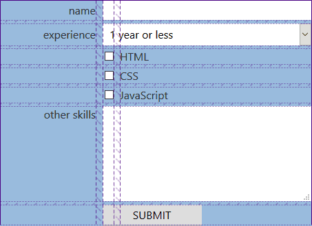
In this form layout:
- standard labels appear in column one
- checkbox and radio buttons span columns one and two (but are aligned right)
- checkbox and radio labels appear in column three
- all other fields span columns two and three.
Here are the outer container and child field properties:
.formgrid {
  display: grid;
  grid-template-columns: 1fr 1em 2fr;
  grid-gap: 0.3em 0.6em;
  grid-auto-flow: dense;
  align-items: center;
}

input, output, textarea, select, button {
  grid-column: 2 / 4;
  width: auto;
  margin: 0;
}
grid-column defines the starting and ending grid tracks. Tracks are the edges between cells so the three-column form layout has four tracks:
- the first track on the left-hand side of the grid before column one
- the track between columns one and two
- the track between columns two and three
- the final track on the right-hand edge of the grid after column three.
grid-column: 2 / 4; positions all fields between tracks 2 and 4 — or inside columns two and three.
The first HTML element is the name <input>. It spans columns two and three, which means column one (track 1 / 2) is empty on that row. By default, the name label would therefore drop to row 2, column 1. However, by setting grid-auto-flow: dense; in the container, the browser will attempt to fill empty cells earlier in the grid before progressing to a new row.
Checkboxes and radio buttons can now be set to span tracks 1 to 3 (columns one and two) but align themselves to the right-hand edge using justify-self: end:
input[type="checkbox"], input[type="radio"] {
  grid-column: 1 / 3;
  justify-self: end;
  margin: 0;
}
Labels on the grid will handle themselves and fit into whichever row cell is empty. However, the default widths and spacing from the float layout are now unnecessary:
label, input[type="checkbox"] + label, input[type="radio"] + label {
  width: auto;
  padding: 0;
  margin: 0;
}
Finally, <textarea> labels can be vertically positioned at the top of the cell rather than centered:
textarea + label {
  align-self: start;
}
Here’s the final grid-based form layout:
See the Pen form grid 2: grid applied by SitePoint (@SitePoint) on CodePen.
Unlike floats, the design won’t break at small dimensions or require tweaking when different fonts, sizes or labels are added.
Grid Enlightenment
It’s taken several years to become viable, but CSS Grid is well supported and offers layout possibilities that would have been difficult with floats or flexbox. Forms are an ideal use case, and the resulting CSS is short yet robust.
If you’re looking to learn another CSS technique, Grid should be at the top of your list.
Frequently Asked Questions on CSS Grid Web Form Layout
How can I make my CSS Grid layout responsive?
Making your CSS Grid layout responsive involves using media queries and the ‘fr’ unit. Media queries allow you to apply different styles for different devices based on their screen size. The ‘fr’ unit represents a fraction of the available space in the grid container. For example, you can define your grid template columns as ‘1fr 1fr’ for larger screens and ‘2fr’ for smaller screens. This way, your grid items will take up half the space on larger screens and the full space on smaller screens.
Can I use CSS Grid layout with Bootstrap?
Yes, you can use CSS Grid layout with Bootstrap. While Bootstrap has its own grid system, you can still use CSS Grid for more complex layouts. You can use Bootstrap classes for basic structure and CSS Grid for detailed layout control. However, remember that CSS Grid might not be fully supported in older browsers, unlike Bootstrap’s grid system.
How can I align items in a CSS Grid layout?
You can align items in a CSS Grid layout using the ‘align-items’, ‘justify-items’, and ‘place-items’ properties. ‘Align-items’ aligns items vertically, ‘justify-items’ aligns items horizontally, and ‘place-items’ is a shorthand property for the two. You can set these properties to ‘start’, ‘end’, ‘center’, ‘stretch’, or ‘baseline’.
How can I create a gap between grid items?
You can create a gap between grid items using the ‘gap’, ‘row-gap’, and ‘column-gap’ properties. ‘Gap’ is a shorthand property for ‘row-gap’ and ‘column-gap’. You can set these properties to any length value. For example, ‘gap: 10px’ will create a 10px gap between all grid items.
How can I overlap grid items?
You can overlap grid items by placing them into the same grid cell or by using negative grid row or column numbers. For example, if you have two items and you want the second item to overlap the first, you can set ‘grid-row: 1’ and ‘grid-column: 1’ for both items.
How can I use CSS Grid layout for form design?
You can use CSS Grid layout for form design by defining a grid container for your form and placing your form elements into the grid cells. This allows you to create complex form layouts without having to use floats or positioning. You can also use the ‘grid-template-areas’ property to create a visual representation of your form layout.
How can I create a nested grid?
You can create a nested grid by defining a grid container inside another grid container. The inner grid container will become a grid item of the outer grid container. You can then define grid columns and rows for the inner grid container, just like you would for any other grid container.
How can I use CSS Grid layout with flexbox?
You can use CSS Grid layout with flexbox by defining a flex container inside a grid container or vice versa. This allows you to use the strengths of both layout models. For example, you can use CSS Grid for two-dimensional layouts and flexbox for one-dimensional layouts.
How can I control the order of grid items?
You can control the order of grid items using the ‘order’ property. By default, grid items are placed into the grid in the order they appear in the source code. However, you can change this order by setting the ‘order’ property to a positive or negative integer. Lower values are placed first.
How can I create a grid with dynamic number of columns?
You can create a grid with a dynamic number of columns using the ‘repeat’, ‘auto-fill’, and ‘minmax’ functions. For example, ‘grid-template-columns: repeat(auto-fill, minmax(200px, 1fr))’ will create as many 200px columns as can fit into the grid container. If there is extra space, the columns will stretch to fill it.
 Craig Buckler
Craig is a freelance UK web consultant who built his first page for IE2.0 in 1995. Since that time he's been advocating standards, accessibility, and best-practice HTML5 techniques. He's created enterprise specifications, websites and online applications for companies and organisations including the UK Parliament, the European Parliament, the Department of Energy & Climate Change, Microsoft, and more. He's written more than 1,000 articles for SitePoint and you can find him @craigbuckler.