
This post is the first of a two-part series.
Introduction
I remember the first time I was learning CSS, and how I was excited to learn about float and inline display to place elements in the desired layout. I wonder how I would have reacted if a two-dimensional layout system was available at that time. Actually, even now I'm excited about this because it changes everything: the way we write our CSS but also the way we write our markup. With CSS grid it is easier than ever to build responsive, dynamic, and source-order independent layouts.
In this post, we will learn about all the CSS grid properties to build easy and some less easy layouts. We will define everything then we will dig a little deeper to see what we can achieve with CSS grid.
With that being said, if you are ready to learn a new way to think about layout, take the red pill and I will show you how deep the rabbit hole goes.

1. Before we start
But before we start I would like to address some concerns that you might have, as well as making sure we are familiar with the basics of CSS grid and its terminologies.
Q&A
Does CSS grid replace flex-box?
Well, CSS grid does not replace flex-box. They are two different tools for different purposes. Actually, they work very well together, we can have a flex display inside a grid display and vice versa.
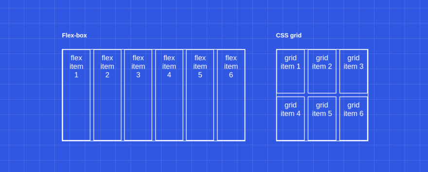
What are the differences between CSS grid and flex-box?
There are a lot of differences, but the main one is that flex-box is a one-dimensional layout system whereas CSS grid is a two-dimensional layout system. Have a look at the Figure 1.1 below:
Why not use bootstrap instead?
I think the best answer to this question is this quote from Jen Simmons:
The more I use CSS Grid, the more convinced I am that there is no benefit to be had by adding a layer of abstraction over it. CSS Grid is the layout framework baked right into the browser — Jen Simmons
Is CSS grid production-ready?
It depends. Do you need to support: IE, Opera mini, Blackberry browser, or Baidu mobile? If the answer is no, then yes it is production-ready, if the answer is yes then you might use it anyway for the browsers that support it (unprefixed: 91.61%) using the @supports CSS at-rule:
@supports (display: grid) {
  div {
    display: grid;
  }
}
Basics
Basically, a grid could be broken down to two elements: the grid container and the grid-items.

As we see in the Figure 1.2 the grid container is a set of columns and rows. A row is a space between two consecutive row-lines (horizontal lines) and a column is a space between two consecutive column-lines (vertical lines). A row could be called a track, and the same goes for a column. So a grid track is a space between two parallel grid-lines.
Each track could have one or multiple grid cells. The grid cell is the fundamental grid unit as it is the smallest one. It is the space between four intersecting grid-lines. If we combine multiple grid cells together we have a grid area. It is important to mention that a grid area must be rectangular, we can not have a T shaped grid area for example.
The grid-lines start from 1 to the number of lines you explicitly or implicitly defined. The last number of grid-line could be referred to as -1, the grid-line before it as -2 and so on. This will come handy later.
In the Figure 1.2 the number of column-lines goes from 1 to 6 (of from -6 to -1) and the number of row-lines goes from 1 to 5 (or -5 to -1).
The number of grid-lines is considered explicit if you explicitly set it in your CSS. And it is considered implicit if it is set by the browser dynamically.
Finally, the grid cells could be separated by a space or a gap. Those gaps are called gutters, but we generally refer to them as gaps :).
2. CSS grid basic properties
Ok, with that we should be ready to start implementing some grids. We first are going to talk about all the properties we could use with the grid container, then we will have a look at the properties of the grid-items after that.
Let's consider the following template for this section:
<div class="grid-container">
    <div class="grid-item">grid item 1</div>
    <div class="grid-item">grid item 2</div>
    <div class="grid-item">grid item 3</div>
    <div class="grid-item">grid item 4</div>
    <div class="grid-item">grid item 5</div>
    <div class="grid-item">grid item 6</div>
    <div class="grid-item">grid item 7</div>
    <div class="grid-item">grid item 8</div>
    <div class="grid-item">grid item 9</div>
</div>
The Grid container
Display
A CSS grid is defined using the grid value of the display property. So, to define the grid using the template above, we should do:
.grid-container {
  display: grid;
}
Rows & Columns
We can define columns and rows on your grid using the grid-template-rows and grid-template-columns properties:
.grid-container {
  grid-template-columns:  1fr 1fr 1fr 1fr;
  grid-template-rows:  1fr auto 2fr;
}
Or we can use grid-template where we first define the grid-template-rows then the grid-template-columns (separated by a slash):
.grid-container {
  grid-template:  1fr auto 2fr  / 1fr 1fr 1fr 1fr;
}
By the way an fr is a fractional unit, so 1fr is for 1 part of the available space.
Repeat function
The repeat() function represents a repeated fragment of the track-list.
So we could achieve the same template as above like this:
.grid-container {
  grid-template:  1fr auto 2fr / repeat(4, 1fr);
}
Read the documentation here to see how to use auto-fit and auto-fill to add tracks dynamicly.
Minmax function
The minmax() CSS function defines a size range greater than or equal to min and less than or equal to max.
We can use it with repeat() like this:
.grid-container {
  grid-template-columns:  repeat(3, minmax(100px, 1fr));
}
Gaps
We can add gaps between the row-lines by using row-gap, we can do the same between column-lines using column-gap:
.grid-container {
 row-gap: 5px;
 column-gap: 10px;
}
Or we can use gap where we first define the row-gap then the column-gap:
.grid-container {
  gap: 5px 10px;
}
If the row-gap is the same as the column-gap, we can specify only one value.
The grid items
To specifies a grid-item’s start and end position within the grid we basically use four properties. Let's have a look at their definitions.
Definitions
| Properties | Definitions |
|---|---|
grid-row-start |
The grid-row-start CSS property specifies a grid item’s start position within the grid row by contributing a line, a span, or nothing (automatic) |
grid-row-end |
The grid-row-end CSS property specifies a grid item’s end position within the grid row by contributing a line, a span, or nothing (automatic) |
grid-column-start |
The grid-column-start CSS property specifies a grid item’s start position within the grid column by contributing a line, a span, or nothing (automatic) |
grid-column-end |
The grid-column-end CSS property specifies a grid item’s end position within the grid column by contributing a line, a span, or nothing (automatic) |
Or we can use the shortened version of these properties:
| Properties | Definitions |
|---|---|
grid-row |
The grid-row CSS property is a shorthand property for grid-row-start and grid-row-end specifying a grid item’s size and location within the grid row |
grid-column |
The grid-column CSS property is a shorthand property for grid-column-start and grid-column-end specifying a grid item's size and location within the grid column |
Basic template spacing
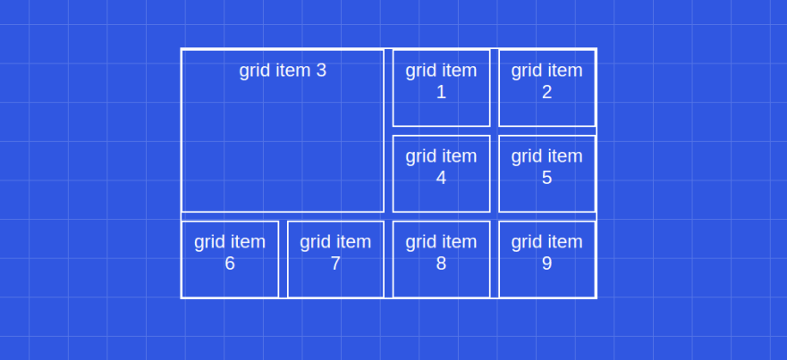
So, considering the markup we have at the start of this section, let's say we want the third grid-item to take 4 cells instead of one (we want it to span across two grid columns and two grid rows) like in the Figure 1.3. How could we do it?
We could implement like this:
// Grid container
.grid-container {
  display: grid;
  gap: 10px;
  grid-template-columns: repeat(4, 1fr);
  grid-template-rows: repeat(3, 1fr);
}

// Grid item (third)
.grid-container .grid-item:nth-child(3) {
  grid-column-start: 1;
  grid-column-end: 3;
  grid-row-start: 1;
  grid-row-end: 3;
  // or
  grid-column: 1 / 3;
  grid-row: 1 / 3;
  // or
  grid-column: 1 / span 2;
  grid-row: 1 / span 2;
  // or
  grid-column: -5 / span 2; // because we have 4 columns
  grid-row: -4 / span 2; // because we have 3 rows
}
Note that the third grid-item is actually the first in the Figure 1.3. That has to do with the fact that with CSS grid we can have (for the first time) source order independence. We will touch on that a little bit later when we will talk about the
grid-auto-flow.
Click here if you want to play with it and explore the different solutions.
3. Advanced templating
There are more advanced properties that can help you adjust your template as you would like it to be. In this section, we are going to have a look at these properties and see how we can use them in our CSS.
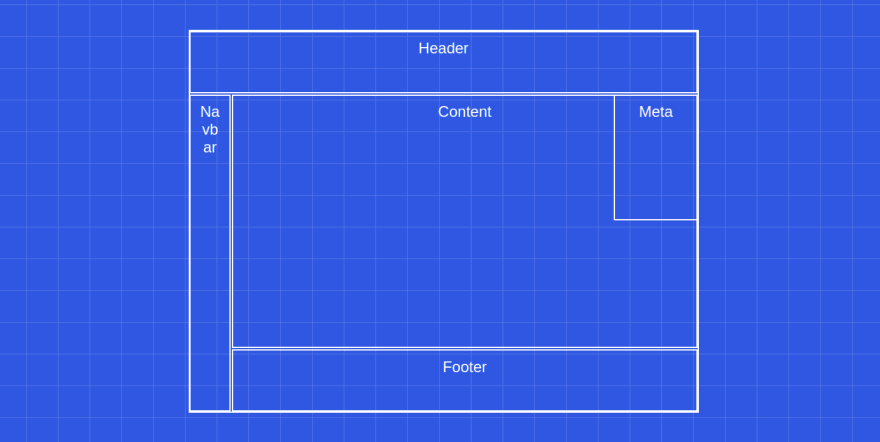
For this section , consider the following template:
 <div class="grid-container">
   <div class="grid-item header">Header</div>
   <div class="grid-item content">Content</div>
   <div class="grid-item navbar">Navbar</div>
   <div class="grid-item meta">Meta</div>
   <div class="grid-item footer">Footer</div>
 </div>
Using what we've learned before, we can implment the following CSS to make it look like a basic website layout:
.grid-container {
  grid-template: repeat(6, 1fr) / repeat(12, 1fr);// rows then columns
}
.grid-container .header {
  grid-column: 1 / -1;  grid-row: 1 / 2;
}
.grid-container .navbar {
  grid-column: 1 / 2;  grid-row: 2 / -1;
}
.grid-container .content {
  grid-column: 2 / -1;  grid-row: 2 / -2;
}
.grid-container .footer {
  grid-column: 2 / -1;  grid-row: -2 / -1;
}
.grid-container .meta {
  grid-column: -3 / -1;  grid-row: 2 / 4;
}
Now let's say we want our navbar (on the right) to be a little bit wider. For now, it spans across one column-line, we want it to span through two column-lines instead. To do this we have to change the .navbar position but we also have to change the .content and the .footer position, because currently the .navbar goes from the column-line 1 to 2, and the .footer & .content goes from the column-line 2 to the last.
It could be tedious to change the position of the elements if we have to do that each time, it would be great if there was a way to tell CSS grid to do this automatically for us. Well, there is not one way, but there are at least two.
Named lines
The first solution is to name the specific line, then we refer to it using its alias instead of its number. Let's try to implement this.
.grid-container {
  grid-template-rows: repeat(6, 1fr);
  grid-template-columns: 1fr 1fr [content-start navbar-end] repeat(10, 1fr);
}
In the code above, we named the tird line using simple brackets with aliasses inside (a sigle line could have multiple aliasses). Then now we will change the CSS of the elements mentioned before:
.grid-container .navbar {
  grid-column: 1 / navbar-end;  grid-row: 2 / -1;
}
.grid-container .content {
  grid-column: content-start / -1;  grid-row: 2 / -2;
}
.grid-container .footer {
  grid-column: content-start / -1;  grid-row: -2 / -1;
}
The result should look like this:

Try to do the same for the other lines (ex: header-row-end / content-row-start) in this code snippet.
Element template areas
The second solution consists of using template areas. The grid-template-areas CSS property specifies named grid areas. This property has a weird syntax for CSS but we use them like this:
.grid-container {
  grid-template-areas:
    'h h h h h h h h h h h h'
    'n n c c c c c c c c c c'
    'n n c c c c c c c c c c'
    'n n c c c c c c c c c c'
    'n n c c c c c c c c c c'
    'n n f f f f f f f f f f';
}
.grid-container .navbar {
  grid-area: n;
}
.grid-container .content {
  grid-area: c;
}
.grid-container .footer {
  grid-area: f;
}
.grid-container .header {
  grid-area: h;
}
.grid-container .meta {
  grid-column: -3 / -1;  grid-row: 2 / 4;
}
We use grid-template-areas to define the grid container areas, then we place the grid-items in the desired area using grid-area.
As a reminder, all the areas must be rectangular.
Notice how we did not use
grid-areafor.metaelement. That's because, for now, there isn't a way to superpose elements using this method. At least not that I'm aware of.
You can play around with it, the code is available here.
4. Implicit rows & grid flow
Let's consider the following code:
<div class="grid-container">
  <div class="grid-item">1</div>
  <div class="grid-item">2</div>
  <div class="grid-item">3</div>
  <div class="grid-item">4</div>
  <div class="grid-item">5</div>
  <div class="grid-item">6</div>
</div>
<style>
.grid-container {
  grid-template-columns: repeat(3, minmax(100px, 1fr));
  grid-template-rows: 80px;
}
.grid-container .grid-item:nth-child(2) {
  grid-row: span 2;
}
.grid-container .grid-item:nth-child(3) {
  grid-column: span 3;
}
</style>
We have a grid of three columns and we want the second grid-item to span across two rows and the third to span across three columns. This resuts in this:
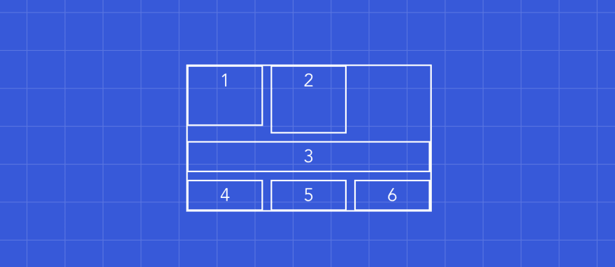
This looks bad, so what is happening in here? First, the second element is slightly taller than the first, because we told it to be twice as tall, but it does not look twice as tall at all. Also, the grid-items from 3 to 6 are less tall than the fist.
Implicit rows
That has to do with the fact that we explicitly set the first row: grid-template-rows: 80px;. But the other rows were implicitly created, so the second row is almost none visible because it's empty and the other rows are as big as their content needs them to be.
We could fix that by setting the height of the implicitly created rows using grid-auto-rows like this:
.grid-container {
  grid-template-columns: repeat(4, minmax(100px, 1fr));
  grid-template-rows: 80px;
  grid-auto-rows: 100px;
}
And this should look like this:

This looks better but still, we can do better. Notice the blanc spaces, why don't we use them to place the grid-items 4, 5, and 6?
To do that we can use grid-auto-flow.
Grid flow
The grid-auto-flow CSS property controls how the auto-placement algorithm works, specifying exactly how auto-placed items get flowed into the grid. It could take multiple parameters (you can read more about it here), but here we are interested in only one: dense.
This will tell the browser to place the items on any big enough space for them:
.grid-container {
  grid-auto-flow: dense; // default is row
}
With that our grid finally looks nice :)

Conclusion
This was quite a lot of information to process, but with that, we covered many of the CSS grid properties so you should feel comfortable to start using CSS grid in your apps. This post is the first of a series, in the next one we will implement 3 practical examples using grid, so stay in tune.
I hope you learned something useful and as always, Happy coding!
Hey, let's stay in touch!
I'm working on a lot of awesome posts and tutorials to come. If you liked this one, make sure to follow me on Twitter to get updated on when the next one might come out.


Top comments (19)
This is a great post, and I love the visuals/illustrations!
I appreciate the comparison to flexbox too - I have a lot of experience with flexbox, but none with grid, so it's good to know they aren't really replacements for one another.
I do find the css grid syntax to be a bit... funny. Do you get used to it after awhile? I probably just need to play with it for a bit, and see how it feels 🙃
Thanks!
Thank you, appreciate it.
Well, the
grid-template-areassyntax is really weird at first, but if you think of CSS grid as a framework on its own it gets easier (at least it did the trick for me :p).Awesome post!
Thank you Mohammed! 🙏
Very good post.
There are some things that you will be interested in....mostly by Morten Rand-Hendriksen; check him out on codepen. He also has a very good presentation on Grid on Youtube at youtube.com/watch?v=txZq7Laz7_4
In relation to @supports for Grid he makes a good point and suggests using @supports (grid-area: auto) rather than simply @supports (display: grid) because some older browsers support an early version of grid which will be triggered by the simpler version.
You will also notice in his pens that he illustrates a working solution to stacking grid items for which you state in your post...
Notice how we did not use grid-area for .meta element. That's because, for now, there isn't a way to superpose elements using this method. At least not that I'm aware of.
Since I am an old school (really old) programmer. I am interested in simpler methods of writing HTML, CSS, and javascript and am experimenting extensively now with HTML/Pug, SCSS/SASS, and ES6.
Flexbox and Grid provide a lot of the features that have been on my wishlist for a long time.
It seems to me that the more these languages develop, the more they seem to be getting back to way programming once was. Pretty soon, I might be current again.
I look forward to more posts
You're like my hero of CSS! Thank you so much for the clear explanations and all the illustrations :D
Just realised you are French, merciiiii pour tout, c'est du super contenu! Etant junior et en télétravail, j'apprécie tout contenu qui est clair, direct et m'aide pour pratiquer dans mes sides projects. Merci merci merciiii!!!
Hey, Merci pour ton retour !
Ça me motive à continuer :)
Excellent post. I worked with the tutorial within a React app. Called to mind grid layouts from back in my ASP.NET web forms days. I think I use columns and rows in bootstrap most of the time. I'm open to any option so long as the controls adjust to orientation and devices. I also have to stick to patterns that are common or that my clients use. I would like to see this CSS grid layout filled with working controls. I'll drop some in just for poops and giggles.
Hi Mustapha! you are great, your explanation is amazingly clear and complete! thank you very very very much :)
a little question: is it accurate the statement "Or we can use grid-template where we first define the grid-template-rows then the grid-template-columns" in the "Rows & Columns" paragraph? it seems to me that this does conflict with the example given above ...
have nice days!
Hey Nando, thanks for the kind words, means a lot to me.
You are absolutely right. I inverted them in the article, but it actually is rows then columns:
I made the correction, thanks so much for pointing out this error, you are awesome!
awesome post, love the illustrations! I now get the difference between flexbox and grid, what I would suggest is to add column/row-line number on other illustrations as well not just on il. 1.2, cheers! :)
Hey Puleta, thanks for the feedback. Great idea, I'll make sure to add them 🙂
I wouldn't say it's not supported by IE(11). Funny enough, I learned that IE11 was the first browser to have support for CSS grid (but back then with an alternative syntax and/or prefixes).
Check this article series from CSS tricks on how you can support IE11 with grid and what the caveats are.
css-tricks.com/css-grid-in-ie-css-...
IE10 and IE11 support an older version of the specification, so i can't say that they support it. But i get what you are saying, it is great to know that we can also use it on IE.
Thanks for sharing.
Wow! This is great content alongside a great presentation! You made everything very clear, I will go and read the second part straight away!
Wow, what a great post with nice examples. Will definitely going to try and use this in my next assignment.
Thank you, glad to hear that 🙂
Great post. I love CSS Grid. This will serve me well as a reference, thank you!
Some comments may only be visible to logged-in visitors. Sign in to view all comments.