
When thinking about what CSS framework to use for a new project, options like Bootstrap and Foundation readily jump to mind. They’re tempting to use because of their ready-to-use, pre-designed components, which developers can use with ease right away. This approach works well with relatively simple websites with a common look and feel. But as soon as we start building more complex, unique sites with specific needs, a couple of problems arise.
At some point, we need to customize certain components, create new components, and make sure the final codebase is unified and easy to maintain after the changes.
It’s hard to satisfy the above needs with frameworks like Bootstrap and Foundation, which give us a bunch of opinionated and, in many cases, unwanted styles. As a result, we have to continuously solve specificity issues while trying to override the default styles. It doesn’t sound like a fun job, does it?
Ready-to-use solutions are easy to implement, but inflexible and confined to certain boundaries. On other hand, styling web sites without a CSS framework is powerful and flexible, but isn’t easy to manage and maintain. So, what’s the solution?
The solution, as always, is to follow the golden middle. We need to find and apply the right balance between the concrete and abstract. A low-level CSS framework offers such a balance. There are several frameworks of this kind, and in this tutorial, we’ll explore the most popular one, Tailwind CSS.
What Is Tailwind?
Tailwind is more than a CSS framework, it’s an engine for creating design systems. — Tailwind website
Tailwind is a collection of low-level utility classes. They can be used like lego bricks to build any kind of component. The collection covers the most important CSS properties, but it can be easily extended in a variety of ways. With Tailwind, customization isn’t pain in the neck anymore. The framework has great documentation, covering every class utility in detail and showing the ways it can be customized. All modern browsers, and IE11+, are supported.
Why Use a Utility-first Framework?
A low-level, utility-first CSS framework like Tailwind has a plenty of benefits. Let’s explore the most significant of them:
- You have greater control over elements’ appearance. We can change and fine-tune an element’s appearance much more easily with utility classes.
- It’s easy to manage and maintain in large projects, because you only maintain HTML files, instead of a large CSS codebase.
- It’s easier to build unique, custom website designs without fighting with unwanted styles.
- It’s highly customizable and extensible, which gives us unlimited flexibility.
- It has a mobile-first approach and easy implementation of responsive design patterns.
- There’s the ability to extract common, repetitive patterns into custom, reusable components — in most cases without writing a single line of custom CSS.
- It has self-explanatory classes. We can imagine how the styled element looks only by reading the classes.
Finally, as Tailwind’s creators say:
it’s just about impossible to think this is a good idea the first time you see it — you have to actually try it.
So, let’s try it!
Getting Started with Tailwind
To demonstrate Tailwind’s customization features, we need to install it via npm:
npm install tailwindcss
The next step is to create a styles.css file, where we include the framework styles using the @tailwind directive:
@tailwind base;

@tailwind components;

@tailwind utilities;
After that, we run the npx tailwind init command, which creates a minimal tailwind.config.js file, where we’ll put our customization options during the development. The generated file contains the following:
module.exports = {
  theme: {},
  variants: {},
  plugins: [],
}
The next step is to build the styles in order to use them:
npx tailwind build styles.css -o output.css
Finally, we link the generated output.css file and Font Awesome in our HTML:
  <link rel="stylesheet" type="text/css" href="output.css">
  <link rel="stylesheet" href="https://cdnjs.cloudflare.com/ajax/libs/font-awesome/5.9.0/css/all.min.css">
And now, we’re ready to start creating.
Building a One-page Website Template
In the rest of the tutorial, we’ll build a one-page website template using the power and flexibility of Tailwind’s utility classes.
Here you can see the template in action.
I’m not going to explain every single utility (which would be boring and tiresome) so I suggest you to use the Tailwind cheatsheet as a quick reference. It contains all available utilities with their effect, plus direct links to the documentation.
We’ll build the template section by section. They are Header, Services, Projects, Team, and Footer.
We firstly wrap all section in a container:
<div class="container mx-auto">
  <!-- Put the sections here -->
</div>
Header (Logo, Navigation)
The first section — Header — will contain a logo on the left side and navigation links on the right side. Here’s how it will look:
Now, let’s explore the code behind it.
<div class="flex justify-between items-center py-4 bg-blue-900">
  <div class="flex-shrink-0 ml-10 cursor-pointer">
    <i class="fas fa-drafting-compass fa-2x text-orange-500"></i>
    <span class="ml-1 text-3xl text-blue-200 font-semibold">WebCraft</span>
  </div>
  <i class="fas fa-bars fa-2x visible md:invisible mr-10 md:mr-0 text-blue-200 cursor-pointer"></i>
  <ul class="hidden md:flex overflow-x-hidden mr-10 font-semibold">
    <li class="mr-6 p-1 border-b-2 border-orange-500">
      <a class="text-blue-200 cursor-default" href="#">Home</a>
    </li>
    <li class="mr-6 p-1">
      <a class="text-white hover:text-blue-300" href="#">Services</a>
    </li>
    <li class="mr-6 p-1">
      <a class="text-white hover:text-blue-300" href="#">Projects</a>
    </li>
    <li class="mr-6 p-1">
      <a class="text-white hover:text-blue-300" href="#">Team</a>
    </li>
    <li class="mr-6 p-1">
      <a class="text-white hover:text-blue-300" href="#">About</a>
    </li>
    <li class="mr-6 p-1">
      <a class="text-white hover:text-blue-300" href="#">Contacts</a>
    </li>
  </ul>
</div>
As you can see, the classes are pretty self-explanatory as I mentioned above. We’ll explore only the highlights.
First, we create a flex container and center its items horizontally and vertically. We also add some top and bottom padding, which Tailwind combines in a single py utility. As you may guess, there’s also a px variant for left and right. We’ll see that this type of shorthand is broadly used in many of the other utilities. As a background color, we use the darkest blue (bg-blue-900) from Tailwind’s color palette. The palette contains several colors with shades for each color distributed from 100 to 900. For example, blue-100, blue-200, blue-300, etc.
In Tailwind, we apply a color to a property by specifying the property followed by the color and the shade number. For example, text-white, bg-gray-800, border-red-500. Easy peasy.
For the logo on the left side, we use a div element, which we set not to shrink (flex-shrink-0) and move it a bit away from the edge by applying the margin-left property (ml-10). Next we use a Font Awesome icon whose classes perfectly blend with those of Tailwind. We use one of them to make the icon orange. For the textual part of the logo, we use big, light blue, semi-bolded text, with a small offset to the right.
In the middle, we add an icon that will be visible only on mobile. Here we use one of the responsive breakpoint prefixes (md). Tailwind, like Bootstrap and Foundation, follows the mobile-first approach. This means that when we use utilities without prefix (visible), they apply all the way from the smallest to the largest devices. If we want different styling for different devices, we need to use the breakpoint prefixes. So, in our case the icon will be visible on small devices, and invisible (md:invisible) on medium and beyond.
At the right side we put the nav links. We style the Home link differently, showing that it’s the active link. We also move the navigation from the edge and set it to be hidden on overflow (overflow-x-hidden). The navigation will be hidden (hidden) on mobile and set to flex (md:flex) on medium and beyond.
You can read more about responsiveness in the documentation.
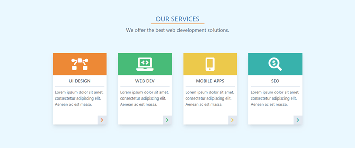
Services
Let’s now create the next section, Services. Here’s how it will look:
And here’s the code:
<div class="w-full p-6 bg-blue-100">
  <div class="w-48 mx-auto pt-6 border-b-2 border-orange-500 text-center text-2xl text-blue-700">OUR SERVICES</div>
  <div class="p-2 text-center text-lg text-gray-700">We offer the best web development solutions.</div>
  <div class="flex justify-center flex-wrap p-10">
    <div class="relative w-48 h-64 m-5 bg-white shadow-lg">
      <div class="flex items-center w-48 h-20 bg-orange-500">
        <i class="fas fa-bezier-curve fa-3x mx-auto text-white"></i>
      </div>
      <p class="mx-2 py-2 border-b-2 text-center text-gray-700 font-semibold uppercase">UI Design</p>
      <p class="p-2 text-sm text-gray-700">Lorem ipsum dolor sit amet, consectetur adipiscing elit. Aenean ac est massa.</p>
      <div class="absolute right-0 bottom-0 w-8 h-8 bg-gray-300 hover:bg-orange-300 text-center cursor-pointer">
        <i class="fas fa-chevron-right mt-2 text-orange-500"></i>
      </div>
    </div>
    ...
  </div>
</div>
We create a section with light blue background. Then we add an underlined title and a subtitle.
Next, we use a flex container for the services items. We use flex-wrap so the items will wrap on resize. We set the dimensions for each card and add some space and a drop shadow. Each card has a colored section with a topic icon, a title, and a description. And we also put a button with an icon in the bottom-right corner.
Here we use one of the pseudo-class variants (hover, focus, etc.). They’re used in the same way as responsive breakpoints. We use the pseudo-class prefix, followed by a colon and the property name (hover:bg-orange-300).
You can learn more about pseudo-class variants in the documentation.
For brevity, I show the code only for the first card. The other ones are similar. You have to change only the colors, icons, and titles. See the final HTML file on GitHub repo for a reference.
Projects
Let’s move to the next section, Projects. Here’s the final look:
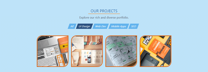
And here’s the code:
<div class="section bg-blue-200">
  <div class="section-title">OUR PROJECTS</div>
  <div class="section-subtitle">Explore our rich and diverse portfolio.</div>

  <nav class="flex justify-center flex-wrap mt-4 mb-8 text-white">
    <div class="h-8 mr-2 px-3 py-1 bg-blue-400 hover:bg-blue-600 text-center cursor-pointer -skewx-20">All</div>
    <div class="h-8 mr-2 px-3 py-1 bg-blue-800 text-center -skewx-20">UI Design</div>
    <div class="h-8 mr-2 px-3 py-1 bg-blue-400 hover:bg-blue-600 text-center cursor-pointer -skewx-20">Web Dev</div>
    <div class="h-8 mr-2 px-3 py-1 bg-blue-400 hover:bg-blue-600 text-center cursor-pointer -skewx-20">Mobile Apps</div>
    <div class="h-8 mr-2 px-3 py-1 bg-blue-400 hover:bg-blue-600 text-center cursor-pointer -skewx-20">SEO</div>
  </nav>

  <div class="flex justify-center flex-wrap">
    <div class="w-48 h-48 m-2 hover:-mt-1 border-4 border-orange-600 rounded-tl-2xl rounded-br-2xl cursor-pointer hover:shadow-lg">
      <img class="w-full h-full object-cover rounded-tl-2xl rounded-br-2xl" src="design1.jpg" />
    </div>
    ...
  </div>
</div>
First, you may notice that here I use section classes. They’re not from the Tailwind. I created them and will show you how right now.
Because all three middle sections will share one and the same base look and feel — which leads to code repetition — now is the time to start thinking in components. One of the great features Tailwind offers is the ability to extract and create easily and painlessly any kind of custom components. So, here we’ll extract a custom section component.
Here’s how. Open the styles.css and add the following classes right after the components declaration:
...
@tailwind components;

.section {
  @apply w-full p-6;
}

.section-title {
  @apply w-48 mx-auto pt-6 border-b-2 border-orange-500 text-center text-2xl text-blue-700;
}

.section-subtitle {
  @apply p-2 text-center text-lg text-gray-700;
}
...
As you can see, to create a component class we use the @apply directive followed by the necessary utilities. Here’s more information about extracting components.
Now, to use the new classes, we need to re-build the styles again:
npx tailwind build styles.css -o output.css
Now, instead of a long array of utilities, we just use one single class for each element. And as you can see, the custom classes can be used safely in conjunction with the regular utilities (section bg-blue-200).
Let’s move to the navigation buttons. We put them in a flex container and style them as nice-looking rectangles. But we want to make them a bit more dynamic and stylish by applying a little skew effect. The problem is that Tailwind doesn’t offer such utility. So, it’s time to learn how to create our own utilities. It’s super easy.
Open styles.css again and add the needed class right after the utilities declaration:
...
@tailwind utilities;

.-skewx-20 {
  transform: skewX(-20deg);
}
...
What we want is to skew the rectangles horizontally. For this we need the skewX() with a negative value. In Tailwind, utilities with negative values are created by putting a minus sign before the utility name.
We can see the effect of our new utility immediately after we re-build the styles.
Here’s more information about adding new utilities.
Now, we create another flex container for the project cards. We want to round their top-left and bottom-right corners, but the amount of roundness which rounded utility offers is less than we need. So, this time we’ll learn how to customize the default Tailwind theme.
Open tailwind.config.js and add the borderRadius option after the theme.extend key:
theme: {
    extend: {
      borderRadius: {
        xl: '1rem',
        '2xl': '2rem',
        '3xl': '3rem'
      }
    }
  },
Here we use the extend key, because we don’t want to override other options, we want to include additional options. After we re-build the styles, we can see how our new options take effect.
To learn more about theme customization, visit the documentation.
There’s one more thing we want to do which Tailwind doesn’t offer by default. We want the card to rise up a bit on hover. So we need to add a subtle negative margin on hover. But to make it work we need to enable the hover variant to the margin utility.
To do so, we put the following in tailwind.config.js:
  variants: {
    margin: ['responsive', 'hover']
  },
The important thing here is that we must always provide the complete list of variants we want to enable, not only the new ones.
Learn more about configuring variants in the documentation.
Now, let’s re-build the styles and see the result.
Team
At this stage you’ve got a pretty good idea of how Tailwind works, and building the Team section will be pretty familiar. Here’s how it will look:

Here’s the code:
    <div class="section bg-blue-100">
      <div class="section-title">OUR TEAM</div>
      <div class="section-subtitle">Meet our skilled professionals.</div>

      <div class="flex justify-center flex-wrap">
        <div class="w-48 m-4 py-2 bg-white shadow-lg">
          <img class="w-24 h-24 mx-auto rounded-full" src="jessica.jpg" />
          <p class="mx-2 mt-2 text-center text-lg text-gray-700 font-semibold">Jessica Thompson</p>
          <p class="text-center text-gray-600">UI Artisan</p>
          <div class="flex justify-center items-center mt-2">
            <i class="fab fa-facebook-square fa-2x mx-1 text-blue-500 hover:text-orange-500 cursor-pointer"></i>
            <i class="fab fa-twitter-square fa-2x mx-1 text-blue-500 hover:text-orange-500 cursor-pointer"></i>
            <i class="fab fa-google-plus-square fa-2x mx-1 text-blue-500 hover:text-orange-500 cursor-pointer"></i>
          </div>
        </div>
        ...
      </div>
    </div>
Here, we create a set of profile cards. The code for them is highly repetitive, so we’ll extract it in a reusable card component. We already know how to do it.
We create the card classes and put them in the styles.css file:
...
.card {
  @apply w-48 m-4 py-2 bg-white shadow-lg;
}

.card-image {
  @apply w-24 h-24 mx-auto rounded-full;
}

.card-title {
  @apply mx-2 mt-2 text-center text-lg text-gray-700 font-semibold;
}

.card-subtitle {
  @apply text-center text-gray-600;
}

.card-icons {
  @apply flex justify-center items-center mt-2;
}

.card-icon {
  @apply mx-1 text-blue-500 cursor-pointer;
}

.card-icon:hover {
  @apply text-orange-500;
}
...
Now, let’s re-build the styles and use the card classes in our file. We swap the utilities with the classes, and as a result we get a much shorter version of the code.
<div class="section bg-blue-100">
  <div class="section-title">OUR TEAM</div>
  <div class="section-subtitle">Meet our skilled professionals.</div>

  <div class="flex justify-center flex-wrap">
    <div class="card">
      <img class="card-image" src="jessica.jpg" />
      <p class="card-title">Jessica Thompson</p>
      <p class="card-subtitle">UI Artisan</p>
      <div class="card-icons">
        <i class="fab fa-facebook-square fa-2x card-icon"></i>
        <i class="fab fa-twitter-square fa-2x card-icon"></i>
        <i class="fab fa-google-plus-square fa-2x card-icon"></i>
      </div>
    </div>
    ...
  </div>
</div>
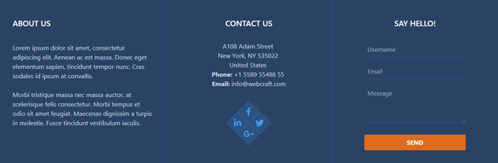
Footer (About, Contacts)
Now we’ll look at the final Footer section. This will contain three columns and will look like this:
Here’s the code:
    <div class="w-full bg-blue-900">
      <div class="flex flex-wrap text-center text-white">

        <!-- ABOUT COLUMN -->

        <div class="w-full md:w-1/3 p-5 border-r border-blue-800 md:text-left">
          <div class="my-6 ml-3 text-xl font-semibold">ABOUT US</div>
          <p class="p-3 text-gray-400">Lorem ipsum dolor sit amet, consectetur adipiscing elit. Aenean ac est massa. Donec eget elementum sapien, tincidunt tempor nunc. Cras sodales id ipsum at convallis.</p>
          <p class="p-3 text-gray-400">Morbi tristique massa nec massa auctor, at scelerisque felis consectetur. Morbi tempus et odio sit amet feugiat. Maecenas dignissim a turpis in molestie. Fusce tincidunt vestibulum iaculis.</p>
        </div>

        <!-- CONTACTS COLUMN -->

        <div class="w-full md:w-1/3 p-5 border-r border-blue-800">
          <div class="my-6 text-xl font-semibold">CONTACT US</div>
          <p class="mt-8 text-gray-400">
            A108 Adam Street <br>
            New York, NY 535022 <br>
            United States <br>
            <strong>Phone:</strong> +1 5589 55488 55 <br>
            <strong>Email:</strong> info@webcraft.com
          </p>
          <div class="relative w-20 h-20 mx-auto my-12 bg-blue-300 rotate-45">
            <div class="flex justify-center items-center absolute left-0 top-0 w-10 h-10 hover:-ml-1 hover:-mt-1 bg-blue-800 cursor-pointer">
              <i class="fab fa-facebook-f fa-lg text-blue-500 -rotate-45"></i>
            </div>
            <div class="flex justify-center items-center absolute top-0 right-0 w-10 h-10 hover:-mt-1 hover:-mr-1 bg-blue-800 cursor-pointer">
              <i class="fab fa-twitter fa-lg text-blue-500 -rotate-45"></i>
            </div>
            <div class="flex justify-center items-center absolute right-0 bottom-0 w-10 h-10 hover:-mr-1 hover:-mb-1 bg-blue-800 cursor-pointer">
              <i class="fab fa-google-plus-g fa-lg text-blue-500 -rotate-45"></i>
            </div>
            <div class="flex justify-center items-center absolute bottom-0 left-0 w-10 h-10 hover:-mb-1 hover:-ml-1 bg-blue-800 cursor-pointer">
              <i class="fab fa-linkedin-in fa-lg text-blue-500 -rotate-45"></i>
            </div>
          </div>
        </div>

        <!-- FORM COLUMN -->

        <div class="w-full md:w-1/3 p-5">
          <div class="mt-6 text-xl font-semibold">SAY HELLO!</div>
          <form class="w-4/5 mx-auto mt-2 px-6 pt-6 pb-4 rounded">
            <div class="flex items-center mb-4">
              <input class="w-full h-10 p-2 border-b border-blue-800 bg-blue-900 text-white" type="text" placeholder="Username">
            </div>
            <div class="flex items-center mb-4">
              <input class="w-full h-10 p-2 border-b border-blue-800 bg-blue-900 text-white" type="text" placeholder="Email">
            </div>
            <div class="mb-6">
              <textarea class="w-full h-24 px-2 pt-2 border-b-2 border-blue-800 bg-blue-900 text-white" placeholder="Message"></textarea>
            </div>
            <div class="flex justify-between items-center">
              <button class="w-full py-2 px-4 rounded bg-orange-600 hover:bg-orange-700 text-white font-bold" type="button">SEND</button>
            </div>
          </form>
        </div>

      </div>
    </div>
Here, we create a three-column, responsive grid. For that we use the Flexbox utility and width utility with its responsive variants. By using w-full md:w-1/3 classes, we force the columns to be stacked on mobile, and in a row on medium and beyond.
In the first column, the text will be left-aligned on medium and beyond (md:text-left).
In the second column, we put some contact information and a social sharing widget. Let’s see how to create it.
We use a square flex container where we put four smaller squares positioned evenly on each corner. We rotate all squares 45 degrees. Inside each small square we put a social icon which we rotate -45 degrees to align it to its container. On hover, each small square moves a bit outside the big square.
As we can see, we need to create two more utilities for the rotation operations. So, we open styles.css again and add the necessary classes:
...
.rotate-45 {
  transform: rotate(45deg);
}
.-rotate-45 {
  transform: rotate(-45deg);
}
...
Now, re-build the styles and see the results.
In the last column, we have a subtle contact form.
Last Considerations
You’ve already noticed for sure that the final file size is pretty big. Don’t worry, this can be fixed. For detailed information, see the controlling file size section of the documentation.
I intentionally left more places with code repetition in the template. You already know how to deal with this issue, and it will be a good exercise to extract it into components as reinforcement.
Conclusion
As you can see, Tailwind gives you a straightforward workflow, without restricting options or limiting flexibility. The utility-first approach offered by Tailwind is successfully implemented by large companies like GitHub, Heroku, Kickstarter, Twitch, Segment, and more.
For me, personally, after many hours of “fighting” and “battling” with styles from frameworks like Bootstrap, Foundation, Semantic UI, UIkit, and Bulma, using Tailwind utilities feels like flying freely in a cloudless sky.
Frequently Asked Questions (FAQs) about Tailwind CSS
What Makes Tailwind CSS Unique Compared to Other CSS Frameworks?
Tailwind CSS stands out due to its utility-first approach. Unlike traditional CSS frameworks that come with predefined components, Tailwind allows you to build your own custom designs. It provides low-level utility classes that let you build completely custom designs without ever leaving your HTML. This approach promotes component reusability and keeps your stylesheets maintainable as your project grows.
How Can I Get Started with Tailwind CSS?
To get started with Tailwind CSS, you need to install it into your project using npm (Node Package Manager). You can then configure it to suit your project’s needs using the tailwind.config.js file. This file allows you to customize your design system, such as defining your color palette, typography, spacing/sizing scale, and more.
Can I Use Tailwind CSS with React or Vue?
Yes, Tailwind CSS can be used with any JavaScript framework, including React and Vue. It doesn’t dictate how you structure your HTML or JavaScript, giving you complete freedom to build your components the way you want.
How Can I Make My Website Responsive with Tailwind CSS?
Tailwind CSS comes with a set of responsive variants that make building responsive interfaces a breeze. You can control the responsiveness of your design by prefixing your utility classes with the appropriate breakpoint name (e.g., sm:, md:, lg:, xl:).
Is Tailwind CSS Suitable for Large-Scale Projects?
Absolutely. Tailwind CSS is designed to be highly scalable and maintainable, making it suitable for both small and large-scale projects. Its utility-first approach promotes component reusability and keeps your stylesheets lean and easy to manage, even as your project grows.
How Can I Customize the Default Theme in Tailwind CSS?
Tailwind CSS provides a highly customizable default theme that you can easily tweak to suit your project’s needs. You can customize the theme by modifying the tailwind.config.js file.
Can I Use Tailwind CSS with a Preprocessor Like Sass?
Yes, you can use Tailwind CSS with a preprocessor like Sass, Less, or Stylus. However, Tailwind CSS doesn’t require a preprocessor to work, as it’s built with PostCSS.
How Can I Optimize My Tailwind CSS File for Production?
Tailwind CSS comes with a built-in PurgeCSS feature that you can use to remove unused styles and optimize your CSS file for production. You can enable this feature by setting the purge option in your tailwind.config.js file.
Can I Use Tailwind CSS for Email Design?
While Tailwind CSS is primarily designed for building web interfaces, it can also be used for email design. However, due to the unique challenges of email client compatibility, you may need to use additional tools or techniques to ensure your emails look consistent across all clients.
How Can I Learn More About Tailwind CSS?
The official Tailwind CSS documentation is a great place to start. It provides a comprehensive guide on how to use and customize Tailwind. Additionally, there are numerous online tutorials, articles, and courses available that can help you get up to speed with Tailwind CSS.
 Ivaylo Gerchev
I am a web developer/designer from Bulgaria. My favorite web technologies include SVG, HTML, CSS, Tailwind, JavaScript, Node, Vue, and React. When I'm not programming the Web, I love to program my own reality ;)