
In this article, we review the art of creating printer-friendly web pages with CSS.
Key Takeaways
-
The Importance of Printer-Friendly Pages: Despite the digital age, there’s a significant need for printer-friendly web pages. Printing web pages is essential for various purposes, such as printing travel tickets, offline reading, and providing accessible information for those who find it difficult to use screens. The article emphasizes the necessity of optimizing web pages for printing to improve accessibility and user experience.
-
CSS for Print: CSS plays a crucial role in making web pages printer-friendly. The article outlines how to use CSS to create print stylesheets that ensure web content is presented in an optimal format when printed. This includes using specific media queries for print, adjusting layout and styles, and ensuring that the printed page is legible and well-organized.
-
Practical Tips and Techniques: The article provides a wealth of practical advice on creating effective print stylesheets. Key recommendations include removing unnecessary elements, linearizing layouts, using appropriate fonts and sizes, managing page breaks, and including supplementary content for printed versions. These tips help web developers ensure that their sites can be easily and efficiently printed, saving ink and paper while maintaining the integrity of the web content.
Why Do We Need CSS for Printing?
“Who prints web pages?” I hear you cry! Relatively few pages will ever be reproduced on paper. But consider:
- printing travel or concert tickets
- reproducing route directions or timetables
- saving a copy for offline reading
- accessing information in an area with poor connectivity
- using data in dangerous or dirty conditions — for example, a kitchen or factory
- outputting draft content for written annotations
- printing web receipts for bookkeeping purposes
- providing documents to those with disabilities who find it difficult to use a screen
- printing a page for your colleague who refuses to use this newfangled t’internet nonsense.
Unfortunately, printing pages can be a frustrating experience:
- text can be too small, too large, or too faint
- columns can be too narrow, too wide, or overflow page margins
- sections may be cropped or disappear entirely
- ink is wasted on unnecessary colored backgrounds and images
- link URLs can’t be seen
- icons, menus, and advertisements are printed which could never be clicked!
Many developers advocate web accessibility, yet few remember to make the printed web accessible!
Converting responsive, continuous media to paged paper of any size and orientation can be challenging. However, CSS print control has been possible for many years, and a basic style sheet can be completed within hours. The following sections describe well-supported and practical options for making your pages printer-friendly.
Print Style Sheets
Print CSS can either be:
- Applied in addition to screen styling. Taking your screen styles as a base, the printer styles override those defaults as necessary.
- Applied as separate styles. The screen and print styles are entirely separate; both start from the browser’s default styles.
The choice will depend on your site/app. Personally, I use screen styles as a print base most of the time. However, I have used separate style sheets for applications with radically different outputs — such as a conference session booking system which displayed a timetable grid on-screen but a chronological schedule on paper.
A print style sheet can be added to the HTML <head> after the standard style sheet:
<link rel="stylesheet" href="main.css" />
<link rel="stylesheet" media="print" href="print.css" />
The print.css styles will be applied in addition to screen styles when the page is printed.
To separate screen and print media, main.css should target the screen only:
<link rel="stylesheet" media="screen" href="main.css" />
<link rel="stylesheet" media="print" href="print.css" />
Alternatively, print styles can be included within an existing CSS file using @media rules. For example:
/* main.css */
body {
  margin: 2em;
  color: #fff;
  background-color: #000;
}

/* override styles when printing */
@media print {

  body {
    margin: 0;
    color: #000;
    background-color: #fff;
  }

}
Any number of @media print rules can be added, so this may be practical for keeping associated styles together. Screen and print rules can also be separated if necessary:
/* main.css */

/* on-screen styles */
@media screen {

  body {
    margin: 2em;
    color: #fff;
    background-color: #000;
  }

}

/* print styles */
@media print {

  body {
    margin: 0;
    color: #000;
    background-color: #fff;
  }

}
Testing Printer Output
It’s not necessary to kill trees and use outrageously expensive ink every time you want to test your print layout! The following options replicate print styles on-screen.
Print Preview
The most reliable option is the print preview option in your browser. This shows how page breaks will be handled using your default paper size.
Alternatively, you may be able to save or preview the page by exporting to a PDF.
Developer Tools
The DevTools (F12 or Cmd/Ctrl + Shift + I) can emulate print styles, although page breaks won’t be shown.
In Chrome, open the Developer Tools and select More Tools, then Rendering from the three-dot icon menu at the top right. Change the Emulate CSS Media to print at the bottom of that panel.
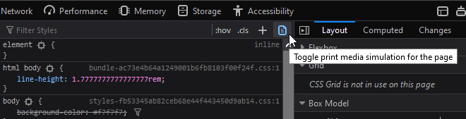
In Firefox, open the Developer Tools and click the Toggle print media simulation icon on the Inspector tab’s style pane:
Hack Your Media Attribute
Presuming you’re using a <link> tag to load printer CSS, you could temporarily change the media attribute to screen:
<link rel="stylesheet" href="main.css" />
<link rel="stylesheet" media="screen" href="print.css" />
Again, this won’t reveal page breaks. Don’t forget to restore the attribute to media="print" once you finish testing.
Remove Unnecessary Sections
Before doing anything else, remove and collapse redundant content with display: none;. Typical unnecessary sections on paper could include navigation menus, hero images, headers, footers, forms, sidebars, social media widgets, and advertising blocks (usually anything in an iframe):
/* print.css */
header, footer, aside, nav, form, iframe, .menu, .hero, .adslot {
  display: none;
}
It may be necessary to use display: none !important; if CSS or JavaScript functionality is showing elements according to particular UI states. Using !important isn’t normally recommended, but we can justify its use in a basic set of printer styles which override screen defaults.
Linearize the Layout
It pains me to say this, but Flexbox and Grid rarely play nicely with printer layouts in any browser. If you encounter issues, consider using display: block; or similar on layout boxes and adjust dimensions as necessary. For example, set width: 100%; to span the full page width.
Printer Styling
Printer-friendly styling can now be applied. Recommendations:
- ensure you use dark text on a white background
- consider using a serif font, which may be easier to read
- adjust the text size to
12ptor higher - modify paddings and margins where necessary. Standard
cm,mm, orinunits may be more practical.
Further suggestions include …
Adopt CSS Columns
Standard A4 and US Letter paper can result in longer and less readable lines of text. Consider using CSS columns in print layouts. For example:
/* print.css */
article {
  column-width: 17em;
  column-gap: 3em;
}
In this example, columns will be created when there’s at least 37em of horizontal space. There’s no need to set media queries; additional columns will be added on wider paper.
Use Borders Instead of Background Colors
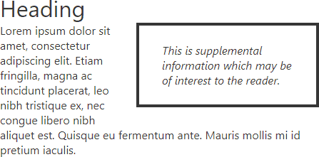
Your template may have sections or call-out boxes denoted by darker or inverse color schemes:
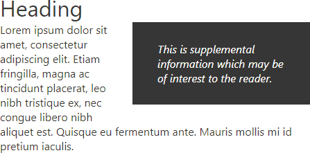
Save ink by representing those elements with a border:
Remove or Invert Images
Users will not want to print decorative and non-essential images and backgrounds. You could consider a default where all images are hidden unless they have a print class:
/* print.css */
* {
  background-image: none !important;
}

img, svg {
  display: none !important;
}

img.print, svg.print {
  display: block;
  max-width: 100%;
}
Ideally, printed images should use dark colors on a light background. It may be possible to change HTML-embedded SVG colors in CSS, but there will be situations where you have darker bitmaps:
A CSS filter can be used to invert and adjust colors in the print style sheet. For example:
/* print.css */
img.dark {
  filter: invert(100%) hue-rotate(180deg) brightness(120%) contrast(150%);
}
The result:
Add Supplementary Content
Printed media often requires additional information which would not be necessary on-screen. The CSS content property can be employed to append text to ::before and ::after pseudo-elements. For example, display a link’s URL in brackets after the text:
/* print.css */
a::after {
  content: " (" attr(href) ")";
}
Or you can add print-only messages:
/* print.css */
main::after {
  content: "Copyright site.com";
  display: block;
  text-align: center;
}
For more complex situations, consider using a class such as print on elements which should only be visible when printed,. For example:
<p class="print">Article printed at 1:23pm 5 September 2020. Please see https://site.com/page for the latest version.</p>
The CSS:
/* hidden on-screen */
.print {
  display: none;
}

@media print {

  /* visible when printed */
  .print {
    display: block;
  }

}
Note: most browsers display the URL and current date/time on the printed page’s header and/or footer, so there’s rarely a need to generate this information in code.
Page Breaks
The CSS3 properties break-before and break-after allow you control how page, column, or region breaks behave before and after an element. Support is excellent, but older browsers may use the similar page-break-before and page-break-after properties.
The following break-before and break-after values can be used:
auto: the default — a break is permitted but not forcedavoid: avoid a break on the page, column or regionavoid-page: avoid a page breakpage: force a page breakalways: an alias ofpageleft: force page breaks so the next is a left pageright: force page breaks so the next is a right page
Example: force a page break immediately prior to any <h1> heading:
/* print.css */
h1 {
  break-before: always;
}
Note: be wary of over-using page breaks. Ideally, printer output should use as few pages as possible.
The break-inside (and older page-break-inside) property specifies whether a page break is permitted inside an element. The commonly supported values:
auto: the default — a break is permitted but not forcedavoid: avoid an inner break where possibleavoid-page: avoid an inner page break where possible
This can be preferable to specifying page breaks, since you can use as little paper as possible while avoiding page breaks within grouped data such as tables or images:
/* print.css */
table, img, svg {
  break-inside: avoid;
}
The widows property specifies the minimum number of lines in a block that must be shown at the top of a page. Imagine a block with five lines of text. The browser wants to make a page break after line four so the last line appears at the top of the next page. Setting widows: 3; breaks on or before line two so at least three lines carry over to the next page.
The orphans property is similar to widows except it controls the minimum number of lines to show at the bottom of a page.
The box-decoration-break property controls element borders across pages. When an element with a border has an inner page break:
slice: the default, splits the layout. The top border is shown on the first page and the bottom border is shown on the second page.clone: replicates the margin, padding, and border. All four borders are shown on both pages.
Finally, CSS Paged Media (@page) has limited browser support but provides a way to target specific pages so alternative margins or breaks can be defined:
/* print.css */

/* target all pages */
@page {
  margin: 2cm;
}

/* target the first page only */
@page :first {
  margin-top: 6cm;
}

/* target left (even-numbered) pages only */
@page :left {
  margin-right: 4cm;
}

/* target right (odd-numbered) pages only */
@page :right {
  margin-left: 4cm;
}
The CSS page break properties can be placed within your screen or print styles because they only affect printing, but I recommend using them in print CSS for clarity.
Be aware that page break control is little more than a suggestion to the browser. There’s no guarantee a break will be forced or avoided because layout is restricted to the confines of the paper.
Printing Pains
Control over printing web media will always be limited, and results can vary across browsers. That said:
- printer-friendly style sheets can be retro-fitted to any site
- most printer styling will work in the majority of browsers
- print styles will not affect or break existing functionality
- the development costs are minimal.
Adding a few page breaks and removing unnecessary sections will delight users and raise your site above competitors. Add it to your to-do list!
For more advanced CSS knowledge, read our book CSS Master, 3rd Edition.
FAQs About Creating Printer-friendly Pages with CSS
Creating a CSS print stylesheet is important for controlling the appearance of web pages when they’re printed. Let’s end by covering some of the frequently asked questions about how to create printer-friendly pages with CSS.
What is CSS for print?
It’s possible to print web pages directly from your browser, but a printed web page often won’t look like the page you see on the screen. Web pages are styled with CSS, and CSS can also be used to provide styling for the printed page. However, web page styles don’t usually translate well to print, so it’s important to write CSS styles specifically for the printed page. CSS for print is a set of styles specifically designed to help printers format the layout of the printed page.
How can I use CSS for print?
Web page CSS will automatically apply to the printed version of a web page, but often with unexpected or unwanted results. CSS for print recognizes the unique constraints of the printed page, in contrast to the more flexible browser environment. Setting styles for print involves thinking about how elements will best lay out on a printed page. That may include hiding elements that are not relevant to print, such as menus and the like, styling links in a way that makes the URL is visible on the printed page, and removing background images and font colors that may not be relevant to a printed version of the web page.
How do I set up a CSS print stylesheet?
There are two basic ways to serve up print styles in CSS: via a separate stylesheet, or via a media query. CSS print styles can be stored in a separate stylesheet that’s linked to a web page in the <head> section of the document:<link rel="stylesheet" media="print" href="print.css" />
CSS print styles can be placed within a stylesheet, along with styles for other media, via media queries:@media print { /* print styles here */ }
What are some common use cases for print stylesheets?
Common use cases for print stylesheets include:
– Adjusting font sizes and styles for readability on paper.
– Removing or hiding certain elements that are not relevant when printed (such as navigation menus).
– Ensuring that images and background colors do not print by default.
– Specifying page breaks to control how content is divided across pages.
How can I hide specific elements in the print version?
You can hide specific elements in the print version using CSS by setting the display property to none.
For example:@media print {.hide-on-print {display: none;}}
How do I specify page breaks in a print stylesheet?
You can specify page breaks using the page-break-before and page-break-after CSS properties. For example:@media print {.page-break {page-break-before: always;}}
Can I change the page margins for printed documents?
Yes, you can change the page margins for printed documents using the @page rule in your print stylesheet. For example:@page {margin: 1cm;}
How can I ensure that images and background colors don’t print?
You can prevent images and background colors from printing by using CSS properties like background-image and background-color with the none value in your print stylesheet. For example:@media print {img {display: none;}body {background-color: white;}}
Is it possible to change the font styles and sizes for printing?
Yes, you can change font styles and sizes for printing by specifying different styles within your print stylesheet. For example:@media print {body {font-size: 12pt;font-family: Arial, sans-serif;}}
How do I test my print stylesheet before printing?
You can test your print stylesheet by using your web browser’s print preview feature. Most modern browsers allow you to see how the page will look when printed without actually printing it.
 Craig Buckler
Craig is a freelance UK web consultant who built his first page for IE2.0 in 1995. Since that time he's been advocating standards, accessibility, and best-practice HTML5 techniques. He's created enterprise specifications, websites and online applications for companies and organisations including the UK Parliament, the European Parliament, the Department of Energy & Climate Change, Microsoft, and more. He's written more than 1,000 articles for SitePoint and you can find him @craigbuckler.