Pseudo-Randomly Adding Illustrations with CSS
Published 4 years, 2 days pastI’ve been incredibly gratified and a bit humbled by the responses to the new design. So first of all, thank you to everyone who shared their reactions! I truly appreciate your kindness, and I’d like to repay that kindness a bit by sharing some of the techniques I used to create this design. Today, let’s talk about the ink-study illustrations placed between entries on the site, as well as one other place I’ll get to later.
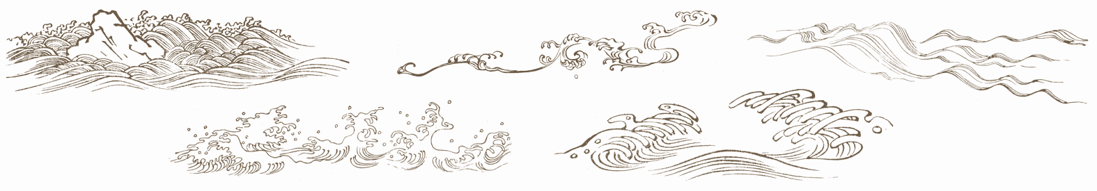
Very early in the process, I knew I wanted to separate entries with decorations of some sort, as a way of breaking up the stream of text. Fortunately, Hamonshū provided ample material. A little work in Acorn and I had five candidate illustrations ready to go.
The thing was, I wanted to use all five of them, and I wanted them to be picked on a random-ish basis. I could have written PHP or JS or some such to inject a random pick, but that felt a little too fiddly. Fortunately, I found a way to use plain old CSS to get the result I wanted, even if it isn’t truly random. In fact, its predictability became an asset to me as a designer, while still imparting the effect I wanted for readers.
(Please note that in this article, I’ve simplified some aspects of my actual CSS for clarity’s sake; e.g., removing the directory path from url() values and just showing the filenames, or removing declarations not directly relevant to the discussion here. I mention this so that you’re prepared for the differences in the CSS shown in this piece versus in your web inspector and/or the raw stylesheet.)
Here’s how it starts out:
#thoughts .entry + .entry::before {
   content: "";
   display: block;
   height: 10em;
   background:
      url(separator-big-05.png) 50% 100% / contain no-repeat;
}
That means, for every blog entry except the first, a block-level bit of generated content is inserted at the beginning of the entry, given a height, and the image separator-big-05.png is dropped into the generated box and sized to be contained within it, which means no part of the image will spill outside the background area and thus be clipped off. (The file has the number 05 because it was the fifth I produced. It ended up being my favorite, so I made it the default.)
With that in place, all that remains is to switch up the background image that’s used for various entries. I do it like this:
#thoughts .entry:nth-of-type(2n+1)::before {
   background-image: url(separator-big-02.png);
}
#thoughts .entry:nth-of-type(3n+1)::before {
   background-image: url(separator-big-03.png);
}
#thoughts .entry:nth-of-type(4n+1)::before {
   background-image: url(separator-big-04.png);
}
#thoughts .entry:nth-of-type(5n+1)::before {
   background-image: url(separator-big-01.png);
}
So every second-plus-one entry (the third, fifth, seventh, etc.) that isn’t the first entry will use separator-big-02.png instead of -05.png. Unless the entry is an every-third-plus-one (fourth, seventh, tenth, etc.), in which case separator-big-03.png is used instead. And so on, up through every-fifth-plus-one. And as you can see, the first image I produced (separator-big-01.png) is used the least often, so you can probably guess where it stands in my regard.
This technique does produce a predictable pattern, but one that’s unlikely to seem too repetitious, because it’s used to add decoration separated by a fair amount of text content, plus there are enough alternatives to keep the mix feeling fresh. It also means, given how the technique works, that the first separator image on the home page (and on archive pages) is always my favorite. That’s where the predictability of the approach helped me as a designer.
I use a similar approach for the separator between posts’ text and their comments, except in that case, I add a generated box to the end of the last child element in a given entry:
.single #thoughts article .text > *:last-child:after {
   content: "";
   display: block;
   height: 10em;
   background:
      url(separator-big-05.png) 50% 100% / contain no-repeat;
}
That is, on any page classed single (which is all individual post pages) after the last child element of a .text element (which holds the text of a post), the decoration box is generated. The default, again, is separator-big-05.png — but here, I vary the image based on the number of elements in the post’s body:
.single #thoughts article .text > *:nth-child(2n+1)::after {
   background-image: url(separator-big-02.png);
}
.single #thoughts article .text > *:nth-child(3n+1)::after {
   background-image: url(separator-big-03.png);
}
.single #thoughts article .text > *:nth-child(4n+1)::after {
   background-image: url(separator-big-04.png);
}
.single #thoughts article .text > *:nth-child(5n+1)::after {
   background-image: url(separator-big-01.png);
}
In other words: if the last child element of the post text is a second-plus-one, separator-big-02.png is used. If there are 3n+1 (one, four, seven, ten, thirteen, …) HTML elements in the post, separator-big-03.png is used. And so on. This is an effectively random choice from among the five images, since I don’t count the elements in my posts as I write them. And it also means that if I edit a piece enough to change the number of elements, the illustration will change! (To be clear, I regard this as a feature. It lends a slight patina of impermanence that fits well with the overall theme.)
I should note that in the actual CSS, the two sets of rules above are merged into one, so the selectors are actually like so:
#thoughts .entry + .entry::before,
   .single #thoughts article .text > *:last-child:after {…}

#thoughts .entry:nth-of-type(2n+1)::before,
   .single #thoughts article .text > *:nth-child(2n+1)::after {…}

#thoughts .entry:nth-of-type(3n+1)::before,
   .single #thoughts article .text > *:nth-child(3n+1)::after {…}
In all honesty, this technique really satisfies me. It makes use of document structure while having a random feel, and is easily updated by simply replacing files or changing URLs. It’s also simple to add more rules to bring even more images to the mix, if I want.
And since we’re talking about using structure to vary layout, I also have this @media block, quoted here verbatim and in full:
@media (min-width: 50em) {
   #thoughts .entry:nth-of-type(2n) {
      transform: translate(-1vw,0);
   }
   #thoughts .entry:nth-of-type(3n) {
      transform: translate(3vw,0);
   }
}
This means on the home page and blog archive pages, but only at desktop-browser widths, some entries are shifted a bit to the left or right by fractions of the viewport width, which subtly breaks up the strict linearity of the content column on long pages, keeping it from feeling too grid-like.
To be honest, I have no idea if that side-shifting effect actually affects visitors’ experience of using meyerweb, but I like it. Sometimes the inter-entry wave art fits together with the side-shift so that it looks like the art flows into the content. That kind of serendipity always delights me, whether it comes by my hand or someone else’s. With luck, it will have delighted one or two of you as well.
Comments (7)
Awesome work
Reminds me of a similar approach here: https://www.sitepoint.com/the-cicada-principle-and-why-it-matters-to-web-designers/
I think the trick is prime or co-prime numbers
Pingback ::
Dew Drop – April 16, 2020 (#3177) | Morning Dew
[…] Pseudo-Randomly Adding Illustrations with CSS (Eric Meyer) […]
Well spotted, Ron! Would you believe I plan to mention the Cicada Principle in an upcoming post in this series?
Pingback ::
Pseudo-Randomly Adding Illustrations with CSS | owl's ramble-ons
[…] Eric MeyerPseudo-Randomly Adding Illustrations with CSS […]
Pingback ::
Дайджест свежих материалов из мира фронтенда за последнюю неделю №411 (13 — 19 апреля 2020) / Хабр
[…] CSS-находки в новом дизайне Facebook • LCH-цвета в CSS • Вставка псевдо-рендомных иллюстраций с помощью CSS • Использование CSS для размещения текста внутри […]
Pingback ::
Eric Meyer Redesign – @studiochris
[…] a follow-up, he also posted his method to add pseudo-random illustrations with CSS as separators between entries on the […]
Pingback ::
Псевдослучайное добавление иллюстраций с помощью CSS | Все про сайтостроение
[…] Источник: https://meyerweb.com […]