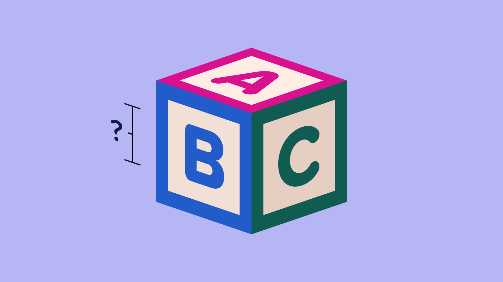
Childish Font Sizes

We’ve come a long way when it comes to font-size. I remember a time when it was commonplace to set body copy to ten pixels (or smaller!) so we could cram as much text as possible into our static 640×480 layouts. These days, the arguments for a 16-pixelFootnote
1
baseline are widely accepted: We have plenty of data supporting its readability, it can prevent unintentional zoom in mobile browsers, and it’s been the default in every major browser for many years.
But there are plenty of reasons to go even larger:
- Studies have shown that larger type improves reading comprehension. In one 2012 study, the sweet spot for body copy seemed to be 18–22 pixels.Footnote 2
- Larger type is more accessible to more people. The U.S. Department of Health and Human Services recommends a font size of at least 19 pixels if your audience includes older adults.
- It’s already the trend: Content-heavy sites like Medium, Vox and The Washington Post (to name just a few) go larger than 16 pixels for article bodies, even on small screens.
- Some fonts seem smaller at 16 pixels than others. If your font is light, condensed or has a low x-height, 16 pixels probably won’t cut it.
- Thanks to features like CSS clamp, our font sizes can be just as fluid as our layouts, growing from a minimum readable value up to a maximum of our choosing at whatever responsive rate we want.
In spite of these arguments, I’ve felt some surprising resistance to larger font sizes. The fact that push-back exists at all is not surprising: It can take years for new browser features or usability best practices to settle into widespread adoption, and anything unfamiliar is a hard sell. It’s the form that feedback takes that surprises me, because it’s so specific.
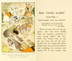
Across a few different projects with disparate audiences, visual identities and typefaces, the reaction to a larger body font size I hear most often is that it feels a bit “childish,” “child-like” or “like a children’s book.”
Those descriptors might sound pejorative out of context, but I want to be clear: Our customers are polite, lovely people, and we ask for their candid, unfiltered feedback as often as we can. I consider it a success when a stakeholder trusts us with their honest reactions instead of couching everything in layers of indirect language. And it makes patterns of feedback like this one much easier to spot!
So why “childish?” I think the frequency of that response comes down to shared experience. We were all children once, we’ve all seen children’s books, and the tricks that make typography accessible to children are the same that help adults of varying literacy, visual acuity and attentiveness: Larger fonts with generous x-height, balanced word and line spacing, reasonable line lengths, consistent alignment and adequate contrast.Footnote 3
But if these characteristics help adults and children alike, why is the text in our printed magazines, novels, newspapers, textbooks and instruction manuals so much smaller?
Some of that comes down to content: The more experienced the reader, the more complex the information can be. Longer passages of text benefit from sections and headings, with contrasting sizes (larger and smaller) and styles (weight, case, etc.) to establish hierarchy. Tables, charts and figures may be used to convey complex relationships, requiring a certain density of information to be useful. These are still relevant considerations in our digital experiences.
But I suspect the biggest explanation for long-form typographic shrinkage comes down to the physical limitations of the printed page. Larger text means more pages, which means more paper, ink and binding materials… more labor and fuel to design, print, assemble and ship… more space taken up on our shelves and in our carry-on bags. It simply isn’t practical for your favorite novel to significantly increase its font size without increasing its cost or becoming physically unwieldy to read while reclined on the couch.
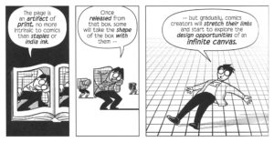
Web design has plenty of its own limitations, but page count isn’t one of them: Our browsers are windows to an infinite canvas of content. We don’t mind that Wikipedia would fill 3,000+ printed volumes because it never has to: Our devices won’t grow larger or heavier while browsing it, regardless of its font size.
So until I hear a more compelling argument, I’m going to continue advocating for larger font sizes for longer passages of content, taking care to preserve hierarchy and information density where appropriate. 18 or 20 pixels might feel pretty large at first glance when we’re so used to squinting at 16 or less, but the data is clear and the readability benefits are immediate.Footnote 4
Footnotes
-
I’m using pixels throughout this article for clarity, but you should probably use proportionate units (
em,rem, etc.) where possible. Return to the text before footnote 1 - The study uses points, but these are CSS points, so they equate to pixels. Points are a different size in print (about one-third larger 🥲) so I’ve used the term “pixels” here for consistency within the article. Return to the text before footnote 2
- An earlier hypothesis of mine was that larger fonts exposed more similarities between corporate typefaces and those of children’s books or products, but that idea fell apart when I re-familiarized myself with the staggering variety of typographic treatments in works for children. Return to the text before footnote 3
- Some might argue that this is a moot point… our savviest users can resize the text however they’d like. To me, that’s like asking our users to hold the screen closer to their face: Always an option, but a shaky defense for a design decision. Return to the text before footnote 4
Tyler Sticka has over 20 years of experience designing interfaces for the web and beyond. He co-owns Cloud Four, where he provides creative direction to their multidisciplinary team. He’s also an artist, writer, speaker and reluctant developer. You can follow Tyler on his personal site or on Mastodon.
