Grids are important when creating complex websites. The importance of grids in modern web design is clear from the number of frameworks that implement the grid system to speed up development.
With the introduction of the CSS Grid Layout spec, you will not need to include a separate stylesheet just to use the grid system. Another advantage is that you will not have to rely on properties like inline and float to lay out the elements on a web page. In this tutorial, we will cover the fundamentals of the grid system and create a basic blog layout.
Browser Support
At present, only IE 10+ and Edge support Grid Layout — you cannot use it on a commercial website just yet.
It can be enabled in Chrome through the “Experimental Web Platform features” flag in chrome://flags. You can enable it in Firefox using the layout.css.grid.enabled flag.
Another option is to use a polyfill. A CSS Grid Polyfill does exist! Using the various options above, you can start experimenting and learn as much about the Grid Layout as you can while it is still in its infancy.
Note: Internet Explorer has currently implemented the older version of the spec. Unfortunately, this means that it is not entirely compatible with the latest spec. When going through the examples in this tutorial I suggest you use Chrome or Firefox with appropriate flags enabled.
Grid System Terminology
The CSS grid system is similar to tables when it comes to laying out elements. However, it is much more powerful and flexible. In this section, I will discuss a few terms that you will need to keep in mind when working with grids:
The fr unit: This unit is used to specify a fraction of available space. It is meant to be used with grid-rows and grid-columns. According to the spec —
The distribution of fractional space occurs after all ‘length’ or content-based row and column sizes have reached their maximum.
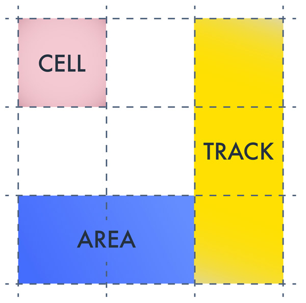
Lines: Lines define the boundaries of other elements. They run vertically as well as horizontally. In the figure below, there are four vertical and four horizontal lines.
Tracks: Tracks are the space between parallel lines. In the figure below, there are three vertical and three horizontal tracks.
Cells: Cells are the building block of grids. In the figure below, there are nine cells in total.
Areas: An area is a rectangular shape with an arbitrary number of cells. So, a track is an area and so is a cell.
Positioning Elements in a Grid
Let’s begin with the basics. In this section, I will teach you how to position elements at a certain location using grids. To use CSS Grid Layout, you need a parent element and one or more child elements. For the sake of demonstration, I will use the following markup for our grid system:
<div class="grid-container">
  <div class="grid-element item-a">A</div>
  <div class="grid-element item-b">B</div>
  <div class="grid-element item-c">C</div>
  <div class="grid-element item-d">D</div>
  <div class="grid-element item-e">E</div>
  <div class="grid-element item-f">F</div>
</div>
After you are done with the markup you need to apply display:grid or display:inline-grid on the parent element along with other styling like this:
.grid-container {
  display: grid;
  grid-template-columns: 200px 10px 0.3fr 10px 0.7fr;
  grid-template-rows: auto 20px auto;
}
The grid-template-columns and grid-template-rows properties are used to specify the width of various rows and columns. In the above example, I have defined five columns. The 10px columns act as gutters to provide required spacing between elements. The first column is 200px wide. The third column takes up 0.3 parts of the remaining space. Similarly, fifth column takes up 0.7 parts of the remaining space.
Using auto for the first row in grid-template-rows allows the row to expand as necessary based on the content inside it. The 20px row acts as a gutter.
At this point, the elements are packed closely together as evident from the following demo.
See the Pen CSS Grid Layout Demo 1 by SitePoint (@SitePoint) on CodePen.
Observe that element B is in the second column that we were planning on using as a gutter. If you don’t specify the position of child elements inside the grid, the browser puts one element per cell until the first row is completely filled, the rest of the elements then go in the next row. This is the reason that we are left with four spare columns in the second row.
To move elements to a specific cell in the grid you need to specify their position in CSS. Before I explain how to move elements around using grid system, take a look at the following image.
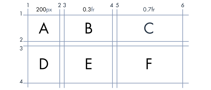
In this example, we will be using “line-based placements”. Line-based placement means that the lines in our grid system will act as guidelines to place and confine elements. Let’s take element B as an example. Horizontally, it starts at column line 3 and ends at column line 4. Along the vertical axis, it is located between the line at row 1 and the line at row 2.
We use grid-column-start to specify the starting vertical line for an element. In this case, it would be set to 3. grid-column-end indicates the ending vertical line for an element. This property would be equal to 4 in this case. Corresponding row values will also be set similarly.
With all of the above in mind, to move element B to the second cell you would use the following CSS:
.element-b {
  grid-column-start: 3;
  grid-column-end: 4;
  grid-row-start: 1;
  grid-row-end: 2;
}
Similarly, to move element F to the sixth cell you would use the following CSS:
.element-f {
  grid-column-start: 5;
  grid-column-end: 6;
  grid-row-start: 3;
  grid-row-end: 4;
}
After these changes in CSS, the elements should be spaced properly like they are in this demo:
See the Pen CSS Grid Layout Demo 2 by SitePoint (@SitePoint) on CodePen.
Creating a Basic Layout
Now it is time to create a basic blog layout. The blog will have a header, a footer, a sidebar and two sections for actual content. Let’s begin with the markup:
<div class="grid-container">
  <div class="grid-element header">Header</div>
  <div class="grid-element sidebar">Sidebar</div>
  <div class="grid-element main">Main Content</div>
  <div class="grid-element extra">Extra Info</div>
  <div class="grid-element footer">Footer</div>
</div>
Keep in mind that the order of elements in markup does not make any difference as to where the elements are positioned on the web page. As long as you do not change the CSS, you can put the footer above the header in the markup and the position of elements on the web page will not change. Of course, I would not recommend it. The point is — your markup will no longer dictate the placement of your elements.
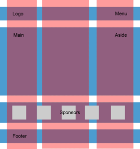
All we have to do now is figure out the value of properties like grid-row-end for various elements. Just like in the last example, we will use a grid diagram to determine the value of all grid properties.
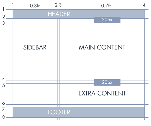
As the above image indicates, the header goes from column line 1 to column line 4 and row line 1 to row line 2. The CSS for this should be as follows:
.header {
  grid-column-start: 1;
  grid-column-end: 4;
  grid-row-start: 1;
  grid-row-end: 2;
}
Similarly, “extra content” goes from column line 3 to column line 4 and row line 5 to row line 6. Therefore, the CSS would be:
.extra {
  grid-column-start: 3;
  grid-column-end: 4;
  grid-row-start: 5;
  grid-row-end: 6;
}
Grid properties of all other elements can also be determined with ease now. Have a look at the CodePen demo and experiment with various grid values to get a better understanding of line-based placement:
See the Pen CSS Grid Layout Demo 3 by SitePoint (@SitePoint) on CodePen.
Conclusion
The CSS grid layout spec allows us to create complex layouts with ease. The CSS we need to write is much simpler and more maintainable. We no longer have to use float or other such properties when creating complex layouts in our designs. Another great advantage is the complete separation of markup and layout. With CSS Grid Layout, the possibilities are endless.
If you have any questions regarding this tutorial, let me know in the comments.
Frequently Asked Questions about CSS Grid Layout
What is the difference between CSS Grid Layout and other CSS layout methods?
CSS Grid Layout is a two-dimensional layout system, unlike other CSS layout methods such as Flexbox, which is one-dimensional. This means that with CSS Grid, you can control the layout both horizontally and vertically, which is not possible with other methods. It’s designed to handle more complex designs and large scale layouts. It’s also more flexible and powerful, allowing for more creative and intricate designs.
How do I start using CSS Grid Layout?
To start using CSS Grid Layout, you need to set the display property of an element to grid or inline-grid. This makes the element a grid container and its children become grid items. You can then use various grid properties to define the layout of the grid and the placement of the grid items.
Can I use CSS Grid Layout with other CSS layout methods?
Yes, CSS Grid Layout can be used in combination with other CSS layout methods. For example, you can use Flexbox for the components of your website and CSS Grid for the overall layout. This allows you to take advantage of the strengths of each layout method.
How do I create a grid with CSS Grid Layout?
To create a grid with CSS Grid Layout, you first need to define a grid container by setting the display property of an element to grid or inline-grid. You can then use the grid-template-columns and grid-template-rows properties to define the number and size of the columns and rows in the grid.
How do I place items on the grid?
You can place items on the grid using the grid-column and grid-row properties. These properties allow you to specify the start and end lines for the item, effectively placing it in a specific cell or cells of the grid.
What are grid lines and grid tracks?
In CSS Grid Layout, grid lines are the dividing lines that make up the structure of the grid. They are numbered starting from 1, with the line numbers increasing from top to bottom and left to right. Grid tracks are the space between two adjacent grid lines, which can be a column or a row.
What is the fr unit in CSS Grid Layout?
The fr unit in CSS Grid Layout stands for “fraction”. It represents a fraction of the available space in the grid container. For example, if you have a grid with three columns and you set the width of one column to 1fr and the other two to 2fr, the first column will take up one third of the available space and the other two will each take up one third.
How do I make a grid responsive?
To make a grid responsive, you can use media queries in combination with the grid-template-columns and grid-template-rows properties. You can also use the auto-fill and auto-fit keywords with the repeat function to automatically adjust the number and size of the columns and rows based on the size of the viewport.
Can I nest grids within grids?
Yes, you can nest grids within grids in CSS Grid Layout. This means that you can make a grid item itself a grid container, allowing you to create complex nested layouts.
Is CSS Grid Layout supported by all browsers?
CSS Grid Layout is supported by all modern browsers, including Chrome, Firefox, Safari, and Edge. However, it is not supported by Internet Explorer. For this reason, it’s important to provide a fallback layout for users who are using unsupported browsers.
 Nitish Kumar
I am a front-end developer who has a keen interest in working with various libraries and reading about latest developments in my field. I also publish a list of most popular web development articles of the week every Tuesday on the website Freadio.